- Home
- Illustrator
- Discussions
- Re: Can't create the graph. The requested transfor...
- Re: Can't create the graph. The requested transfor...
Copy link to clipboard
Copied
I'm attempting to create a vertical column graph in Illustrator 24.3 and keep receiving the following message: Can't create the graph. The requested transformation is too extreme.
The data consists of numbers only. Six columns by ten rows. Nothing out of the ordinary. Any insights would be appreciated.
 2 Correct answers
A little late to the game here, but this just happened to me as well. The problem was that I was that I had an override set for the value axis, with a max of 60 and 6 divisions, but the data I was attempting to replace was in thousands, which would have extended the graph off the pasteboard. Solution is to untick the 'Override Calculated Values' and then replace the data. I can see from your screenshot below that your value axis is max 1 with 5 divisions, but your data goes into the thousands, s
...Summary of this thread:
Having just completed a couple of dozen charts for a project, I had this error message as well. Here are the situations that trigger it:
- @troyh5226751 describes the most common problem: an override on the axis value. This usually happens when you copy/paste a chart to use as a base for a new one. Before adding the data to the new chart, select the base chart, right-click on Type, and UNcheck the axis value. Then, after you add the new data into the chart, you can adjust
Explore related tutorials & articles
Copy link to clipboard
Copied
Which version of Illustrator?
Which operating system?
Hmm! Just guessing here, because of the word Transformation. Are you applying some kind of 3D Effect or other Effect to the Graph?
Copy link to clipboard
Copied
No effects. Illustrator 24.3. Mac OS 10.15.6.
Copy link to clipboard
Copied
Can we see a screenshot of where you are with your data values? What tool are you in and action are you performing when you get the error?
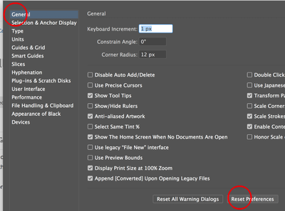
Try resetting your Ilustrator prefs
Copy link to clipboard
Copied
Thanks for the response.
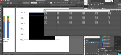
Screenshot attached. Could it be the commas and periods?
Copy link to clipboard
Copied
Can you post that data table as a text into a forum post?
Copy link to clipboard
Copied
Copy link to clipboard
Copied
Thank you.
I can't provoke that error with those values, but also I hade to change the delimiter (delete the comma, because of localisation).
So would it work you if you just delete the delimiter (it is meant as a thousand delimiter, right?)?
Copy link to clipboard
Copied
That's correct. I truly appreciate your time with this, but I've had to move on and create the bar graph via a redraw of the Excel data / graph. I'll keep trying with future graphs and will post if I find a solution.
Copy link to clipboard
Copied
A little late to the game here, but this just happened to me as well. The problem was that I was that I had an override set for the value axis, with a max of 60 and 6 divisions, but the data I was attempting to replace was in thousands, which would have extended the graph off the pasteboard. Solution is to untick the 'Override Calculated Values' and then replace the data. I can see from your screenshot below that your value axis is max 1 with 5 divisions, but your data goes into the thousands, so that is probably the problem.
Copy link to clipboard
Copied
Thank you, I had the same problem and this resolved it perfectly.
Copy link to clipboard
Copied
Hello @dawn28034950v7n3,
Glad to hear that helped resolve the problem. Feel free to reach out if you have more questions or need assistance. We'd be happy to help.
Thanks,
Anubhav
Copy link to clipboard
Copied
Summary of this thread:
Having just completed a couple of dozen charts for a project, I had this error message as well. Here are the situations that trigger it:
- @troyh5226751 describes the most common problem: an override on the axis value. This usually happens when you copy/paste a chart to use as a base for a new one. Before adding the data to the new chart, select the base chart, right-click on Type, and UNcheck the axis value. Then, after you add the new data into the chart, you can adjust the axis value to suit your needs. See @troyh5226751 's screen capture in this thread.
- Commas, currency symbols, percent signs, spaces, and other symbols are in your data fields.
The Illustrator chart tool is an ancient module dating from 1993. It's very limited in what it can do. Unlike modern programs like Excel, Illustrator's chart module can't interpret these symbols. Ensure that only digits, the hyphen/minus sign, and the period/decimal point are in your values. Examples:- $1,000.25 = 1000.25 with the prefix set to $ on the axis value.
- €3.50 or 3,50 € = 3.50 with the prefix/suffix set to € on the axis value.
- 45.5% = 45.5 with the suffix set to % on the axis value. Note that decimal percentages (0.455) might throw off your chart. I found it more accurate to convert all forms of percentages to whole numbers, such as 10, 20, 30 rather than 0.10, 0.20, or 0.30.
- Negative numbers: (1250.00) = -1250.00
- European decimal commas such as €12,10 or 12,10€ (12 euros and 10 cents) will need to be converted to decimal points (12.10) in order to work with this program. Truthfully, I work usually with US/Canadian currencies so my experience with other national currencies is very limited, but I'll assume that it's similar for other world currencies — only periods are allowed. Also Illustrator's chart module was developed before the Euro sign was adopted and doesn't recognize most non-American currency systems.
The charting module is one of the weakest parts of Illustrator. And it's buggy as heck. I couldn't get my Windows 2021 version to work well enough. I moved the same file to Mac Illustrator and was at least able to function.
If Illustrator's quirks, bugs, and limitations can't give you the tools you need, look to other programs (oh no...she's not going to say this in an Adobe forum, is she?!!!):
- Cacidi Charts is an Illustrator plug-in.
- Datylon Graph is another plug-in.
- Pro-quality statistical graphing software (like Tableau) might be overkill, and these programs usually don't have the flexibilty or design controls needed by graphic designers. Plus, the end product might not be suitable for press (file format, color, resolution, etc.).
- And MS Excel is recognized as the most user-friendly, customizable, and powerful graphing programm out there for ordinary users. When saved as a press-quality PNG or PDF, I usually can get something sufficient for digital documents and digital printing at my print shop, but not for pro-quality offset printing.
| PubCom | Classes & Books for Accessible InDesign, PDFs & MS Office |
Get ready! An upgraded Adobe Community experience is coming in January.
Learn more


