Copy link to clipboard
Copied
Hello, please see the attached example of what I am, and am not, trying to accomplish (best shown rather than explained). As the sample shows I want to the curved letters to still be upright - rather than perpendicular to the curve, if that makes sense. I have tried a few things, including the Warp effect and Envelope Distort, with no luck. Any help would be appreciated. Thanks.
 1 Correct answer
MEONHOMES,
I believe that you will like the Envelope Distort way(s). You can look at the search results here,
and you may wish to use HelpX articles provided by Adobe, such as this one,
https://helpx.adobe.com/illustrator/using/reshape-using-envelopes.html
...
Explore related tutorials & articles
Copy link to clipboard
Copied
Hello @MEONHOMES,
Thanks for reaching out. Would you mind using the Arch Warp effect on the Text to check if it helps?
Looking forward to hearing from you.
Thanks,
Anubhav
Copy link to clipboard
Copied
Thank you, that is close to what I want but if you notice in the example, the letters in the middle are smaller and get taller towards the ends, whereas, with the Arch feature all letter heights are the same. Thx!
Copy link to clipboard
Copied
Exactly what didn't work with envelope distort? Most probably you will just need to better prepare the envelope.
Copy link to clipboard
Copied
MEONHOMES,
I believe that you will like the Envelope Distort way(s). You can look at the search results here,
and you may wish to use HelpX articles provided by Adobe, such as this one,
https://helpx.adobe.com/illustrator/using/reshape-using-envelopes.html
which can be discerned from forum threads by their starting with https://helpx.
Copy link to clipboard
Copied
Thank you I will check these out. 🙂
Copy link to clipboard
Copied
Depending on the warp effect some manual path editing might be required.
Art Brushes can offer an alternative to Illustrator's stock warp effects and text on path effects. A string of text can be turned into an Art Brush and then applied to a path as a live line stroke. Then tools like the Width Tool can be used to alter the effect.
One advantage of turning lettering into an Art Brush is the lettering will bend to the curve of the path. The standard text on path effect merely rotates the glyphs. The effect can be tricky though. Some of the distortions to letters may be unpredictable. The distortions can be minimized by fine tuning the size/length of lettering to match the length of the path. That's easier to do now with variable fonts.
Copy link to clipboard
Copied
You are welcome, MEONHOMES.
You can also venture into highly customized ways of creating vintage old fashioned text. We had many precious threads about a wide range of appearances and ways to obtain them, but they were all lost, so unfortunately right now this is the only thread dealing with any such way, in a case somewhat different to yours,
Copy link to clipboard
Copied
MEONHOMES,
I had wondered whether you wished to accomplish the more intricate top shape in your screenshot, presumably the existing one (using another font) inspiring you, with its upward curve at the ends of the upper part, but rereading your answer to Anubhav,
"Thank you, that is close to what I want but if you notice in the example, the letters in the middle are smaller and get taller towards the ends, whereas, with the Arch feature all letter heights are the same. Thx!"
I now believe that you are looking for a simpler appearance with different rounding of top and bottom.
In that case you can obtain it with one of two other Warp effects after a bit of preparation, and probably with the need for adjustment until you get it exactly as you wish; some of the members of the Warp family inherently ensure upright letters.
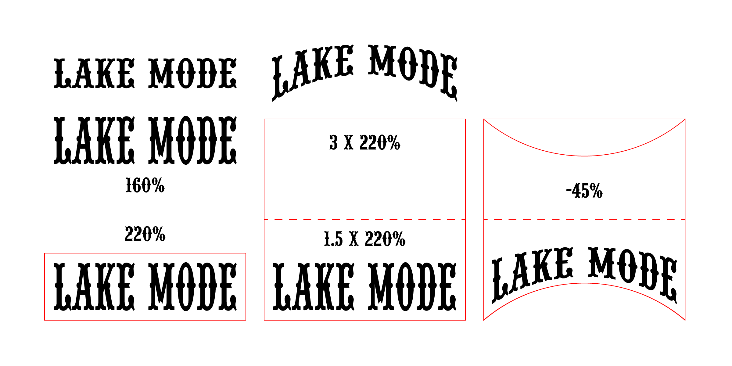
You can, shown with values that roughly gives you the same letter height at the middle:
1) Create the live Type with the desired height at the middle, and Outline the Type;
The images below show transformation numbers;
2) Increase the height of the text (shown as 160% of the original text);
3) Create a rectangle round the text (shown in red at 220% of the original text);
4) Increase the height of the rectangle upwards (shown in red at 3 x 220% = 660% of the original text, or shown in dashed red 1.5 x 220% = 330%);
5) Group the rectangle and the text and apply Effect>Warp>Bulge or Effect>Warp>Arc Lower with a negative value (shown at -45% Bend);
6) Object>Expand Appearance, Ungroup, and remove the warped rectangle (shown beside the original text).
Remember to make backups and use Undo to get back and redo.
In this case with both upper and lower rounding bending downwards at the ends, Effect>Warp>Arc Lower can be used with half the height of the rectangle and give the same appearance so it is simpler; with opposite bends, Effect>Warp>Bulge is needed so it is more flexible.
Click to get closer, Click again to get closer still
Find more inspiration, events, and resources on the new Adobe Community
Explore Now


