• Global community
    • Language:
      • Deutsch
      • English
      • Español
      • Français
      • Português
  • 日本語コミュニティ
    Dedicated community for Japanese speakers
  • 한국 커뮤니티
    Dedicated community for Korean speakers
Exit
0

Font/object outline option "behind object"?

Engaged ,
Sep 23, 2017 Sep 23, 2017

Copy link to clipboard

Copied

Migrating from CorelDRAW I'd like to add outline to text in Adobe Illustrator.

Currently, in Illustrator I cannot find an option to put an object's (text's) outline behind the object.

Here's what I would be doing in CorelDRAW (adding text, adding outline to text, put outline behind text, change outline from mitered to round):
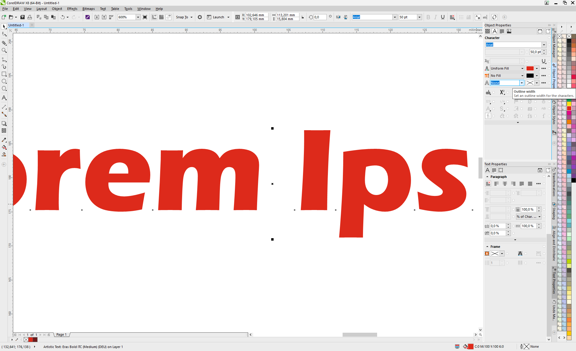
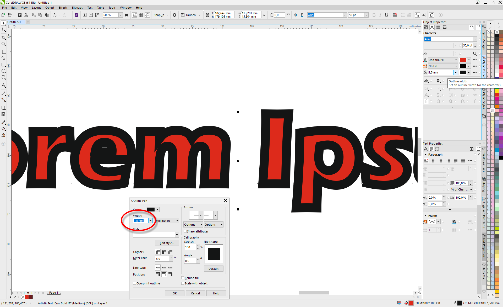
Outline - 01.png

Outline - 02.png

Outline - 03.png

Outline - 04.png

Your help is appreciated.

Views

2.9K

Translate

Translate

Report

Report
Community guidelines
Be kind and respectful, give credit to the original source of content, and search for duplicates before posting. Learn more
community guidelines

correct answers 1 Correct answer

Community Expert , Sep 23, 2017 Sep 23, 2017

Select the text object (only fill colour is applied). Go to the Appearance palette and add a new stroke. Then drag the Stroke item below the Type item.

Votes

Translate

Translate
Adobe
Community Expert ,
Sep 23, 2017 Sep 23, 2017

Copy link to clipboard

Copied

Select the text object (only fill colour is applied). Go to the Appearance palette and add a new stroke. Then drag the Stroke item below the Type item.

Votes

Translate

Translate

Report

Report
Community guidelines
Be kind and respectful, give credit to the original source of content, and search for duplicates before posting. Learn more
community guidelines
Guide ,
Sep 23, 2017 Sep 23, 2017

Copy link to clipboard

Copied

Here's more information about the Appearance panel;

The Appearance Panel in Illustrator - YouTube

Votes

Translate

Translate

Report

Report
Community guidelines
Be kind and respectful, give credit to the original source of content, and search for duplicates before posting. Learn more
community guidelines
Engaged ,
Sep 25, 2017 Sep 25, 2017

Copy link to clipboard

Copied

Thanks, Kurt & Angie, for your valuable help! Excellent answers, which were very enlightening to me.

Votes

Translate

Translate

Report

Report
Community guidelines
Be kind and respectful, give credit to the original source of content, and search for duplicates before posting. Learn more
community guidelines
Community Expert ,
Sep 23, 2017 Sep 23, 2017

Copy link to clipboard

Copied

Klaus,

Now that Kurt and Angie have answered the question fully, and now that we have safely reached Midfall, there may be time for a silly question:

Which stroke alignment (equivalent construction) is best (depending on font(s), colours, other artwork, background (if any), moon, stars, sun, time of night/day)?

Votes

Translate

Translate

Report

Report
Community guidelines
Be kind and respectful, give credit to the original source of content, and search for duplicates before posting. Learn more
community guidelines
Guide ,
Sep 24, 2017 Sep 24, 2017

Copy link to clipboard

Copied

Not sure I understand your question? Can you explain or upload a screenshot of what you want to do?

Votes

Translate

Translate

Report

Report
Community guidelines
Be kind and respectful, give credit to the original source of content, and search for duplicates before posting. Learn more
community guidelines
Community Expert ,
Sep 25, 2017 Sep 25, 2017

Copy link to clipboard

Copied

Angie, this is the question (about (opinions on) preference/preferableness):

Votes

Translate

Translate

Report

Report
Community guidelines
Be kind and respectful, give credit to the original source of content, and search for duplicates before posting. Learn more
community guidelines
Guide ,
Sep 25, 2017 Sep 25, 2017

Copy link to clipboard

Copied

It very much depends on each given situation. If the Stroke is behind the Fill then you can set the Stroke width nice and chunky and still be able to read the text. If the Stroke is in front of the fill then I generally prefer it to sit outside the edge when using it on text but there are other times, when applying it to shapes, that I would align it on the inside or middle.

Occasionally I've put it on the inside to "slim down" a font. This isn't usually a good idea but it works with some of the chunkier fonts.

Hope this helps?

Votes

Translate

Translate

Report

Report
Community guidelines
Be kind and respectful, give credit to the original source of content, and search for duplicates before posting. Learn more
community guidelines
Community Expert ,
Sep 25, 2017 Sep 25, 2017

Copy link to clipboard

Copied

Angie,

As I understand it your general preference is outside (regardless of moon, stars, sun, time of night/day). Is it the same for the cases shown?

Votes

Translate

Translate

Report

Report
Community guidelines
Be kind and respectful, give credit to the original source of content, and search for duplicates before posting. Learn more
community guidelines
Guide ,
Sep 25, 2017 Sep 25, 2017

Copy link to clipboard

Copied

LATEST

Yes but you also need to adjust the Kerning of the letters to compensate

Votes

Translate

Translate

Report

Report
Community guidelines
Be kind and respectful, give credit to the original source of content, and search for duplicates before posting. Learn more
community guidelines