Copy link to clipboard
Copied
Hey guys,
I had a designer create a logo for me a few months back, and I didn't notice earlier but the text is thicker than the stroke on the logo itself.
I've been trying to decrease the stroke/thickness of the letters to match the logo, but I can't figure out how as the regular stroke field is unavailable.
I'm sure there must be a way. If so, please share it with me here!
Thanks!
Copy link to clipboard
Copied
You might try and use Object > Path > Offset stroke with a negative value
Copy link to clipboard
Copied
Select > Deselect to make sure nothing unwanted is selected
Use the Direct Selection Tool (the white arrow)
and select for example the R shape
With a fill color and no stroke.
go to
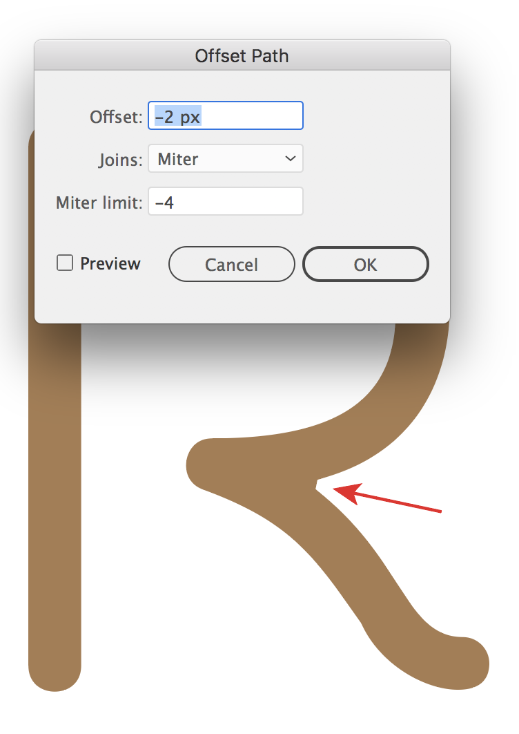
Effect > Path > Offset path
in the dialogue box that pops up
select Preview to see the live result,
And change the offset field to a negative
- easiest way is with mouse scroll wheel
When happy, click Ok
And
Object >Expand Appearance
Copy link to clipboard
Copied
Unfortunately, it's not working. As you can see I tried using varies negative numbers both with offset negative, miter negative, and also every other possibility e.g. offset negative, miter positive etc. Regardless what number I placed there was no change 😕
Is there something I'm doing wrong perhaps?
Copy link to clipboard
Copied
-15 is huge.
Try much smaller values.
Copy link to clipboard
Copied
In addition to what Monika says, I suggest that you reset the miter limit to a positive value, maybe 3 or 4, to avoid problems in corners.
Find more inspiration, events, and resources on the new Adobe Community
Explore Now