

- Home
- Illustrator
- Discussions
- Re: How to alter this letter so that the text does...
- Re: How to alter this letter so that the text does...
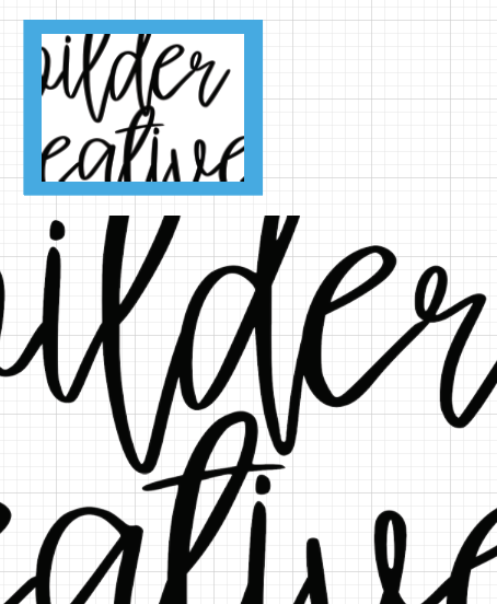
How to alter this letter so that the text doesn't overlap? Screenshot included

Copy link to clipboard
Copied
Hi everyone. I want to remove the very bottom of the tail of the 'd', where it overlaps into the 't' below it. I have looked at tutorials on youtube but I don't think I'm entering the correct search term.
Can anyone tell me what I need to do, or point me in the direction of a youtube video that explains it?
Thank you! 


Explore related tutorials & articles
 10
Replies
10
10
Replies
10

Copy link to clipboard
Copied
Try the eraser tool?


Copy link to clipboard
Copied
I tried that first but I couldn't do it without having an untidy line on the letter... is that the only solution? If so I'll just have to learn to do a better job with the eraser tool!

Copy link to clipboard
Copied
If you actually want to erase it and aren't being successful with the eraser, try using a shape, like an ellipse and the pathfinder tool or shape builder tool to delete it. You can also use pathfinder divide to separate the shapes and then just select the ones you want to delete - that way the individual paths should be nice and smooth.
Copy link to clipboard
Copied
You might also just want to adjust the leading between the two rows of text so that they are just sort of kissing or not touching at all.

Copy link to clipboard
Copied
Yes the error tool is tough to get perfect, but you can usually grab the pen tool with minus sign and delete a few vector points (updated path on the right).

There is also the smoother tool, and you can pull the bezier handles if needed to adjust a curve. Less bezier points will give you smoother results

Copy link to clipboard
Copied
I’d recommend using the Scissors tool to cut the paths where they overlap. Once you have separated the paths you can rejoin them where needed by selecting two stray points with the Direct Selection tool and then hitting Command-J.

Copy link to clipboard
Copied
Do you really mean you want to "remove" as in erase the overlap, or do you mean move the descender so that it doesn't overlap?
If you mean the latter, you might try one of these options:
- Select the letter and change the baseline shift through the Character attributes in the Control Panel.
- Draw your own path for a baseline and place the text on it using the Type on a Path Tool.
- Convert the letters to outlines and make the adjustments to the curve manually.

Copy link to clipboard
Copied
That is a very nice casual script font.
My vote would be to create two separate text lines.
With the Selection tool, move around the bottom line slightly so there is no overlapping.
You can keep the text live.
K

Copy link to clipboard
Copied
Before and After. EZ!
From a design point of view, use that beautiful causal font. Negative and positive spacing.Only slightly move that bottom text frame.
Easy readership. Keep the type live.

Copy link to clipboard
Copied
Amy,
You may consider the possibly too far out and silly delusive conception that it is completely consistent with the very free(ly roaming) script font to have such overlaps, maybe indeed far more natural and convincing than (any) efforts to tame it.

Find more inspiration, events, and resources on the new Adobe Community
Explore Now
 AdChoices