• Global community
    • Language:
      • Deutsch
      • English
      • Español
      • Français
      • Português
  • 日本語コミュニティ
    Dedicated community for Japanese speakers
  • 한국 커뮤니티
    Dedicated community for Korean speakers
Exit
0

How to Arc and stretch type

New Here ,
Nov 08, 2021 Nov 08, 2021

Copy link to clipboard

Copied

Hi all 🙂

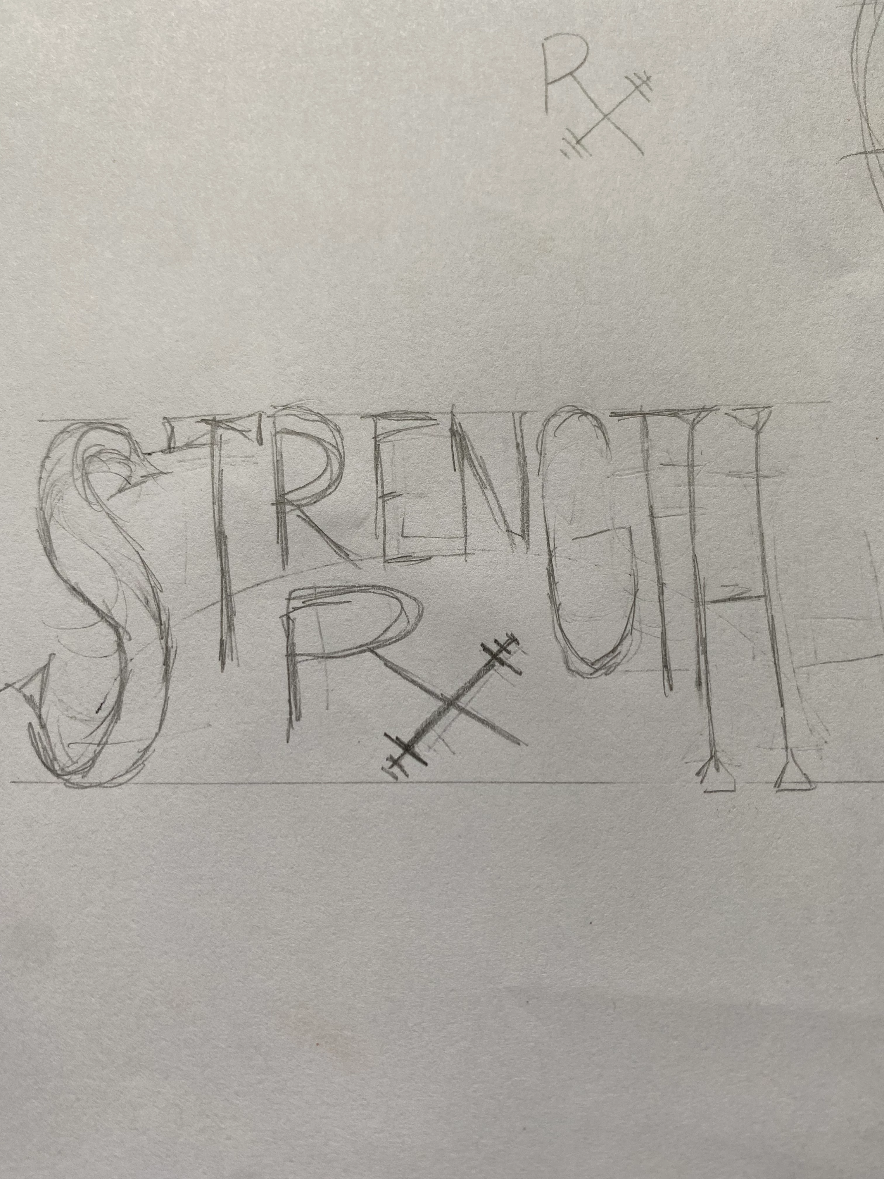
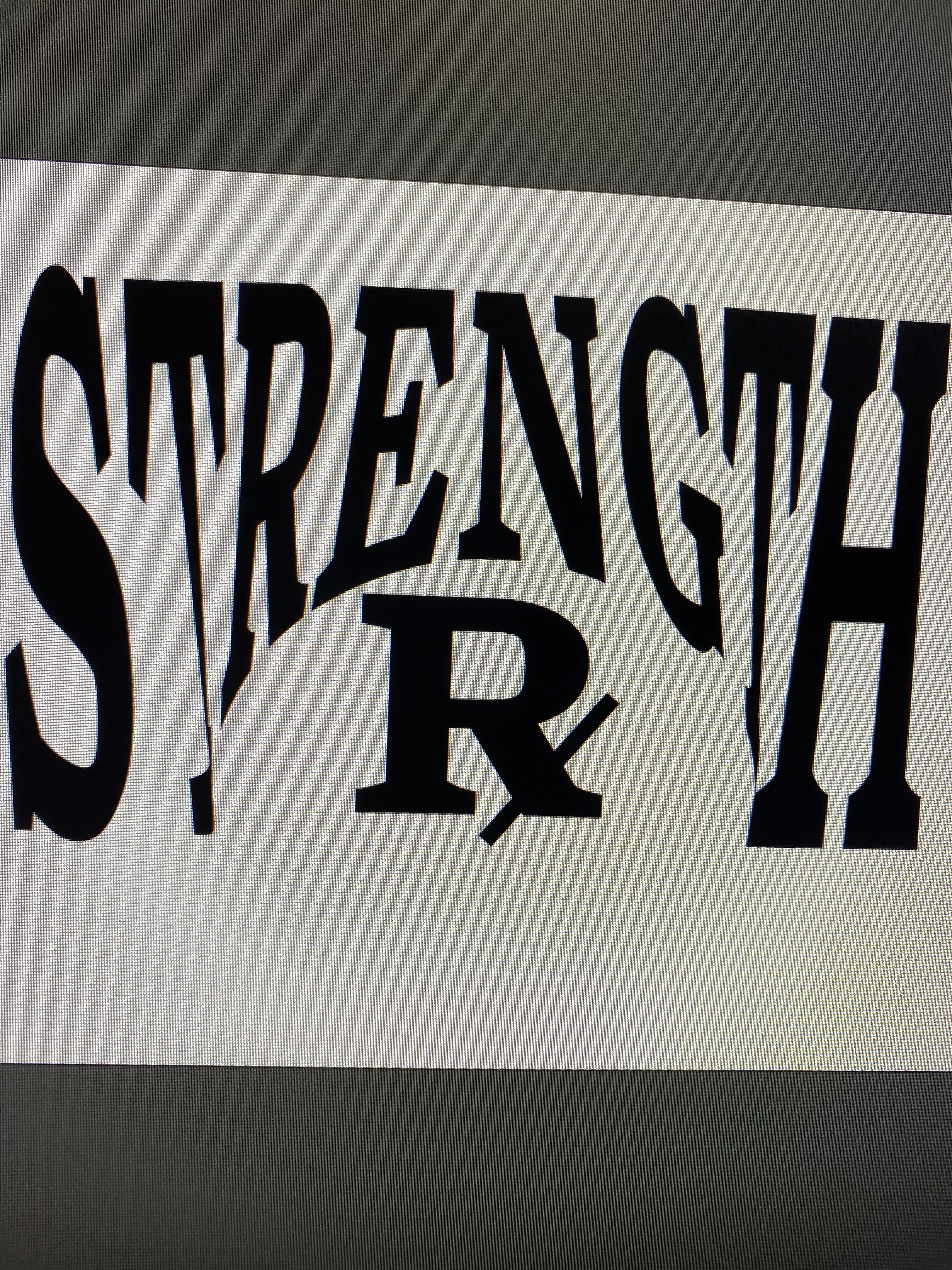
I am trying to achieve this arc (refer to very rough sketch) but have the text stretch and fill the available space. I attempted to have the text fill a shape but it came out all warped. Anybody know how I can do this?

8A71E598-DFA8-44C7-A9CE-2AE889BDA910.jpeg


CBAC6BB0-7944-40A4-9FFD-9CC0C98A9586.jpeg


TOPICS
Type

Views

329

Translate

Translate

Report

Report
Community guidelines
Be kind and respectful, give credit to the original source of content, and search for duplicates before posting. Learn more
community guidelines

correct answers 1 Correct answer

Community Expert , Nov 08, 2021 Nov 08, 2021

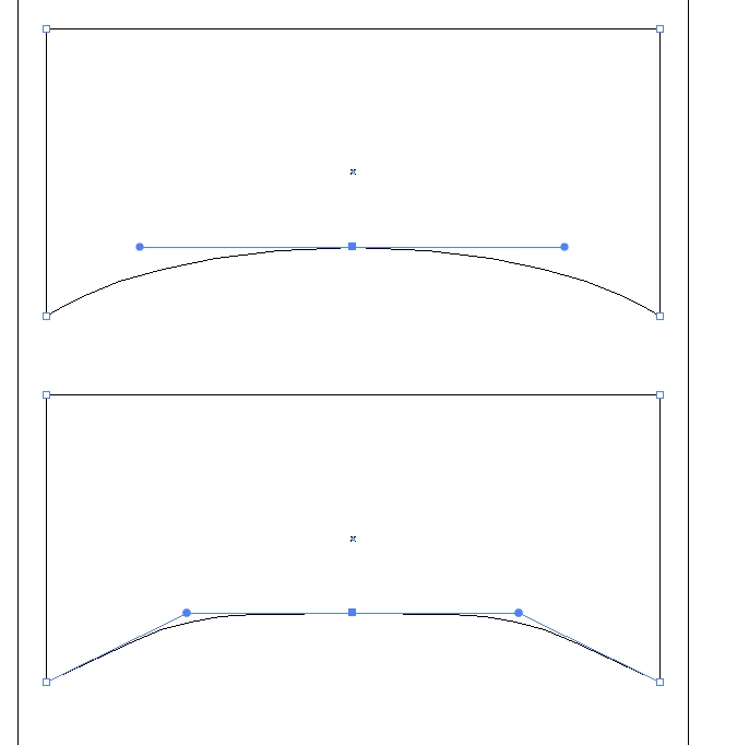
The issue of dsitortion has to do with how the shapes end result looks same, but looking at handles you can see is different.
MikeGondek_0-1636388354799.png


You can see the difference here

MikeGondek_1-1636388436393.png

You can add an extra point to top middle and pull handles to improve distortion.  Going back & forth you may get a decent result, but the add anchor points technique seems to help best. Anyone else have suggestions about distortion, please add to this as curious how others deal with this struggle.

A long time ago we had a Torries wheel

...

Votes

Translate

Translate
Adobe
Community Expert ,
Nov 08, 2021 Nov 08, 2021

Copy link to clipboard

Copied

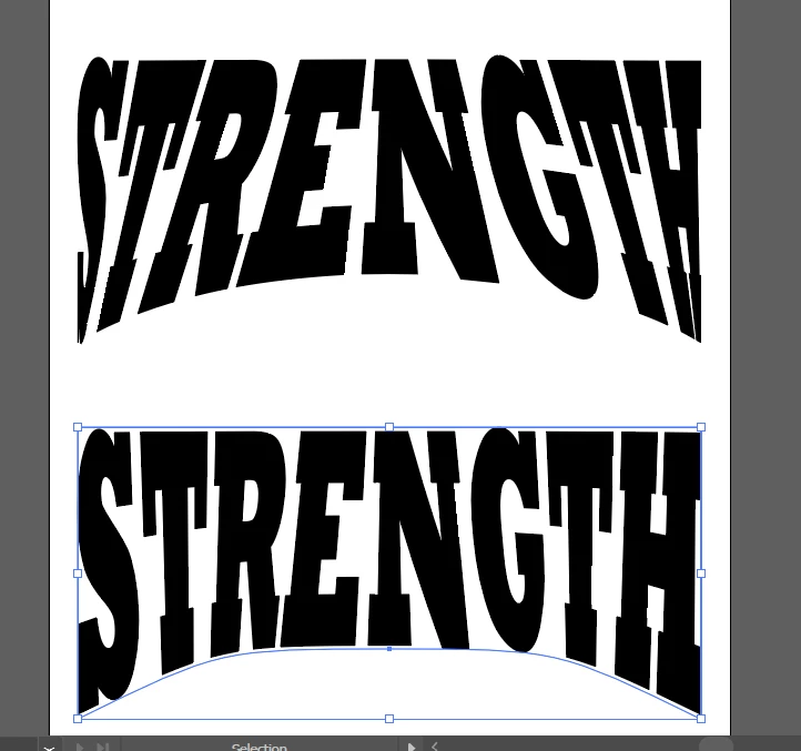
Effect >> Warp >> Arc Lower

MikeGondek_0-1636387575324.png


Votes

Translate

Translate

Report

Report
Community guidelines
Be kind and respectful, give credit to the original source of content, and search for duplicates before posting. Learn more
community guidelines
Community Expert ,
Nov 08, 2021 Nov 08, 2021

Copy link to clipboard

Copied

I personally do not like the distortion seen mostly on first and last letter. So now we get into a complex issue with illustrator. Make a red shape as shown and  use Object >> add anchor point serveral times on the red shape.


MikeGondek_1-1636387899133.png

Then Object >> envelope Distort >> Make with top object.

The red disapperas, I just use any color but black to confirm what is on top.

MikeGondek_2-1636388008777.png


Votes

Translate

Translate

Report

Report
Community guidelines
Be kind and respectful, give credit to the original source of content, and search for duplicates before posting. Learn more
community guidelines
Community Expert ,
Nov 08, 2021 Nov 08, 2021

Copy link to clipboard

Copied

The issue of dsitortion has to do with how the shapes end result looks same, but looking at handles you can see is different.

MikeGondek_0-1636388354799.png


You can see the difference here

MikeGondek_1-1636388436393.png

You can add an extra point to top middle and pull handles to improve distortion.  Going back & forth you may get a decent result, but the add anchor points technique seems to help best. Anyone else have suggestions about distortion, please add to this as curious how others deal with this struggle.

A long time ago we had a Torries wheel that did this photographically where the art was exposed while the Torries wheel changed direction. While that wasted lots of film and chemicals and a large darkroom, but it seems to give a more uniform result.


Votes

Translate

Translate

Report

Report
Community guidelines
Be kind and respectful, give credit to the original source of content, and search for duplicates before posting. Learn more
community guidelines
Community Expert ,
Nov 08, 2021 Nov 08, 2021

Copy link to clipboard

Copied

LATEST

In order to get the most natural looking result of that arched text concept it usually requires manual editing and re-building of the letters. That's what it takes to make the thickness of all letter strokes look harmonious with the non-distorted portions of the letters.

Votes

Translate

Translate

Report

Report
Community guidelines
Be kind and respectful, give credit to the original source of content, and search for duplicates before posting. Learn more
community guidelines
Community Expert ,
Nov 08, 2021 Nov 08, 2021

Copy link to clipboard

Copied

Mike, Dominick,


"Anyone else have suggestions about distortion, please add to this as curious how others deal with this struggle."


Here are a the three links I could find about a different kind of approach, leading to appearances realizing the impossible concept of undistortedly distorted text known from the olden days, where your approach here leads to another kind of undistortedly distorted text, Mike,


https://community.adobe.com/t5/illustrator-discussions/how-can-i-keep-top-third-of-text-untouched-wh...

https://community.adobe.com/t5/illustrator-discussions/warping-outline-text-around-object/td-p/10406...

https://community.adobe.com/t5/illustrator-discussions/distorting-text-in-diamond-shape/m-p/9346000


As mentioned in the first link below, there was a wealth of older exquisite threads about exactly that, often specifically requated by the OPs, all unfortunately lost.


The second link shows a case similar to the present one.


And the third link mentions the inevitable tapering and thickening/thinning of all non vertical letter parts such as arms, legs, bars, and serifs, occuring with envelope distortion.


Apart from that, Dominick, your distortedly distorted attempt is intriguing, and could be further pursued, including the Rx in a spatial appearance.


Votes

Translate

Translate

Report

Report
Community guidelines
Be kind and respectful, give credit to the original source of content, and search for duplicates before posting. Learn more
community guidelines