

- Home
- Illustrator
- Discussions
- How to: cut a letter into multiple shapes
- How to: cut a letter into multiple shapes

Copy link to clipboard
Copied
I've been trying to learn this for days and every method I eventually hit a brick wall
I'm trying to fragment this word into several shapes.

As such:

I want one layer for each colored segment shown above.
I know how to turn the word into shape layers, outline each letter, have them on a distinct layer each.
I was able to do the W using the Pen Tool + Pathfinder Panel.
But other segments are much trickier. The dot of the i for instance. Not only do I have to separete each parte but as you can see on the images I also have to connect the central part of it, other wise the dash is going to be open.
I know this is so far fetched but ideally I would love to have someone on google meet watching my screen and teaching me step by step. But if not...
Maybe you guys have a general idea on how I should go about this.
I know there are several different methods but I'm looking for one that I can finally do this.
It has been a struggle.


 1 Correct answer

Calai,
You can do it in a fully accurate way corresponding to my W reply.
But Referring to your screenshot with markings below, you can also do it in a coarser/simplified way as follows, still with unchanged unchanged visible parts of the original path, based on drawing by eye with the Pen Tool, Smart Guides being your friends:
First copy your i dot twice on top of itself and lock and hide the original and the first copy, and work on the second copy;
Then with the Pen Tool Click on the o
...Explore related tutorials & articles
 13
Replies
13
13
Replies
13

Copy link to clipboard
Copied
If I could see the anchor points on the shapes I might be able to give a more precise answer.
One way you could do it would be to duplicate the shape, like the dot on the 'i'.
Color the duplicate red.
Use the eraser tool to remove the parts you don't want on the red.
Overlay the red shape on to the black dot.


Copy link to clipboard
Copied

I need to separate this into 3 shape layers
One for the "left handle" another layer for the central dash (the one you show in red), and another layer for the "right handle".
The middle dash is tricky because I also need to draw connections so it's one runing thing without opening.
Copy link to clipboard
Copied
Calai,
You can do it in a fully accurate way corresponding to my W reply.
But Referring to your screenshot with markings below, you can also do it in a coarser/simplified way as follows, still with unchanged unchanged visible parts of the original path, based on drawing by eye with the Pen Tool, Smart Guides being your friends:
First copy your i dot twice on top of itself and lock and hide the original and the first copy, and work on the second copy;
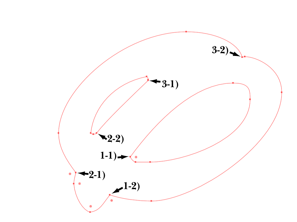
Then with the Pen Tool Click on the outside and the inside of the top right curve of the i dot path where you wish to cut it to start the dash (Smart Guides say path when you are within snapping distance, and you can move the points back and forth until you are satisfied), and then use ObjectPath>Divide Objects Below;
Now you have cut the path which remains closed with straight segments between the two new Anchor Points; this corresponds to steps 2) - 3) in my W reply;
Then with the Scissors Tool, move the cursor to each of the points, 1-1), 1-2), 2-1), 2.2), 3-1), 3-2) where Smart Guides say anchor when you are within snapping distance, make sure you snap to the bottommost of the two Anchorpoints at 3-1);
Now you have cut up the copy path; this corresponds to step 4) in my W reply;
Then with the (normal) Selection Tool select the handle parts and leave the dash part; this corresponds to step 5) in my W reply;
Then draw the curved part from 1-1) to 1-2):
- With the Pen Tool Click to snap to 1-1 (Smart Guides say anchor when you are within snapping distance), then ClickDrag down to the left so that the opposite mirrored Handle to the top right follows the direction of the existing curve, and so that the Handle length is about one third of the distance to 1-2),
- Repeat 1. only with 1-2), where you ClickDrag down to the left so that the Handle you are dragging out to the bottom left follows the direction of the existing curve;
Then draw the curved parts from 2-1) to 2-2) in the same way;
Then draw the curved parts from 3-1) to 3-2) in the same way, make sure that you snap to ;
These three steps correspond to corresponds to steps 6) - 10) in my W reply;
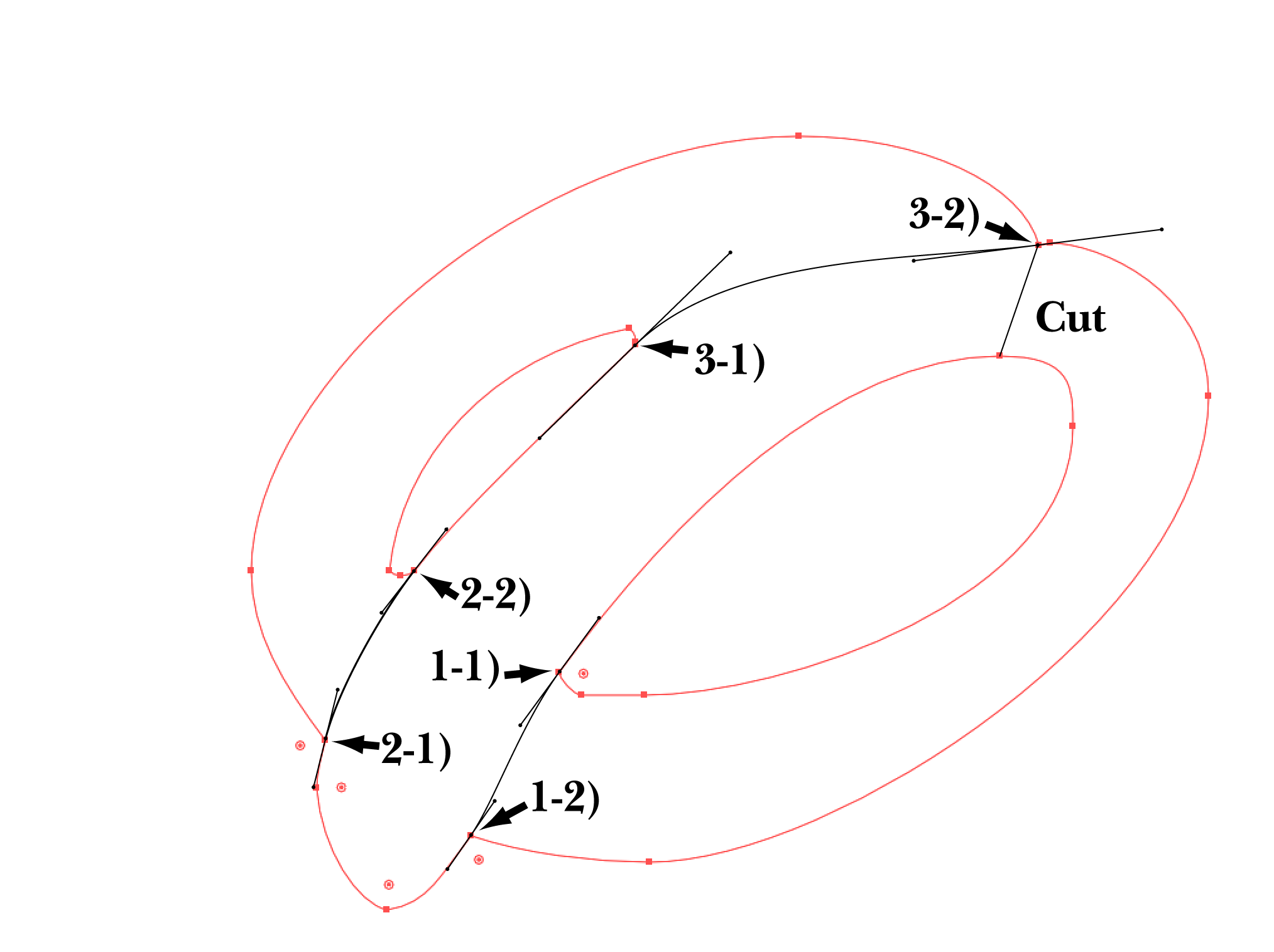
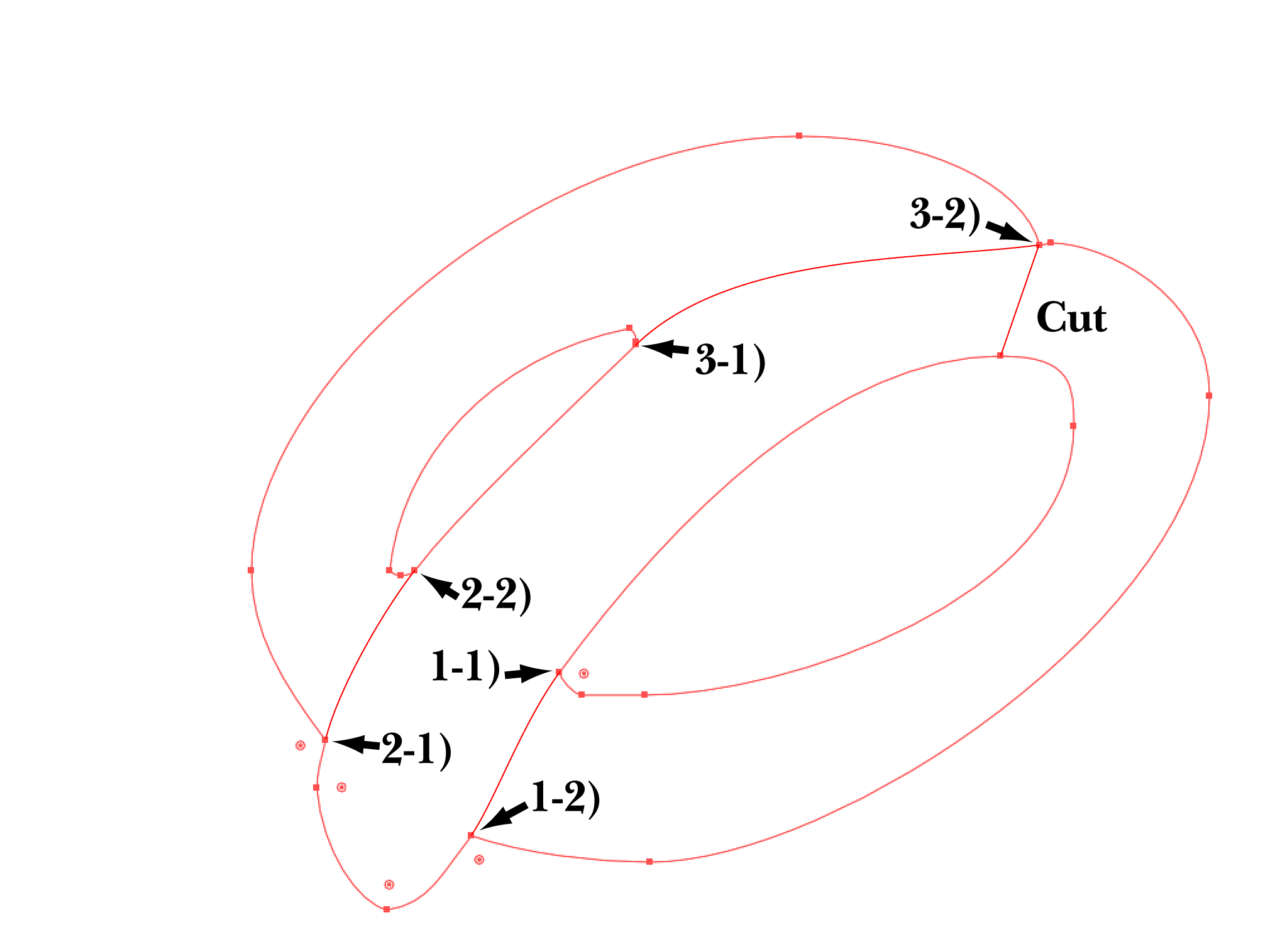
Now you have the dash drawn by eye;
Then switch from Stroke to Fill and give the dash its colour; this corresponds to step 11) in my W reply;
Then Show and Unlock the first copy of the i dot path, and switch from Stroke to (black) Fill; this corresponds to step 12) in my W reply;
Now you can see what it looks like;
Then select both paths and use Minus front (Pathfinder); this also corresponds to step 12) in my W reply.
Click to get closer, Click again to get closer still
Edit: A few bold italic underlined additions have been made. See this reply for explanations:
Copy link to clipboard
Copied
Jacob Bugge
I'm immensely grateful for the effort you clearly put into your answer. Unfortunally I don't think I'm able to get trough just by reading. I have a hard time undestanding and slowly learning that I'm getting ahead of myself. Perhaps I need basic courses on this program to better learn itl. I'm a video editor and visual effects artist who doesn't know Illustrator and realizes how important it is. I always had a hard time with it but I have to find a way to learn.
Copy link to clipboard
Copied
I have done it! OMG. It worked. I'll even show you how:

Thank you!
Copy link to clipboard
Copied
You are welcome, Calai, and thank you for sharing.
You can improve the shapes of the new parts 1, 2, and 3, so both Anchor Points are smooth by ClickDragging at both Anchor Points, instead of only Clicking the first Anchor Point, which starts out as a corner and the wrong direction straight towards the other end, and then trying to correct and smooth the first end by ClickDragging the second Anchor Point (obtained at second try for part 3), which then becomes a corner.
If you ClickDrag the first Anchor Point, you can start the new part as a smooth curve with the right direction at the first Anchor Point, and then ClickDrag the second Anchor Point so it is also smooth, in other words work with the two Anchor Points independently to shape the part from both ends.
The key to this is that when you ClickDrag, you are no just dragging out one Handle, but a pair og Handles consisting of the Handle you drag and an exactly opposite mirrored Handle.
When you ClickDrag the first Anchor Point, you can look at the opposite mirrored Handle and ensure that it has the same direction as the existing part, and when you ClickDrag the second Anchor Point, you can just look at the Handle you are dragging out and ensure that it has the same direction as the existing part.
This was what I meant by the above description of the curved part from 1-1) to 1-2), which I have enhanced by the underlined parts (both here and there):
"Then draw the curved part from 1-1) to 1-2):
- With the Pen Tool Click to snap to 1-1) (Smart Guides say anchor when you are within snapping distance), then ClickDrag down to the left so that the opposite mirrored Handle to the top right follows the direction of the existing curve at 1-1), and so that the Handle length is about one third of the distance to 1-2),
- Repeat 1. only with 1-2), where you ClickDrag down to the left so that the Handle you are dragging out to the bottom left follows the direction of the existing curve;"Setting the Handle length to about one third of the distance is just a general suggestion to obtain an even curve, and the right lengths, which can be different, depend on the (desired) shape.
If you wish to improve the shape of the part you have just drawn, you can use Ctrl/Cmd+Z to Undo the whole thing and start over. In this way you can avoid changing the existing parts.
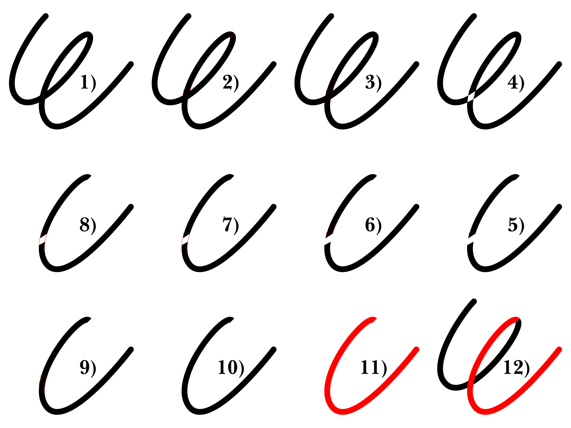
Below I have included two sample GIFs, each switching between smooth Anchor Points only and one with a corner at 3-2) where the Cut is.
The first GIF corresponds to a multiple exposure photo showing each part in black with the pair of Handles at each end, and the second GIF shows the final parts in red as the rest.
 Click to get closer, Click again to get closer still
 Click to get closer, Click again to get closer still
With the smooth Anchor Points at 3-2), the new part/dash forms a smooth continuation of the right handle, also corresponding to your first screenshot where the dash extends into the rhight handle.
Since the Cut has been moved to a corner, the top right end of the dash is independent of the right handle so a corner there is fine, just as you made it.

Copy link to clipboard
Copied
You need to draw a lot of connections. And then I think I would approach this with the shapebuilder tool. You will also need to copy the letters because you need to make several versions (in the video at one point I am cutting the letters: you need to cut them before making the copy).
Like this: https://youtu.be/jauYEllTKV4
Copy link to clipboard
Copied
I was able to get throut with eh W. But the dot if the i it is much harder because the connections I need to make. I appreciate the time you took the make this video. Thank you very much.
Copy link to clipboard
Copied
The i-dot is harder, but it's the same principle.
Once you have drawn a few more curves with the pen tool it will be easy.
Copy link to clipboard
Copied
Calai,
I am afraid you will hear from the House of Mouse if you use any version/elaboration of this for any public purpose.
Obviously, if you create the letters yourself, you will start with the full shapes they were originally created from, and then you can just use those for the muticoloured version as well.
If you wish to divide letters like these into the shapes they were originally made from, in other words recreate the inner parts that have been removed, you can do it in a number of ways, depending on the amount of effort and accuracy needed/desired, the latter including whether the visible outer parts are to remain unchanged and whether all Anchor Points are to be smooth.
Copy link to clipboard
Copied
Calai,
To continue, you can create the differently coloured parts/shapes with full accuracy, including unchanged visible parts of the original path and all Anchor Points smooth, by very simple drawing and cutting only guided by the letters themselves, and you can subtract the coloured parts/shapes from the original letters using Pathfinder.
Here is a sample showing steps of such a way, based on a W deliberately different to the one in your original post.
Click to get closer, Click again to get closer still

Copy link to clipboard
Copied
Calai, hi.
Not sure what your ultimate goal here is. ???
It’s quite obvious you have selected Disney’s custom font. There are many knock offs.
Disney does not take to kindly to infringing upon their copyright laws.
Trend lightly.
K

Copy link to clipboard
Copied
Hope I don't get into trouble. I'm not using commercially. I'm just following a youtube tutorial. The name of the font is Waltograph

Find more inspiration, events, and resources on the new Adobe Community
Explore Now
 AdChoices