- Home
- Illustrator
- Discussions
- Re: Illustrator file not displaying correctly in P...
- Re: Illustrator file not displaying correctly in P...
Illustrator file not displaying correctly in PDF
Copy link to clipboard
Copied
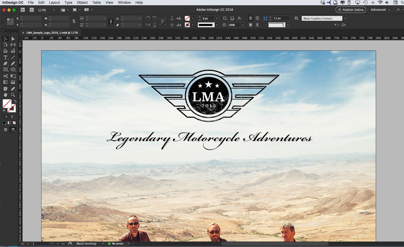
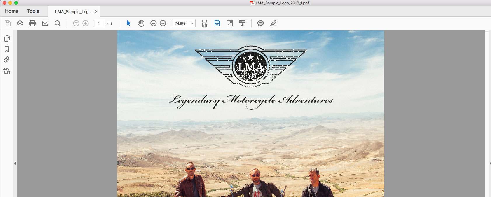
I have created a logo within Illustrator CC and placed it in an InDesign file, when I output to PDF to show my client - the logo does not look as sharp as it is in reality when viewed at 100% scale. If you zoom in to say 300% scale, the logo views perfectly ... what can I do?
Thanks


Explore related tutorials & articles
Copy link to clipboard
Copied
Is this logo just paths?
Or are there effects or masks applied
Is there any blending with other elements in the InDesign file?
How exactly do you export it?
Copy link to clipboard
Copied
Hi Monika,
Thanks for getting back to me so quickly on this. I am pretty new to Illustrator, but believe that there no masks - is it possible for me to upload the file on here for you to look at?
Thanks
Copy link to clipboard
Copied
Seems fairly obvious the problem is coming from the decayed texture on the logo. What method(s) did you use to apply that in Illustrator?
Copy link to clipboard
Copied
Hi John,
I placed the decayed texture above the logo on a new layer, then removed the texture where not required - any more advice would be most welcome.
Copy link to clipboard
Copied
And the texture is a raster image?
Do you have any transparency blending applied?
Can you describe how you did that?
Copy link to clipboard
Copied
The texture image is a Vector file, I did not apply a transparency blend.
Thanks
Copy link to clipboard
Copied
Doesn't look like so.
You can upload the file to Dropbox or the like, so people can take a look.
InDesign, AI and PDF file could be interesting.
Copy link to clipboard
Copied
Copy link to clipboard
Copied
I don't find anything wrong in any of the files. Danny hit the problem in post #3:
In Acrobat, under Preferences > Page Display, is 'Smooth line art' checked?
With it un-checked, I get exactly the same view in your screenshot.
Copy link to clipboard
Copied
THank you.
Open Acrobat Preferences and uncheck "Enhance thin lines". SHould solve it. But solves this only for you. Your customers need to adjust it as well.
Is this going to be printed? You might be disappointed, because all the thin white lines might be gone.
Copy link to clipboard
Copied
Monika,
This is not a good solution, how can the client see if they like it if it does not display accurately? This will be printed if accepted.
This is my first logo I have created from scratch in Illustrator, I must have done something wrong ...
Copy link to clipboard
Copied
aldoc51168322 wrote
This is not a good solution, how can the client see if they like it if it does not display accurately?
This is a long-known display niggle with Acrobat. It is most often of no consequence to most design work, but when it shows up, things can get ugly.
This is my first logo I have created from scratch in Illustrator, I must have done something wrong ...
Well, applying a distress/decay texture to a logo is often a mistake. For one thing, it's a stylistic choice that is bound to go out of fashion yesterday, but more importantly, it has the potential to cause production issues and/or aesthetic problems like that you're seeing. Actually, the way it displays in Acrobat is a small problem, relatively speaking. Imagine all those little texture-flecks you put on there blown up to the size of a billboard. Such things often get weird and unpleasant looking.
Copy link to clipboard
Copied
aldoc51168322 wrote
This is not a good solution, how can the client see if they like it if it does not display accurately?
Unfortunately, it's the solution. You can either advise your client to set their Acrobat display options, or forego the distressed effect.
For better or for worse, I don't think those distressed effects will go out of fashion any time soon, but there are ways to deal with them. For instance, you could create different versions of the logo, where the effect is applied at different sizes relative to the logo itself. Also, in your InDesign comp, you might want to set the blending mode of the logo to Multiply, so the image shows through instead of white, giving the impression of it being stamped.
Copy link to clipboard
Copied
Thanks everybody. I have found a possible solution on the Astute Graphics site - Texturino plugin, it looks like this may resolve the issue as the client wants to see the logo with and without distressed effect.
Copy link to clipboard
Copied
What makes you think that? If that plug-in creates vector textures, you'll still have the same problem. If it creates raster textures, we could tell you how to do that without spending £59.00.
Copy link to clipboard
Copied
Which PDF export setting did you use to export from InDesign?
In Acrobat, under Preferences > Page Display, is 'Smooth line art' checked?
Find more inspiration, events, and resources on the new Adobe Community
Explore Now
