Copy link to clipboard
Copied
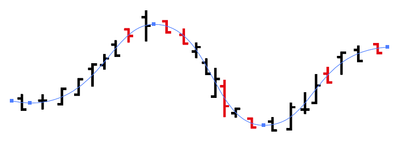
Anyway to achieved the reference image? I tried to used the pattern and put it into the third diagram(pentooled) but the problem is, it gets distorted and I dont want that.. Is there anyway to fix this or even a third party/addon/scripts for this? Lmk thanks
But honestly this is a must and basic tool that adobe must have before going to complex one's like distorting(stitching effect)
 2 Correct answers
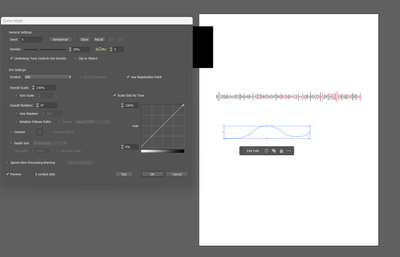
I have no idea what this image is about, but there are ways to do this with plugins, like Symbol Stipple — see the image. But positions of these elements on the path are random, and if you want something more complex than that, like aligning to a grid, some meaning in these symbols, connections, etc. — well, I think it must be a time to describe this in details.
There you go: https://youtu.be/Mq16NSGW6-Y
Explore related tutorials & articles
Copy link to clipboard
Copied
What do you mean with "pentooled"?
Exactly how did you apply the pattern?
Do you have to do this once? Or regularly? With the symbols in exactly that order? Or differently?
I'm also not quite sure what you want to achieve?
Copy link to clipboard
Copied
Hi @Disabled30779926ms28, there isn't any built-in way to do what you want. It could be done with a script, but it would be a fair bit of work. A starting requirement would be that the script would need to be able to reference each symbol separately and map it onto the path. How do you derive the symbols? Do you get them in a particular format? Can you share a demo file?
- Mark
P.S. To call this "a must" and "a basic tool" are extraordinary claims, given that I (and presumably @Monika Gause also) do not know what you are talking about. But I do understand that it is important to you, of course. I am interested in hearing more.
Copy link to clipboard
Copied
Would a tool like this help? (I don't know the product, never used it, but I saw that it can do candlestick charts.)
Copy link to clipboard
Copied
Apologies for rambling, but now I'm speculating that each data point you are graphing has 4 values: entry, max, min and exit. If doing a script, it would be better to simply take the raw data and draw the graph. If I'm right, then I don't see how it would be an accurate graph if you were basing it on a drawn path, with pre-drawn "symbols".
Copy link to clipboard
Copied
Hi, Sorry just come up again. And yes. I have tried datylon but its a much work of me. I just want to pentool them and never distort.. This sounds about right tho but I aint sure how did he manged the distortions..
Copy link to clipboard
Copied
Okay so it is a graph you are making. Do you have the raw data for it? - Mark
Copy link to clipboard
Copied
Editing
Copy link to clipboard
Copied
I have no idea what this image is about, but there are ways to do this with plugins, like Symbol Stipple — see the image. But positions of these elements on the path are random, and if you want something more complex than that, like aligning to a grid, some meaning in these symbols, connections, etc. — well, I think it must be a time to describe this in details.
Copy link to clipboard
Copied
I like this one best.. This seems fitting to my problem.. is this asture plugin? If not, can you send link for the plugins? Tysm
Copy link to clipboard
Copied
You can find them here: https://astutegraphics.com
Copy link to clipboard
Copied
I tried this one using symbol stipple. but I dont seem to get the effect like you did using path tool..
Copy link to clipboard
Copied
do you have a tutorial for this? Thanks..
Copy link to clipboard
Copied
There you go: https://youtu.be/Mq16NSGW6-Y
Copy link to clipboard
Copied
Thank you! Followed you! (:
Copy link to clipboard
Copied
Thank you for following!
Copy link to clipboard
Copied
Hi @Disabled30779926ms28, do you have any feeback? I'm genuinely interested in what you're doing here.
- Mark
Get ready! An upgraded Adobe Community experience is coming in January.
Learn more


