Exit
  • Global community
    • Language:
      • Deutsch
      • English
      • Español
      • Français
      • Português
  • 日本語コミュニティ
  • 한국 커뮤니티
0

Layers appearing out of order

New Here ,
Dec 06, 2016 Dec 06, 2016

Good morning,

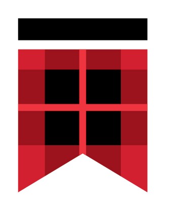
Before I joined my company, they had a design firm create a logo for them. The logo is a chevron composed of two grey bars at the bottom with red and black overlay, pictured below.

507000085_MacD_Enthone_Elec_COLOR chev.jpg

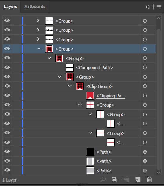
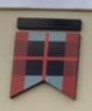
However, we are having issues when sending to printers that the layers seem to appear out of order. The printers are given the .ai file and the .eps files created by the design firm. It particularly appears wrong in Firefox, but I cannot imagine someone is printing our logo via web browser for building signage. I had no hand in the creation process, and have never encountered this problem in Illustrator, so I am at a loss. Below are the layers and an example of a butchered building sign. Any help would be appreciated.

layers.JPG

building mess-up chev.jpg

483
Translate
Report
Community guidelines
Be kind and respectful, give credit to the original source of content, and search for duplicates before posting. Learn more
community guidelines

correct answers 1 Correct answer

Community Expert , Dec 06, 2016 Dec 06, 2016

There are some transparent overlays in this, correct?

Not all applications can handle transparency correctly. Even when opening an AI file in a lower Illustrator version than it has been created in, there might be issues. The clipping groups are pointing to it.

Since this is a simple construction I don't see any need for transparencies or clipping masks at all. As a logo it should be built from the most simple parts possible and that would be some shapes. The transparent overlaid look could easily

...
Translate
Adobe
Community Expert ,
Dec 06, 2016 Dec 06, 2016

There are some transparent overlays in this, correct?

Not all applications can handle transparency correctly. Even when opening an AI file in a lower Illustrator version than it has been created in, there might be issues. The clipping groups are pointing to it.

Since this is a simple construction I don't see any need for transparencies or clipping masks at all. As a logo it should be built from the most simple parts possible and that would be some shapes. The transparent overlaid look could easily be achieved with a darker red color.

Translate
Report
Community guidelines
Be kind and respectful, give credit to the original source of content, and search for duplicates before posting. Learn more
community guidelines
New Here ,
Dec 06, 2016 Dec 06, 2016
LATEST

Thank you for your reply. I'm not sure why they used a clipping mask and transparency, and wanted to be sure it was as unnecessary as it seemed before I rebuild it with the darker red. 

Translate
Report
Community guidelines
Be kind and respectful, give credit to the original source of content, and search for duplicates before posting. Learn more
community guidelines