


Copy link to clipboard
Copied
Hi,
I'd like to create improved pie charts with effects like this without doing them by hand :

I'm bad at scripting in illustrator, but I'd like some effects like the slice's size variations and the text orientation.


 1 Correct answer

Thanks heaps for the feedback.
the issue, as far as I can make out is due to me comparing to strings, I have now passed them as floats so it should work now.
the new version can be downloaded from here:
please let me know if you come across any other issues or bugs.
thanks again..
Explore related tutorials & articles
 66
Replies
66
66
Replies
66

Copy link to clipboard
Copied
I have a question: what's the dual colors of each pie slice represent? ex: for "piece of cake", what does the green and the brown mean?
Copy link to clipboard
Copied
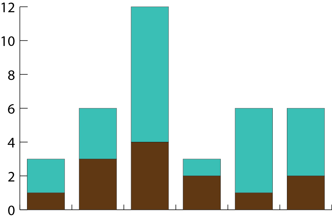
Well in this case it doesn't matter, let's say the size of the slice means the quantity and the brown means their temperature. It can be anything. It's basically the same as this kind of bar chart which Illustrator already does :
Copy link to clipboard
Copied
Ok, I see: you have to supply the minimum of 2-3 pieces of data: 1) what determines the slice size itself, 2) number for 1 section of slice, 3) number for other section of slice (or more); This is a little bit different than the stacked column graph you show, because each of the sections of a column make up the total number of each column, which is in relationship with the Y axis. Their numbers are always related to one type of unit, but in your case you want the constituent sections to be unrelated to the size of the slice, then you will need the 3 pieces of data per record.
So, how do you envision inputting this data:
Do you wish to have a UI with text fields into which to paste the numbers, or are you looking to import some spreadsheet file?
Copy link to clipboard
Copied
I hope I understood. I guess we have 3 ways to handle this :
- 1) Enter 2 numbers per slice/line : one for the size/angle, and a percentage for the internal/brown part
- 2) Enter 2 numbers : this time the second number can be any number, but the maximum value fills the slice and the size of the intermediate values are deduced between 0 (empty) and max (full), unless we set a margin that prevents the max value to fill the slice entirely.
- 3) Enter 3 numbers : this time, the 2 others are the values of the internal and the external part of the slice, which means that equal internal parts doesn't mean equal value. Example : back on the first image I sent, If Megaman has 50 in brown and 50 in blue, and Glitches have 100 in brown and 100 in blue, their brown part still look the same.
To input this data, I would see the same system as the built-in spreadsheet for charts, or importing a spreadsheet file, or any other way.
For each of these propositions, I would just choose the the easiest to script, even if the best would be the solution 2) and the built-in spreadsheet, but that's no big deal.
But I would also like to automatically place the text in front of each slice in the same orientation as in the picture. Would that be possible ?
Do you think you could script or help me script any of these things ?
Copy link to clipboard
Copied
Hey, I am not sure about your #2 way, but 1 and 3 look legit.
Let's switch up the language a bit: I will say "outer" or "external" to signify the numbers used to make the pie slices and "internal" or "nested" to signify the color-splits within an individual slice.
The internal color sections can be made with a record of at least 2 numbers, as both numbers will be added together to form the MAX, and each number will make the respective color section based on the numbers' percentage of the max.
Theoretically you could have a data structure where the number in column 1 has the outer value for the pie slice, and any number in the same row in columns 2+ will form the internal sections.
Please see my attached image:
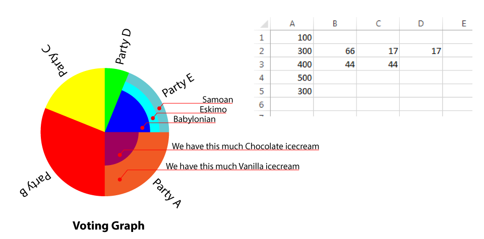
The text labels and orientation is not a problem, they can be assigned via a UI dialog.
* Please note:
My arbitrary labels "Party A", "Party B", etc are in no way related to the Excel column headings of A, B, C...
Copy link to clipboard
Copied
Hi, sorry I had no internet for days.
This looks great !
For me it's perfect, yet I just realized that it really looks like there's more vanilla icecream than chocolate, but there's nothing to do about it, unless something that calculates the area but that would start to be ridiculous.
So yeah, thank you.
I don't know how to put that in a script but this seems to be the easiest way.
Copy link to clipboard
Copied
The representation in my image is technically inaccurate because internal pieces of my pie are to be interpreted as if they were straight bars. To have area come into play, you will need to have all the constituents of a slice as percent of a full (imaginary) circle, a circle that's the size of the actual whole pie graph's circle (unrelated to the data which separates the slices). What you do, is lay on top each of the constituent parts as percent of the circle, as smaller circles, centered on top of the big one, and sorted so that ones with bigger area do not cover the smaller ones. Then after all of the parts of your given slice are represented as circles laid on top of each other, use the sector of the given pie slice as a cliping mask to clip your set of circles into the pie slice. Now, your areas of individual 'peels' within a slice should be logically representative of the actual number.
The percentages of the circles which will temporarily represent your sections of inner slice data will not be gotten linearly though, you won't be able to just make the parts a percentage of the vertical or horizontal scale of the big circle, the percentages will need to be figured out using Pi & circle equations. The sample thought process for a single one slice is this:
1) Inside this slice there are 2 numbers: 60 pigs and 40 cats. The total is 100, so let a circle the size of the graph be proportional to the total of these numbers.
2) The area of a big circle is now related to 60 pigs + 40 cats. Now, make one circle on top of the big one.
3) Find the area for the new smaller circle using simpler math: my big circle is X area, so my smaller circle which will stand for 60, will have an area 60% of X.
4) To make the smaller circle have the correct area, figure out the numbers you need for diameter, or scales, which will make the smaller circle end up with an area that's 60% of the big one's area.
5) Now use an existing path (hopefully there will be one) from the pie graph to contain the two circles inside a slice. The smaller circle will represent 60% while the bacground, or the 100% circle that's obstructed by the 60% will now show you 40% in area format.
You can experiment by doing this in a regular Illustrator document with simple circles. Make a 100px tall & wide circle, select it, note it's area with use of this script: alert(app.activeDocument.selection[0].area);, then try and make an approximate circle that's 50% smaller, by shrinking a copy of your original circle until you alert yourself the area which is 50% of your total. You will see the inner circle's height and width are not 50% of the original circle, and if you take a quarter-slice of the entire group by drawing a square from the middle of the circles, outward and using Divide in Pathfinder, if you select each of the divided components, your areas will be approximately the same.
Copy link to clipboard
Copied
I am looking forward to any code you are doing for this sillyV.
I have been trying to work out how to determine the handle length of each sector of the circle.
I can plot the anchor points using cos and sin, but cant find anything on setting the correct handle length.
I thought I could just start plotting more points in a wider stepped arc and use that to Clip a circle.
but it would be nice to know how drawing a perfect sector is possible
Copy link to clipboard
Copied
Hey imagecollection, you have nailed it: I was not even thinking of the actual drawing, but if I was to try and draw it, I would definitely clip a circle with a sector triangle- if the angle is too wide, make an intermediate point between the two sector sides to close the sector outside the circle's edge.
And, if they needed a solid closed sector path, I would use the bezier function to get as many points and I need from the circle, and construct a new path from the points that are within my sector angle, and the circle's center. This solution would not be great as the round edge of the sector will be made of many polygon-style segments.
If you can determine the relationship between the distance of the handle from the anchor point and the angle of the sector, I am sure that it could be used to construct the perfect sector using anchors and handles for the round part. If the angle is over 180, the sector can be expanded in algorithm to be split into two halves, and then joined later during drawing.
The good news is that the handles from both sector sides should be of equal distance, and both on a tangent of where the sector side meets the circle's edge.
I bet the famous Jongware would be able to make this into a snippet in a jiffy. But me, not so much 
Copy link to clipboard
Copied
I just want to know now...
I found that for 90° sector, you can use the following for length of handle
var handleLength = 4/3*(Math.sqrt(2)-1)*radius;
but as this will only work for a sector 90° exactly.
so have found a bit more info.
this will also get the correct handle length for a 90° sector
and gets close for smaller sectors.
but not good enough to make me Happy...
var handleLength = 4/3*(Math.tan((angleInDegrees*Math.PI/180)/4))*radius;
does anyone know of a more accurate way to work this out???
what am I missing...
Copy link to clipboard
Copied
Hey that looks more advanced than anything I want to come up with, do you have any screenshots of what this looks like as a graphic representation?
Copy link to clipboard
Copied
was just playing with figures.
guess I could to to put something together.
I'll get back to you with that
Copy link to clipboard
Copied
I think I was worried about nothing.
its looking pretty good.
I'll post some code soon on what I have so far.
Copy link to clipboard
Copied
I can help you with a UI dialog if you want one!
Copy link to clipboard
Copied
That would be great.
I have basic pie chart working.
But it goes bad if a segment is larger then 45deg.
so I need to ad extra anchors for large sectors.
then I can tackle the inner sections and text labels.
Copy link to clipboard
Copied
Edit above.
it goes bad over 90deg. Not 45deg as stated...
Copy link to clipboard
Copied
Looks like it will be a work in progress for a little while.
Can you clarify please, on the option a) inner segment to be a percentage of the overall radius ?
Is that similar to the screenshot I posted where the size of the inner section is based on the radius instead of area? If so, I don't really think we need that option since most people would expect this graph to be based on area- like when OP pointed out that in my screenshot it's hard to tell that both inner sections are the same amount because of course, one end is skinnier than the other and has less area.
Copy link to clipboard
Copied
Point taken, Area it is.
outer Pie now working.
next to come, inner Pie
Copy link to clipboard
Copied
Working Script just needs UI... and some touch-ups to stop it breaking if data out of range etc...
first array decides on size of each slice.
second array is inner pie slice based on percentage of full slice
second array need to be smaller then first array or it will be larger then the large slice!!!
if first = 4 and second = 2 would be 50% of the area
qwertyfly.com/files/PieMaker.jsx
right click and save link as...
Copy link to clipboard
Copied
Wow what a beautiful result, just what the OP asked for! I like how you did the 'shadow', and it looks great, well done! Ok, I'll crank that UI out asap.
Copy link to clipboard
Copied
for UI am thinking a way to fill out an array for outer segments
then another array for inner segments
and a final array for text labels.
an option for size/radius.
and an option for
a) inner segment to be a percentage of the overall radius
b) inner segment to be a percentage of area
styling is another thing, maybe leave that for later...
her is what I have so far.
give it a shot and let me know what you think...
var r = 100; //Radius
var angleArray = [4,2,6,5,1,2,5,1];


var divisions = 0;
for (var i = 0; i < angleArray.length; i++){
divisions += angleArray;}
var anglePerDivision = 360 /  divisions;


var Cx = 0 , Cy = 0; // Center of Pie
var Sx = 0 , Sy = 100; // Start Point on outer edge
var Ex , Ey; // End Point on outer edge
var SHx , SHy; //handle of Start Point
var EHx , EHy; //handle of End Point
var HL , HR , HA; //Handle Length, Radius, Angle
var acc = 0; //accumulative angle
var a = 0;
for (var i = 0; i < angleArray.length; i++){


a  = angleArray*anglePerDivision;
acc += a;


Ex = Math.sin(toRad(acc))*r;
Ey = Math.cos(toRad(acc))*r;


HL = HandleLength(a,r);
HR = HandleRadius(r,HL);
HA = HandleAngle(HR,HL);


SHx = Math.sin(toRad(acc-a)+HA)*HR;
SHy = Math.cos(toRad(acc-a)+HA)*HR;
EHx = Math.sin(toRad(acc)-HA)*HR;
EHy = Math.cos(toRad(acc)-HA)*HR;


DrawSector()


Sx = Ex;
Sy = Ey;
}


function DrawSector(){
var Sector = app.activeDocument.pathItems.add();
var pt;
pt = Sector.pathPoints.add();
pt.anchor = Array(Sx, Sy);
pt.leftDirection = Array(Sx, Sy);
pt.rightDirection = Array(SHx, SHy);
pt = Sector.pathPoints.add();
pt.anchor = Array(Ex, Ey);
pt.leftDirection = Array(EHx,EHy);
pt.rightDirection = Array(Ex, Ey);
pt = Sector.pathPoints.add();
pt.anchor = Array(Cx, Cy);
pt.leftDirection = Array(Cx, Cy);
pt.rightDirection = Array(Cx, Cy);
Sector.closed = true;
Sector.stroked = false;
Sector.filled = true;
Sector.selected = true;


redraw()
}
function toRad(angle){return angle*Math.PI/180;} //Convert Degrees into Radians
function HandleLength(angle,radius){return 4/3*Math.tan(toRad(angle)/4)*radius;} //Calculate Handle Lengh (Not accurate enough)
function HandleRadius(radius,hl){return Math.sqrt((radius*radius)+(hl*hl));} //Length of Hypotenuse, Distance of handle from Centre
function HandleAngle(hr,hl){return Math.asin(hl/hr);} //angle of the Hypotenuse, angle of handle from the anchor (answer in Radians)

Copy link to clipboard
Copied
Nice work ! (Wonder if the thread originator will ever return? 😉
[Question:] Without evaluating the code too closely, what are the outer & inner input slice numbers based upon?
Like:
inputNum/totalNum*360% = arc%
Or:
inputNum/totalNum*100% = arc%
Or:
%*360=decimal*360 = arc%
Or:
decimal*360 = arc%
Etc:
Quick Assessments / Suggestions :
1.) Given the question above, in general I think it would perhaps be more applicable to allow the user to input percentage numbers verses decimals and re-factor the needed math internally in the code as needed allowing the user a simpler input. Or having an option based upon user preference: decimal or percentage.
2.) You may consider adding: "cir.stroked = false;" to your dropShadow function so it does not inadvertently apply the current stroke/color/size from the IDE when executed.
3.) You may also consider allowing a corresponding legend beside the chart, or simply appending the arc% numbers to the end of the text names.
----------
4.) As for the UI:
It could be as simple as input into "edittext" fields, then evaluating, verifying, parsing and passing the info.

Similarly, it could be as simple as using "File.openDialog" and bringing in raw data from a TXT file or CSV file and evaluating, verifying, parsing and passing the info. Or a combination of the two within the same simple UI.
Or of course it can be as complex as desired. 😉
----------
Again, nice work.
Copy link to clipboard
Copied
Thanks for the feedback...
the Outer sectors are percentage of the total. so 4 sectors all entered at the same value would produce a quartered Pie.
the inner sectors are a percentage of the corresponding outer sectors area. but as a decimal. so if the outer figure is 44 and the inner is 22 then 50% area for inner and outer.
So outer could just be entered as percentages and would work.
inner would not respond in the same way. guess there could be check boxes to allow user to choose how data is entered.
I have since added stroked false to the drop shadow as I noticed this after I uploaded...
I like the idea of an option to add the values to the text output.
I was thinking of making the dialog as simple as adding the values as array's, and would prob be the best way to implement the script quickly.
although it would be nice to have a more advanced dialog...
but as you state it could get very complex!
As for the original Poster... I'm beyond really caring.
I have had fun working out all the maths etc behind getting the pie sectors drawn. that was the whole reason I have got as far as I have with this...
Copy link to clipboard
Copied
You definitely have the gift of mathematical curiosity, and this thread will be a great reference for pie scripts for all time!

Find more inspiration, events, and resources on the new Adobe Community
Explore Now
 AdChoices