- Home
- Illustrator
- Discussions
- Re: Not able to choose color of my gradient in the...
- Re: Not able to choose color of my gradient in the...
Not able to choose color of my gradient in the color picker tool
Copy link to clipboard
Copied
Why can't i chose the color of my gradient in the color picker of the tools bar, just like i do with the fill and stroke color?
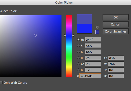
Why do i need to tell the gradient panel every damn time that my gradient is not black and white. Gradients are almost never black and white.
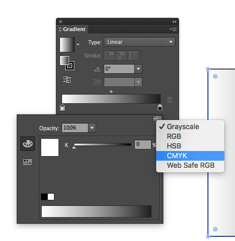
Why don't we have a shortcut for the fill and stroke color picker tool, just like Photoshop? Or maybe a real color picker panel, not that stupid color panel that it have.
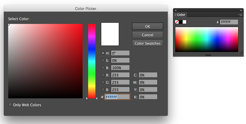
Why don't we still don't have this?
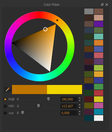
Why is the default tools shortcuts so nothing to do with anything?
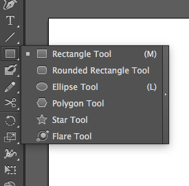
Why is it so hard to make a simple mask?

Why is using the eyedropper not as simple as it should? (have to duble click in it every time and change its options)
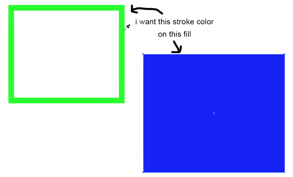
And, of course, this thing, EVERY. DAMN. TIME!
I guarantee every person who uses this software wondered for a long time how to hide this in the first time this happened . Whyyyy so easy to show and so difficult to hide?
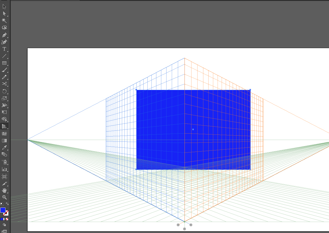
Most of this problems you can solve it with options and with habits, i know, i know. Still, it is all these little stupid things that drives me crazy. I cannot use another software since the company I work at demands me to work with it.
Why is Illustrator so damn infuriating and over complex? It takes about 40 steps to do something should be possible with 3!
Explore related tutorials & articles
Copy link to clipboard
Copied
Create your gradients in the Gradient panel and save them in Swatches. You can assign them from there without starting with B/W.
Double click the Fill or Stroke icon in the Toolbox and voila: the Color Picker, just like Photoshop.
The tools shortcuts were intended as shortcuts for those with motion disabilities, who aren't facile with a mouse. I still use them, and recommend post-its to help you learn the ones you care about.
Select the blue box, turn on Draw Inside mode at the bottom of the tools panel. Cut the green box and paste it inside the blue one. Don't forget to turn Draw Normal on when done. Easiest.Mask.Ever.
Double click the Eyedropper before using it to tell it what you want it to pick up. Press Sh+X to swap fill and stroke color.
Try not to inadvertently click the Perspective Drawing tool. If you can't help yourself, turn off the grid with View > Perspective Grid > Hide Grid.
On the other hand, have you checked out the color inspiration tools with the Color Guide panel and Adobe Color. Or Edit > Recolor Artwork? Pretty amazing stuff, once you learn where it is and how it works. ![]()
Copy link to clipboard
Copied
Try not to inadvertently click the Perspective Drawing tool. If you can't help yourself, turn off the grid with View > Perspective Grid > Hide Grid.
Barb's suggestions are good. I do find myself accidentally turning on the Perspective Grid too often and don't understand why the shortcut is NOT a toggle (I can never remember the "hide" shortcut). Better yet, I'd like to disable the Persp Grid COMPLETELY because I find it useless in my work.
I agree there is MUCH room for ergonomic improvements in AI. Your list doesn't even scratch the surface, feli.
Copy link to clipboard
Copied
RCraighead,
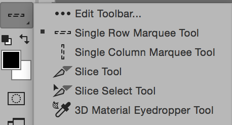
If you are in CC 2015, you can do just that! Click the .... at the bottom of the Toolbar, then click Edit toolbar and move your unwanted tools to the hidden tools area. They will still be available if you hit the dots again, but it's harder to click them accidentally.
Copy link to clipboard
Copied
jane-e wrote:
If you are in CC 2015, you can do just that! Click the .... at the bottom of the Toolbar, then click Edit toolbar and move your unwanted tools to the hidden tools area. They will still be available if you hit the dots again, but it's harder to click them accidentally.
Unfortunately that customizing is not available in Illustrator, but it is in Photoshop.
Copy link to clipboard
Copied
Ton Frederiks wrote:
Unfortunately that customizing is not available in Illustrator, but it is in Photoshop.
Thank you, Ton! You are correct.
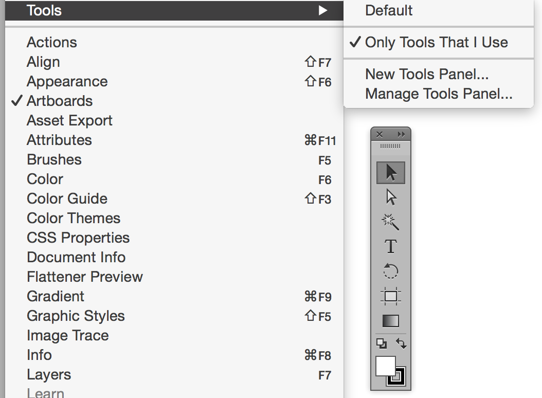
In Illustrator you need to create a new Tools panel that excludes the unused tools. You can have as multiple Tools panes and can hide the one called Default.
Copy link to clipboard
Copied
I must correct my post: The Perspective Grid shortcut IS a toggle "Command Shift + I".
Copy link to clipboard
Copied
Thank you, I use Illustrator for years but i didn't knew a lot of those things. Still, as I said, most of this things need to be configured or is not obvious at all. I'm not trying to say this things aren't possible, i know they are. I'm trying to say they should be more obvious.
Copy link to clipboard
Copied
Easiest for the forum if you ask only one question per thread, but here's more on the gradient: yes, you can do that.
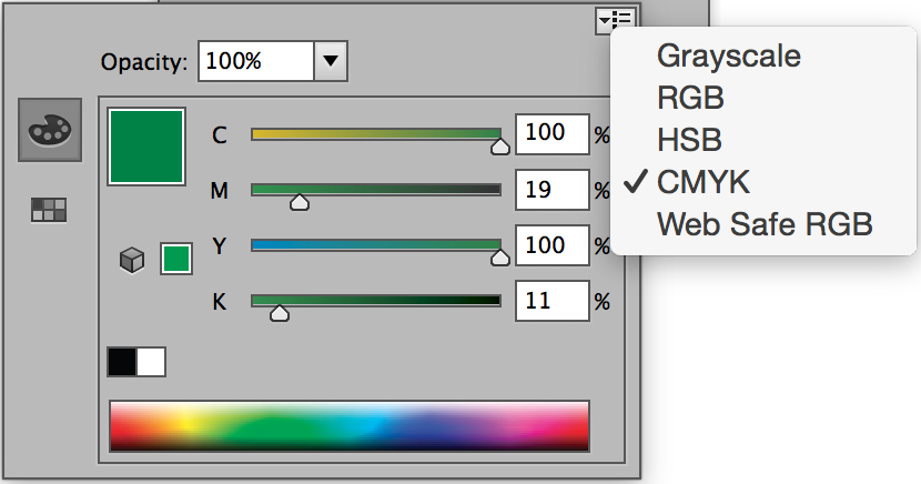
1. Shift click the ramp if necessary to change to CMYK.
2. Select a marker in the gradient panel. Note below that the far right marker is selected.
3. Select colors in the Color panel. Or Option click colors in the Swatches panel. Or double click the marker.

Jane Edwards
Copy link to clipboard
Copied
But how can i chose the color with the real color picker?
Also, how was I supposed to know shift click changes to CMYK? Today the user interface needs to be self explanatory and easy for the user to get familiarity with.
You see, none of those ways you said is very easy or obvious to me at all. Too much selection, shift clicks, option clicks and duble clicks. God i just want to make a simple gradient!
Copy link to clipboard
Copied
Felipe,
You may try to change the text size in the Display to 100% (from Medium or whatever), then maybe restart, see post #10 by gwinnc here:
https://forums.adobe.com/thread/1595993
It seems that the issue is caused by a corrupt folder called en_US or similar (depending on language) within the Adobe Illustrator 18 Settings folder, see post #7 by Jules in this thread,
https://forums.adobe.com/thread/1595766
so the solution should be to move or rename that folder (or the whole Adobe Illustrator 18 Settings folder).
You can find the folder in Move the folder (follow the link with that name) with Illy closed.
The folder can also be found through this:
https://helpx.adobe.com/illustrator/kb/preference-file-location-illustrator.html
As a temporary roundabout way, you can select the lower rectangle to the right of the rainbow and DoubleClick to apply that to change the top rectangle and the values: the lower colour is the right one.
You may also look here (one thread linking on to the other):
Copy link to clipboard
Copied
Felipegrin,
Illustrator is a complex yet amazing program. It is almost 30 years old. If you are looking for a simple program, this may not be the one for you. But if you are looking for a program that, once you have mastered it, is powerful beyond imagination, then stick with it. You can ask questions here, and volunteers will help you. Your questions indicate that you want a better understanding of the program, and you might benefit from taking a class from an Adobe Authorized Training Center with an Adobe Certififed Trainer. You will find a list on the Adobe website, and many have online options to join live classes. Those of us who are trying to help you can't rewrite the program, we can only tell you how it works! Photoshop and Illustrator were sold as separate programs until Creative Suite, and they do not work the same way, including with gradients. PS is raster, and AI is vector. Hope this explanation helps.
Best to you,
Jane
Copy link to clipboard
Copied
I have to completely agree with felipegrin. I'm sure he is not asking for specific answers about how to do the things he lists in his original post. He is drawing attention to the woeful user experience when trying to complete really simple tasks. I'm afraid saying Illustrator is powerful and thirty years old doesn't cut it. That's thirty years Adobe have had to get it right. Felipegrin's post adequately demonstrates they haven't.
Let me offer another example. To be clear I'm am highlighting a problem rather than asking for specific instructions.
Let say I have a colour I want to use in a creative clould library. I want to use it as a base colour for a gradient, maybe I'll fade up to slightly lighter at the top. Not sure yet, I'm designing something, so I want to experiment when I work. I haven't decided on what colours to use yet, you know, because I'm designing. So what's the workflow to tell Illustrator about the gradient.
The user experience.....
- Select the object
- Set the fill colour to gradient
- Change the direction to vertical. (How often does anybody ever need a horizontal gradient?)
- The gradient is black and white, grayscale.
- Click the colour swatch on the gradient. Nothing happens
- Double click the tiny weeney colour swatch. A dialog opens with arbitrary swatch colours in it. None is the one I want. How do I pick the colour I want? Oh, I can't.
- So after much messing around I have to deselect my object.
- Double click the colour in the library panel
- Accept the dialog the pops up
- Open the swatch panel
- Click the tiny weeny new swatch icon
- Select my object
- Double click the tiny weeney swatch icon
- Choose my newly created swatch in the modal swatch dialog. OK now after fourteen steps I have one of the colours in my gradient.
- Now to make the second colour a subtle variation of my first chosen colour? Well now that is tricky. I have to deselect my object.
- Select the original colour in the swatch panel to load it into the fill colour, but of course it has to be with nothing else selected so as not to mess up the work I've already done it adding the first colour to the gradient.
- Double click the fill colour and choose my subtle colour variation in the colour mixer
- Go back to the swatch panel and click the teeny weeny new swatch button. The tiny new swatch is loaded into an arbitrary location in the swatch panel, so you have to watch carefully. If it is similar to any other colour you might have to do this again so you can be sure when you are picking the right one in a few steps time.
- Memorise the location of your new swatch in the swatch panel.
- Select your object again
- In the gradient panel double click the teeny weeny colour swatch.
- Retrieve the location of your subtle colour in the modal swatch dialog from your human memory. Click it. Now you have your gradient, but wait, I'm not sure about that second colour. I'd like to add more saturation. What to do? You guessed it folks. Go back to step 15.
Would it be that hard for the user experience to be something like the following?
- Select that blue box
- Choose gradient as the fill type
- Oh wow! One of the gradient colours is the blue it started out as. That's helpful
- What about the second colour? Click the button for the second colour. A modal colour picker appears. Choose your color.
- Done
I love Adobe products and use them all day every day. My work over the past twenty years has covered graphic design for print to visual effects for feature films. I've been using a host of creative software for a long time. The example above is just one of many that makes Illustrator extremely frustrating to use in comparison to almost any other creative software. Felipegrin is right. Adobe knows he's right.
Adobe are realising fantastic updates all the time across the creative cloud range. There are so many klunky user experience bottlenecks in Illustrator, that I'm sure wouldn't be so tuff to fix.
I would also ask that Adobe don't add to my frustration by replying to this message by telling me I've posted it in the wrong part of their website.
Copy link to clipboard
Copied
Great idea—be sure to fill out a feature request. You can copy and paste what you wrote here.
Feature Request/Bug Report Form
Copy link to clipboard
Copied
I wrote
I would also ask that Adobe don't add to my frustration by replying to this message by telling me I've posted it in the wrong part of their website.
Adobe replied
Great idea—be sure to fill out a feature request. You can copy and paste what you wrote here.
I think this neatly encapsulates what you can expect from Adobe support and the lack of respect they have for their customers.
Copy link to clipboard
Copied
moley,
Jane is no more part of Adobe support than are you, or am I.
Copy link to clipboard
Copied
Adobe did not reply. jane-e replied with a suggestion.
Jane is just a user like you here on the forums
Copy link to clipboard
Copied
Oh dear. Please accept my apologies Jane. I thought you were an Adobe employee.
Copy link to clipboard
Copied
moley.tv wrote:
Oh dear. Please accept my apologies Jane. I thought you were an Adobe employee.
No problem at all, moley.tv, but thanks anyway for apologizing!
I have wanted to be able to create a new swatch while I am creating a color from inside the gradient panel and get annoyed every single time that it's not a choice. I need to add a feature request as well...
And thanks also to Jacob and Ton for explaining who we are.
Copy link to clipboard
Copied
I just came here to tell, that I hate Illustrator and InDesign gradient tools. It's so hard and illogical to use. Every time I use it, I have to google how to use it.
If I could just double click the color stop to change color, it would be perfect and user friendly, but it seems that the double click sometimes works and sometimes not. I have no idea what causes this.
Copy link to clipboard
Copied
Hi aartturi,
Can you tell us what does happen in Illustrator when you double-click the color stop?
Is the tip of the mouse pointer in the middle of the color stop? That is the first thing to trouble-shoot.
Copy link to clipboard
Copied
Also, try these two alternate methods in Illustrator:
1. Drag a Swatch onto a color stop
2. Select a color stop and Option (Alt) + click a Swatch
Copy link to clipboard
Copied
I think the best thing to do is download and install Affinity Designer. It costs the same as one months subscription to creative cloud for a perpetual licence and has a UI the makes some kind of sense.
Copy link to clipboard
Copied
moley.tv schrieb:
I think the best thing to do is download and install Affinity Designer. It costs the same as one months subscription to creative cloud for a perpetual licence and has a UI the makes some kind of sense.
.. and lacks so many efficient functions.
Copy link to clipboard
Copied
Some of Adobe features lack even the slightest intuitive nature. This is one of them. Yes there are work-arounds, or ways to get it done, but the intuition is absent. For anyone to defend Adobe on this particular issue shows a real disconnect in thought.
InDesign has its process, and that is what it is until it changes, but there is nothing smart or efficient about the way InDesign forces users to engage in what is in my experience one of the MAIN design features of the entire InDesign toolbox.
The word for it is silly. InDesign gradient tool and options are silly. Now back to work.
-
- 1
- 2
Get ready! An upgraded Adobe Community experience is coming in January.
Learn more


