- Home
- Illustrator
- Discussions
- Re: PDF formatting text incorrectly from AI file
- Re: PDF formatting text incorrectly from AI file
Copy link to clipboard
Copied
Hi, When saving my Illustrator file as a PDF, some of the letters appear to be distorted. I have attached an example of the error, notice the double l in 'sell'
It's only on key letters, is there a fix to this?
Update: I have attached my preference settings from Acrobat, if this helps.
Thanks
 2 Correct answers
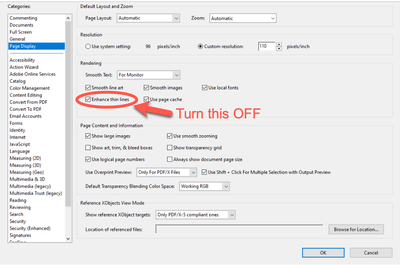
See if it helps to do this:
Peter
"is there a way of saving the preferences on the doc"
No. This is a viewer-related issue. It has to be set by the end user.
It's also an Acrobat-specific issue with the "Enhanced Thin Lines" option. Other viewers are not affected by it. It also doesn't affect print quality.
The issue is how the PDF file format handles simple rectangles in compressing the file.
When you convert a font to outline, sanserif letters like a lower-case "L" or capital "I", become simple rectangles. Simple rectangles ca
...Explore related tutorials & articles
Copy link to clipboard
Copied
Looks good when I open it in Acrobat. But the example you give is not a font anymore but outlined.
Copy link to clipboard
Copied
See if it helps to do this:
Peter
Copy link to clipboard
Copied
Yes this has worked, thanks for your help!
Copy link to clipboard
Copied
Hi, So I have fixed the problem for me, however this is a document that will be downloaded by other people, is there a way of saving the preferences on the doc, meaning by default that the enhance thin lines box is unticked when people open it?
Thanks
Copy link to clipboard
Copied
"is there a way of saving the preferences on the doc"
No. This is a viewer-related issue. It has to be set by the end user.
It's also an Acrobat-specific issue with the "Enhanced Thin Lines" option. Other viewers are not affected by it. It also doesn't affect print quality.
The issue is how the PDF file format handles simple rectangles in compressing the file.
When you convert a font to outline, sanserif letters like a lower-case "L" or capital "I", become simple rectangles. Simple rectangles can be compressed in a way that makes them actually behave, in a way, like strokes. This saves coding space, making the file smaller. Acrobat's viewer sees them as strokes, and hence the "Enhance Thin Lines" option can affect them... potentially making these "strokes" a bit bolder compared to other letters beside them, depending on the viewing percentage. Turning off the "Enhanced Thin Lines" eliminates this issue by having everything rendered similarly.
Copy link to clipboard
Copied
Thank you, Brad, I appreciate your explanation.
Peter
Copy link to clipboard
Copied
The only way to cheat on this is to add an extra anchor point to the outlined rectangle. Your milage may vary.
Copy link to clipboard
Copied
Hi Brad,
Thanks for clarifying this, very much appreciated.
Find more inspiration, events, and resources on the new Adobe Community
Explore Now

