- Home
- Illustrator
- Discussions
- Re: Placing vertical lines evenly spaced?
- Re: Placing vertical lines evenly spaced?
Placing vertical lines evenly spaced?
Copy link to clipboard
Copied
In CS5, I have a rectangle and want to place 2 or 3 vertical lines on the right side of it to divide some icons that will be placed within each of the areas divided by the vertical lines. What is the best way to ensure that the lines are evenly spaced within that area?
Thanks.
Explore related tutorials & articles
Copy link to clipboard
Copied
Select all your vertical lines
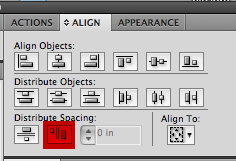
Align Palette >> Distribute evenly

Copy link to clipboard
Copied
It didn't seem to work for me. Here is what I am trying to do, I have the two icons on the right side, and I want to divide the space evenly for both icons, though have it set to large enough so it fits the icons.
Thanks!
Copy link to clipboard
Copied
Don't forget that Illustrator can only calculate this based on the dimensions of the bounding box. This hasn't too much to do with the optical alignment the takes into account space that derives from the objects' individual form. If there's lot of white space on one side of an object, it will look as if the space is not evenly distributed although from the math perspective it is.
Copy link to clipboard
Copied
- Turn on view >>smart Guides (so a checkmark is in front of it)
- Turn on view >> snap to point
- Zoom in close, so you can watch as your cursor changes in the next step
- Select one of your small vertical lines and option drag and drop a copy to the right end of the blue gradient
- Select the the 3 vertical lines
- Click on distribute as in the first example (your 2 small boxes in the gradient are now the same exact width)
- Delete the 3rd line I had you create (it was just used as a tool to help the align palette distribute the space evenly)
- Center your 2 white icons in the space
Find more inspiration, events, and resources on the new Adobe Community
Explore Now
