- Home
- Illustrator
- Discussions
- Re: Smallest text size you should use for print?
- Re: Smallest text size you should use for print?
Smallest text size you should use for print?
Copy link to clipboard
Copied
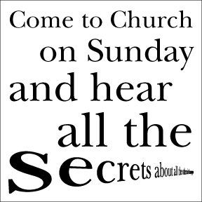
I had some business cards I designed printed for a gentleman and everything was good minus the text size, too small to read, I think it was around 4 pt for the smallest section of text.
From some experienced designers in the print arena, what is the smallest size text you should use on things like this? Is there a standard, does it vary from piece to piece etc....any additional info is good ![]()
I am designing a 4x4 card, so this piece is a little bigger than a standard business card. Right now 9 pt is the smallest text on my card


Explore related tutorials & articles
Copy link to clipboard
Copied
I reckon 5 or 6 point would be a safe size for small type on a business card.
Much depends on the font used, the spacing (tracking) of the letters and the colour they are printed in.
Serif fonts are often more legible than sans serif and a font with a large x-height will usually be more legible than one with a small one.
Small lettering frequently becomes more legible merely by increasing the tracking.
On your examples there are a lot of upper case (capital) letters. You will find lower case more legible because it allows you to see the shape of whole words.
Copy link to clipboard
Copied
Michael,
Whichever sizes looks nice together, for a case like this I believe you should settle for something that may be read with old eyes. 9pt may be a bit on the low side. I should think 10 would be better, you might even consider 11 or 12.
Edit: Hi Steve.
Copy link to clipboard
Copied
Are your eyes failing you, Jacob? 🙂
Copy link to clipboard
Copied
I am still enjoying the Compact Edition of the OED with much of the good stuff at 2pt, Steve.
I do have some cheap +1 glasses, and I have this strange experience: looking at the Triniton monitor and switching between glasses and no glasses, the screen switches between distinctly concave and distinctly convex (like an ordinary old CRT); it settles after a while.
Copy link to clipboard
Copied
mhossey wrote:
...what is the smallest size text you should use on things like this? Is there a standard, does it vary from piece to piece etc....any additional info is good...
There is no standard, the text should be with a size that will allow the target audience to read it effectively but you are also limited to the space available. Also, this is not your case, but sometimes on products some information that is required by law is reluctantly put by the clients and they want it with the smallest size possible so it is not prominent - the so called "fine text". You should have a printer that can print at least 600 dpi, doesn't have to be color, make samples and show to your client. I'm over middle age now and need reading glasses to read fine text so for me at least 10 pts please for the unaided eye ![]()
Copy link to clipboard
Copied
Thanks everyone, I feel like 10 is going to be the magic pt size for me here. Good info on tracking, x height, serifs, and lower case letters being more legible. Mucho appreciated ![]()
Copy link to clipboard
Copied
Copy link to clipboard
Copied
You are correct 10 would be th smallest size you should use on a business card. or on anything that you wish people to actually be able to read. A great deal of people over forty will have ahard time reading anything smaller and over forty is the largest population segment in the U.S.
And if you notice there aremany younger people using glasses or contact lenses. Even people who have laser correction done to their eyes seem to also need reading glasses.
So though many people with good vision that are designers use smaller fonts do so without really thinking about the actual function off the card.
When I started out as a graphic designer I designed a number of cards and my card itself was actually popular and people I gave to it to told me they kept it because it was very simply looked good and they could read it. many of them also told nme if someone gave them a card they had a hard time reading they threw it away.
Find more inspiration, events, and resources on the new Adobe Community
Explore Now
