Copy link to clipboard
Copied
Hi all.
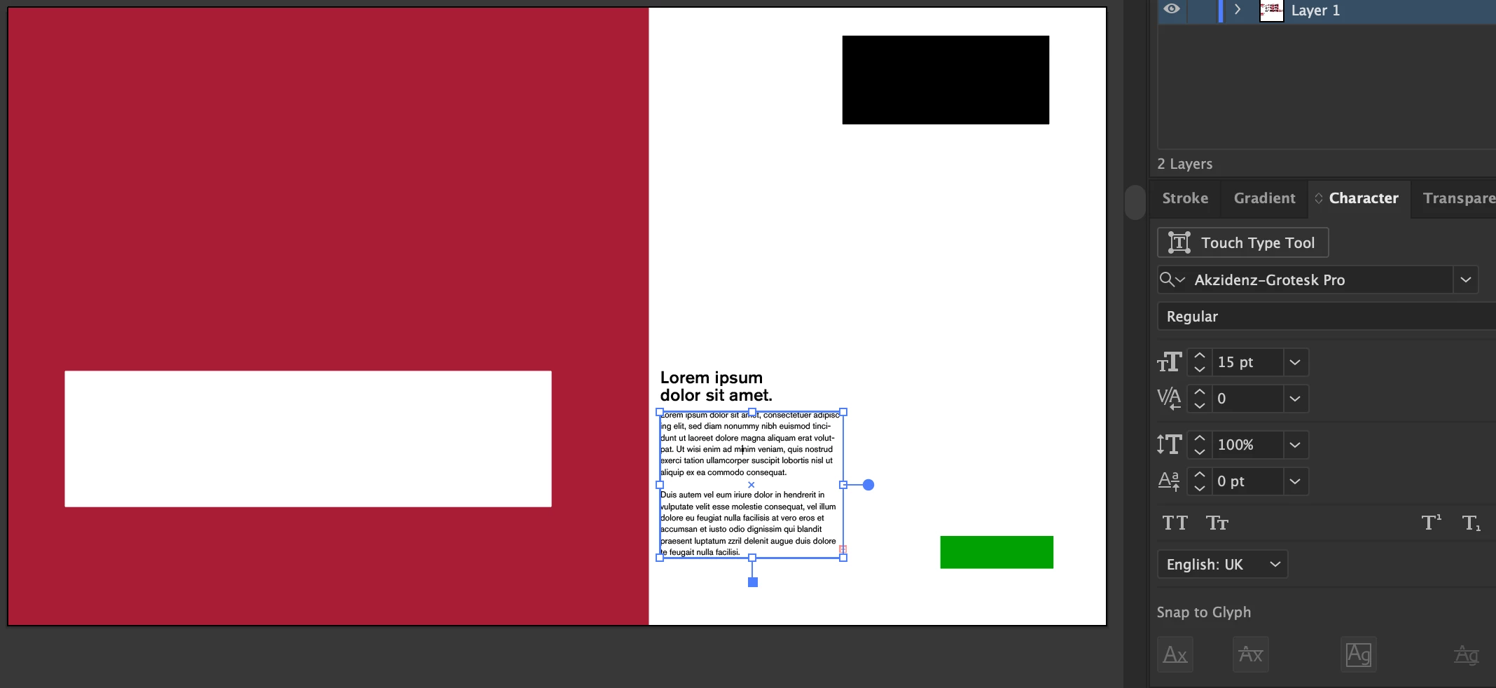
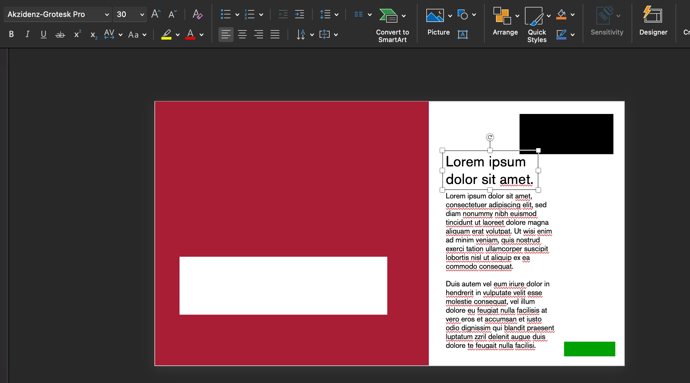
I'm working on a brand presentation and have set my document up at 1920x1080px, a colleague commented that my body copy was too small (I think it looks fine in full screen, but hey ho), I have the body copy at 15pt, and figured I'd check the size by creating a 16px box and comparing (16px should work out to 12pt text, the industry recommended minimum for body copy) - the box was SIGNIFICANTLY larger than my '15pt' text, I then copied the files into a 1920x1080px PowerPoint, using the same typeface and Pt size to test, and the text is near double the size. Does anybody know what's happening here? Document dimensions are both the same, pt size is the same and typeface is the same.
Many thanks,
James
Illustrator:
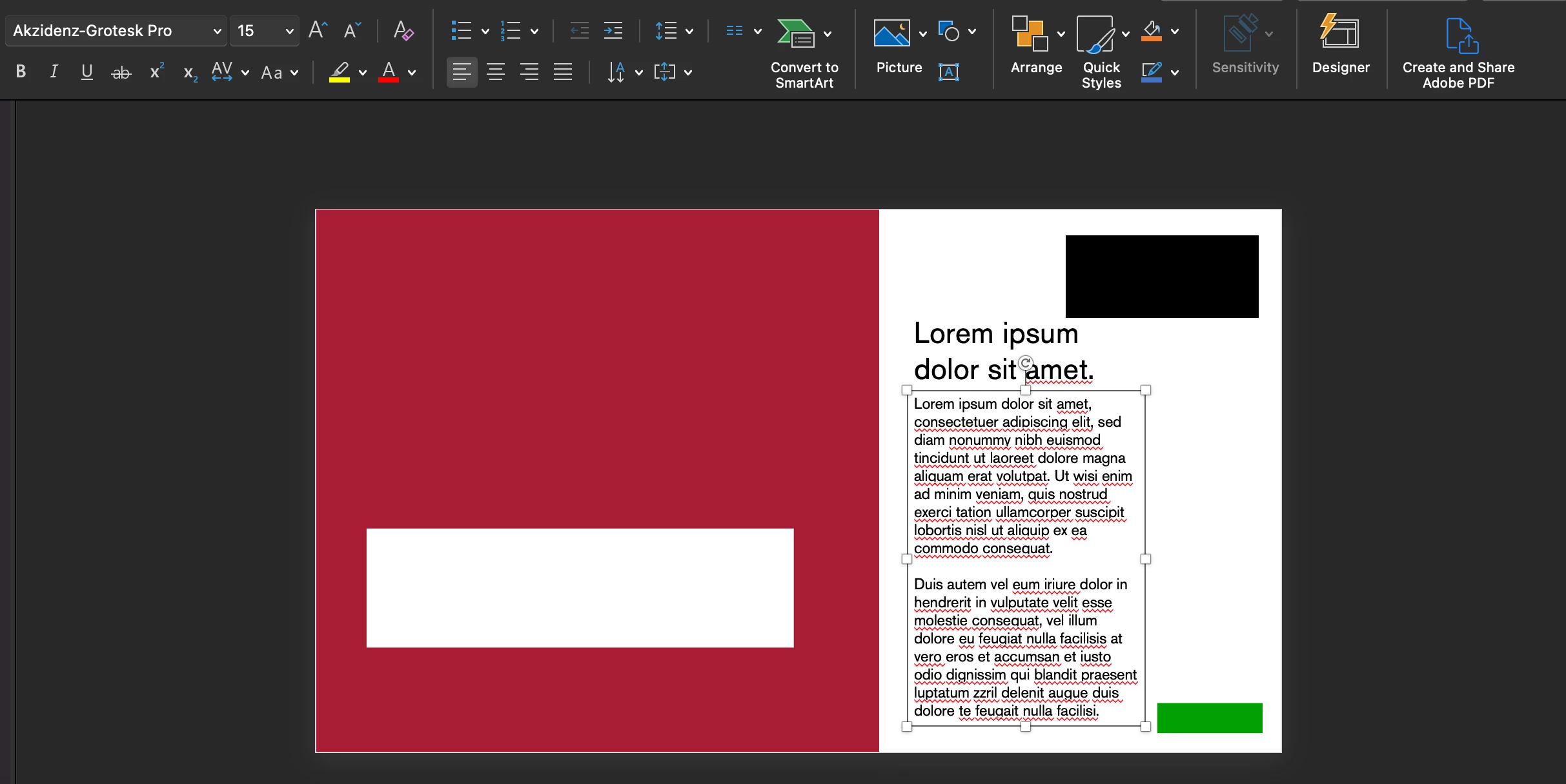
PowerPoint:
For Illustrator pixels and points are treated the same; 1 px equals 1 pt.
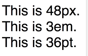
The html world outside Illustrator makes a difference between pts and px.
Add to that; the design of the font can make a visual difference in size between various fonts.
This is an html example:
Copy link to clipboard
Copied
You just can't compare the sizes that way.
Copy link to clipboard
Copied
I don't understand... The artboards are the same size (1920x1080px), the font source files are the same, a pt is supposed to equate to roughly 1.3 pixels, so how can you not compare? Or why are they different? Surely it's pretty inconvenient if the industry standard software doesn't read pt size correctly?
Copy link to clipboard
Copied
If your design is going to be displayed on a computer screen or HDTV screen then its units should be set up in terms of pixels. If I was laying out the document I would go so far as to use pixels as the unit of measure for the letters. Further I would use the font height options to set capital letter heights in whole pixel values and make sure they were aligning to the pixel grid. That makes the lettering look cleaner and sharper.
Copy link to clipboard
Copied
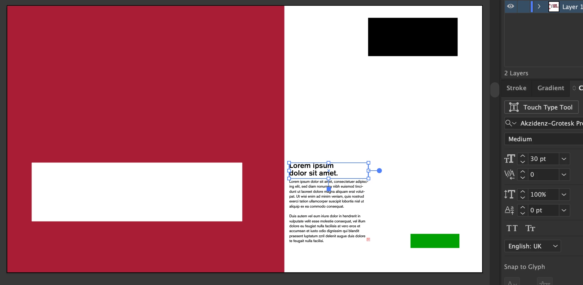
Thank you for the tip, I will do that in future! - I have just changed my settings to pt as opposed to px, - I'm still a tad confused though, as having tested on 2 separate 900x900px artboards, (one with the type unit measurement in px and one in pt), the type comes out the same size? Is this a coding error? As 1px is supposed to equate to 0.75pts no? I'm only so confused as all settings are the same on both softwares with completely different results - same DPI settings, same pt size settings, same px artboards, same font source files but different font heights when all of these units are standard measurements? I will just use my eye to define legibility scaling on docs in future but it's just a bit frustrating that there's no standardisation in Adobe softwares (I'm aware that fonts can be coded with different em-heights, but surely based on the pixel data, a correction automisation could be put in place by Adobe?) - if I'm being an imbecile please feel free to inform me haha. Coding is not my forté!
(em-height of 900px text on a 900x900px artboard)
(em-height of 900pt text on a 900x900px artboard)
Copy link to clipboard
Copied
Illustrator works in absolute measurement.
And it was there before the web - are you aware of that?
So it's actually quite bad that the web doesn't respect the industry standard.
Copy link to clipboard
Copied
I'm not perfectly sure why you're giving me this tone with your replies - but yes, as others have clarified with their detailed, informative and helpful explanations, the actual answer to the question is that when Illustrator was created, screens were at an PPI & aspect ratio that meant 1:1 px:pt was an accurate measurement, as for web 'not respecting the industry standard', it doesn't work that way, web respects the PPI of modern machines (which means that it respects the modern industry standard), Adobe respects the PPI of outdated machines. As an expert, I feel like you should aim to inform and educate as opposed to patronising people asking genuine questions on this forum? Thank you for your input, but I'm glad that the other 2 experts actually contributed detailed and informative information. Patronising people isn't particulary an 'expert' trait.
Copy link to clipboard
Copied
@James28136201371j schrieb:
the actual answer to the question is that when Illustrator was created, screens were at an PPI & aspect ratio that meant 1:1 px:pt was an accurate measurement,
When CSS styling was invented and the browser manufacturers figured out scaling, they also made quite a lot of assumptions that do not hold up to technical reality. So still after all those years comparing sizes in DTP software to CSS sizes, it's not possible. Even what one would consider absolute measurement (linke inches and centimeters), is not absolute on the web and probably will not match.
https://www.smashingmagazine.com/2021/07/css-absolute-units/
And also: an inch in CSS is designed as 96 px - so same thing as with Illustrator, only different conversion: Illustrator uses 1980ies Mac pixel density, CSS uses 1980ies Windows pixel density. And it still uses it.
https://www.freecodecamp.org/news/css-unit-guide/#:~:text=Inches.,pixels%2C%20or%20about%202.54cm.
What might help you better compare your web page to an Illustrator rendering of the same is Preferences > General and then unchecking the "Show print size at 100%" option. This makes Illustrator render one monitor pixel as one image pixel. So: like the browser does it.
PowerPoint is yet another thing.
Copy link to clipboard
Copied
Thank you for the explanation and link to the article, that's really helpful. I'm starting to understand the reasoning / complications now - I don't actually use PPT so I don't really know anything about it, I just wanted to test the scaling in other softwares and PPT was a closer match (I was aware that typefaces and fonts are slightly variable from the conception of type blocks and em-height) to 1.33px:1pt, which I now understand is a theoretical and innacurate measurement on screen - I'm guessing Microsoft updated their scaling system post CSS in 1996 to closer match standard web etc.
Thanks for the info, I appreciate you taking the time out of your day to help educate me
Copy link to clipboard
Copied
By default Adobe Illustrator treats point text and area text objects in a traditional manner oriented for print-based page layout. Basically that means the size of a letter will include more than just the letter itself; it also includes space around the letter.
If I set a string of point text in Myriad Pro at 24 points the physical size of the letters are not 24 points. Converted to outlines a capital "E" is only 16.1772 points tall. This ratio changes from one typeface to the next. A 24 point "E" in Helvetica Now Display Medium is 17.0879 points in actual size. A 24 point "E" in Proxima Vara Regular is 16.0078 points.
This stuff isn't a big problem in print because the document's grid system and the distance from one baseline to the next is the main thing that matters. In other kinds of graphic design that disconnect from a letter's stated size versus its physical size can be a problem. In the sign industry we size letters according to the physical size of capital letters. If I design a lighted channel letter building sign with 24" tall letters, the capital letters really have to be 24" tall, not some 16.176" value or whatever else tall. The customer isn't going to stand for that.
Text objects will probably look alright on a 1920x1080 resolution HDTV monitor since there's 2.2 million pixels in the display -that is if the text objects are big enough to be legible. The pixel preview mode in Illustrator can be a good indicator.
If I'm designing graphics for a LED sign, I'm usually going to be working with far fewer pixels. That's where setting the capital letter sizes in whole pixels values and lining those type objects up with the pixel grid makes a tremendous difference. Some edges of the letters are still going to be fuzzy. But if the baselines and cap lines are matching the pixel grid at least those boundaries will be reproduced sharp.
Copy link to clipboard
Copied
Ah just had my follow up answered by someone else, thank you!
Copy link to clipboard
Copied
For Illustrator pixels and points are treated the same; 1 px equals 1 pt.
The html world outside Illustrator makes a difference between pts and px.
Add to that; the design of the font can make a visual difference in size between various fonts.
This is an html example:
Copy link to clipboard
Copied
Thank you!! Now I finally get it! - any idea why it's set up like this? Incredibly confusing and complicated for those of us working with accessibility / legibility in mind... I'm sure I don't just speak for myself when I say it would be easier if the industry standard graphic design software went along with the industry standard definition of pt / px haha.
Thanks again for your great response.
Copy link to clipboard
Copied
In 1987 when Illustrator was introduced on Mac, there was no Web and the Mac screen had a resolution of 72 ppi.
Perfect realsize display of fontsizes; 1 screen px equaled 1 point size. That's where the px=pt size in Illustrator comes from.
A screendump from the first Illustrator version:
Copy link to clipboard
Copied
Good to hear that was helpful.
Copy link to clipboard
Copied
Ah thanks for the info! I just assumed they would've modernised by now - but moving forwards I'll just use 16pt as my minimum font size (to get roughly 12pt 'real-size') and times things by 1.3, then round them to get a more accurate estimate.
It was very helpful, I appreciate you taking the time to inform me!