

- Home
- Illustrator
- Discussions
- Why are my files looking washed out after I upload...
- Why are my files looking washed out after I upload...

Copy link to clipboard
Copied
So I'm trying to get some prints of a file I've been working on. I saved the file as an .ai, .eps, and .pdf and uploaded it to VistaPrint. For some reasons, everything seems a bit less saturated/washed out.
Any ideas?
Thanks!


 1 Correct answer

I think you are misunderstanding how the appearance of black works.
Your screen is set to display blacks as Rich blacks, so your display is making 100k look darker than it actually does when going to print. Many people are under the misconception that 100k is really dark, but it is not due to the paper absorbing ink. Try this as a test and I believe this will become clear.
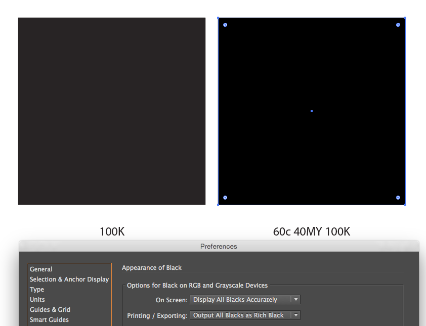
Use a rich black (e.g.: 60c 40MY 100K) instead of 100k for VistaPrint.
Adobe's Printing/Exporting is very deceiving as named
...Explore related tutorials & articles
 24
Replies
24
24
Replies
24

Copy link to clipboard
Copied
Which color mode did you design it in?
Do you know how to use color management?
Is your monitor calibrated?
How exactly did you save that file? WHich options?
Did you read the file specifications of Vista Print? Does your file match it?

Copy link to clipboard
Copied
Are you referring to a soft proof viewed on the monitor or are you looking at an actal printed piece?
Copy link to clipboard
Copied
A soft proof...just when I open the PDF file on my screen.
Copy link to clipboard
Copied
Can we see a screenshot?
You may have designed your artwork in File >> Document Color Mode >> RGB. Very important to be in the correct color mode, CMYK for Vistaprint.
Another reason is you may have not used the correct .pdf preset. Why did you upload all 3 formats?
Copy link to clipboard
Copied
MikeGondek schrieb
You may have designed your artwork in File >> Document Color Mode >> RGB. Very important to be in the correct color mode, CMYK for Vistaprint.
Unfortunately with Vistaprint you might still be surprised when receiving the final print. I'm not sure what exactly they do with CMYK files, but in my print the yellow had cyan in it that wasn't in the uploaded file.
On the other hand, 200 business cards cost 20 EUR. So you get what you pay for.
Copy link to clipboard
Copied
I created a new document, 11x17, CMYK color, so the document is in CMYK. My monitor is fine as far as calibration.
I originally uploaded the .ai file, but it was washed out so I tried a .pdf and .eps, and still the same thing.
Even if I open up the saved .pdf on my computer, it looks washed out (please see attached photos).
File>Save as>Save as type dropdown (PDF)>Save>Adobe PDF Preset dropdown (High Quality Print)
Going a bit whacky here, any other thoughts?!

Copy link to clipboard
Copied
Don't see the washed out in your screenshots.
What kind of black is that? 100K?
Copy link to clipboard
Copied
I agree, it does not look like a wash-out as I would define it. Has the Black been set to overprint? Or does the Black knock-out of the background?
Copy link to clipboard
Copied
I think we're on to something! I clicked on the black, went to View>Overprint Preview, and it showed me the "washed" out look I don't like. How do we prohibit Overprint, if possible? I just read something about 'knockout' vs 'overprinting' which sounds like it would solve my problem.
Pardon my questions, I'm a bit new to Illustrator.
Thanks
Copy link to clipboard
Copied
mrbcox47 schrieb
I just read something about 'knockout' vs 'overprinting' which sounds like it would solve my problem.
Not overprinting this black and red would make it far worse.
Copy link to clipboard
Copied
Yes I think I have a lot of research to do.
Copy link to clipboard
Copied
I'm not sure how to find out the type of black I'm using, any tips?

Copy link to clipboard
Copied
i think what you're seeing is just the difference between 100k and rich black.
if you go to preferences > appearance of black, what do the options say?
Copy link to clipboard
Copied
It's weird because when I create the PDF it definitely looks like the 100k black, even though my preferences have everything set to Rich Black

Copy link to clipboard
Copied
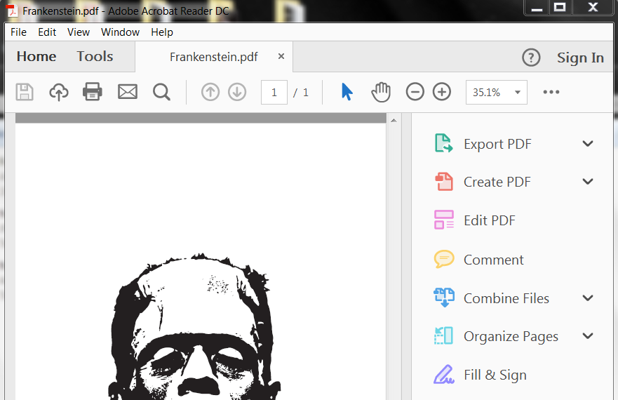
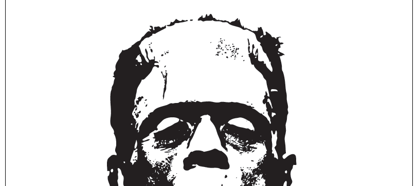
Here's another example of in-house Illustrator VS the PDF I saved of it: 
Copy link to clipboard
Copied
So again, the first image is without overprint preview selected, and the second image is with overprint preview selected. I see a noticeable difference. I selected the artwork and went to the Attributes panel, and overprint fill and overprint stroke are unchecked. Such a small issue and we can't find a solution!

Copy link to clipboard
Copied
it's not to do with overprinting per se, but overprint preview will display blacks accurately, i.e. 100k instead of rich black.
Copy link to clipboard
Copied
OK thank you for clarification, that makes sense now.
In that case, how does one use an accurate black that is the blackest of blacks? All I want to do is have this thing print like a rich black.
Copy link to clipboard
Copied
you should probably ask vistaprint what, if any, kind of rich black will work best on their stock and use that.
Copy link to clipboard
Copied
If you have specific wishes as to the result of your print, don't print with Vistaprint.
The less expensive printing is, the more you need to know and do yourself.
Copy link to clipboard
Copied
I agree Monika, I'm going to head over to my local print shop and see what we can arrange. I'm sure once they see my illustrator file they might be able to pinpoint my black richness issue.
I really appreciate all of your help! Thanks again.
Copy link to clipboard
Copied
I think you are misunderstanding how the appearance of black works.
Your screen is set to display blacks as Rich blacks, so your display is making 100k look darker than it actually does when going to print. Many people are under the misconception that 100k is really dark, but it is not due to the paper absorbing ink. Try this as a test and I believe this will become clear.
Use a rich black (e.g.: 60c 40MY 100K) instead of 100k for VistaPrint.
Adobe's Printing/Exporting is very deceiving as named. A 100k will still print 100k when printing or export. This setting is more for RGB devices.
Doug is right, Overprint preview will display blacks more accurately (but only if display all blacks as rich blacks is set). I believe show blacks accurately is a better way to work for print, and you do not need to turn on overprint preview to show blacks accurately if you are set up as per my screenshot. Reminds me to overprint and make rich blacks when needed.
Copy link to clipboard
Copied
You really helped me understand this even further. Thank you so much.
Copy link to clipboard
Copied
For my part you are welcome, glad that helped.
And do not use 100% for all 4 colors, as you may encounter blasting by exceeding that maximum density.

Find more inspiration, events, and resources on the new Adobe Community
Explore Now
 AdChoices