 Adobe Community
- Home
- InDesign
- Discussions
- Re: Acrobat jacked up a reference to "9/11"
- Re: Acrobat jacked up a reference to "9/11"

Copy link to clipboard
Copied
I typed a book title in InDesign -- a book about the events of 9/11 -- and exported the page to Acrobat using the Press Quality setting with default options. My question has to do with the resulting appearance of the "9/11" digits once the page is in Acrobat.
Potentially pertinent info: The default numerics in this particular font (FreightSans Pro, Book weight) are generally too small, and they don't all rest on the base line; several dip below the baseline. The client likes the font but not the default numbers, so I've replaced all the numbers with the glyph choice that standardizes the size and places them on the baseline.
- 1ST ATTACHED IMAGE
- In InDesign, the "9/11" is the right size and is sitting on the baseline as desired.
- 2ND ATTACHED IMAGE
- In Acrobat (again, exported to Press Quality, default settings), the "9" has reverted to the below-baseline default glyph.
- Further, the second "1" has not only reverted but has ALSO somehow acquired an underline -- which is a complete mystery since there is no underline applied.
- Everywhere "9/11" is mentioned in the manuscript, this happens.
- Other instances of these same digits (e.g., 19th) are not affected.
My first thought was that the "slash" in "9/11" was somehow triggering one of the programs to think "9/11" is a fraction. But if that was the case, wouldn't it look like a fraction in InDesign before I ever exported to Acrobat?
But I'm not sure that is really the problem because why would something that converted this combo of keystrokes to a fraction then also add that random underline under the second "1"? And why isn't Acrobat honoring the glyphs I've chosen, to start with?
This is a real head-scratcher and actually a big problem because the client is waiting for their book layout and the deadline is tomorrow. Does anyone know why this quirk would happen when I export to Press Quality and how I can prevent it or turn it off? Or is there is a bug in InDesign related to glyphs or fractions or both? Or is there some palette I've missed with some option I need to tweak or maybe something in preferences in one program or the other? I've looked but I haven't found anything yet. Hope it's just something I've missed!
See "9/11" in the two images below and thanks in advance for any help!
(Note: I gathered these images in two different screenshots. The typefaces are actually the same size, but the 2nd image looks a little smaller because I took my Acrobat screen capture at a slightly different zoom; just didn't want someone to spot that and mistakenly think thinking it might imply something about the problem.)
PS -- I've temporarily solved my problem by converting the "9/11" figures to outlines for purposes of meeting my deadline. But I'd still love to get feedback on this question.


 1 Correct answer
Hi, "Jongware."
Thanks so much for your reply and show of support.  This is a very weird situation but I am beginning to think it was just a one-time quirk (unless it happens again in future, obviously). As I mentioned in my first posting, the font I'm using is FreightSans Pro, Book weight in this instance. It is a front from TypeKit, so it is synced and therefore, I presume, installed only once.
I took your suggestion and created a dummy document using basically the same specs -- in fact, I
... 4
Replies
4
4
Replies
4

Copy link to clipboard
Copied
If you would like any instance of 9/11 to always appear so that the numbers are above the baseline, you may like to try the following:
1) Create a character style that tells the number to be the correct position above the baseline:
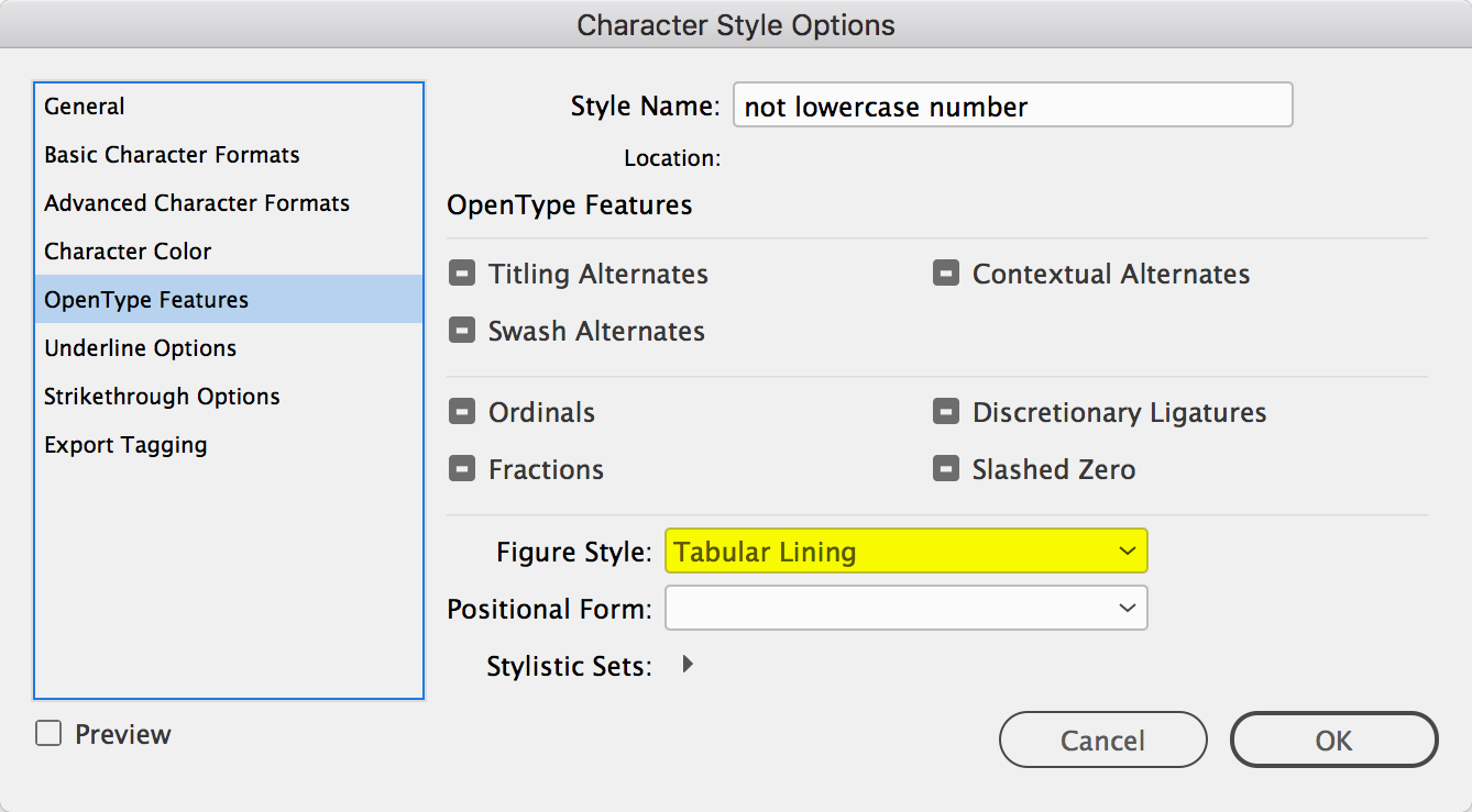
2) Make a GREP style within your paragraph style that makes any instance of 9/11 become this character style:

Please let us know the outcome from your machine.
Copy link to clipboard
Copied
Thanks. I will definitely try this, and that whole section about Open Type might be just what I've been missing. I will have to try after this deadline, though! Under the gun now. I'm hoping this Open Type section (which I thought was available but I couldn't find) might hold the clue as to why my glyphs were fine in InDesign but exported incorrectly to Acrobat (see the second image I supplied previously). That, I think is the real mystery and question here. But I'm sure I can use your info as well! 

Copy link to clipboard
Copied
casinclaire wrote
...
My first thought was that the "slash" in "9/11" was somehow triggering one of the programs to think "9/11" is a fraction. But if that was the case, wouldn't it look like a fraction in InDesign before I ever exported to Acrobat?
But I'm not sure that is really the problem because why would something that converted this combo of keystrokes to a fraction then also add that random underline under the second "1"? And why isn't Acrobat honoring the glyphs I've chosen, to start with?
You are 100% correct, this is not how fractions -- or any other OpenType function -- should work. They should be exported as however they appear in InDesign itself.
Some random questions:
What font is this? (Not that it should matter. But perhaps there is something strange in its definition -- something very strange. It might ring a bell for somebody.)
Is there a remote possibility you might have two instances of that font installed? (Which could cause weird glyph related problems; but admittedly again, it'd appear wrong in InDesign as well.)
Does the exact same thing happen with an entirely new blank document where you type in "9/11" and export? If it does, post that INDD and PDF on a public server so we might take a look at it with other tools.
Copy link to clipboard
Copied
Hi, "Jongware."
Thanks so much for your reply and show of support. This is a very weird situation but I am beginning to think it was just a one-time quirk (unless it happens again in future, obviously). As I mentioned in my first posting, the font I'm using is FreightSans Pro, Book weight in this instance. It is a front from TypeKit, so it is synced and therefore, I presume, installed only once.
I took your suggestion and created a dummy document using basically the same specs -- in fact, I based it on the original, just dumped a bunch of pages and kept the ones where the problem first showed (as I said, it happened throughout the document anytime 9/11 was used). I saved and exported to Acrobat, and the problem DID NOT appear again. Nor did it appear in a completely new and separate document I created for testing purposes, one that did not have any of the same styles applied, etc.
I have never seen anything like this happen before. Maybe my machine was hiccuping or something at the time. I appreciate your help, and suggestions. It helped me to at least check it out again. If it happens again, I'll touch base again on this thread.

 AdChoices