Roger Breton
Legend
December 14, 2016
Answered

Adobe Color Theme panel is not color managed?

  • December 14, 2016
  • 4 replies
  • 4227 views

Windows 10, InDesign CC 11.4.1.102 x64

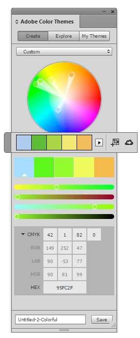
I am having a hard time ignoring the discrepancy between the Color Theme Tool floating "palette" and the Adobe Color Themes "panel". The screen capture that you see here was made by placing the small palette on the larger panel so that you can CLEARLY see the difference (Please, pay attention to the greens, the yellow appears redder as opposed to lemony, and the blue patch, on the left, turns overly bright). It is grossly obvious that these two UI elements are NOT color-managed the same way and I hope I'm not the only one noticing the difference. I can't talk for the appearance of these UI elements on the Mac but on Windows, this is very  disturbing, so much so that it takes away the usability of that tool all together. This is not a matter of Preferences... This is a matter of the Themes Panel, perhaps, being written in JavaScript, so that it can't be managed the same as the Windows "native" UI element?

This topic has been closed for replies.
Correct answer rob day

As you can see, the RGB colors don't appear RGB anymore but were converted to US Newsprint using AbsCol RI.

Try double-clicking the Theme Tool and set it to Convert to RGB (see my #5). I just tested an RGB image with the default Convert as Document Intent and got a CMYK theme, but with it set to Convert to RGB I got a theme with RGB swatches.

4 replies

Roger Breton
Legend
December 14, 2016

Rob,

As an experiment, I created a new color theme on Adobe Color using CIE Lab color values.

I saved the theme.

Returned to InDesignCC.

Updated my CC Library.

The new theme did appear.

But I could not browse its color composition.

So I assigned each color, one by one, to simple rectangle shapes.
Here is result of one such shape:

You see, on the right, my starting CIE Lab value, 24 51 -59.

On the left, a rectangle I filled with the "imported theme color" within InDesign.

Below, you see the result in the Color palette (F6), 23 44 -61.

I tried a few manual ICC color conversions with Photoshop but I can't obtain 23 44 -61 from 24 51 -59.

Bummer...

rob day
Community Expert
Community Expert
December 14, 2016

Looks like the CC Libraries don't support Lab themes. When I add the same theme to swatches via the CC Library panel the swatches are added as RGB not Lab.

Roger Breton
Legend
December 16, 2016

Here's an example of why using a primary RGB swatch isn't really useful for comparing an RGB profile's appearance effect on same values. Below is the same placed image profiled with sRGB left and ProPhoto right. Very difficult to see a difference with 0|255|0 green but the appearance shift with the less saturated ocher 148|114|41 is striking:


I hear you, Rob. I won't debate your point.

Two things.

First, the Tool's floating palette is misleading.

Take this screen capture, for example. At first glance, nothing wrong BUT it only visually matches the sampled image.

I established that, out of ANY images, these 5 little squares in that palette always visually match the image colors it was sampled from.

The problem? It's when these colors are applied. I don't know about you but, in my humble experience, so far, whether with "primaries" or other less saturated colors, there is an inevitable DUMBING down of colors going on, they are "systematically darker". Always? Regardless of the selected "Bright or Colorful or Deep or Muted or Dark" rule.

Second of all, I also established that, when "Convert to RGB" is selected in the Tool's option, whether in a "Print" document or a "Web" document (you would think?), the "applied" (or resulting colors) are always converted to CMYK first and then to converted to RGB.

Thank's to the Color palette, after freshly applying a color from the Theme to an object on the page, say a rectangle, switching to the Selection tool to select that object always causes the Color palette to automatically switch color space to reflect the color space the object is in. (Neat trick I'll remember to use)

Frankly, the more I "play" with this "tool" the less I trust it.

I experimented with images made up of "primaries" and "plain natural scenes" and the dumbing down effect I witness is always there, it's as though the Tool was programmed to decrease the Lightness level of sampled colors.

I'll continue experimenting but I'm getting a bit discouraged.

rob day
Community Expert
Community Expert
December 14, 2016

Also, it looks like you can keep a theme's color in the document's CMYK gamut by making a manual edit in the swatch's CMYK field. So here's my out-of-gamut theme where the swatch numbers have been edited a bit and now moving the color in the picker won't allow me to choose an out-of-gamut color. I've pulled the magenta selector out to the edge and I'm still getting the closest CMYK value

Roger Breton
Legend
December 14, 2016

Rob and Michael, thank's for your help. Michael, the choice of RGB vs CMYK Transparency Blend Space is important and in a way I did not suspect before -- thank's to you, I discovered something new.

Rob, you set me on a path of "war". So I started by creating an RGB document in Photoshop who only have five solid colored areas, red, green, blue, cyan and yellow. I assigned sRGB to the image.

I placed the document in InDesign, with the default CMYK Transparency Blending Space.

I used the Theme Color Tool to capture the nuances out of that RGB placed image.

I then saved the colors to my CC Cloud Library.

As you can see, the RGB colors don't appear RGB anymore but were converted to US Newsprint using AbsCol RI.

I can see a match between the RGB colors I manually create in InDesign compared to the placed image.

I can "logically" follow through the "converted" colors (CMYK now) in my CC Library panel.

But I still can't explain the appearance once transfered in the Adobe Color Themes panel?

Something is getting lost in translation somewhere.

rob day
Community Expert
rob dayCommunity ExpertCorrect answer
Community Expert
December 14, 2016

As you can see, the RGB colors don't appear RGB anymore but were converted to US Newsprint using AbsCol RI.

Try double-clicking the Theme Tool and set it to Convert to RGB (see my #5). I just tested an RGB image with the default Convert as Document Intent and got a CMYK theme, but with it set to Convert to RGB I got a theme with RGB swatches.

rob day
Community Expert
Community Expert
December 14, 2016

It is grossly obvious that these two UI elements are NOT color-managed the same way and I hope I'm not the only one noticing the difference.

I think you have to watch out for what color mode you've selected when you create the swatches.

This is what I'm seeing. I created this theme's swatches with RGB selected and set the values to be out of the CMYK gamut. Here the document's CMYK color profile assignment is US Newsprint SNAP:

If the assignment is the default US SWOP Coated the CMYK numbers change, 0|0|255 now converts to 88|76|0|0 and if I select CMYK and add swatches I get the US SWOP Coated version of my out-of-gamut colors—the appearance doesn't match because of the conversion:

If I add RGB swatches I get swatches with the originally created RGB values:

Roger Breton
Legend
December 14, 2016

Rob,

There is a fundamental difference between how we both describe what we're doing.

You wrote:

I think you have to watch out for what color mode you've selected when you create the swatches.

This is what I'm seeing. I created this theme's swatches with RGB selected and set the values to be out of the CMYK gamut. Here the document's CMYK color profile assignment is US Newsprint SNAP:

So, you start FROM the Color Themes Panel, from which you SELECT the RGB or CMYK color space at the BOTTOM of the panel.

This is *very* different from where I am coming from.

I agree 100% that, starting from the Color Themes Panel, like you did, I will arrive at YOUR results. No brainer.

But that's not where I am coming from. You see, the Color Theme Tool is designed to "capture" colors from placed images.

So far, I have not been able to successfully capture "RGB" colors in my CC Library with the Color Themes Panel even though the image I captured the colors from *is* an RGB image AND I have RGB Transparency Blend Space selected, which is mind boggling -- there are NO interface that I can find that would allow capturing "natively" the RGB colors, it seems that the friendly button "Add this theme to my current CC Library" is hard-coded to convert captured colors on the fly to CMYK (the last button on the right of this palette)?

I think that's one problem. I will take a stroll down Preferences in case I missed some choice about this behavior...

rob day
Community Expert
Community Expert
December 14, 2016

I see the problem. This came up awhile back with Kuler, and yes the appearance of saved themes in the panel is not color managed. I'm not much of a color theme user, but the conversion numbers in the panel do seem to respond correctly to the color management settings, which I don't think happened with Kuler.

A work around with Kuler was to build and save your theme swatches in Lab mode, then color manage the colors as needed when they get added as swatches or colors in the document.

It does look like you can save swatches with specified CMYK color values, which will hold when you save the theme and apply the colors as CMYK—it's just that they don't display correctly in the panel after the save.

So this is the panel preview when I manually enter CMYK primary numbers with SNAP as the profile:

And this after I save or update the theme. Obviously 100% Cyan would never print or convert to 0|255|255 RGB:

Mike Witherell
Community Expert
Community Expert
December 14, 2016

When you are using it, is the color model the same? Is it set to Edit > Transparency Blend Space > CMYK or RGB? When you change it to RGB, do they appear to match?

Mike Witherell
Roger Breton
Legend
December 14, 2016

Good suggestion, Michael! Alas! That fails to effect a visual difference. By default, the Transparency Blending Space is set to CMYK and switching this around to RGB, under the Edit menu, does not make any difference that I can see. Do you get a difference at your end when you change the Transparency Blending color space? I'm curious.

Thank's!

rob day
Community Expert
Community Expert
December 14, 2016

That fails to effect a visual difference. By default, the Transparency Blending Space is set to CMYK and switching this around to RGB, under the Edit menu, does not make any difference that I can see.

The blend space only affects the preview of color on pages with transparency, so I would not expect setting it to RGB to change your example.

The two green swatches in your example are clearly out-of-gamut RGB colors so if you convert them to CMYK (you have CMYK selected in the Color Theme panel), they would have to change in appearance when applied on the page.

Also double-click the color theme tool and you get some options for applying color.