Question
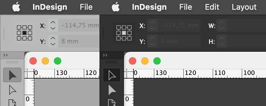
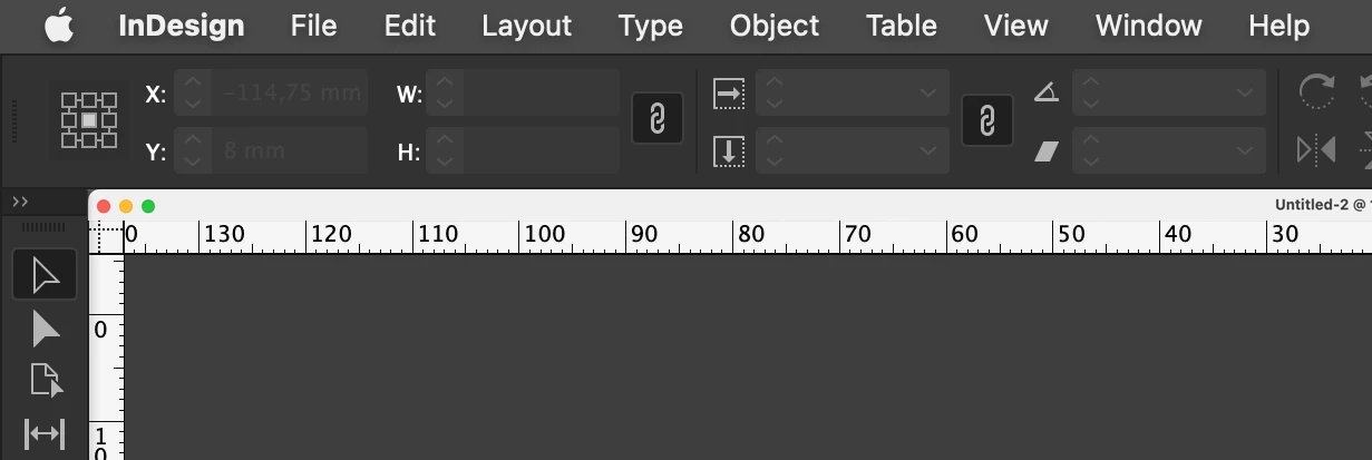
Anywone bugged by titlebar color - and size?
I cannot understand why the titlebar of documents is :
A- large
and
B: white, like always: even when a different -darker- tone is chosen in prefs > interface > appearance
or when the system is set to dark.

Would a 30px titlebar not be more logical, and being coloured in the right tone!

