

- Home
- InDesign
- Discussions
- Re: Are selection and direct selection tools symbo...
- Re: Are selection and direct selection tools symbo...

Copy link to clipboard
Copied
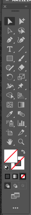
Hi, I'm using the new Indesign 17.01 and I found something strange in the selection & direct selection tools regarding their symbols: I expect to use the black arrow for the selection tool and the white one for the direct selection but they are inverted as can be seen from the screenshot. The white one on the left activates the selection tool while the black one on the right the direct selection.
Is it normal due to any new update or is something strange?


 1 Correct answer

The positions of the tools did not change.
Switch to the lightest UI. There is no change in appearance at all.
Just in the two dark UI settings.
We already had some discussions about the change here in the forum.
Top row is InDesign 2021, bottom row is InDesign 2022.
Check the consistency of the little triangle in the Page Tool between 2021 and 2022.
The same happened now with both selection tools:

Regards,
Uwe Laubender
( ACP )
 18
Replies
18
18
Replies
18
Copy link to clipboard
Copied
The positions of the tools did not change.
Switch to the lightest UI. There is no change in appearance at all.
Just in the two dark UI settings.
We already had some discussions about the change here in the forum.
Top row is InDesign 2021, bottom row is InDesign 2022.
Check the consistency of the little triangle in the Page Tool between 2021 and 2022.
The same happened now with both selection tools:
Regards,
Uwe Laubender
( ACP )
Copy link to clipboard
Copied
Thank you Uwe for the explanation and I checked what you say switching to the lightest UI.
But, I'm sorry, is something strange since both Illustrator and Photoshop in the newest versions keep the original symbols even in the darker UI.
I don't like work with the lightest UI and in this way the new Indesign icons don't keep consistency with the Adobe ecosystem.

Copy link to clipboard
Copied
I have the same issue. In InDesign they have swapped the positions round so that the selection tool is now at the top (as it always used to be). I am constantly clicking on the wrong tool and it's wasting loads of time over the course of a day. It's infuriating!

Copy link to clipboard
Copied
As Uwe stated, go by the position of the tools--that has not changed.
Also consider using the keyboard shortcuts--it is a big timesaver:
- v for Selection tool (think moVe tool)
- a for the Direct Selection tool (think Art-editing tool)
- Esc if you are typing text to switch to the Selection tool
Copy link to clipboard
Copied
Hi Laura,
The first tool is always the Selection tool.
The second one is always the Direct Selection tool.
This has not changed.
FWIW: If you would switch to one of the two lighter UIs you would see no difference at all compared to older CC versions.
Regards,
Uwe Laubender
( ACP )
Copy link to clipboard
Copied
I don't understad what has changed then, because since doing the update yesterday I am consistently clicking the direct selection tool instead of the selection tool and it's driving me mad. I have got used to the dark mode, so would rather not have to change it because the icons have changed. And in Illustrator they are the other way round too - direct selection at the top. I really wish Adobe would make everything consistent across apps. 😞
Copy link to clipboard
Copied
.. and in Illustrator - the direct selection tool is the filled in arrow, and in InDesign the selection tool is the filled in arrow!! No wonder I'm confused!
Copy link to clipboard
Copied
"I really wish Adobe would make everything consistent across apps. "
Well, I wish that the developer teams from Illustrator and PhotoShop were also that consistent.
InDesign has it right now in terms of inter-InDesign consistency with both icons.
It's solid ( Selection tool ) vs hollow ( Direct Selection tool ).
Regards,
Uwe Laubender
( ACP )
Copy link to clipboard
Copied
Yes, I would agree it is correct now in InDesign - it is having to get used to it changing that is the problem. It being different in Illustrator is a pain!!
Copy link to clipboard
Copied
Why did you swap the two icons?
In all other Adobe apps the selection tool and the direct selection tool always keep the same appearance, even with the darkest UIs.
It's absolutely crazy that you guys, in the Indesign department, don't take into consideration all the other apps from Adobe and it's really hard to understand why the two icons should change their appearance when switching between UI.
PLEASE, keep them looking normal like in all other Adobe apps. These are the basic rules of the User Experience that are taught in the first year of any graphics course.

Copy link to clipboard
Copied
This is definitely an issue - I thought I was losing my memory or something because I couldn't keep straight which was the Direct Select tool vs. Select. I switch between Illustrator and InDesign a lot and finally realized that they are appearing differently in each one. Hope this gets fixed soon!!
Copy link to clipboard
Copied
This is confusing me as well. I am now constantly clicking on the wrong selection tool. I don't actually like the lighter UI, prefer the darker one. I cannot believe changing the appearance of these tools was considered a priority?
Copy link to clipboard
Copied
Me too! This is ongoing and driving me mad. I switch between InDesign and Illustrator all the time and it is a nightmare, as not only are the icons different, but they are in different places. It's crazy that Adobe have done this!
Copy link to clipboard
Copied
This change of appearance is totally wrong! The appearance of the icons must be the same among all Adobe apps and there is nothing to support this crazy decision as even within the same Indesign the two icons change their appearance from a light to a darker user interface. Guys at Photoshop and Illustrator have maintained perfect consistency. You, Indesign team, no. What you did is totally wrong.
PS: Users do not see a solid arrow or an empty arrow. Users see a black and white arrow...

Copy link to clipboard
Copied
I'm with you. Ive found it so frustrating and a time waste that i have gone back to previos versions. To me its like someone deciding to swap the accelerator pedal for the brake pedal or red will no mean go and green stop. Its crazy!

Copy link to clipboard
Copied
Yet again, another example of adobe changing a tool when nobody asked for it just to make it more complicated for long time users. Bet this was a Corporate decision.
Copy link to clipboard
Copied
The change is going into its fifth. year. You are just noticing it now?
Copy link to clipboard
Copied
I'm aware it's been fixed. I just noticed it when updating an old program and it bothered me that it was changed in the first place.

Find more inspiration, events, and resources on the new Adobe Community
Explore Now
 AdChoices