• Global community
    • Language:
      • Deutsch
      • English
      • Español
      • Français
      • Português
  • 日本語コミュニティ
    Dedicated community for Japanese speakers
  • 한국 커뮤니티
    Dedicated community for Korean speakers
Exit
4

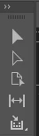
Arrows switched around on toolbar?

Contributor ,
Nov 08, 2021 Nov 08, 2021

Copy link to clipboard

Copied

Usually the top arrow is solid black, for grabbing and moving, and the second arrow is white for grabbing and moving photos inside a picture box for example. Did they get switched around in 2022 InDesign? Now the grab arrow is white, and the move objects inside is black? Am I nuts?


Screen Shot 2021-11-08 at 5.06.21 PM.png

TOPICS
Bug

Views

2.8K

Translate

Translate

Report

Report
Community guidelines
Be kind and respectful, give credit to the original source of content, and search for duplicates before posting. Learn more
community guidelines
Community Expert ,
Nov 08, 2021 Nov 08, 2021

Copy link to clipboard

Copied

Edit > Preferences > Interface > Appearance > choose the light gray appearance.

I cannot answer your second question. Insufficient data.

Mike Witherell

Votes

Translate

Translate

Report

Report
Community guidelines
Be kind and respectful, give credit to the original source of content, and search for duplicates before posting. Learn more
community guidelines
Community Expert ,
Nov 08, 2021 Nov 08, 2021

Copy link to clipboard

Copied

The Selection tool (the top arrow) is now always the solid arrow; the Direct Selection tool is now always the hollow arrow.

David Creamer: Community Expert (ACI and ACE 1995-2023)

Votes

Translate

Translate

Report

Report
Community guidelines
Be kind and respectful, give credit to the original source of content, and search for duplicates before posting. Learn more
community guidelines
Contributor ,
Nov 09, 2021 Nov 09, 2021

Copy link to clipboard

Copied

But not in Illustrator? They switched it in InDesign but not in their sister software?

Votes

Translate

Translate

Report

Report
Community guidelines
Be kind and respectful, give credit to the original source of content, and search for duplicates before posting. Learn more
community guidelines
Community Expert ,
Nov 09, 2021 Nov 09, 2021

Copy link to clipboard

Copied

The Illustrator team [sometimes] takes forever to catch up with ID and PS.

A few things that come to mind off the top of my head:

  • although we can do it now, double-clicking on a layer to rename it wasn't available for some time.
  • you still can't right-click on layers,
  • spring-loaded tools,
  • birds-eye view.
David Creamer: Community Expert (ACI and ACE 1995-2023)

Votes

Translate

Translate

Report

Report
Community guidelines
Be kind and respectful, give credit to the original source of content, and search for duplicates before posting. Learn more
community guidelines
Contributor ,
Nov 09, 2021 Nov 09, 2021

Copy link to clipboard

Copied

It's not the interface; have been using this interface for a couple of years and never any issues. It's the upgrade.

Votes

Translate

Translate

Report

Report
Community guidelines
Be kind and respectful, give credit to the original source of content, and search for duplicates before posting. Learn more
community guidelines
Community Expert ,
Nov 08, 2021 Nov 08, 2021

Copy link to clipboard

Copied

You're not crazy, it's just a challenging icon design for the dark UI. Maybe the thinking is that the lighter arrow stands out more in the darker toolbar, but you're right that it doesn't match the actual cursor.


— Adobe Certified Expert & Instructor at Noble Desktop | Web Developer, Designer, InDesign Scriptor

Votes

Translate

Translate

Report

Report
Community guidelines
Be kind and respectful, give credit to the original source of content, and search for duplicates before posting. Learn more
community guidelines
Contributor ,
Nov 09, 2021 Nov 09, 2021

Copy link to clipboard

Copied

No, I have been using the dark interface for a couple of years. It's not that.

Votes

Translate

Translate

Report

Report
Community guidelines
Be kind and respectful, give credit to the original source of content, and search for duplicates before posting. Learn more
community guidelines
Community Expert ,
Nov 09, 2021 Nov 09, 2021

Copy link to clipboard

Copied

You're right. I just looked back at a screenshot of an older version and the top arrow was dark and bottom arrow was light. It looks like a mistake by Adobe. Maybe it has to do with the new UI Scaling they added.


— Adobe Certified Expert & Instructor at Noble Desktop | Web Developer, Designer, InDesign Scriptor

Votes

Translate

Translate

Report

Report
Community guidelines
Be kind and respectful, give credit to the original source of content, and search for duplicates before posting. Learn more
community guidelines
Community Expert ,
Nov 09, 2021 Nov 09, 2021

Copy link to clipboard

Copied

It's not a mistake. It's a correction.

Solid and hollow have indeed replaced black and white for the selection and direct selection tools.

Votes

Translate

Translate

Report

Report
Community guidelines
Be kind and respectful, give credit to the original source of content, and search for duplicates before posting. Learn more
community guidelines
Community Expert ,
Nov 09, 2021 Nov 09, 2021

Copy link to clipboard

Copied

The toolbar icon does not match and actual cursor (it's opposite), and someone is confused. In UI design, that is a mistake. Just because you can explain a reasoning does not make it good user-centered design.


It's not as simple as solid vs hollow... because both of the actual cursors have outlines! The black fill arrow has a white outline, and the light gray fill (used to be white) has a black and white double outline. Depending on the background you may not always see all those outlines, but sometimes you do.


Adobe should make the toolbar icon match the overall feel of the actual cursor when the primary difference is black vs light gray. That's how they had prevoiusly done it! I think this could be an accident when updating the app, but if not... it's a step in the wrong direction.


— Adobe Certified Expert & Instructor at Noble Desktop | Web Developer, Designer, InDesign Scriptor

Votes

Translate

Translate

Report

Report
Community guidelines
Be kind and respectful, give credit to the original source of content, and search for duplicates before posting. Learn more
community guidelines
Community Expert ,
Nov 09, 2021 Nov 09, 2021

Copy link to clipboard

Copied

I'm just messenger. Take it up with decision makers. I don't use the dark UI for InDesign so I'm not really effect, but I certainly understand the confusion.

You already know this, but for those that don't, do not report this as a bug. It will get dismisses as "as designed."

Votes

Translate

Translate

Report

Report
Community guidelines
Be kind and respectful, give credit to the original source of content, and search for duplicates before posting. Learn more
community guidelines
Community Expert ,
Nov 09, 2021 Nov 09, 2021

Copy link to clipboard

Copied

It makes sense to me if I think of the hollow arrow (the direct selection tool) letting the background show through on the toolbar. On screen, the Selection tool is solid, and the Direct Selection tool is "hollow" (but doesn't let the background show through). The keyboard shortcuts are the same and the tool positions are the same, so I don't really care what they look like. 

image.pngimage.png

IMO, the biggest problem is that Illustrator did not follow suite (but no surprise there...), and Photoshop to some extent (although those tools are not used as much). 


Going on the assumption that Adobe isn't going to change the interface unless they get a reasonable amount of user feedback, the "old" method must have been causing confusion for some. OR, my other hypothesis is that changes are made so the interface department can keep their jobs... 

David Creamer: Community Expert (ACI and ACE 1995-2023)

Votes

Translate

Translate

Report

Report
Community guidelines
Be kind and respectful, give credit to the original source of content, and search for duplicates before posting. Learn more
community guidelines
Contributor ,
Nov 09, 2021 Nov 09, 2021

Copy link to clipboard

Copied

Thank you. I have always thought of the arrows as black and white. I started using this software so long ago. So instintively I want to click on the black arrrow, which is now the "hollow" arrow, and now is second. I flip between InDesign and Illustrator constantly, and now is and extra second everytime because it's changed.


Like when they decided Photoshop didn't need SHIFT to make scaling proportional, but left it unchanged on the rest of their software. 


So stoopid. 


how do one complain to Adobe?


Votes

Translate

Translate

Report

Report
Community guidelines
Be kind and respectful, give credit to the original source of content, and search for duplicates before posting. Learn more
community guidelines
Community Expert ,
Nov 09, 2021 Nov 09, 2021

Copy link to clipboard

Copied

I've referred to the tools as black arrow and white arrow for decades. Going to have to Rekall Inc. and have my memories adjusted...


Think of the Selection tool as the moVe tool to remember the keyboard shortcut (v).

Think of the Direct Selection tool as the Art tool to remember the keyboard shortcut (a).


I feel your pain about the shift in Photoshop's use of the Shift key too.

David Creamer: Community Expert (ACI and ACE 1995-2023)

Votes

Translate

Translate

Report

Report
Community guidelines
Be kind and respectful, give credit to the original source of content, and search for duplicates before posting. Learn more
community guidelines
New Here ,
Feb 02, 2022 Feb 02, 2022

Copy link to clipboard

Copied

This is indeed ridiculous. And the only reason why I use ridiculous is because i don't wont to use any swear words. This is just confusing, for no reason.

I read consistency... consistency would mean kepeing the black arrow black and the white white, like it has always been. I really hope this is an error and the change it back.

Votes

Translate

Translate

Report

Report
Community guidelines
Be kind and respectful, give credit to the original source of content, and search for duplicates before posting. Learn more
community guidelines
Community Expert ,
Feb 02, 2022 Feb 02, 2022

Copy link to clipboard

Copied

There are three basic ways to switch between the Selection tool and the Direct Selection tool:

  1. Keyboard shortcuts (v and a, respectively; think "moVe" and "Art-editing")
  2. Position of the tools--the Sel. tool has always been the top tool; the Direct Sel. tool below. (Top left and top right respectively if using a two-column toolbar.)
  3. The "color" of the tools--technically, these are solid and hollow--not "black" and "white". That is the [new] consistency in InDesign. The logical reason for this is how the tools appear with the color themes. Having a black arrow with a dark theme doesn't make much sense. 


  • Method 1 is the most efficient since you can use your other hand to switch tools (unless you have your morning coffee in it...)
  • Method 2 is okay since it relies on muscle memory to get the mouse to the proper position. However, if you have a large monitor, this can waste time and could contribute to carpal tunnel syndrome over time.
  • Method 3 is the least efficient and slowest method since you are having to look at the tool bar and visually guide your mouse. Plus this has the same problems as method 2.


David Creamer: Community Expert (ACI and ACE 1995-2023)

Votes

Translate

Translate

Report

Report
Community guidelines
Be kind and respectful, give credit to the original source of content, and search for duplicates before posting. Learn more
community guidelines
Community Beginner ,
Feb 03, 2022 Feb 03, 2022

Copy link to clipboard

Copied

I use the shortcuts a/v, still I don’t think it’s a good user experience that you have to click on a white arrow in order to get the dark arrow (Selection Tool) and to click on a dark arrow to get a white one (Direct Selection Tool).


I do understand the argument that the Direct Selection Tool isn’t actually dark but hollow, still than Adobe has to change it throughout the Creative Cloud apps. I’m not sure what you do professionally but as a graphic designer I can tell you that many people use Photoshop, Illustrator and InDesign at the same time.

Votes

Translate

Translate

Report

Report
Community guidelines
Be kind and respectful, give credit to the original source of content, and search for duplicates before posting. Learn more
community guidelines
Community Expert ,
Feb 05, 2022 Feb 05, 2022

Copy link to clipboard

Copied

The "black" arrow and "white" arrow worked until the user interface had options to change from the default light interface of older versions to whatever the user wanted. As I mentioned, having a dark arrow on a dark interface is not very efficient.


>>>I’m not sure what you do professionally but as a graphic designer

Graphic designer, art director of multiple publications, production director--probably before you were born... 😁

David Creamer: Community Expert (ACI and ACE 1995-2023)

Votes

Translate

Translate

Report

Report
Community guidelines
Be kind and respectful, give credit to the original source of content, and search for duplicates before posting. Learn more
community guidelines
Contributor ,
Feb 07, 2022 Feb 07, 2022

Copy link to clipboard

Copied

Do you have a screenshot of InDesign before this 2022 update? I didn't have this issue 6 months ago. This is a 2022 issue. Not a Dark mode issue, I've been using the dark mode since they came out with it.


And, I've been around; started with PageMaker, then Quark, then InDesign. Freehand and now Illustrator (Freehand was better).

Votes

Translate

Translate

Report

Report
Community guidelines
Be kind and respectful, give credit to the original source of content, and search for duplicates before posting. Learn more
community guidelines
Community Expert ,
Feb 07, 2022 Feb 07, 2022

Copy link to clipboard

Copied

Votes

Translate

Translate

Report

Report
Community guidelines
Be kind and respectful, give credit to the original source of content, and search for duplicates before posting. Learn more
community guidelines
Community Beginner ,
Feb 08, 2022 Feb 08, 2022

Copy link to clipboard

Copied

quote

>>>I’m not sure what you do professionally but as a graphic designer

Graphic designer, art director of multiple publications, production director--probably before you were born... 😁


By @Creamer Training


Haha, nice one David!

Votes

Translate

Translate

Report

Report
Community guidelines
Be kind and respectful, give credit to the original source of content, and search for duplicates before posting. Learn more
community guidelines
Contributor ,
Nov 09, 2021 Nov 09, 2021

Copy link to clipboard

Copied

Thanks for the info; I wonder why they don't think "InDesign users may use Illustrator, let's make the tools and behaviors similar".....

Votes

Translate

Translate

Report

Report
Community guidelines
Be kind and respectful, give credit to the original source of content, and search for duplicates before posting. Learn more
community guidelines
Community Expert ,
Nov 09, 2021 Nov 09, 2021

Copy link to clipboard

Copied

Different programming teams (probably competing for a finite amount of money). 
At some point, Adobe corporate will put their foot down and say "make it so".

David Creamer: Community Expert (ACI and ACE 1995-2023)

Votes

Translate

Translate

Report

Report
Community guidelines
Be kind and respectful, give credit to the original source of content, and search for duplicates before posting. Learn more
community guidelines
Community Expert ,
Nov 09, 2021 Nov 09, 2021

Copy link to clipboard

Copied

Bartender! I'll have what he's having.

Votes

Translate

Translate

Report

Report
Community guidelines
Be kind and respectful, give credit to the original source of content, and search for duplicates before posting. Learn more
community guidelines