avoid out of gamut colors
Copy link to clipboard
Copied
I created a document in InDesign CS6 for Kindle publication. I used RGB colors for making the colors bright on the screen.
It tells me that some colors are out of gamut in relation to printing. But I don't want to print this document, I just want to use it to display on the screen. How can I avoid out of gamut coolors?
Copy link to clipboard
Copied
If you don't want to print (for reading on a Kindle), then you can ignore the message "colors are out of gamut for printing". You should be fine.
Copy link to clipboard
Copied
Hi @Brigit Ananya , If you are designing only for screens, set your Transparency Blend Space to RGB, your document's assigned RGB profile to sRGB (Edit>Assign Profiles...), and turn off Overprint Preview. Your pages will then preview without any gamut clipping.
Copy link to clipboard
Copied
Thanks. But even when View>Overprint Preview is unchecked, some colors still get changed when considered out of gamut. How can I keep the RGB values I give to my colors?
Copy link to clipboard
Copied
Also, make sure you are not using Spot swatches, and you have View>Proof Colors turned off.
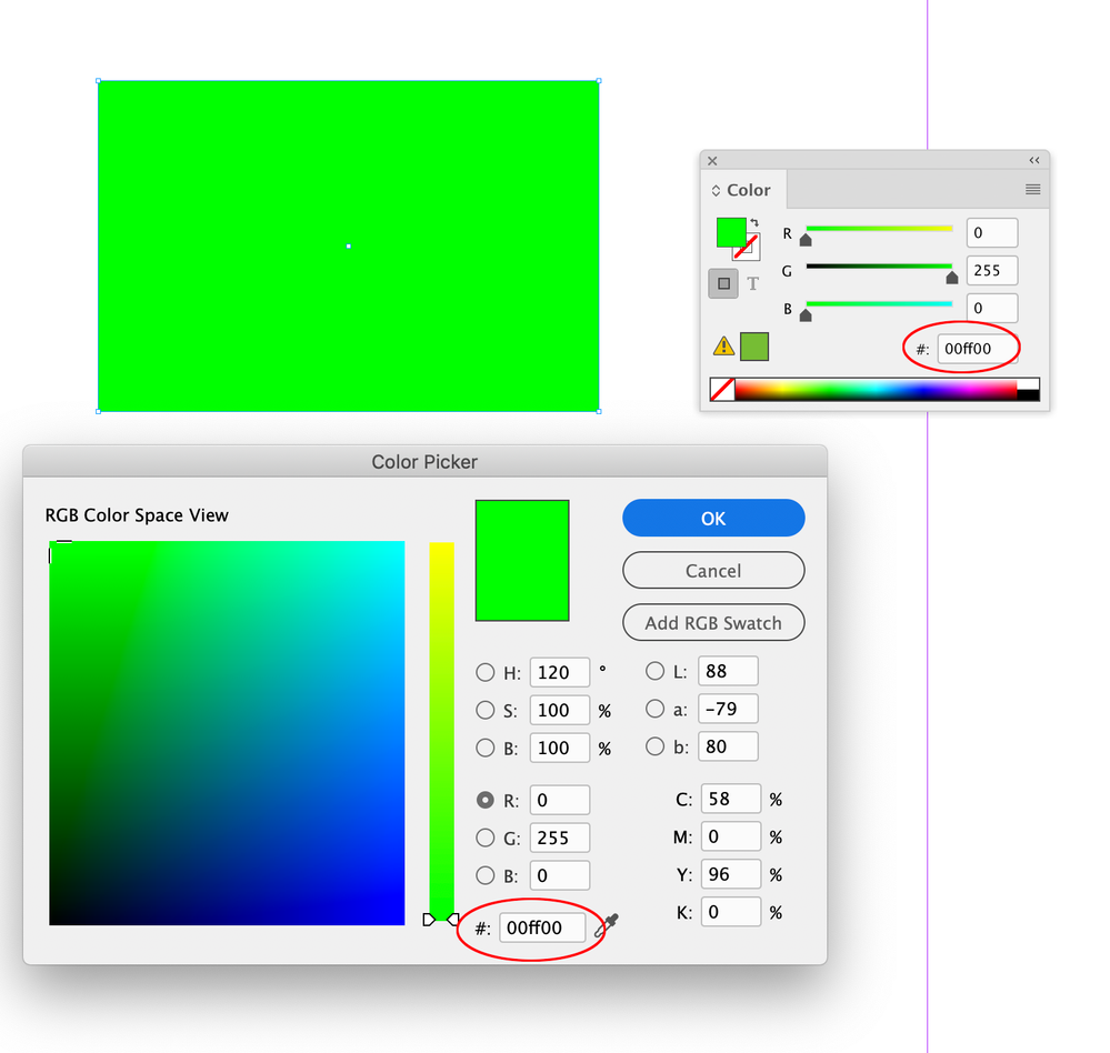
Can you show that happening in a screen capture? The warning would always show in the Swatches or Color panels, but an out-of-gamut RGB color should display unchanged, assuming the blend space is RGB, and Overprint preview is off:
Copy link to clipboard
Copied
The solution — basically, ignore the warning 🙂 — is noted, but I'd like to add that when designing for e-book, it's best to conform to web standards. (EPUB is, after all, little more than a packaged web page.) In this case, I'd suggest using hex color codes, but as InDesign doesn't really do hex, then set the color model to Web so that the selections fall to the basic RGB steps that most browsers and monitors support. You can define in-between RGB colors, but they could shift a bit to match a nearest web-safe color. All trivial; you can pretty much use the whole RGB spectrum for EPUB/Kindle.
That said, keep in mind that a lot of Kindle reader are monochrome. You should proof your pages in Kindle Previewer set to the 'Reader' mode to make sure you don't have color combinations that wash out— one light gray on another, for example.
┋┊ InDesign to Kindle (& EPUB): A Professional Guide, v3.1 ┊ (Amazon) ┊┋
Copy link to clipboard
Copied
but as InDesign doesn't really do hex
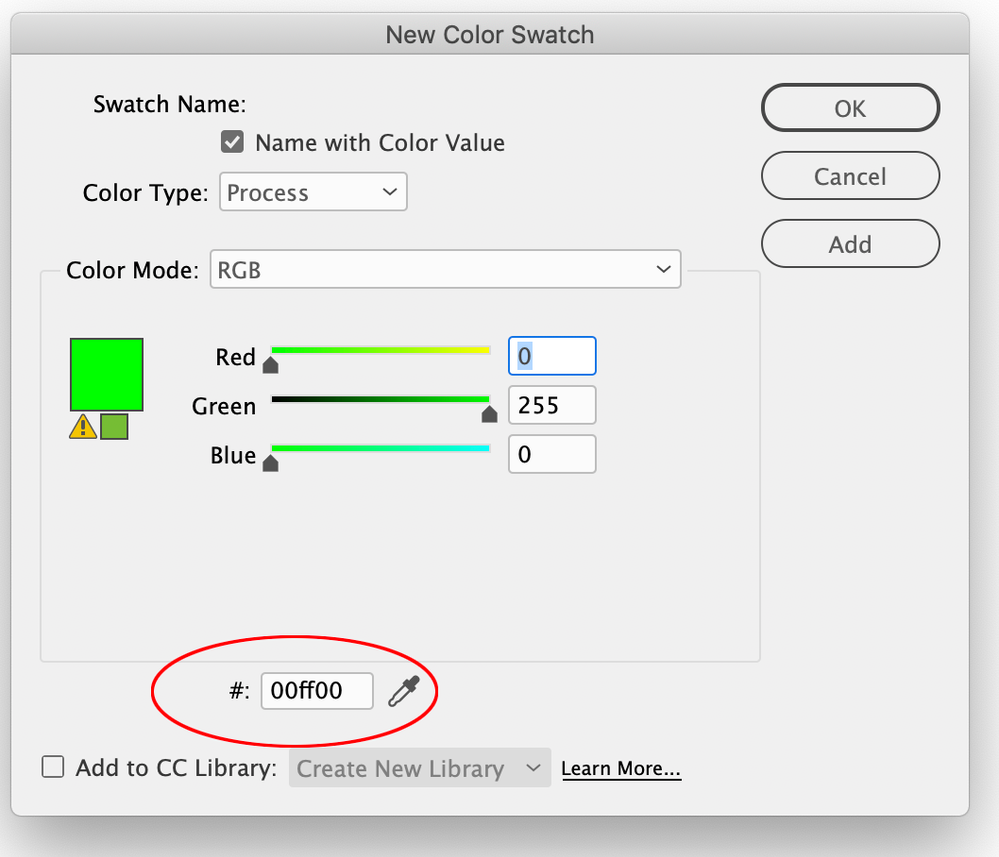
The Color, Swatches, and Color Picker panels let you spec RGB color as HEX. To get the same appearance as web HTML hex, assign sRGB as the document’s RGB profile.
Copy link to clipboard
Copied
Major brain f*rt on that one. Thanks.
I (guess) I meant that it's kind of minimized and not as fully emphasized or interactive as the other models, at least not as much as more web-centric tools. But it is there.
┋┊ InDesign to Kindle (& EPUB): A Professional Guide, v3.1 ┊ (Amazon) ┊┋
Copy link to clipboard
Copied
You should proof your pages in Kindle Previewer
Also, InDesign lets you set the Proof Setup to any Gray space—I would assume Kindle uses sGray—might be more convenient to stay in InDesign and proof to sGray, or whatever space Kindle uses?
Copy link to clipboard
Copied
That's valuable, but I am not sure Kindle's monochrome modes fully map to a regular grayscale equivalent. I've seen cases of color on color that should give decent gray contrast, but for one mapping or equivalent reason or another, don't. I'd give KP in Reader mode the final word on any complex color layout where content could be lost.
┋┊ InDesign to Kindle (& EPUB): A Professional Guide, v3.1 ┊ (Amazon) ┊┋


