


Copy link to clipboard
Copied
Hi there.
I have a couple of questions please regards formatting with the baseline grid to get consistency across the breadth of a design.
I have set up my baseline grid to start at 0mm from the margin and occur every 5pt (half of 10pt basically). Works great.
I have set my body copy to be 10pt with 10pt leading and snap to baseline every line. Also works well for my document. Good size and nice spacing.
I have set my headings to 25pt with 25pt leading. Also seems ok.
However, I could do with clarity on the following points if anyone can help please:
- If my baseline grid is set to 5pt and my heading font (for example) is set to 25pt. Should the font height not span 5 gridlines of space? a heading set to 25pts only seems to take up 3.5 leading lines.
- Aligning to baseline is great for setting the, erm, baseline. However, how do you also accommodate for the top of the characters? This question carries forward from the last question really, because it a font set to 25pt doesn't span 5x leading lines then it won't align to the text in another column that is, for example, set to 10pt with 10pt leading. In my mind, it should all lock into place but I must be missing something.
- Following on from the last question I have a heading at the top of my page that I want to both top align with the margin and also sit on the appropriate baseline - this title runs across two lines, also. I have it aligned with the baseline fine but it is not aligned with margin. It falls a little way short. But again, it should all lock together as far as I can see. The baseline starts at 0 from the margin. The occurs every 5pt. The heading is 25pt. The leading is 25pt.
I suspect it is something to do with text frame margins but would like a definitive answer and best practice, please.
Thanks,
Al.


 1 Correct answer

However, how do you also accommodate for the top of the characters? This question carries forward from the last question really, because it a font set to 25pt doesn't span 5x leading lines
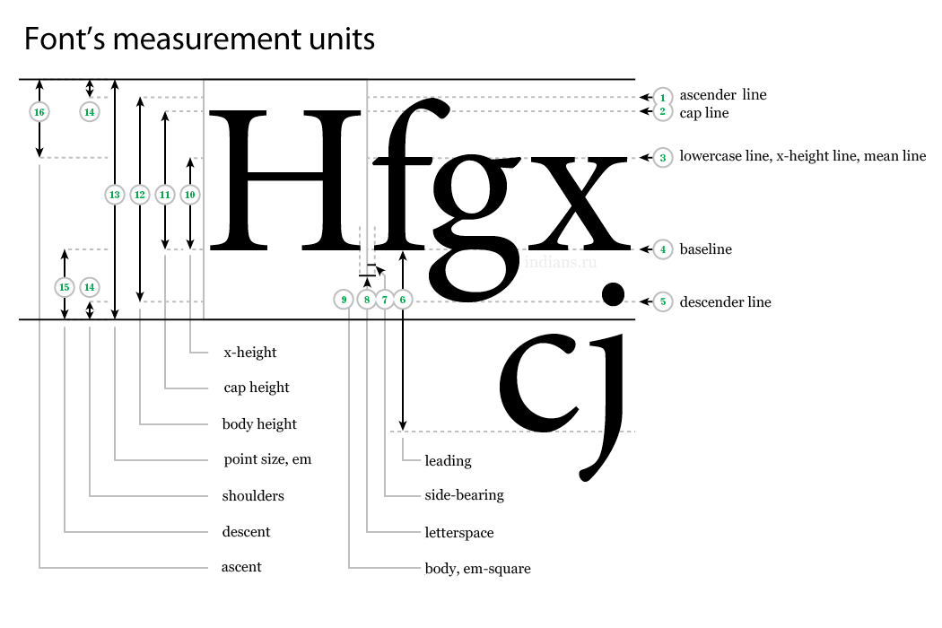
It sounds like you might be confusing the font’s point size with its cap height?
Point size is the distance from the descender line to the ascender line plus some padding amount for the "shoulders"
So here I’ve set the baseline grid to 25pt with the text as 25/25 and snap to baseline grid turned off. As Mike sugg
... 11
Replies
11
11
Replies
11

Copy link to clipboard
Copied
Have you tried going to Text Frame Options > Baseline Options (2nd tab) and changing the First Baseline Offset to something other than Ascent? Like maybe Leading?
Copy link to clipboard
Copied
Thanks Mike.
I have played with those settings but none seem to get me where I think I ought to be.
Maybe I'm missing the point.
It's ok I can work around it.
Just a bit baffled.
Copy link to clipboard
Copied
Just a bit baffled.
Maybe this thread will help? The text in the screen capture in #5 is from an InDesign Secrets article

Copy link to clipboard
Copied
I have set my body copy to be 10pt with 10pt leading
Before you make adjustment to the baseline grid, you may want to consider more leading. That could be adding more leading 10/12 or reducing the type size 8.5/10
Copy link to clipboard
Copied
However, how do you also accommodate for the top of the characters? This question carries forward from the last question really, because it a font set to 25pt doesn't span 5x leading lines
It sounds like you might be confusing the font’s point size with its cap height?
Point size is the distance from the descender line to the ascender line plus some padding amount for the "shoulders"

So here I’ve set the baseline grid to 25pt with the text as 25/25 and snap to baseline grid turned off. As Mike suggests the first line's baseline position is set in the Text Frame Options>Baseline Options. I've chosen Cap Height, and because snap to grid is off the first baseline is at the cap height, which isn't 25 pts.
I could choose Leading as the Offset and the text's first baseline would sit at 25 pt (its leading amount). Leading is the text‘s measurement from baseline to baseline.
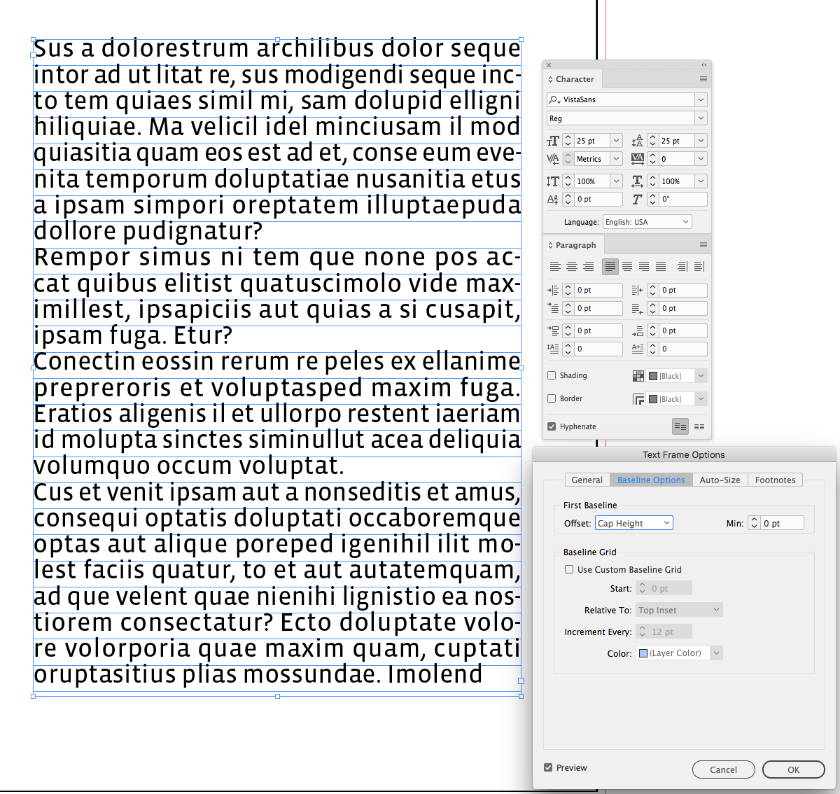
If I leave the offset as Cap Height, and turn on snap to grid, the text's baseline will align with the first baseline ignoring the Cap Height Offset setting:


Copy link to clipboard
Copied
Point size does not correspond to cap height. It roughly corresponds to the distance from the bottom of the lowest character to the top of the highest character. A 50 point E is not 50 points high. Depending on the font is is usually about 35 points high.

Copy link to clipboard
Copied
Just a quick reply regarding the font's perceived size.
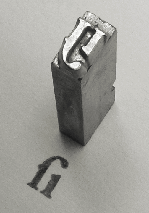
The more correct term for font size is "corps", meaning the body (corpus) of wood or metal the risen character would be sitting on, in the old days of letterpress. So it's the height of surrounding material to accommodate all characters, symbols, and ornaments in a given font. And the size and proportions of the actual character is totally up to the designer.
Below, the typical cast character of an fi ligature.

Copy link to clipboard
Copied
Absolutely a very nice picture, but isn't this rather a Long s+i ligature? ("Long s" as in "Paradiſe Loſt" or "ſucceſs".)

Copy link to clipboard
Copied
No. fi.
Copy link to clipboard
Copied
I'm not sure what relevance this argument has to the original question (which was excellently answered by rob day - I learned a lot from his explanation!), but the title and explanation of the image in Wikimedia says it's a long s. https://commons.wikimedia.org/wiki/File:Long_S-I_Garamond_sort_001.png
Copy link to clipboard
Copied
It is indeed a long s, a character vote down in 1800.

 AdChoices