Best practice for RGB and grayscale images for digital and print?
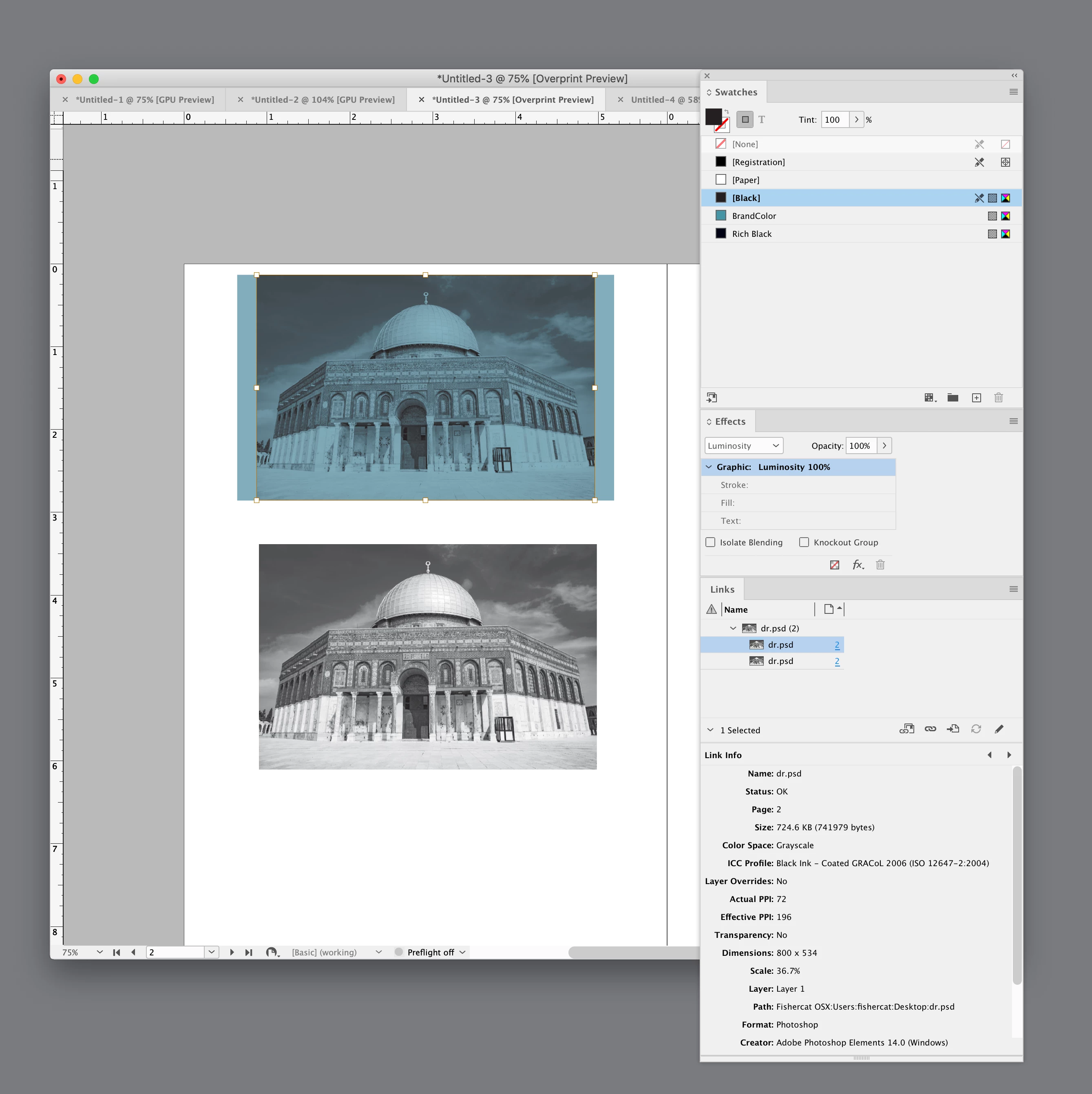
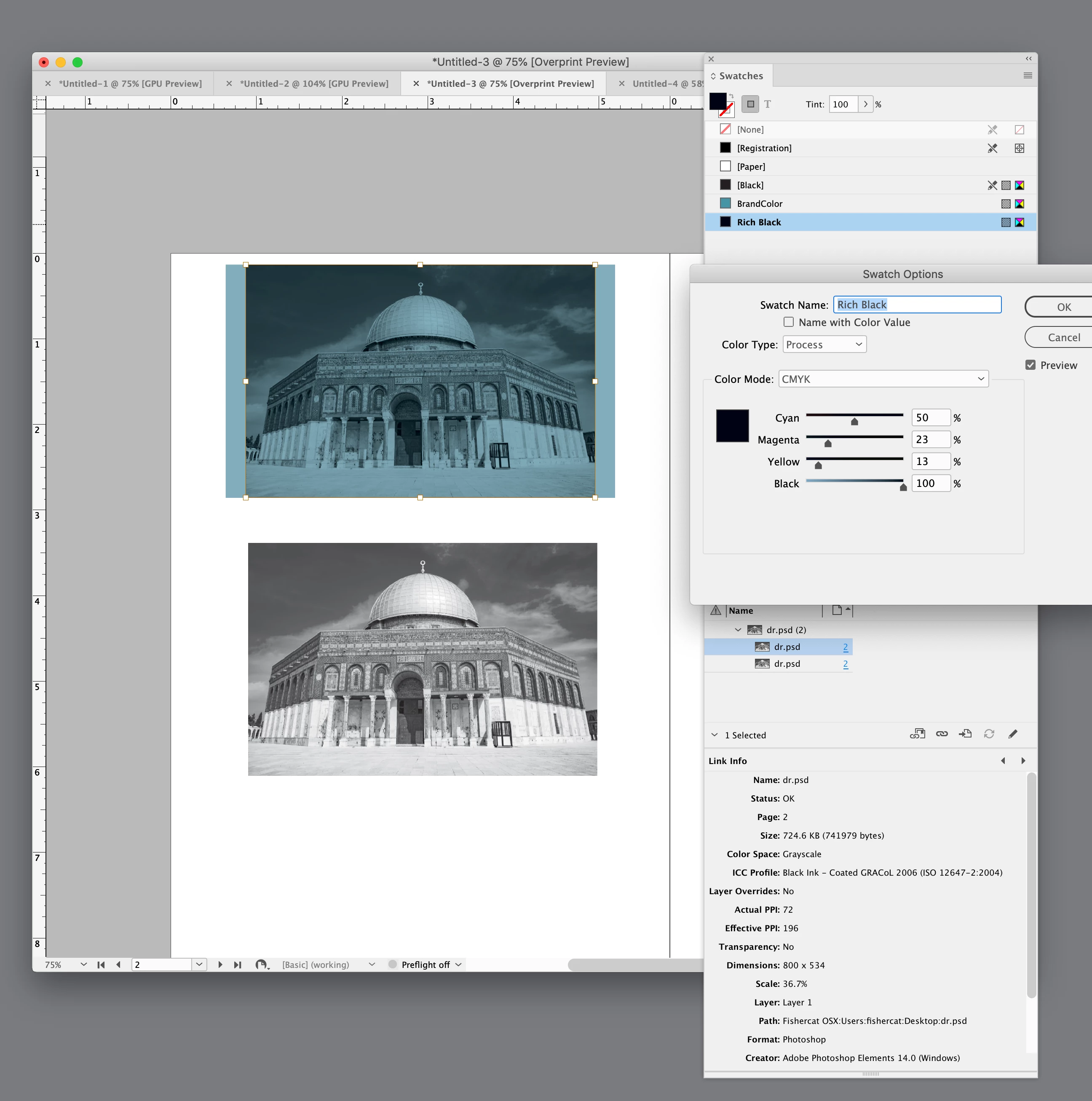
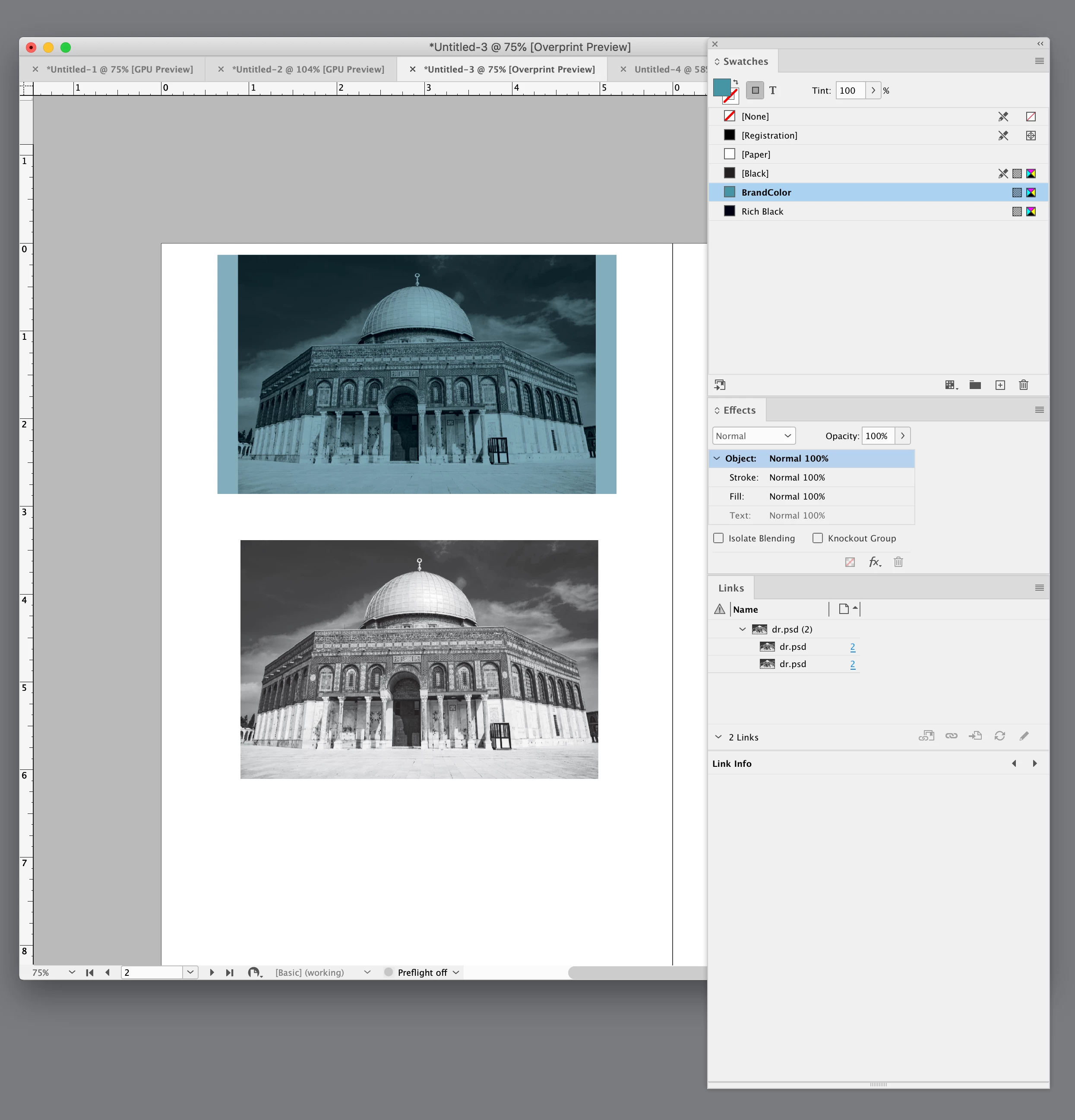
We have many books that are being developed for use both online (as PDF files) and in print. Some of these books have photos/illustrations in them. Up to this point we've just been using RGB .jpg files with an "overlay" (actually the rectangle is "filled" with our brand color, and then the photo blend mode is set to "Luminosity" to create the appearance of an overlay that matches the color scheme of the book). This works (and looks) great for the digital files. But we're now creating print files for economical printing (in black), and the photos obviously need some special treatment to print only in black. I know how to convert images to grayscale, but the problem is that now they look very washed out/muddy (especially with the "overlay" applied). I think they'll print just fine, but they don't look nearly so nice for our digital PDF files. 😞
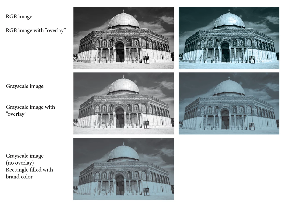
Part of the problem with last image is that when the rectangle "container" is filled with our brand color, the grayscale image inherits some of that coloring even before the "overlay" is applied. Is there a way to prevent this?
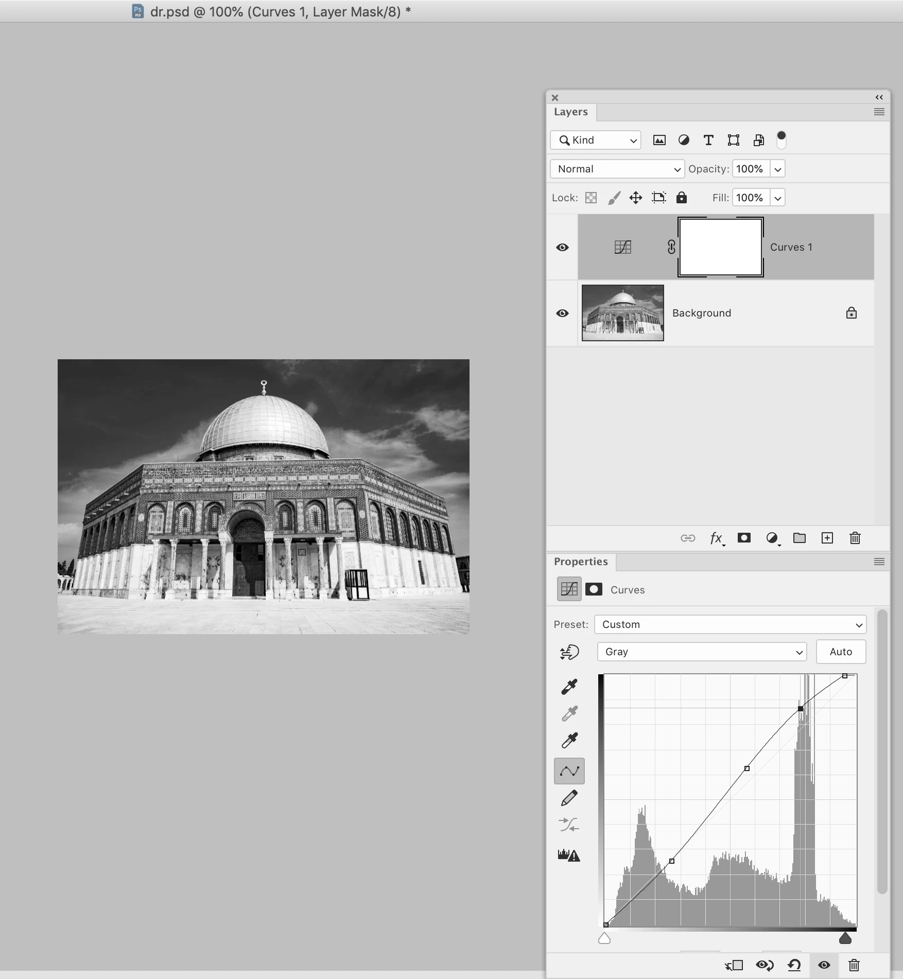
So I'm wondering how do the pros go about creating photos that look optimal for both print and digital? Ideally we want to use just one copy of the photos for everything. But maybe I need a script to swap out the RGB files for greyscale ones just for exporting a print PDF? What is the best solution? We don't have access to Photoshop, unfortunately. (I do the grayscale conversion in Affinity Photo).