

- Home
- InDesign
- Discussions
- Re: Best Screen Built Neutral Gray for Print?
- Re: Best Screen Built Neutral Gray for Print?
Best Screen Built Neutral Gray for Print?

Copy link to clipboard
Copied
I'm working on an identity system for a client and I'm trying to pick a good neutral gray to go with PMS 301 Blue. The business cards, letterhead, and envelopes will all print in 4-color process. Some of the gray will be used for typography as small as 8 pt..
My initial thought was to use a 60 or 70% screen of black, but screened type is not as rich as a 4-color build. So basically, I need a good, neutral gray that's easily built out of 4-color process. Any suggestions?
Thanks!


 16
Replies
16
16
Replies
16

Copy link to clipboard
Copied
Why not use another spot color and do it as a two color job? A spot will be much easier especially at that size since you won’t have to worry about registration issues.

Copy link to clipboard
Copied
Building upon Bob's suggestion …
When dealing with a corporate identity, you must consider how it will be displayed and printed. Remember that a corporate identity will be used for much more than just envelopes, letterheads, and business cards. In many organizations, the logos are incorporated directly into the source documents (InDesign, Word, whatever). And of course, very few organizations can afford to print everything with spot colors. The fact is that PMS 301 (assuming you mean Pantone 301 Coated) is somewhat outside the gamut of CMYK process printing, yielding a fairly muted blue color when printed either with process CMYK on either offset or digital printers (either toner or inkjet). I suspect the client might not be happy with the results.
Bob introduced this issue, but in terms of detail – when you are getting into fairly small 8 point type, printing with more than one colorant can yield significant registration issues that will outweigh any benefits of a multi-colorant-based rich black.
Some thoughts to consider …
- Dov
Copy link to clipboard
Copied
Thanks guys. I appreciate your advice. Spot color is fine for the identity system, but this client does a lot of 4-color brochures, so eventually the gray will need to be printed as a 4-color build.
Dov, in terms of determining if a color is within the CMYK gamut, I typically use Pantone's Color Bridge. Is that what you would recommend as well? If so, I probably should be using the uncoated version for this particular project. 
Thanks!
Copy link to clipboard
Copied
Pantone Color Bridge is designed for what you want to do, but the equivalent Pantone Color Bridge 301 (either coated or uncoated) is a significantly different color than the spot color due to the gamut issues. But if your customer is satisfied with that, you are good to go. FWIW, coated is probably more appropriate for what you are doing.
But you still have the issue of that rich black and 8pt type. Don't go there. Too risky!
- Dov

Copy link to clipboard
Copied
Gray balance is determined by the CMYK press profile. So if you start with a perfectly neutral RGB color, where all of the RGB values are equal, the converted CMYK numbers would change depending on the destination press profile. So for 100|100|100 RGB, Coated FOGRA39 converts to something like 56|46|45|34, while Uncoated FOGRA29 converts to 61|53|49|18.
The general rule-of -thumb for neutral 4-color gray is there would be somewhere around 20% more cyan in the mix, with magenta and yellow roughly equal, and the black amount determined by the profile's black generation, but you can see the uncoated example has less yellow.
So if you can trust the printer to properly color manage the output, the best approach might be to provide equal RGB values exported to PDF/X-4, and let the conversion happen at output where the CMYK profile should(?) be known.
but screened type is not as rich as a 4-color build
What do you mean by rich relative to a black tint? If you are trying to get absolute black on press, adding CMY to 100% black does affect the black value density, but I don't think that follows for black tints. In the bottom example I can find a black only percentage to match the appearance of the neutral 4-color mix 52|44|43|7, but need the extra CMY to get absolute black

Copy link to clipboard
Copied
Thanks Rob. I appreciate all of the good information. And yes, I've been screen building blacks for years.
In terms of the gray, do you think it would be a bad idea to use a 60 or 70% screen of black? It would make reproducing the text in a 4-color environment a lot easier, but I don't think it would look as good as a screen-built gray with larger graphics or solids areas of color.
[Update]
Actually, I just noticed your examples above and it looks fine. Perhaps a tint of red, but that's okay.
Copy link to clipboard
Copied
do you think it would be a bad idea to use a 60 or 70% screen of black? It would make reproducing the text in a 4-color environment a lot easier, but I don't think it would look as good as a screen-built gray with larger graphics or solids areas of color.
Not at all.
Why would a 4-color mix in place of a black tint look better with larger type? Unless you are looking for a cool or warm color shift that's not possible with the neutral black-only tint? If the goal is a perfect neutral, I don't see the advantage of 4-color when the appearance can be matched with a black only tint.
[Update]
Actually, I just noticed your examples above and it looks fine. Perhaps a tint of red, but that's okay.
Just to clarify, the brown cast in the 100% K example is caused by the document CMYK profile. I was trying to show why 100% black benefits from added CMY, but a 60%K, 4-color equivalent does not.
You can see the affect of the document CMYK profile on 100% black by changing the document's assigned CMYK profile, when your Appearance of Black preference is set to Accurate. Look at the difference between US Newsprint and SWOP Coated.

Copy link to clipboard
Copied
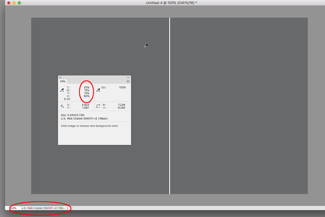
My suggested 4C color mix is 20C 15M 15Y 60K. And for print, always create this color using CMYK.
Copy link to clipboard
Copied
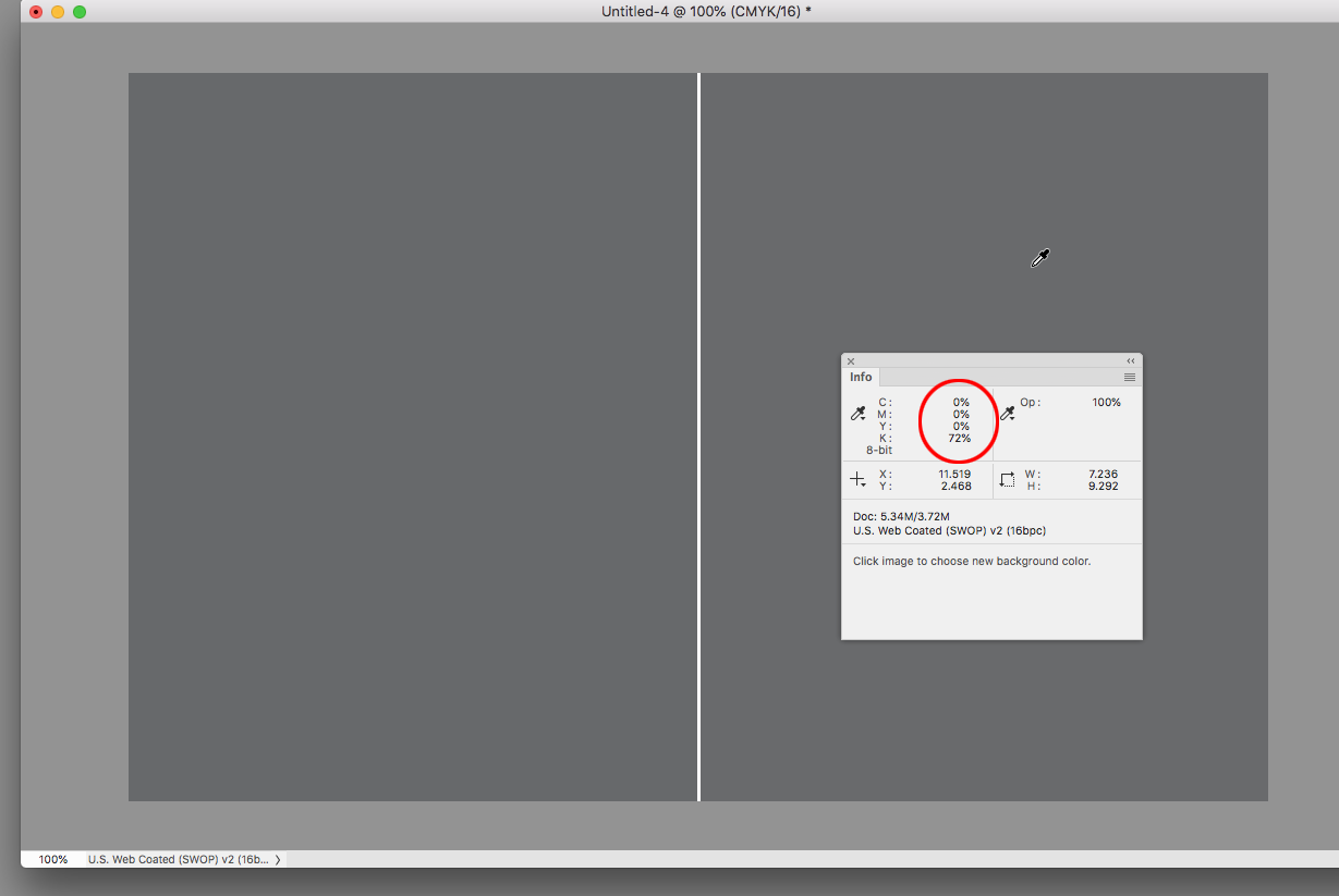
Hi Jeffrey, if the goal is neutrality, why would the built CMYK mix be better than 70%K where there wouldn't be registration worries or unwanted color casts if the press is not holding to the profile's gray balance?
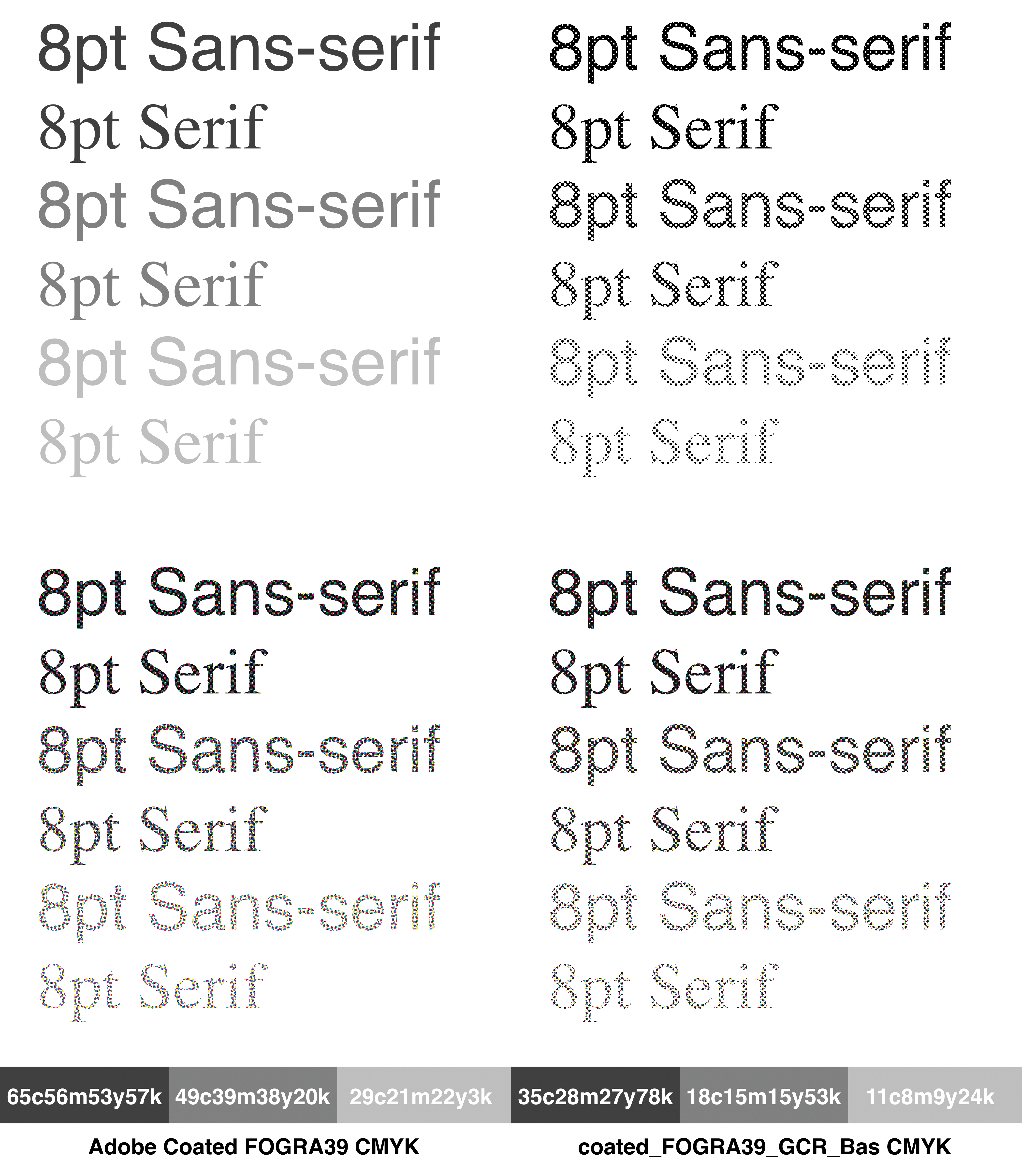
Here SWOP Coated with the 4-color mix on the left and 72%K on the right—the appearance of the two colors is basically the same:

Copy link to clipboard
Copied
There is a difference in the look of a single plate “stipple” vs a four colour “rosette” of AM screening. This is noticeable to the human eye at standard viewing distance for offset work that is “hand held”. Text/rules and large areas of flat tone will likely be perceived differently. Somebody outside of the print game may or may not notice or be able to articulate the difference. FM screening has it’s own set of pros/cons for large flat areas vs text etc.
The following image uses simulated Photoshop halftone (round dot 150lpi @ 2400ppi) to illustrate (a RIP preview would be better, but this is all I have at hand). I have shown 8pt type in serif and sans-serif, which is obviously different to a large flat panel of colour. Click on the image to view at intended size (or download and view in Photoshop).
Copy link to clipboard
Copied
I recently had a case where the file had small type at 50% black that was sent out as PDF/X with GRACol Coated 2006 as the output intent. The printer forced a conversion to GRACol 2013, which converted the 1 color black to 4-color. The print was on register, but I saw the conversion right away because the rosettes made the text appear bolder.
Copy link to clipboard
Copied
if the goal is neutrality, why would the built CMYK mix be better than 70%K where there wouldn't be registration worries or unwanted color casts if the press is not holding to the profile's gray balance?
Rob, the OP is looking for a mix that can remain neutral and is richer than straight black.
The chances of unwanted color cast using my suggested mix [20C 15M 15Y 60K] (which has a better ratio of UC compared to black) are less likely to occur than a mis-color managed RGB gray, that once converted, is something like the following mix [55C 50M 49Y 15K]
Copy link to clipboard
Copied
I understand how CMY makes 100% K richer (blacker), but I don't get what "richer" means when the desired value is 60-70%. The 20|15|15 CMYK mix would make the 60% black have a darker value, but why not simply run a higher percentage of black by itself to get the same appearance?
Copy link to clipboard
Copied
I interpret the OP's use of "richer" as adding a little life to the starkness of gray, as opposed to just darkening.
Copy link to clipboard
Copied
So maybe the OP doesn't really want a perfect neutral? With a neutral color the H and S of the HSB is always 0, so the only number that can change is Brightness.

Copy link to clipboard
Copied
Jeffrey_Smith wrote
if the goal is neutrality, why would the built CMYK mix be better than 70%K where there wouldn't be registration worries or unwanted color casts if the press is not holding to the profile's gray balance?
Rob, the OP is looking for a mix that can remain neutral and is richer than straight black.
The chances of unwanted color cast using my suggested mix [20C 15M 15Y 60K] (which has a better ratio of UC compared to black) are less likely to occur than a mis-color managed RGB gray, that once converted, is something like the following mix [55C 50M 49Y 15K]
There's no 'rich grey'. I'd strongly advise against using that mix for 8pt text. Unless you really need the grey to be cooler or warmer, stick with a tint of black ink only for text. And for print work that can be done with spot inks (letterheads etc), pick the closest Pantone Solid.

Find more inspiration, events, and resources on the new Adobe Community
Explore Now
 AdChoices