 Adobe Community
Copy link to clipboard
Copied
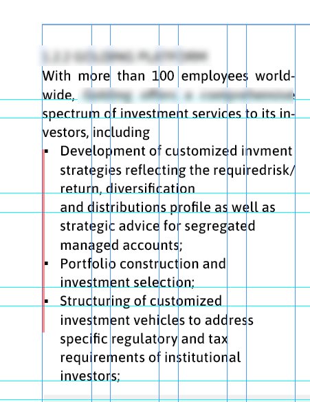
Hello is there a way to make the bullets align exactly with the left margin? at the moment there is a tiny bit of white space shown in red. The type is set in ASAP and the bullets are Arial as they have to be square bullets, its in a paragraph style that pulls in the bullet as a character style
 1 Correct answer
Hi John,
there is a way if the right typeface with the right glyph is used as bullet.
E.g. Arial, glyph from Unicode 2588, FULL BLOCK.
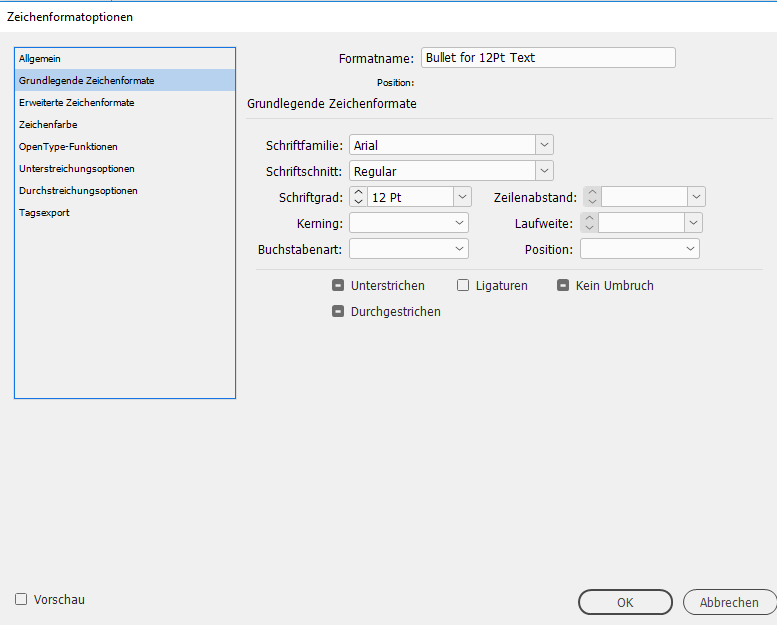
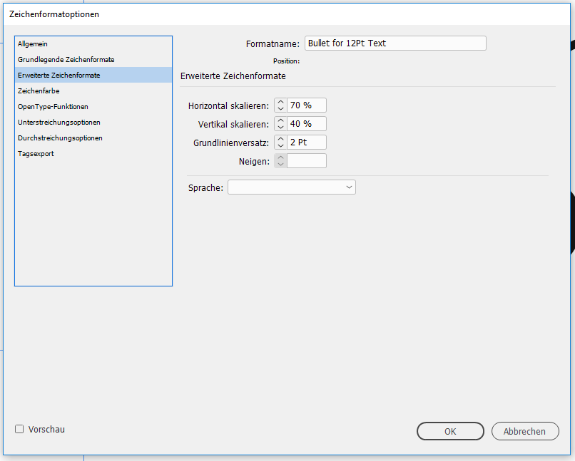
Plus a character style applied to tame it.
From my German InDesign:
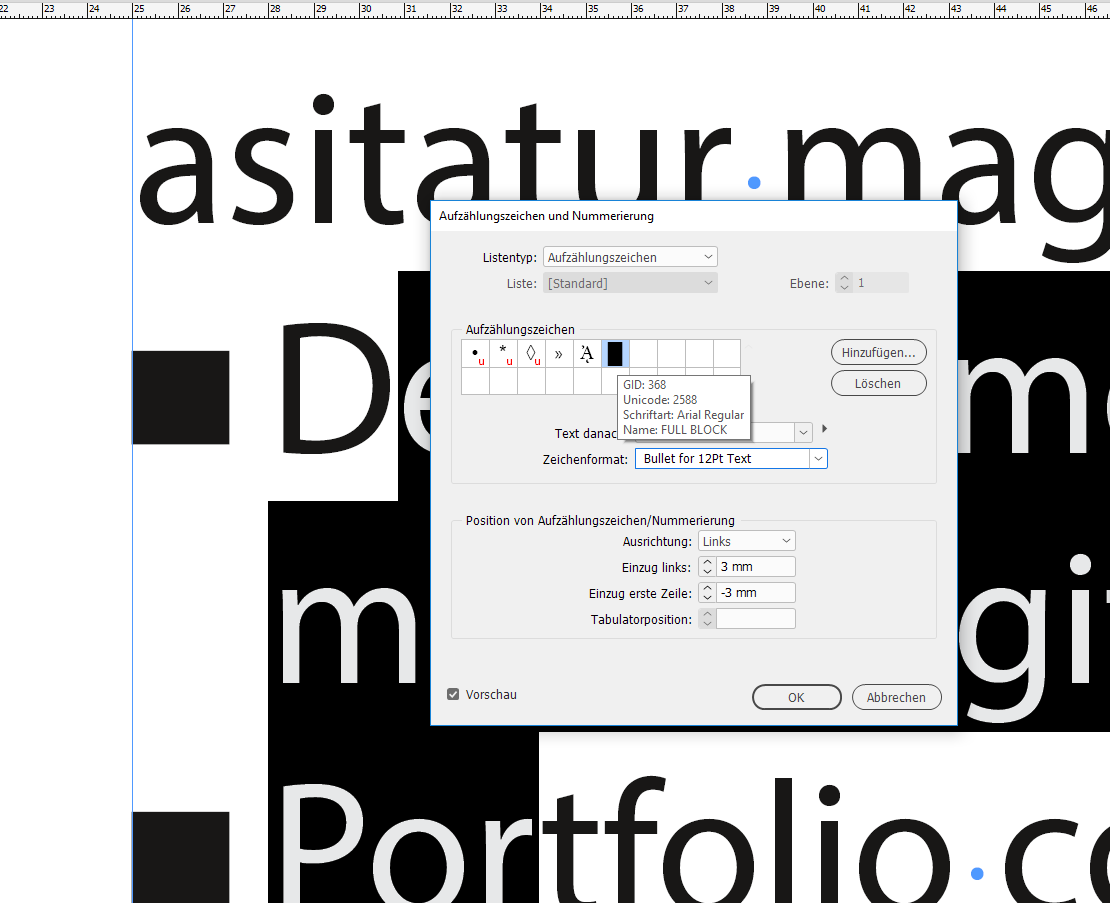
Applied character style to the bullet:
Regards,
Uwe
Copy link to clipboard
Copied
You could select the text frame and in the Story panel (Window > Type & Tables > Story), turn on Optical Margin Alignment. This aligns type to the margins optically by taking into account the relative shapes and sizes of the characters.
Copy link to clipboard
Copied
Thanks but that doesn't quite work, I'm hoping to find a way to have exact control over how close the bullets are to the margin
Copy link to clipboard
Copied
You can't. Assuming the text inset is 0, the bullet character's side bearing is already against the text frame. InDesign doesn't allow a negative text inset.
The only other option is to fake it by 'hanging' the bullets slightly; indenting non-bullet text to align and nudging the frame left to get (the visible part of) the bullets against the page margin.

Copy link to clipboard
Copied
Hi John,
there is a way if the right typeface with the right glyph is used as bullet.
E.g. Arial, glyph from Unicode 2588, FULL BLOCK.
Plus a character style applied to tame it.
From my German InDesign:

Applied character style to the bullet:


Regards,
Uwe
Copy link to clipboard
Copied
Thanks so much, that's a great solution for me and gives enough control ![]()
Copy link to clipboard
Copied
The only thing I do not like with my solution is the amount of baseline shift.
There is no way to do it independently of the point size, e.g. by applying a percentage value based on point size.
If you want a more independent solution where no baseline shift is needed you have to do your own bullet glyph with your own open type font. I suggest looking into Jongware's and Marc Autret's IndyFont script for InDesign:
Regards,
Uwe
Copy link to clipboard
Copied
Thanks for the mention ![]() But we're not that desperate yet.
But we're not that desperate yet.
Square bullets, you say? Then look no further and use a Rule Above:
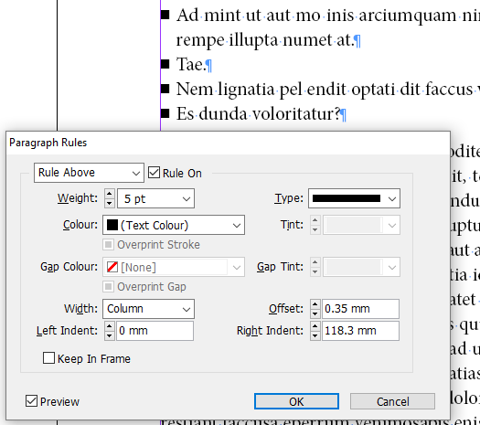
(Exact measurements as shown are only valid for the font and text size in the image. Your own values may differ. Experiment.)
But I'd rather challenge the reasoning of having those bullets line up exactly against the left margin, while the text above and below (surely) still has its proper left side bearings and does *not* line up. Some characters may even overlap it ("W", "w", "T", and "O") while others steer way clear of it ("I", for instance).
All regular characters have some built-in space to their left and right side because without it, you'd get a solid block of touching characters. The sidebearings are specifically meant to provide natural spacing, and their different values left and right are to optically compensate for, for instance, the slopes of "A" and "V" and the rounding of "o", "c", and "e".
If you convert a paragraph of text to outlines, you can vertically align the left sides of each line exactly -- but it will look stiff and unnatural.
Copy link to clipboard
Copied
Hi Jongware,
I also thought about Rule Above or something like that. Paragraph Shading perhaps.
But that does also mean a dependency I do not like: Text frame width.
Regards,
Uwe

