Copy link to clipboard
Copied
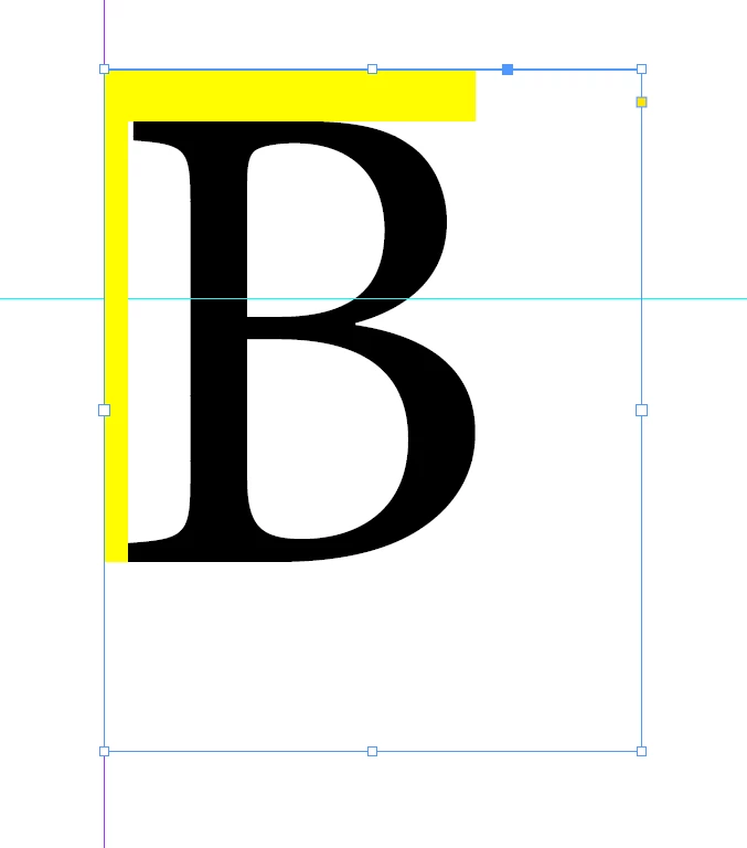
Is there an easy way to get rid of implicit text padding in text-boxes, without making the text a curve or nudging with the offset-settings?
I know that this comes from the Font itself, but it would be nice if there would be a setting to let the box look for the actual glyphs.
Copy link to clipboard
Copied
Copy link to clipboard
Copied
I dont understand your answer 😄
It is the yellow areas, the implicit padding, that I want to get rid of. And as this might later be an automatically filled in text, it would be nice if it would be on base of the real glyphs. What you mean with "You should never outline any text in InDesign" in the context of my question eludes me.
Cap heigt works with B but then not with Ä for example.