- Home
- InDesign
- Discussions
- Can the stroke of an object style be asymmetrical?
- Can the stroke of an object style be asymmetrical?
Copy link to clipboard
Copied
It is quite easy to make an object style that creates a symmetrical frame around a rectangular image. I'd like to know if it is possible to make an asymmetrical frame, i.e. the stroke is 0.5pt on the sides and bottom, but 2pt on the top.
 3 Correct answers
Hi Marie,
yes, that's possible. Hm. But with an object style? Don't think so.
As Jonathan already said, you can do this with a table cell, so it would be a table cell style.
Think about a text frame with a table that has only one single cell.
In the construction phase you have to convert the cell to a graphic cell.
Example from my German InDesign 2021 on Windows 10 below:
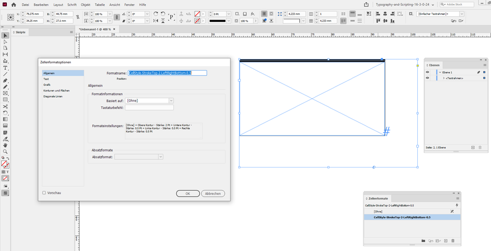
Selected is the text frame containing the table with one single graphic cell. A custom cell style is showing details on
...This is a horrible hack but there might be something in it. Despite the settings, a little fuzziness is creeping in on the sides.
Given years ago [at your own risks!]
[The anchored "blue" stroke is just for visualisation!]
For me, it's just "du bricolage" ! A small script could be relevant to finely adjust the effect gradient depending of the text frames height! 😉
(^/) The Jedi
Copy link to clipboard
Copied
you can do that in a table cell
Copy link to clipboard
Copied
Hi Marie,
yes, that's possible. Hm. But with an object style? Don't think so.
As Jonathan already said, you can do this with a table cell, so it would be a table cell style.
Think about a text frame with a table that has only one single cell.
In the construction phase you have to convert the cell to a graphic cell.
Example from my German InDesign 2021 on Windows 10 below:
Selected is the text frame containing the table with one single graphic cell. A custom cell style is showing details on stroke weights in textual form:
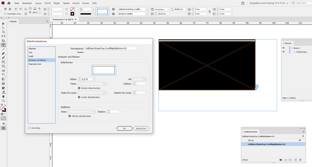
Now selected the table cell where the cell style is applied and the values for the stroke weights for left, right and bottom, the blue lines in the widget for cell strokes are the activated strokes:
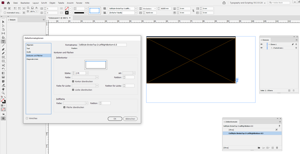
The stroke weight for top:
Regards,
Uwe Laubender
( ACP )
Copy link to clipboard
Copied
This is a horrible hack but there might be something in it. Despite the settings, a little fuzziness is creeping in on the sides.
Copy link to clipboard
Copied
Given years ago [at your own risks!]
[The anchored "blue" stroke is just for visualisation!]
For me, it's just "du bricolage" ! A small script could be relevant to finely adjust the effect gradient depending of the text frames height! 😉
(^/) The Jedi
Copy link to clipboard
Copied
Another cool ways: add by script a para rule above or a top paragraph border, or (allowing more effects) add an anchored stroke!
The user will just need "1 click" for that!!
(^/)


