Known Participant
September 7, 2018
Answered

Colors from Color Picker Appear Duller

  • September 7, 2018
  • 1 reply
  • 1185 views

Hey guys,

I've suddenly got a problem with Indesign all my Adobe applications.

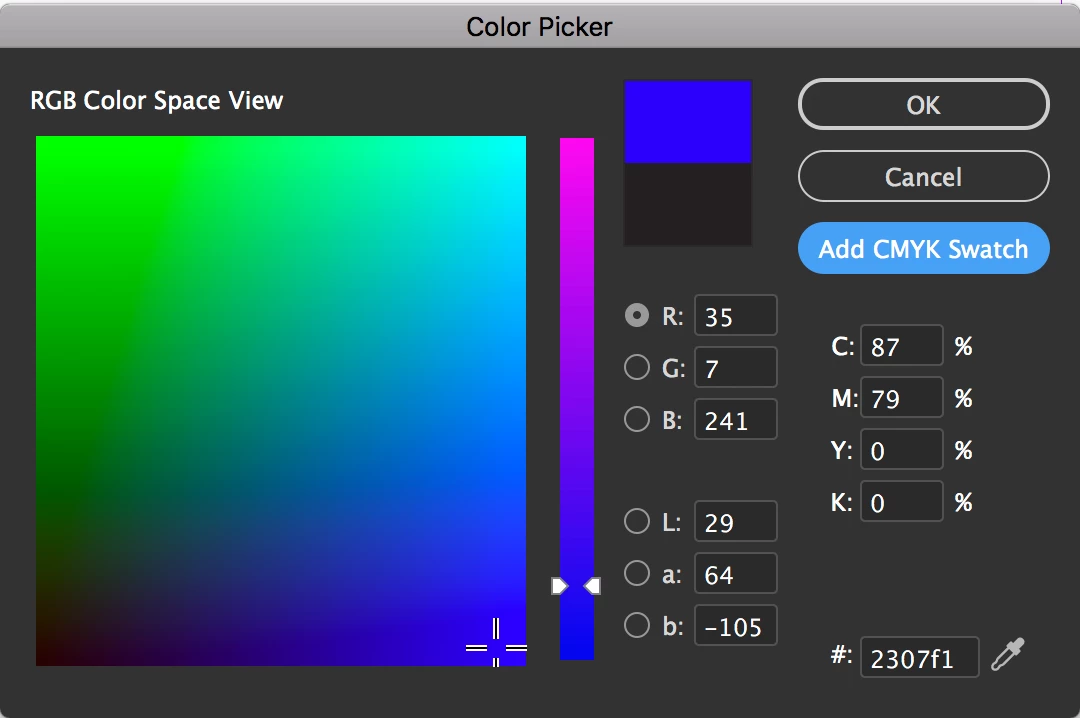
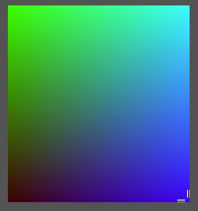
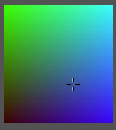
Whenever I select a color in the color picker, it switches to a 'greyer' version of that color after pressing ok.

Pure white and black work fine, but it does this for every other pure color.

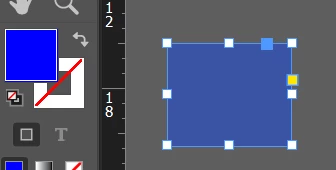
When selecting a shape I applied the color to, the color selector in the toolbar does show the original / pure color. When deseleting the shape it shows the greyed one.

Any idea how to solve this?

It worked perfect untill yesterday and my laptop is as good as they get. No problems with my screen or anything like that. I checked other other applications like video's and even MS paint, those display colors fine. Also tried restarting Indesign and making new documents. I have absolutely no clue what else I can do to fix this.

Thanks in advance!

This topic has been closed for replies.
Correct answer Jeff Witchel, ACI

It looks like you picking an RGB color and adding that color as a CMYK Swatch. (See screenshot below.)

In InDesign if you're working in CMYK, the added Swatch will be CMYK and may look entirely different. (The CMYK spectrum is a lot smaller than RGB.) Those bright "pure" colors don't exist in CMYK.

If you want that bright blue, you have to work in RGB. If you want to set up CMYK colors as Swatches more accurately, use the color panel or Pantone Colors from a CMYK library.

1 reply

Jeff Witchel, ACI
Community Expert
Jeff Witchel, ACICommunity ExpertCorrect answer
Community Expert
September 7, 2018

It looks like you picking an RGB color and adding that color as a CMYK Swatch. (See screenshot below.)

In InDesign if you're working in CMYK, the added Swatch will be CMYK and may look entirely different. (The CMYK spectrum is a lot smaller than RGB.) Those bright "pure" colors don't exist in CMYK.

If you want that bright blue, you have to work in RGB. If you want to set up CMYK colors as Swatches more accurately, use the color panel or Pantone Colors from a CMYK library.

Bill Silbert
Community Expert
Community Expert
September 7, 2018

The only thing to keep in mind in following Jeff's advice is that if you are creating a print job it will ultimately be printed using CMYK which, as you say, will be somewhat duller than RGB. If you're doing a digital project (for web or mobile devices, etc.) then you should use RGB.