- Home
- InDesign
- Discussions
- Betreff: create register (anchored) objects
- Betreff: create register (anchored) objects
Copy link to clipboard
Copied
Hello.
My isssue:
I have a register as a plain text like:
A
Item ....... page x
Item ........ page x
B
Item. ........ page x
Item ..........page x
... and so on. Now I want to put the capital letters in an array, create small text frames with each letter as content, apply an object style, and place these text frames as anchored objects in the same place that that letter was. The last thing to do is to delete the source character.
    function regFormat(){
        app.findGrepPreferences = null;
        app.findGrepPreferences.properties = {findWhat: "^\\u~b",}

        texts = myDoc.findGrep();
        n = texts.length;
        app.changeGrepPreferences.changeTo = "";
        myText.changeGrep();
        app.findGrepPreferences = app.changeGrepPreferences = null;
        app.findGrepPreferences = NothingEnum.nothing;
        app.changeGrepPreferences = NothingEnum.nothing;

        for (var i=0; i<n; i++) {

            var y = texts[i].contents.toString();
            buchstabenMitKomma.push(y);
            }

        regBuchstaben = buchstabenMitKomma.toString().replace( /[\r\n,]+/gm, "" );

        for (var e=0; e<regBuchstaben.length; e++) {

            var x = myFrame.insertionPoints.lastItem().textFrames.add({geometricBounds: [0, 0, 5, 5]});

            x.contents = regBuchstaben[e];
            x.appliedObjectStyle = osRegister ;

            }

     }
Nearly everything is fine, except the insrting place of each rectangle. There are all one behind the other at the end of the document. How can I controll the insertion point? Can I save something like the position of those capital letters??
 2 Correct answers
That's true, it shouldn't. To get those shades the same size you can split the section-head paragraph into two columns, and use the inside gutter to set the width of the shade:
There's no need to script it: you set up the column-splitting in the paragraph style used for the section letters.
> But could you please take a look at the script I posted. I think there is not to much more to do. Only the insertion points are missing.
You shouldn't script this particular feature, but for future reference: the boxes appear at the end of the index because you place them there, at insertionPoints.lastItem()
You complicate things unnecessarily. Here's a reworked version that
...Copy link to clipboard
Copied
Hi cmoke73,
please provide a sample document and another one with one expected result.
That should be doable a bit easier.
What's your InDesign version?
Regards,
Uwe Laubender
( ACP )
Copy link to clipboard
Copied
I'm sorry for being late.
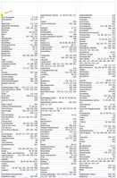
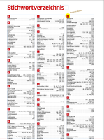
There are two screenshots, before and after. I think it has to be an anchored object as the "character boxes" are the same size.
Copy link to clipboard
Copied
You don't have to put the section letters in anchored boxes: you can use paragraph shading. Much simpler.
Copy link to clipboard
Copied
I would opt for paragraph shading here too, although if you update the TOC/index often I imagine you will have to replace each of the main letters each time. Maybe something to add at the end once the hordes of amends have been tackled.
Copy link to clipboard
Copied
Not at all: the paragraph style for the section letters is set in the Index Generations window. Every time the index is generated the style is applied automatically.
Copy link to clipboard
Copied
However, if you use paragraph shading, anchored as a paragraph style, e.g. with an "I" and a "W", the width is different. That should not happen.
Copy link to clipboard
Copied
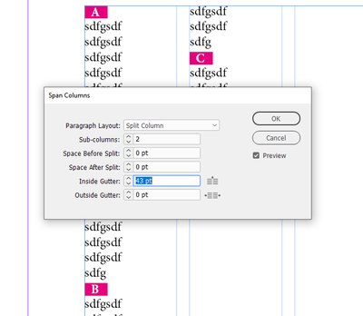
That's true, it shouldn't. To get those shades the same size you can split the section-head paragraph into two columns, and use the inside gutter to set the width of the shade:
Copy link to clipboard
Copied
Okay, thank you Peter. It's a different way to get the result I need. I will think about how to script it.
But could you please take a look at the script I posted. I think there is not to much more to do. Only the insertion points are missing.
Copy link to clipboard
Copied
There's no need to script it: you set up the column-splitting in the paragraph style used for the section letters.
> But could you please take a look at the script I posted. I think there is not to much more to do. Only the insertion points are missing.
You shouldn't script this particular feature, but for future reference: the boxes appear at the end of the index because you place them there, at insertionPoints.lastItem()
You complicate things unnecessarily. Here's a reworked version that places the section letters in anchored frames and deletes the original letters:
function regFormat(){
  app.findGrepPreferences = null;
  // Use $ as the end delimiter so you needn't worry about the return
  app.findGrepPreferences.findWhat = "^\\u$";
  var texts = myDoc.findGrep();
  for (var i = texts.length-1; i >= 0; i--) {
    // Insert a frame before the letter
    texts[i].insertionPoints[0].textFrames.add ({
      geometricBounds: [0, 0, 5, 5],
      contents: texts[i].contents,
      appliedObjectStyle: osRegister,
    });
    texts[i].contents = '';  // Then delete the letter
  }
}
I probably didn't understand where the commas come into play, but that's a non-issue because you don't need the script. This script I posted is simply to illustrate how you could achieve what you want if you had to script it.
P.
Copy link to clipboard
Copied
(Refering to my post below) ... on the other hand, if you try the other solution (split column) the minimum width you can achieve is to wide for my needs. Can´t set an internal offset. If you try, it'll blow the whole line. You also can´t cut to content, because there are three columns and it works only at the margin of the text frame.
text frame width: 175
columns: 3
column-space: 5 mm ==> column width: 55 mm
red register letter: 5 x 5 mm
Did I miss a hint?
Copy link to clipboard
Copied
I can set the columns as narrow as the 'I' by increasing the inside gutter or the number of sub-columns (or both).
Not sure what you mean by 'internal offset'. You simply centre the section letter's paragraph.
Copy link to clipboard
Copied
Dazu brauchst Du in InDesign gar keinen eigenen Textrahmen. Du kannst für die Überschriftbuchstaben einfach ein Absatzformat kreieren.
- Neues Absatzformat, unter automatische Nummerierung keine, aber ein Absatzzeichen ^t und einen zentrierten Tabulator setzen, damit alle Buchstaben dann zentriert mittig sind.
- Mittels Absatzschattierung die rote Fläche dahinter schaffen.
- Anwenden
Copy link to clipboard
Copied
Peter Kahrel said:
"To get those shades the same size you can split the section-head paragraph into two columns, and use the inside gutter to set the width of the shade:"
FWIW: The same width could also be done with a paragraph border where only the left value of the border is set.
No split column paragraph necessary. The width and position of the left border is the width and position of the "shading".
On the other hand, Peter is spot on here to use paragraph shading plus a split column paragraph with a large value for the inside gutter. That allows for a center aligned character in the underlying shading with the same width. However, this construction is directly tied to the width of the text frame or individual column of the text frame. The width of the shading will change if the width of the text frame will change ( or the width of the individual column in the text frame ).
Regards,
Uwe Laubender
( ACP )
Copy link to clipboard
Copied
That's right, Uwe. With a paragraph border you don't need to split the column, but you won't be able to centre the letter (forgot to mention that earlier).
> However, this construction is directly tied to the width of the text frame or individual column of the text frame.
Well, everything you set in paragraph styles is tied to a particular document set-up. This one with a split column is no exception.
P.
Copy link to clipboard
Copied
Hi Uwe.
The beginning is pretty promising 🙂
But...:
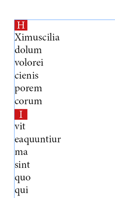
... as U can see, only at the left there is same distance. It might causes a problem with letters of different width.
Copy link to clipboard
Copied
Set the paragraph style to centre.
Copy link to clipboard
Copied
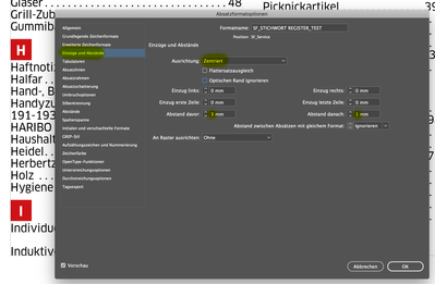
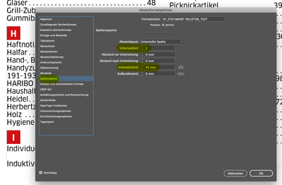
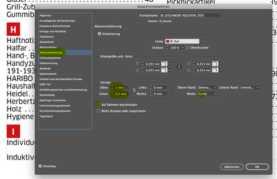
Okay, I think I´ve got it now. It was a wrong combination of settings in the paragraph style.
Here the most important features:
Copy link to clipboard
Copied
Hi cmoke73,
post a sample InDesign document.
I'll look into it and will immediately see what's wrong.
Peter's suggestion is working very well!
Regards,
Uwe Laubender
( ACP )
Copy link to clipboard
Copied
Thank all of you. Sometimes the best way is a more simple way. I was lost in the thought, scripting is the solution for most of the problems
🙂
Regards

