- Home
- InDesign
- Discussions
- Create tables with spaces between cells (ie cellsp...
- Create tables with spaces between cells (ie cellsp...
Copy link to clipboard
Copied
Hi.
One image is better than 100 words, so here is one. 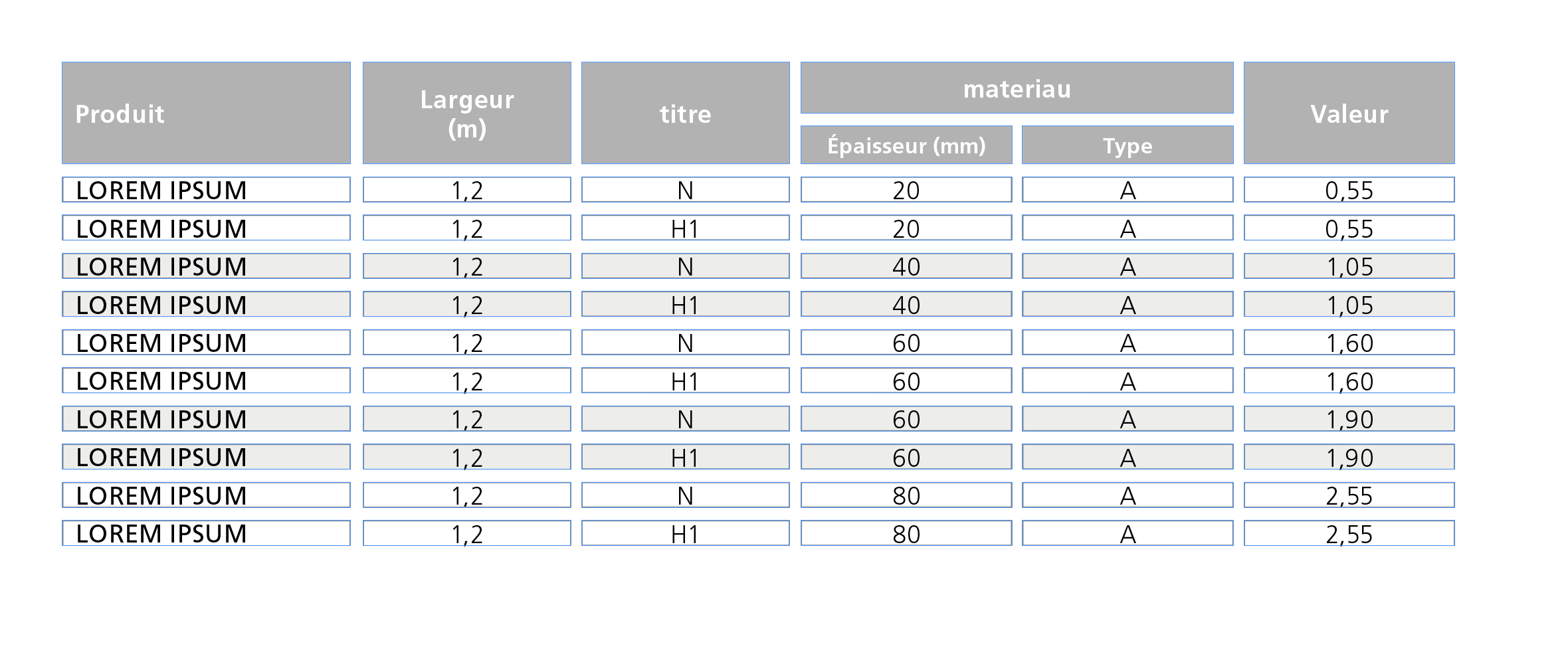
Untill now, this kind of table is done by grouping Text-blocks.
Do you know if ther is a way to get the same result using tables only using regular options or any plugin ?
Thanks in advance.
 1 Correct answer
Hi Aman,
at first glance the task seems to be an easy one. But it isn't.
What you are showing is not exactly what the OP—bernard—likes to accomplish.
In his sample there is no stroke around the table.
The gray header cells are showing no black strokes.
Just the fills.
It could be done using empty columns and empty rows.
But I assume this trick is not allowed.
Maybe something can be done by text formatting using a combination of paragraph shading, graphic lines above and below?
But that wouldn't be very f
Copy link to clipboard
Copied
Well, no. This green frame is just here to test the transparency of the table.
Most of the backgrounds will be pale grey images, or simple white.
Copy link to clipboard
Copied
bernardc8812564 wrote
The only problem is that, with the amount of text in each cell (and their height), every setting has to be different from a table to another …
Hm…
With solution #1 do you mean empty columns and rows?
I would avoid that if possible.
Regards,
Uwe
Copy link to clipboard
Copied
Hi!
As all seems to have already been written and to sustain a previous comment, I've really no scruple to report this video without further comment! Just for pleasure! ![]()
(^/)
Copy link to clipboard
Copied
I don't find this video that useful Obi as I can't see how it is constructed within table or paragraph styles or whatever... sorry ![]()
Copy link to clipboard
Copied
https://forums.adobe.com/people/Eternal+Warrior wrote
I don't find this video that useful Obi as I can't see how it is constructed within table or paragraph styles or whatever... sorry
Hi EW,
Obi-wan posted that in the middle of the night in his time zone around 3 AM.
I guess we'll see some comments soon.
Regards,
Uwe
Copy link to clipboard
Copied
Thanks Uwe 🙂
Copy link to clipboard
Copied
As my Master Yoda always said:
"Young padawan, too impatient you are!
The Strength, your alley is and always will be! …"
"Keep cool!, bro!"!*
Uwe is right! It was (zone) time to sleep!!
EW, Not important you don't find this video useful! I've not posted it in this way!
I've just indicated that it can be done, that it can be done by script and that it can be done in one click*!
"Nuance !" [in French]
If I can't give you the script code**, I can tell you what it does! ![]()
As I showed in my post#12, I used the same way as Uwe explained in his post#14 to make the stroke "invisible" [I love this feature from the Dark Side!!]
That means no effect! Just overprint!
The last issue for the op was the "supplementary stroke" around the cell!
How I do it [personal approach]?
"In a fight, what is important is to know his enemy!" [Sun Tzu, The Art of War, Vth century BC] ![]()
Our enemy is a "table"! … So a layout structure whose main specificity is a "cells" assembly!
Each cell has properties, especially: Width & Height! ![]()
So, the idea is simple: As the script treats each cell, It "extracts" each cell characteristics and converts them:
• Cell color background --> "diagonalLineStrokeColor"
• Cell color background transparency --> "diagonalLineStrokeOverprint"
…
• Cell "width"
• Cell "height"
Trick: Looping each cell, the script extracts its width/height and inserts at its para beginning an anchored rectangle [with a stroke whose color = Cell color background] whose width/height equals to them!
To "decide" if the script has to play for "headers", it will use a condition as: If the cell is an "header", don't add a rectangle! ![]()
To finish, the script plays this music "in batch"! … So, my client, who has several hundred of tables to be treated, can now do it … in 1 click!
Time is Money! … even if happiness has no price! ![]()
If the layout moves, just play the entire script again or its light version about anchoring!
(^/)
[ * Personal comment! ** The script use, not the script itself, has been sold [if somebody interested, PM me!] ]
Copy link to clipboard
Copied
Thanks to all for your interest and answers.
I tried to play with stroke styles, in addition to solution #1 but the result is not perfect.
As you can see, inside space is different for some cells.

Obi-wan Kenobi : your scripts seems tobe the best solution in my case. Is it available ?
I really don't understand why this "cellspacing" option is not implemented in Indesign. It's a lack.
Copy link to clipboard
Copied
Hi Bernard,
what solution do you prefer now?
As it seems to me, you have two options without scripting:
1. Using empty rows and columns to distant the cells with contents from each other.
2. Using my experimental table approach.
Both options come with some rules and some drawbacks.
Obi-wan's solution with scripting:
1. Includes the border around cells with anchoring graphic frames in the cells.
2. A slightly different scripting version where the frames for the cell borders are not anchored to the cells, but stacked above the text frame holding the table. Preferably with a different layer that could be made invisible or locked. Why that version? Because if you anchor frames in cells, editing the text in the cells after running the script could get a bit difficult. You have to use the Story Editor window for that.
Regards,
Uwe
Copy link to clipboard
Copied
Uwe,
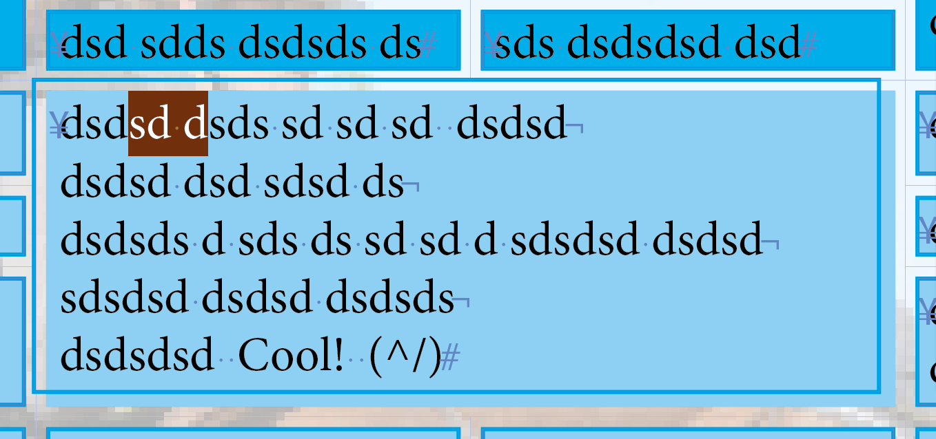
As shown at the end of the video, my use of anchored rectangles to define the supplementary stroke seems to be really relevant!
As the rectangle has no background, when you place the cursor in the cell text, it's directly placed into it! … as there's no anchored frame! Cool! ![]()
(^/)
Copy link to clipboard
Copied
Hi Obi-wan,
nice video.
But do you have a solution showing a table where:
1. The cells are distanced from each other with a visible gap without a colored stroke.
2. Have a black border around the "inner area" of the cell.
3. Have some cells' background fully transparent
4. Have some cells' background opaque
I'm up to something also with using effects but currently struggling with the bottom stroke.
Top, left and right are ok. The problem is the bottom stroke. I am able to define one but that comes with some problems.
Went back to this post by you:
Re: transparent gradient in table cell
I'm working with the effect "Differenz" in my German version.
Is that "Difference" in English?
Here a screenshot:
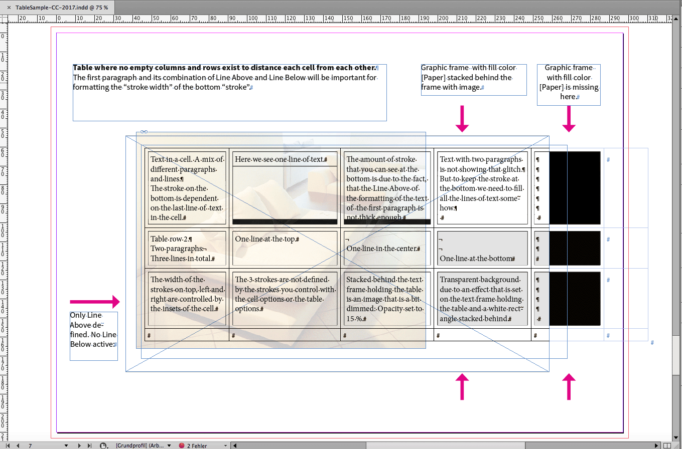
The sample above would comply with items 1 to 3 of my list above.
It will not comply to item 4, because the gray filled cells are semi-transparent.
They have to be, because the used effect is effecting the whole text frame.
Here a view that is showing this where I did not implemented the stroke at the bottom yet:
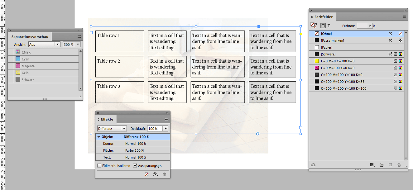
Since I am using "Differenz" (Difference) for the effect, the used color values for the borders, the text, the Diagonal Lines and a Line Above together with a Line Below look a bit strange, but in effect will guarantee a perfect separation for CMYK printing if one rule is respected: You need a rectangle in the background with a [Paper] fill so that the effect could work against a background.
Here the separation view where Black is not showing. The area where no white background is there—just the page, and that will not count as background—is showing the cells background partly as CMY 300%.
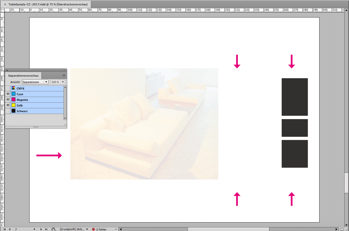
Back to the problem with the stroke at the bottom. In my solution to make it work the stroke is influenced by text formatting.
And that unfortunately means that I need to fill up the cell with text to get it to the right position or leaving no gap in Black at the bottom.
You can see this in my first screenshot here with row two where I filled in some lines using paragraph signs and hard returns for text line endings.
Something on the use of colors in that experimental table:
1. I am using "Difference" as effect on the text frame holding the table.
2. That means, that every color used for formatting inside of the table has to be the opposite what it is usually like.
If you want e.g. a red/orange formatted word in the text with say 70 m 100 y use a color definition like: 100c 30m 0y 100k.
Just the opposite you like to do normally. But be aware of the background. If it is a color like 100 y the background yellow will knock out the text color so the red/orange will become pure 70 Magenta.
Why using this effect "Difference" at all?
I wanted to find a way to get the strokes around the area with Diagonal Lines and a huge Line Above that is knocking out the stroke in the inner area if the cell should look fully transparent.
The trade-offs are as described:
1. Color interaction with the background.
2. Opposite color values should be used in the table.
3. Semi-transparent fills only.
4. Works best on white background.
But as you can see, black text on a discolored background could work well.
Also a little trade-off here: If the discolored background is using say 3% Black in its separation, the text will get a 97% Black in effect plus the other colors with the background. In my case this could result in text color of a mix of 3c 10m 10y 97k. If one is using an image purely of CMY color and no K, the 100% K effectively of the text can be maintained.
Regards,
Uwe
Copy link to clipboard
Copied
Hi Bernhard,
we can acchieve it, if:
1. White strokes are allowed.
2. The strokes of the cells are done with:
A. Paragraph shading of the text
B. A line above with a proper position and width
I am also use a nearly undiscoverable feature of cell strokes that is only available in one menu where you can set the strokes of the cells to stroke style "None".
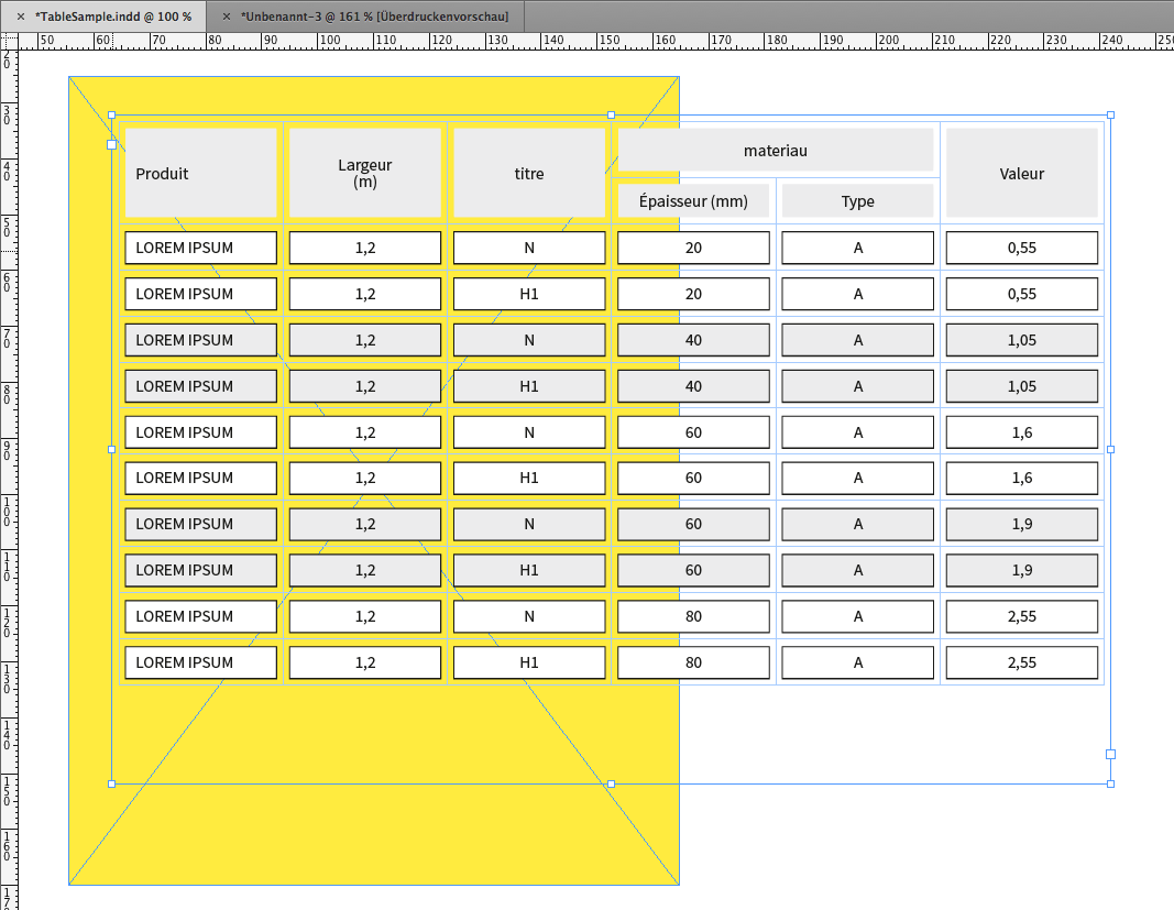
Using stroke style "None" for the cell's stroke is shown here with my German InDesign. This option can only be found in the "Cell Options" menu. Nowhere else! The stroke width with my sample is 7pt.
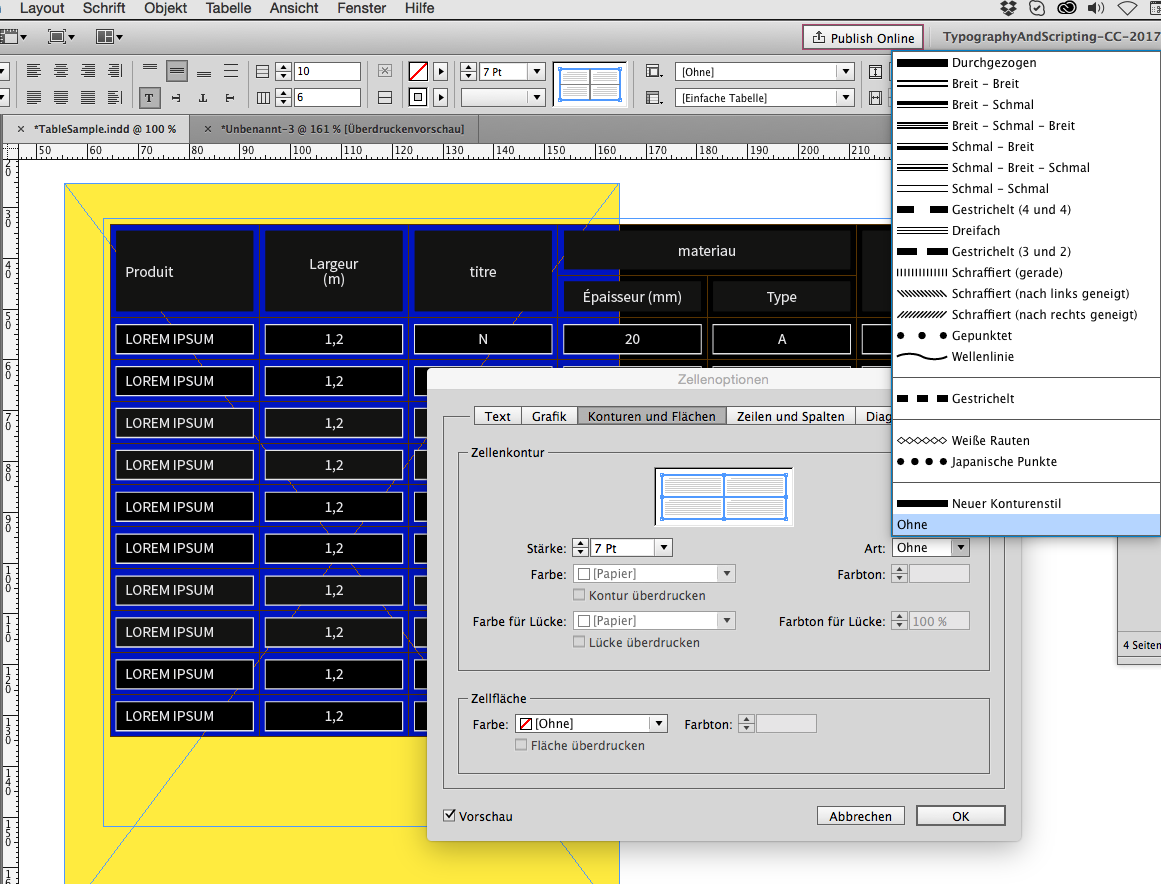
For the fill of the header rows I used another cell decoration feature. Not the usual fill, but "Diagonal Lines" with a large value for the point size that also comes with "Cell Options":
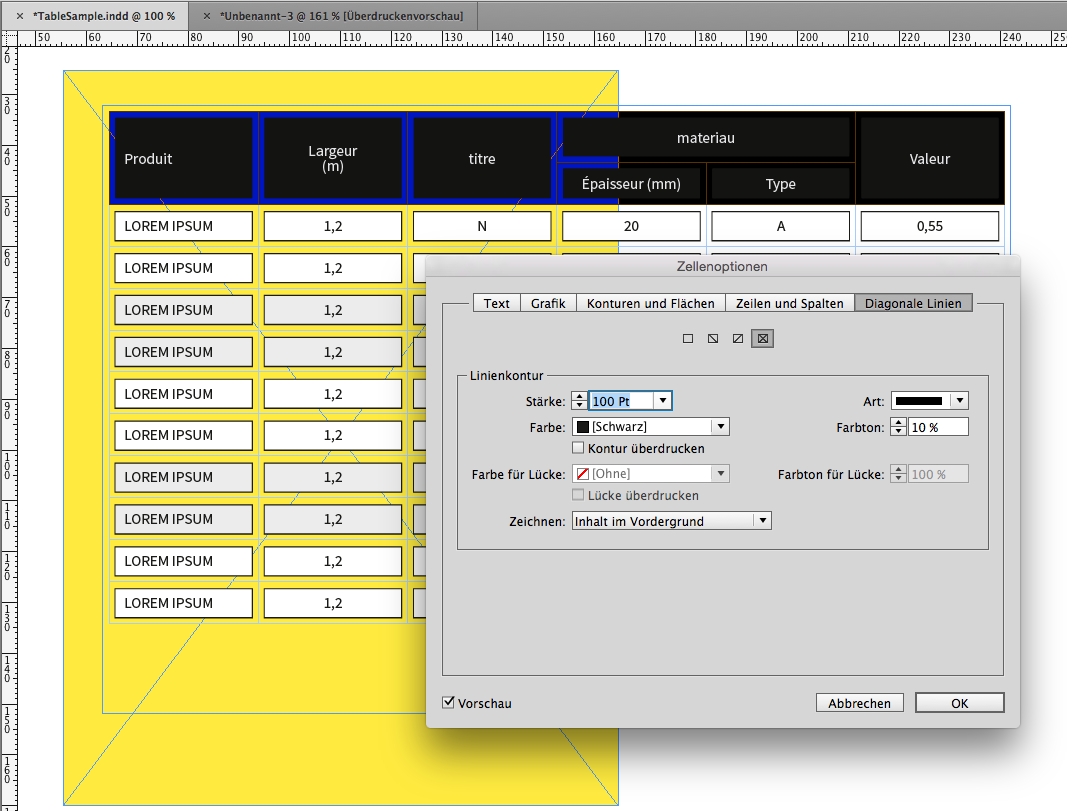
Perhaps we can also use "Diagonal Lines" with the body cells plus Line Above for text formatting.
But we also can use a combination of paragraph shading and Line Above for formatting the text of the body cells so that a "line around a fill" can be seen. Unfortunately paragraph shading was not developed further for a fill plus a line around a paragraph.
Paragraph shading settings for text formatting:
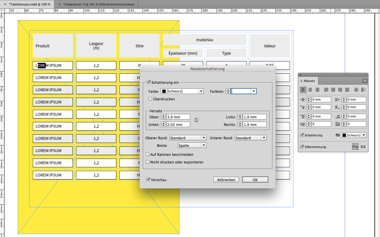
Line Above setting for text formatting case 1:
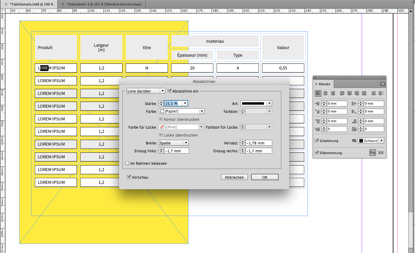
Line Above setting for text formatting case 2:
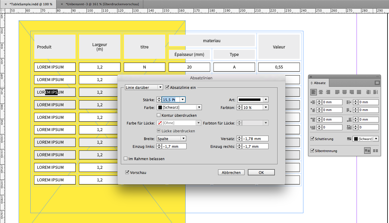
To Obi-wan:
No, I did not forget about this sample you are showing 🙂
Regards,
Uwe
Copy link to clipboard
Copied
This is really useful knowledge Uwe!
I never knew (or perhaps never looked) at the fact there was a stroke style "none" - In my head i was looking at how to change the stroke colour to none.
So now I have advanced my knowledge!
This is the best thing about trying to help people - when it also helps you... Haha!
![]()
Copy link to clipboard
Copied
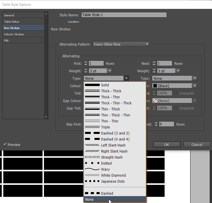
FWIW: You can also choose the stroke option none in table styles... Meaning that solution 1 will work regardless of background....
Copy link to clipboard
Copied
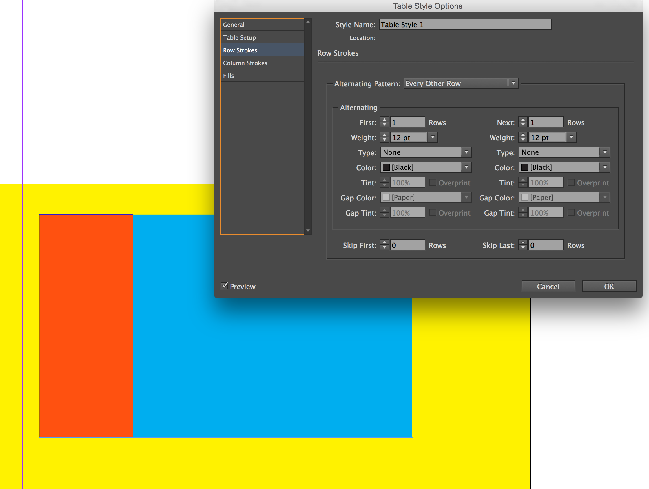
I've been watching this thread, and I think I am missing something crucial in this setup.
When I try setting the stroke style to None, all I get is no stroke at all.
Using InDesign CC 2017.0
Copy link to clipboard
Copied
Have to say... after my excitement of finding Uwe's "None" Stroke I never actually tested it...
My table styles background was possibly a little misleading.
Will have to rely on Uwe or Obi to explain what I have missed...
Best,
EW
Copy link to clipboard
Copied
SJRiegel wrote
I've been watching this thread, and I think I am missing something crucial in this setup.
When I try setting the stroke style to None, all I get is no stroke at all.
Using InDesign CC 2017.0
Hm.
Don't think, that you are missing something.
Why do you believe, that it did not work?
Because you are seeing no gaps with the fills?
The "normal" cell fills will not show any gaps.
You have to use "Diagonal Lines" to fill the cells:
With a high value for stroke style. 100 pt perhaps.
Regards,
Uwe
Copy link to clipboard
Copied
Hm.
Don't think, that you are missing something.
Why do you believe, that it did not work?
Because you are seeing no gaps with the fills?
The "normal" cell fills will not show any gaps.
You have to use "Diagonal Lines" to fill the cells:
With a high value for stroke style. 100 pt perhaps.Regards,
Uwe
That is what I was missing -- using diagonal lines for fills t
hanks
Copy link to clipboard
Copied
Thanks to all, and especially thanks to you Laubender...
I'm quite advanced user of Indesign (WELL, I THOUGHT), but I totally ignored that "non-stroke" and "big-cross" tips with tables.
This is a bit tricky, but does the job. Many thanks for that
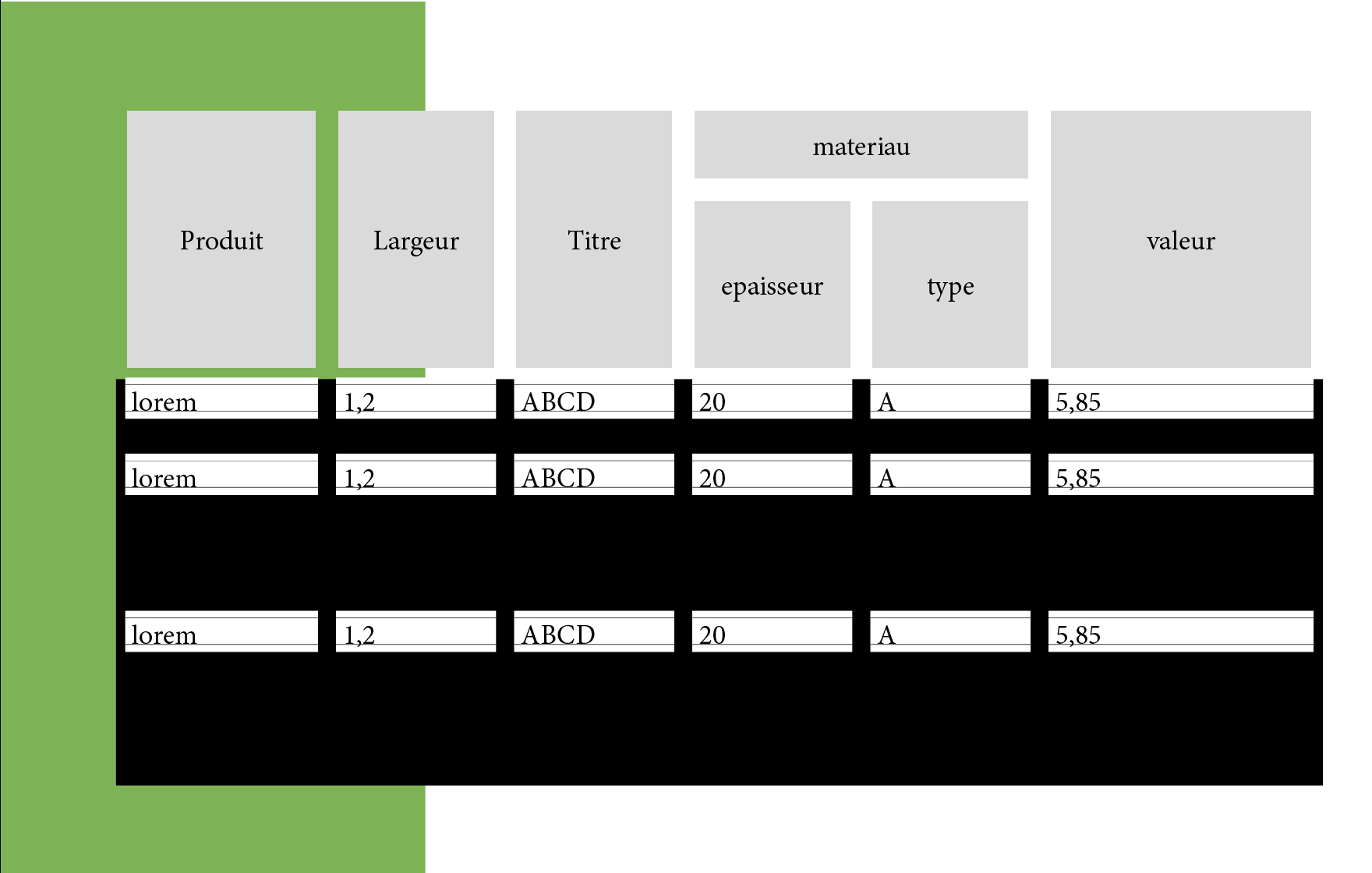
The only thing I can't figure is the way you achieve the stroked cells with color background.
Here is the result I get.
Copy link to clipboard
Copied
Uwe (and to all),
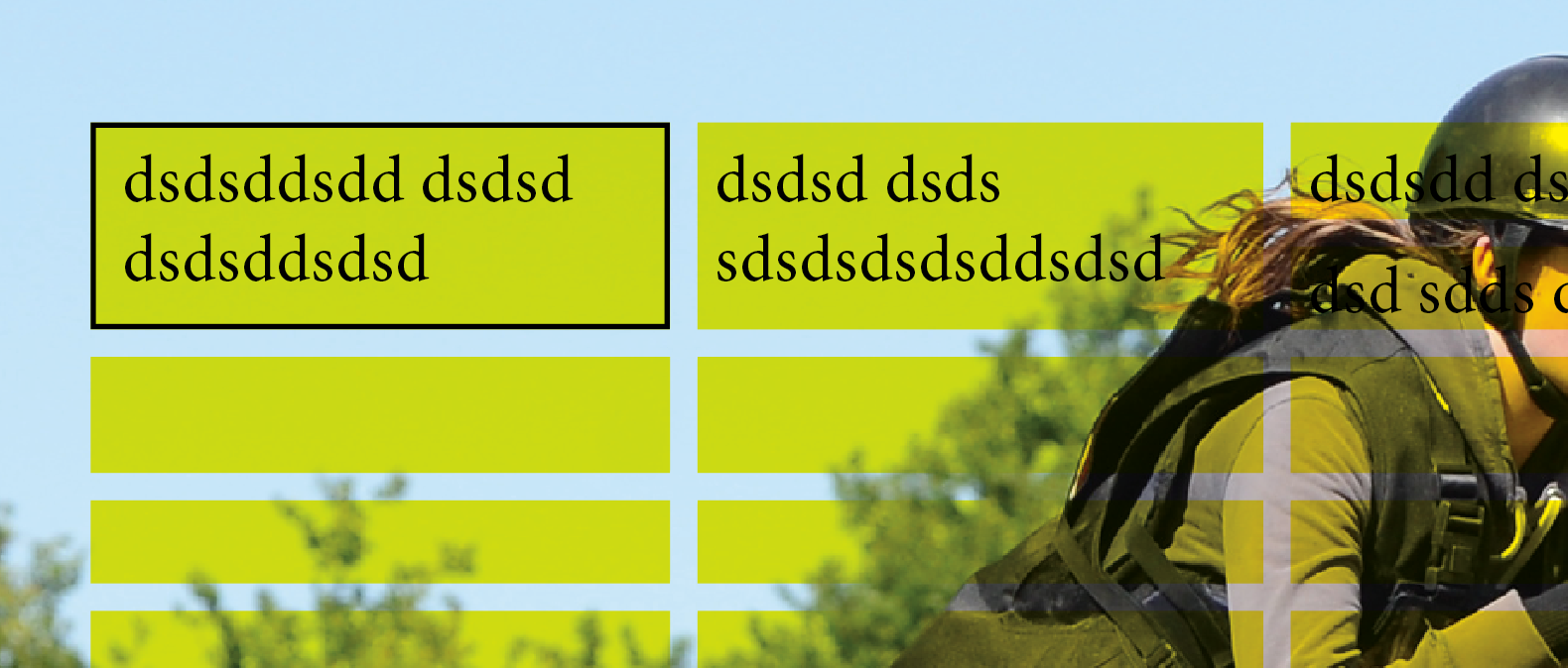
I think the deal could be done in 1 click [and in batch on all tables with a specific style!] with a script that could be "easily" written!
Hope I find time for that! ![]()
(^/)
Copy link to clipboard
Copied
Great Hint. Thank You all especially Laubender
Copy link to clipboard
Copied
I think I found an easy workaround for this. The answer is creating paragraph styles. After you create your table, make sure, within the table, you don't have any cell fills or strokes. Create paragraph styles with borders or shading and tweak the offset space, indents, etc. and natural space is left within the cells. It eliminates the need for extra columns or rows and other fiddly things.
These examples just show some of the ways you can add styles. Hope this helps!
Copy link to clipboard
Copied
Maybe something can be done by text formatting using a combination of paragraph shading, graphic lines above and below?
Maybe. Probably.
I don't have a current subscription to ID so cannot try (CS6 doesn't have shading). The below was done in QXP using shading and tabbed text. Now that the styles are set up, a table could be copied to a decent text editor and manipulated using Regex, then brought in as a tagged text snippet.
(oops, forgot to edit the text styles to make 'em white...)
-
- 1
- 2
Find more inspiration, events, and resources on the new Adobe Community
Explore Now

