- Home
- InDesign
- Discussions
- Re: Is it possible to create evenly distributed di...
- Re: Is it possible to create evenly distributed di...
Creating evenly distributed diagonal lines InDesign
Copy link to clipboard
Copied
Hello! I am trying to create pages with evenly distributed diagonal lines with InDesign. I have googled and looked on so many websites and forums, and all I can seem to find is tutorials on how to do this with Illustrator and Photoshop. I have access to both of these, but I don't know enough about either to know how I could create it there and import to InDesign. I feel like there should be a way, using the line tool, but I've been working with it for about two hours and still can't get the lines evenly distributed across my spread. Any input would be greatly appreciated!
Copy link to clipboard
Copied
Hi,
I know one way which can make you accomplish this in InDesign(dont know much about Photoshop and Illustrator).
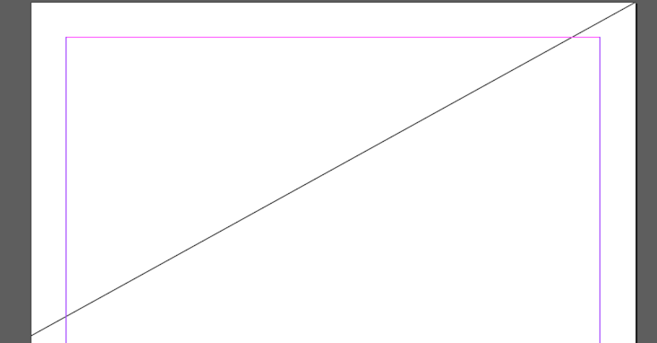
1. Create your first line using the line tool such that it is of desired angle
2. Open the "Move" panel (Ctrl+shift+4 on Win) and then enter the desired vertical distance you want between your lines
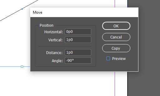
3. Click the Copy option in the Move panel to get another diagonal line parallel to first one

4. Select the second line just created and press "ctrl+alt+4" (object->transform->transform sequence again) to get the pattern
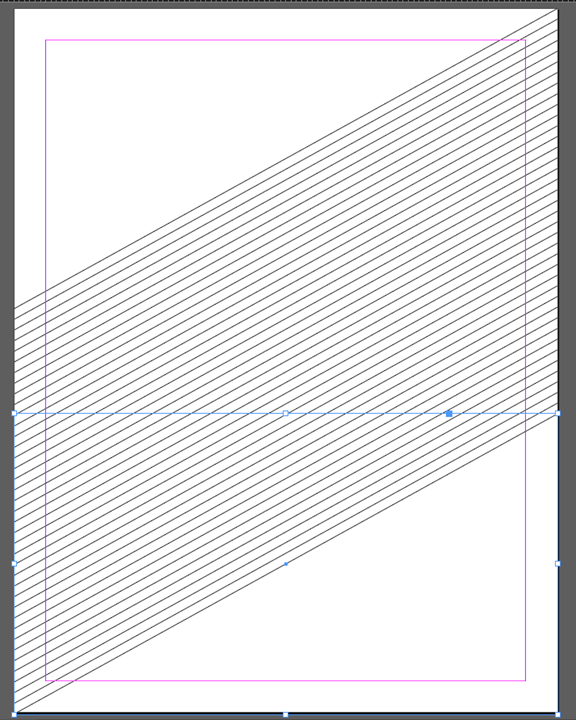
Let me know if this is what you want. I am sure there can be more and better ways.
-Aman
Copy link to clipboard
Copied
Thank you! I will definitely give this a shot! ![]()
Copy link to clipboard
Copied
I'm stuck at opening the move panel. I tried CTRL+Shift+4 and it didn't work? I've looked for it and cannot find it.
Copy link to clipboard
Copied
Object > Transform > Move when an object is selected. (You can also double-click the Selection [black arrow] tool.)
Copy link to clipboard
Copied
Thank you! ![]()
Copy link to clipboard
Copied
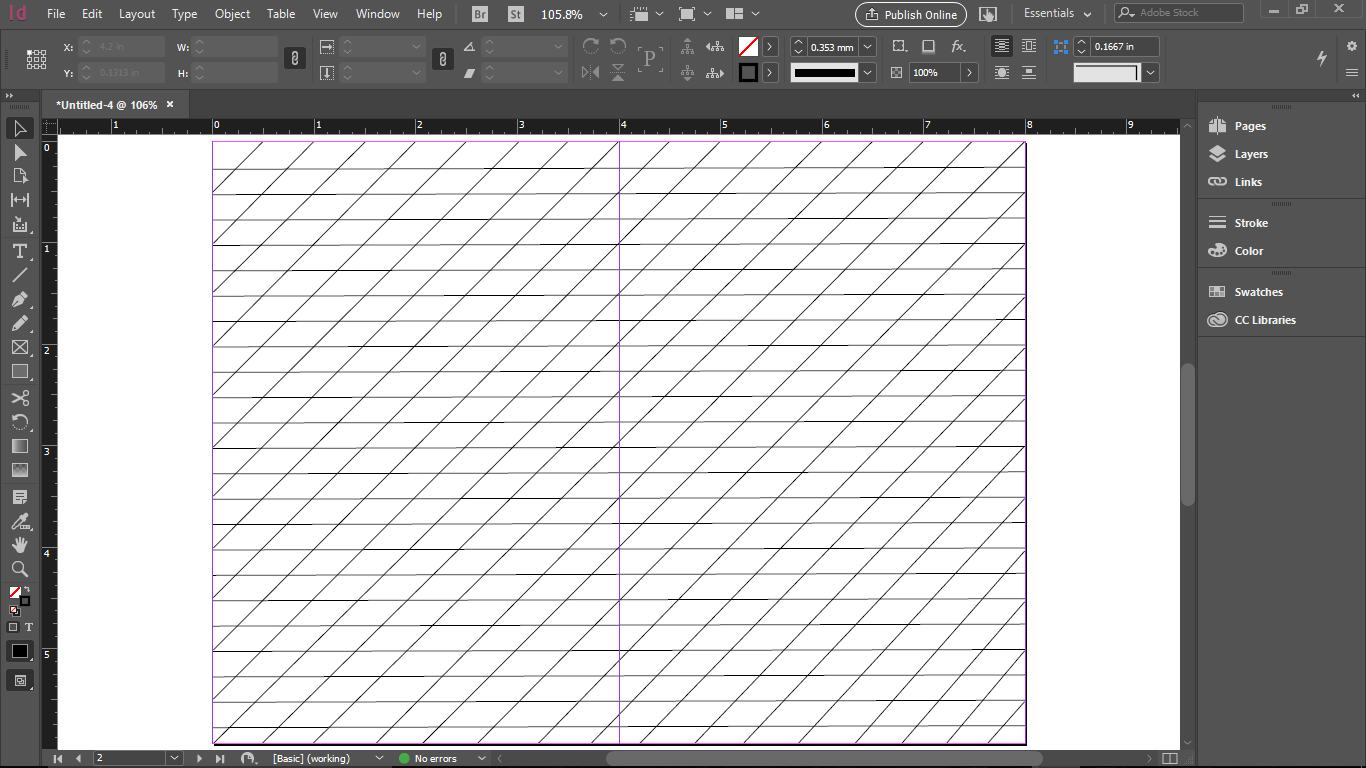
What you told me was very helpful, but I am unable to get the lines even once I get them to fit on my spread. I am going to post a screenshot so you will have a better idea of what I am trying to do. Perhaps it cannot be done with InDesign, but if it's possible and anyone can help, I would greatly appreciate it! I appreciate everyone's input!
Also, I'm not sure why the color of my lines is so uneven once I get it set up...?
Copy link to clipboard
Copied
I am now looking at this on my phone, and the line color looks normal. However, in the software it looks very uneven. My main concern is getting the diagonal lines distributed evenly... thanks so much for all the help!
Copy link to clipboard
Copied
Hi,
Although you are getting the lines the way I thought you wanted, i dont know what you mean exactly when you say
kailar80342908 wrote
but I am unable to get the lines even once I get them to fit on my spread. I am going to post a screenshot so you will have a better idea of what I am trying to do.
I am guessing that by lines, you mean lines to write text on
To do so, I discovered a hack which can enable you to get the lines to write the text. However it's a bit lengthy method.
1. Create a text frame and open text frame options dialog(Ctrl+b). Navigate to Baseline grid and set the grid as shown. (you can obviously change this any time)
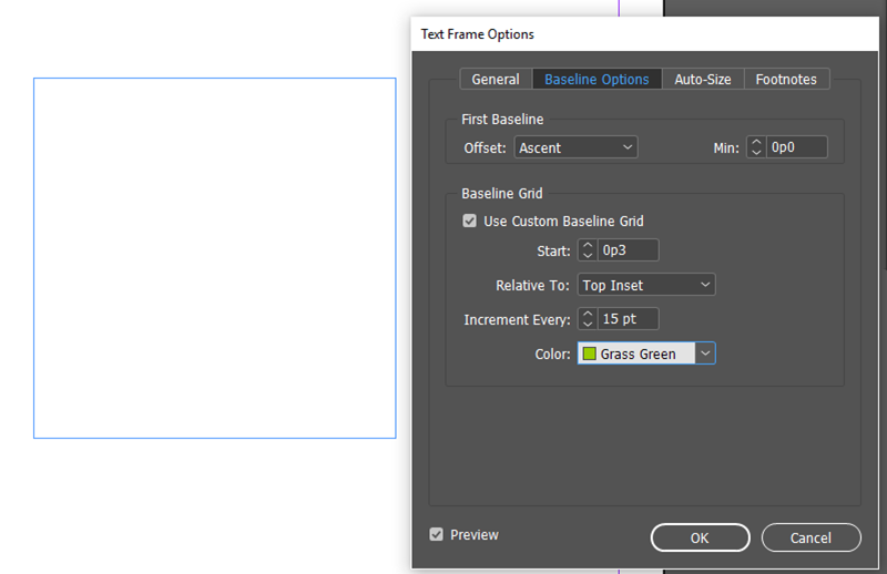
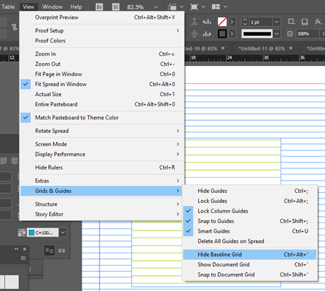
2. Goto view menu-> Grid and Guides and select show baseline grid. You should get something as shown below provided your zoom level is greater than the threshold level for baseline grid.
To check the threshold:

What you should get:
3. Rotate the frame to the desired angle

4. using the White arrow tool(direct selection) select the frame and extend its edges to the page edges so that you get something like
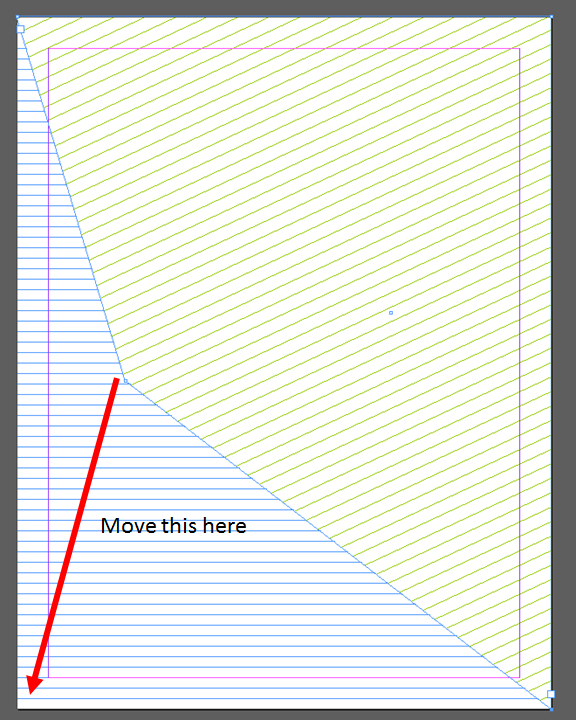
5. Now when you type, your text should be snapped and sticked to the grids (green diagonal lines) you have set provided you enable the "Align to baseline grid" option as shown below
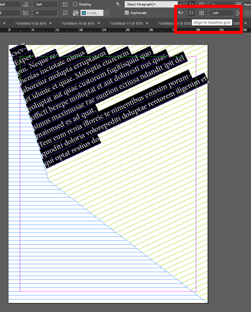
You then get your text snapped nicely on diagonal line:

Do let us know if this is what you wanted!
-Aman
Copy link to clipboard
Copied
Thank you so much! I really do appreciate your help. Unfortunately that's not what I'm wanting. I want the pages to look like what I posted, but I want the diagonal lines to be even. When I followed your instructions I was able to get the lines the same distance apart, however, they were too long and going off my pages (as they did in your example). I simply tried to resize them by selecting them and dragging to fit within my page. When I did that, they were no longer evenly distributed. I hope this makes more sense. If you need me to post a screenshot I will. I tried just using the scissors tool to take off the excess (I haven't been using InDesign very long, so still learning how to use everything) and I guess the scissors tool doesn't work that way, or I couldn't figure out how to get it to, if so. I looked up tutorials about using the scissors tool and it seems it won't do what I was hoping it would. Thank you again for your time and help! I'm sorry that I wasn't clear. I'm ultimately wanting to print this without any text to make a booklet that can be used to practice hand lettering and calligraphy. Please let me know if I can give any further information to make myself more clear. If it can't be done, I will explore the other Adobe software and see if I can do it anywhere else. I'm just more comfortable with InDesign at this point and am hoping I can do all of my booklets using this.
Copy link to clipboard
Copied
If you have your grid the way you want it, but with the ends hanging off the page, select all and cut. Draw a graphic frame the size of your page plus bleed, and use Paste Into. This will mask the extending edges of your lines.
Copy link to clipboard
Copied
Thanks! I'll definitely try this! It's super difficult to get an even diagonal line. But if I can get one that's really even (I'm a perfectionist when it comes to this stuff and it's driving me crazy! ![]() ) then I will try this method.
) then I will try this method. ![]() thanks again!
thanks again!
Copy link to clipboard
Copied
jane-e, thank You for clarification.
@ kailar80342908
I understand your perfectionism. Just accept the fact lines you get with Move or Step and Repeat methods are inevitably even. That's the way computer works, after all. When you want something to look "uneven", "hand-made", you have to put additional efforts in it. Or do it by hand.
So: don't try to "fix" it! Scissors is the wrong tool here, too. Use masking SJRiegel described for you. I could advise in addition: before pasting into, group your lines or even better - combine.
If you're not satisfied with the look on the screen, remember, for some technical reasons monitor may have hard time to draw diagonal lines precisely (especially thin and dense). Print it hires and check it on a paper.
Copy link to clipboard
Copied
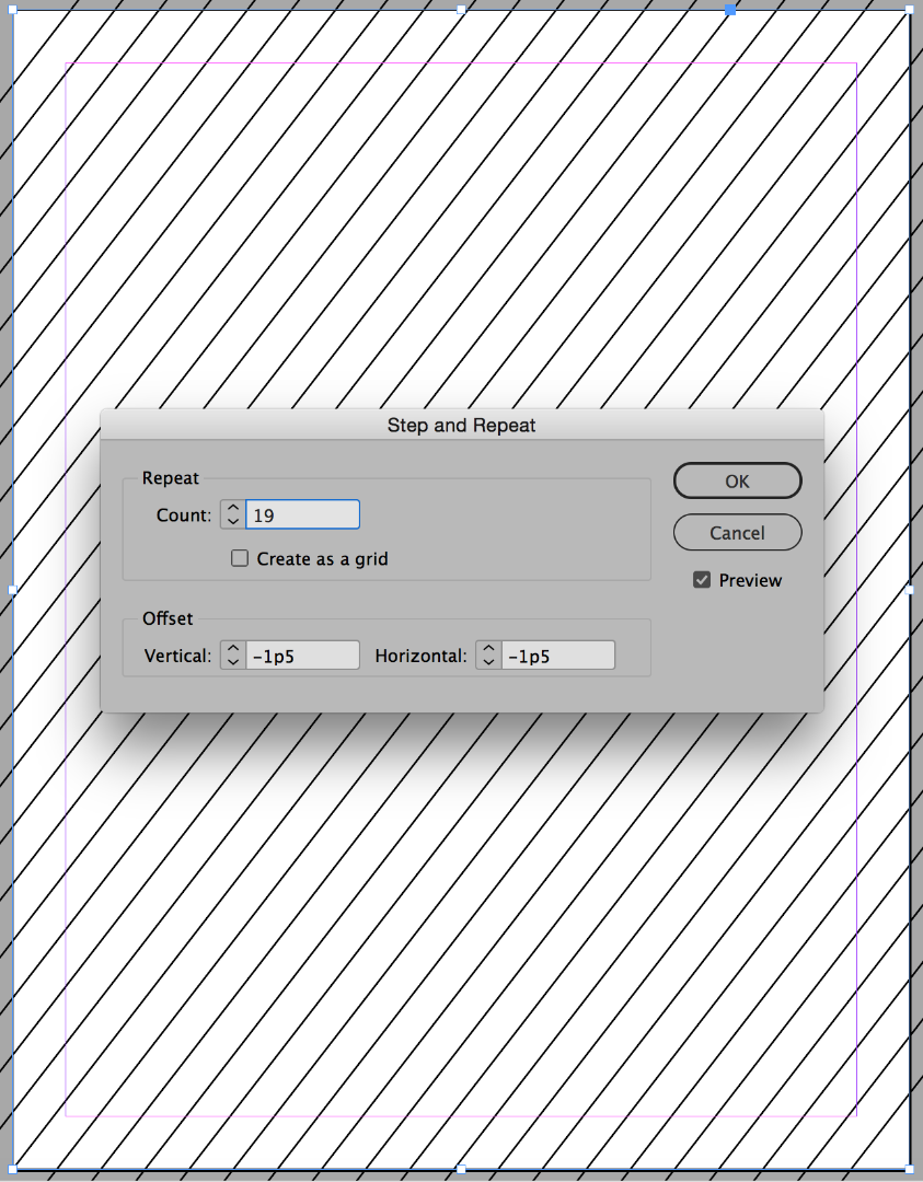
No need to create this outside InDesign.
Edit -> Step and Repeat is the right tool for this.
It's pretty intuitive, you'll get it quickly.
Copy link to clipboard
Copied
I'm not sure what you mean? I think I'll try the other tip, then if I can't get it that way I will check back and see if you can explain in more detail. Thank you!
Copy link to clipboard
Copied
Get ready! An upgraded Adobe Community experience is coming in January.
Learn more

