

Drop Cap with Ornamentation

Copy link to clipboard
Copied
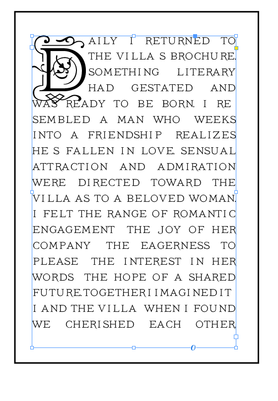
Hi. I'd like to use the Drop Cap in the screenshot. However, you can see that the bottom flourish extends into the line below. Is there a way to not have this happen? Thanks in advance!


 8
Replies
8
8
Replies
8
Copy link to clipboard
Copied
Show us screen captures of the settings you've used on what we are seeing.
Will there be other drop caps in your publication where you need to follow certain rules to match appearance between the drop caps?

Copy link to clipboard
Copied
Hi bfcreativenyc1 ,
enable option "Scale for Descenders" in Drop Caps and Nested Styles of your paragraph formatting.
That should help.
Regards,
Uwe

Copy link to clipboard
Copied
Try making a custom character style that baseline shifts the cap up and applies horizontal and vertical scaling to keep the top of the letter where you want it.

Copy link to clipboard
Copied
agree with all suggestion. I also add a white space if needed to make it look the right way!
Copy link to clipboard
Copied
Can you tell us the name of the font? If I can install it I can experiment with what works. Also, it's not hard on the eyes.

Copy link to clipboard
Copied
https://forums.adobe.com/people/Scott+Falkner wrote
Can you tell us the name of the font? If I can install it I can experiment with what works. Also, it's not hard on the eyes.
Only the initial caps font is. That full-caps body text font is atrocious. It is clearly missing glyphs, too -- at least the apo'strophe and the hyphen.
... Also, please allow hyphenation when typesetting that large and with such a narrow line length.
(I do hope this was for illustrative purpose only!  )
)
Copy link to clipboard
Copied
https://forums.adobe.com/people/%5BJongware%5D wrote
https://forums.adobe.com/people/Scott+Falkner wrote
Can you tell us the name of the font? If I can install it I can experiment with what works. Also, it's not hard on the eyes.
Only the initial caps font is. That full-caps body text font is atrocious. It is clearly missing glyphs, too -- at least the apo'strophe and the hyphen.
... Also, please allow hyphenation when typesetting that large and with such a narrow line length.
(I do hope this was for illustrative purpose only! )
I did nothing to warrant such an insult. Of course the cap.

Copy link to clipboard
Copied
Hi there,
I would like to know if the steps suggested above worked for you, or the issue still persists.
Kindly update the discussion if you need further assistance with it.
Thanks,
Srishti

Find more inspiration, events, and resources on the new Adobe Community
Explore Now
 AdChoices