- Home
- InDesign
- Discussions
- Re: Drop shadow knockout best practice
- Re: Drop shadow knockout best practice
Copy link to clipboard
Copied
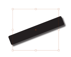
I can think of some ways to work around this, but I am wondering what the best (i.e., what most real pros do) to accomplish this. As you see in this example, I added a drop shadow to the black graphic that shows below it, but I do not want it to show in the right, white margin. What Would A Pro InDesigner Do?
 1 Correct answer
I would draw a rectangular frame taller than the bar, with its left and right edges aligned with the photo. Select the bar and Cut.
Select the rectangle and Paste Into. This turns the rectangle into a clipping mask for the shape and its drop shadow.
Copy link to clipboard
Copied
I would draw a rectangular frame taller than the bar, with its left and right edges aligned with the photo. Select the bar and Cut.
Select the rectangle and Paste Into. This turns the rectangle into a clipping mask for the shape and its drop shadow.
Copy link to clipboard
Copied
This. A subtle aspect to keep in mind is that you can apply effects to a graphics frame, the content of the frame, or both. You can choose or combine to get various results.
—
Copy link to clipboard
Copied
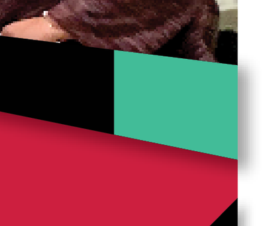
Thanks. I don't know what I'm doing wrong. The object pasted into the black bar does not clip the shadow. I did it with a green bar here to show that it pasted into the black bar.
Copy link to clipboard
Copied
You're doing it backwards. You want to paste your black bar with the shadow into a new blank frame thaat is smaller than the width of the black bar.
Copy link to clipboard
Copied
Ah ha, I see. I misunderstood which bar you were referring to. This makes sense to me too, so hopefully I have learned a general concept for the future. Thank you.
Copy link to clipboard
Copied
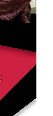
A follow up problem. I used this technique for both versions of the black bar on this page as you see below. To my eyes, cutting the shadow on the top one--where it is on top of the red--is fine. But the one below that where the shadow gets cut on white is just glaring/obvious. If this was Photoshop, I think I would just erase the shadow in gradient fashion as it neared that border, but I cannot do that here. Perhaps the answer is a different design! But how would you deal with this?
Copy link to clipboard
Copied
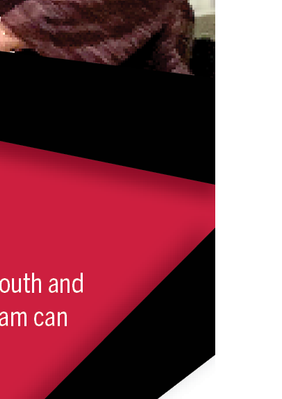
I just changed the direction of the shadow as you see here. Normally, that would look strange to have two completely opposite shadow directions, but I think it works here. However, if you have thoughts about the previous question, I would still like to hear them for my edification.
Copy link to clipboard
Copied
You might consider just changing the angle to 90 degrees instead of using the default. this will also extend the shadow to the left edge of the graphic, however, but being a former photographer I think that's a more realistic shadow -- if it isn't cast past the right edge it shouldn't start beyond the left.
Get ready! An upgraded Adobe Community experience is coming in January.
Learn more


