- Home
- InDesign
- Discussions
- Re: Elaborating on Kashida Justification
- Re: Elaborating on Kashida Justification
Elaborating on Kashida Justification
Copy link to clipboard
Copied
In Persian and Arabic paragraph justification, besides ordinary settings about word spacing and glyph spacing, there are several settings about inserting Kashidas. There is a setting for Kashida Width, and also various types of kashidas, such as Arabic (legacy), Justification Alternatives (Naskh), Stylistic Flat, and so forth. I tried them in several texts to find out a rule for each of them but I couldn't. Also, I couldn't find any documentation related to them. Could you please help me with that?
Copy link to clipboard
Copied
There's not a lot of English-language documentation on using kashidas, but here's what there is! Note that they won't work at all unless the paragraph is full justified; if the paragraph is aligned any other way than full justification, they simply won't be inserted.
Copy link to clipboard
Copied
Thanks for your reply. It helps me a lot but I'm afraid it doesn't describe the Kashida as much as I need. Do you happen to know is there any Non-English elaboration about that? In that case, a translation would help me.
Copy link to clipboard
Copied
There must be... but I don't really read Arabic at all. What kind of information are you looking for? I mean, do you want to know what those variations in InDesign settings (like "Justification Alternatives (Naskh)") mean, or how one uses kashida to lay out full-width text in Arabic?
Copy link to clipboard
Copied
Kashida is basically a way to stretch the Arabic word by adding a dashed line be it short -, medium –, or long —. This option will allow the word to stretch sideways as I mentioned in order to close white spaces between words and eliminate so-called white rivers in a long paragraph.
As @Joel Cherney mentioned, Kashidas will not be visible unless proper justification settings are applied. Then, not all Arabic/Persian/Urdu/Kurdish fonts will respond to Khashida justifications fully as some of the Arabic fonts fall short of closing gaps properly.
I don't use the Justification panel, I use the Paragraph Panel rather to apply Kashida settings. Here in this video, you will see how different Khashida settings affect the text by stretching Arabic text sideway.
Note. I'm using an Arabic font named Winsoft Pro / Medium. This font used to come with old [ Adobe CS1 – Adobe CS6 ] Adobe applications.
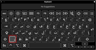
Kashida can be added manually at certain times. Click on the dashed line ـ on your keyboard as shown on a Mac screenshot below, don't click on the Minus symbol -
Copy link to clipboard
Copied
I appreciate your response dear Zaid. Your explanation helps me a lot.
As I comprehended from your video, Indesign is likely to give Kashidas to the letters Sin, Shin, Ghaf, and Fa, prior to any other letters. Is it so? What are the priorities of giving Kashidas to the letters?
And why the word (أغلق) became (أغلـــــق), and not (أغــــلق). What is the reason?
There are still a few ambiguities for me. In the Justification setting of Paragraph Styles, besides Short, Medium, and Long Kashidas, there are several types of Kashidas like Arabic (legacy), Justification Alternates (Naskh), Stylistic Flat Kashidas, Flat Kashidas, and Kashidas. Could you kindly please tell me the difference between them?
Copy link to clipboard
Copied
Thank you so much
Find more inspiration, events, and resources on the new Adobe Community
Explore Now
