- Home
- InDesign
- Discussions
- Re: Expected Appearance of placed Photoshop RGB co...
- Re: Expected Appearance of placed Photoshop RGB co...
Expected Appearance of placed Photoshop RGB content in InDesign CC 2023
Copy link to clipboard
Copied
- Create New "Print" document in InDesign
- Transparency Blend space becomes CMYK
- Import sRGB image created in Photoshop on Page 1
- Should the user expect the imported RGB image to "match" Photoshop's appearance?
Copy link to clipboard
Copied
Would you mind sharing the original ProPhoto file?
Copy link to clipboard
Copied
Here’s the ProPhoto, ProPhoto converted to sRGB, ProPhoto converted to Coated GRACoL, and sRGB converted to GRACol. Relative Colorimetric with Black point Compensation used for all the conversions.
For all of my captures above, I had Proof Colors turned on with the GRACoL as the Proof Setup
https://shared-assets.adobe.com/link/9acc0999-8063-4c69-50ac-06304ce81293
Copy link to clipboard
Copied
I have to agree that the CMYK conversion to GRACoL2006 from ProPhoto resulted in a "higher ripple contrast" than its sRGB counterpart. But the comparison is not completely fair, in my view, since one is starting on a "darker" level than the other. Once I bring the shadow of the booey in the sRGB version to the same Lightness level than in the ProPhoto version (L* = 53) then the contrast difference is less between the two sources in the CMYK conversion.
I won't debate that the ProPhoto brings out a more "turquoise" shade of water than the sRGB counterpart.
It would have been interesting to start from the RAW picture? RAW converted to ProPhoto vs RAW converted to sRGB, you see? But it's interesting to not that, in terms of "reproduction preferences", which a bith subject in itself, the sRGB version might have "please" more than the ProPhoto version, Rob? Because the water would have appeared "bluer"? And I don't know, as the owner of a swimming pool store, you'd be enthousiast at the thought of the water appearing "slightly yellowish", not as blue, as the sRGB version?
You see, I'm RGB space agnostic. I know when I see a picture what i need to do in order to repropduce it to its best, whatever the source, Rob.
All IM'm saying and been saying all along, Adobe could do a better job of handling "native" elements color. It's not a matter of which color space is "inherently better" than the other, it's matter of what does the job best. Strong discussion, we're having, and I know we're not on the same page and I respect that.
I don't insist on having the last word! I think you proved your points and I think I proved mine. I'm satisfied we came to this point in the discussion. I'm happy with what I learned and looking forward to discuss it openly with the students next time.
Do you advocate for people to adopt ProPhoto as their RGB working space accross the CreativeCloud graphic applications?
Copy link to clipboard
Copied
Do you advocate for people to adopt ProPhoto as their RGB working space accross the CreativeCloud graphic applications?
I personally never use sRGB because I want access to the entire CMYK space when I color correct, it doesn’t have anything to do with my subjective feelings about color. Larger gamut spaces like AdobeRGB and eciRGB also catch most of the typical CMYK offset space.
You can color correct the lightness, but you have to look at the CMYK output numbers as you make the correction—you are still confined to the sRGB gamut. There isn’t a correction you can make that will get you to the 100|15|0|0 color that is available in ProPhoto.
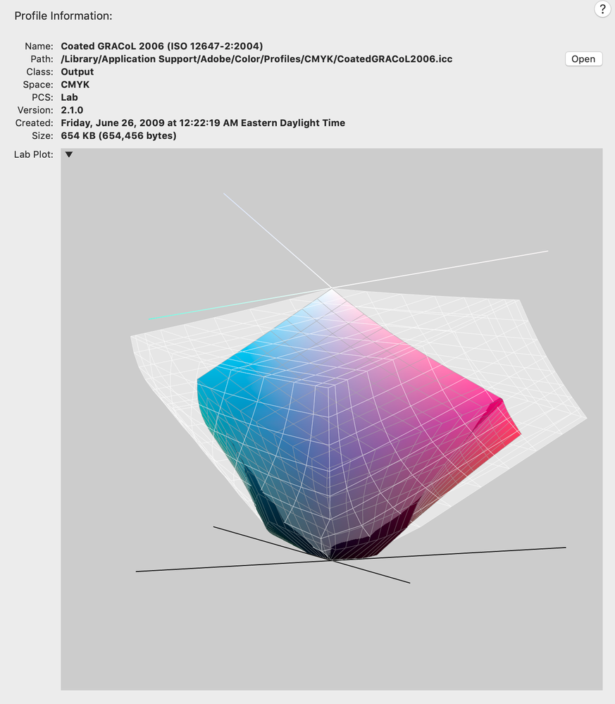
eciRGB GRACoL comparison:
Copy link to clipboard
Copied
Like I said, the way the picture was "developped" out of the RAW file -- if there was ever a RAW file -- makes all the difference. sRGB is the default color space the whole world uases everyday, very successfully. Only a handful of "converts", mostly photographers, because of the nature of their "work", use ProPhoto, mostly for saturated colors. Most color in everyday publication are not that saturated. As in painting reproductions. You can stick with your choice of prefered color spaces, for your own technical reasons. Nothing keeps you from using anyRGB.
----
You can continue this thread with other list members if you want. I rest my case.
Copy link to clipboard
Copied
Most color in everyday publication are not that saturated. As in painting reproductions... you can continue this thread with other list members if you want.
It would be even more important for art and art reproductions not to use sRGB because of the massive clipping—if a painting includes the blue, green and, yellow colors that are outside of the sRGB gamut no skillful printer would purposefully eliminate them from the color separation. I don’t think it’s just a handful of photographers that are aware of the sRGB problem, ICC developed the large gamut eciRGB space to include the offset press space and prevent the sRGB problem.
https://www.color.org/ecirgb.xalter
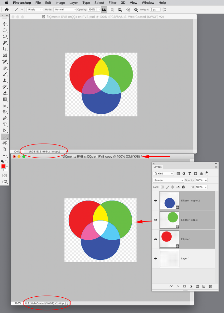
Also, should have thought of this earlier, you can get the blend space collision to happen in Photoshop if you convert your RGB layered smart objects to CMYK without merging the layers:
Copy link to clipboard
Copied
Rob (and others),
I took at look at Acrobat Flattener settings and could not find any smart options to prevent the conversion of Black to "cmykBlack"...
Well, where there is will there is a way, as they say? It just dawn on me that it may be possible (depending on the design) to work around InDesign's "limitation" by :
- selectively exporting RGB elements to PDF using RGB Blend space
- to later import them back in the document while the Document Blend space was changed to CMYK
Also... I can always 'cheat' by creating a "SpotColorBlack" preventing the reseparation of 0c0m0y100k ...
Copy link to clipboard
Copied
I took at look at Acrobat Flattener settings and could not find any smart options to prevent the conversion of Black to "cmykBlack"...
Here’s a step-by-step:
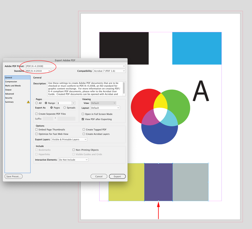
Export to the default PDF/X-4 preset—No Color Conversion. The bottom swatches are blended via Difference:
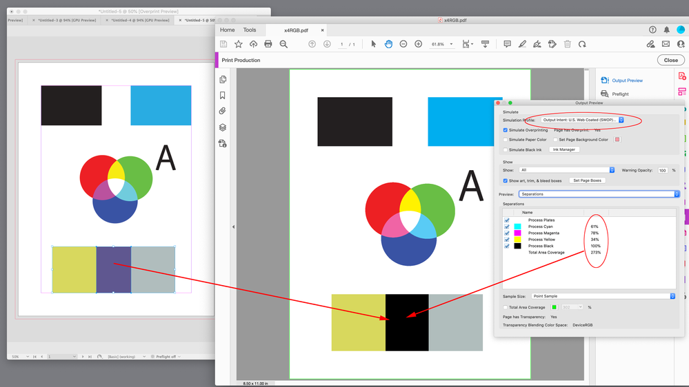
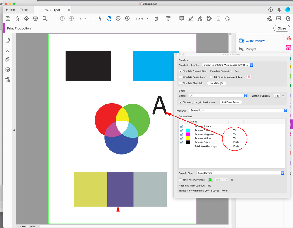
With Acrobat’s Output Preview, the live transparency is previewed in the Output Intent profile:
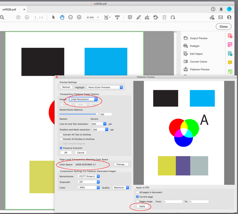
Open Flattener Preview, make sure the Color Space is set to your RGB blend space, and click Apply:
Now there is no transparency on the page, the text is 100% Black, and the flattened Difference has the expected values:
Copy link to clipboard
Copied
Good morning Rob,
Since PDF/X-4 seems to be the "only way to go", to salvage my precious "native" RGB elements, I experimented outputting to PDF/X-4 from InDesign and was naturally led to "Print Production" and "Flattener Preview" when the document opened in Acrobat. Here's a screen capture of what I was greeted with :
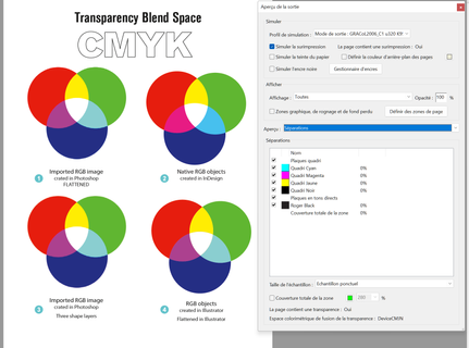
Acrobat uses the Document Intent to initially display the pages in Print Production as you can see. Notice the lingering "discrepancy" between the "native" and "imported" RGB elements 😞 Darn.
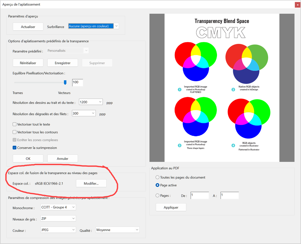
Here is Flattener Preview with selected options :
I then hit the Apply button and, back at the main interface. Yes, all 100 Black text have been "retained" (no re-separation!) but the "discrepancy" between the appearance of "native" vs "imported" RGB contents remains unchanged 😞
Somehow, the use of "native" RGB elements in InDesign with "transparency" attributes such as Blend modes cannot be "solved" by automated means, at least not inside Adobe's products. Even if using PDF/X-4.
I have to conclude that the "trouble" starts with the way InDesign encodes color internally.
I know your aguments of "mixed-mode" objects but this is clearly one limitation I need to bring up with the students at some point. In the meantime, looks like I have to build a library of "problem" situations involving transparency flattening, to walk the students through.
Incidentally, why does Acrobat does a "smarter" flattening job on output (from PDF/X-4) than InDesign, as far as keeping solid Black from turning RGB?
Copy link to clipboard
Copied
Acrobat uses the Document Intent to initially display the pages in Print Production as you can see. Notice the lingering "discrepancy" between the "native" and "imported" RGB elements 😞 Darn.
I’m not seeing that. Make sure you view in Acrobat’s Output Preview after you flatten the page using the RGB blend space.
Here’s InDesign on the left with the Blend Space set to RGB and Separation Preview turned on, and on the right Acrobat’s Output Preview showing the page after flattening using the document RGB space. Everything matches and CMYK black is not converted:
Copy link to clipboard
Copied
You have to set InDesign Blend space to CMYK, Rob, we all know it works great in RGB.
Copy link to clipboard
Copied
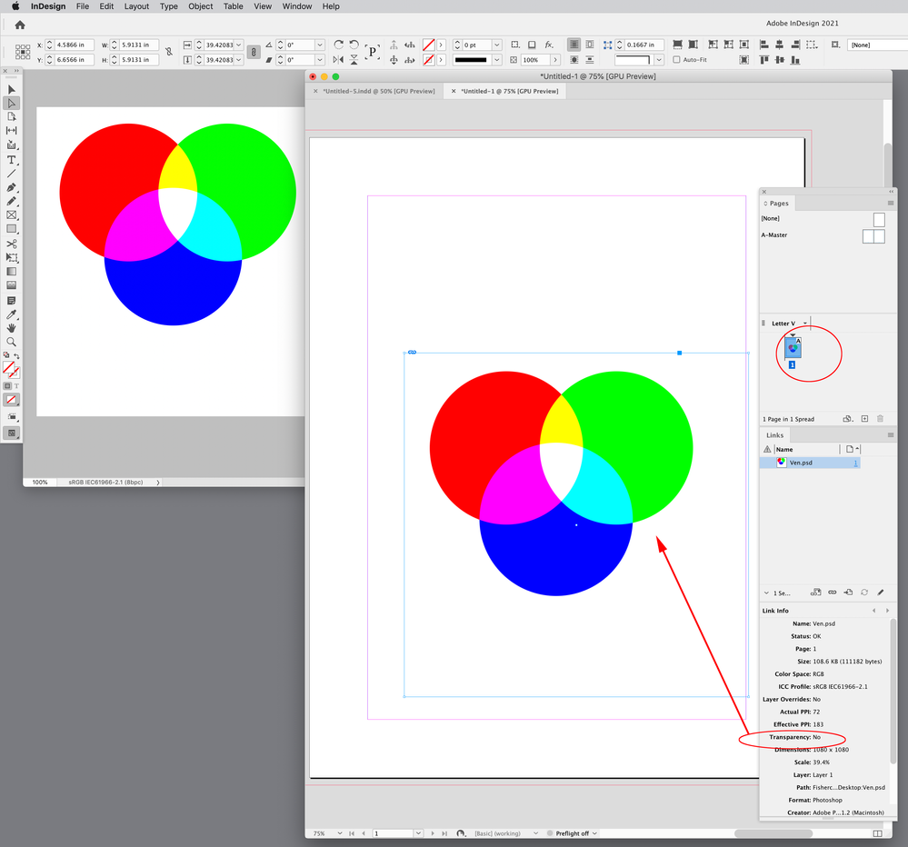
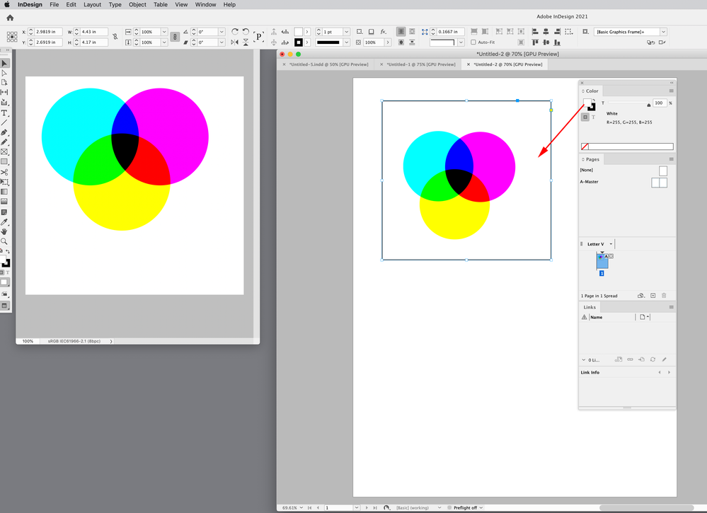
Well, if that was the case, Page 2 below, ought not to be shown in the CMYK Blend space since I deleted the "Native" element? In other words, nothing on this page has any transparency :
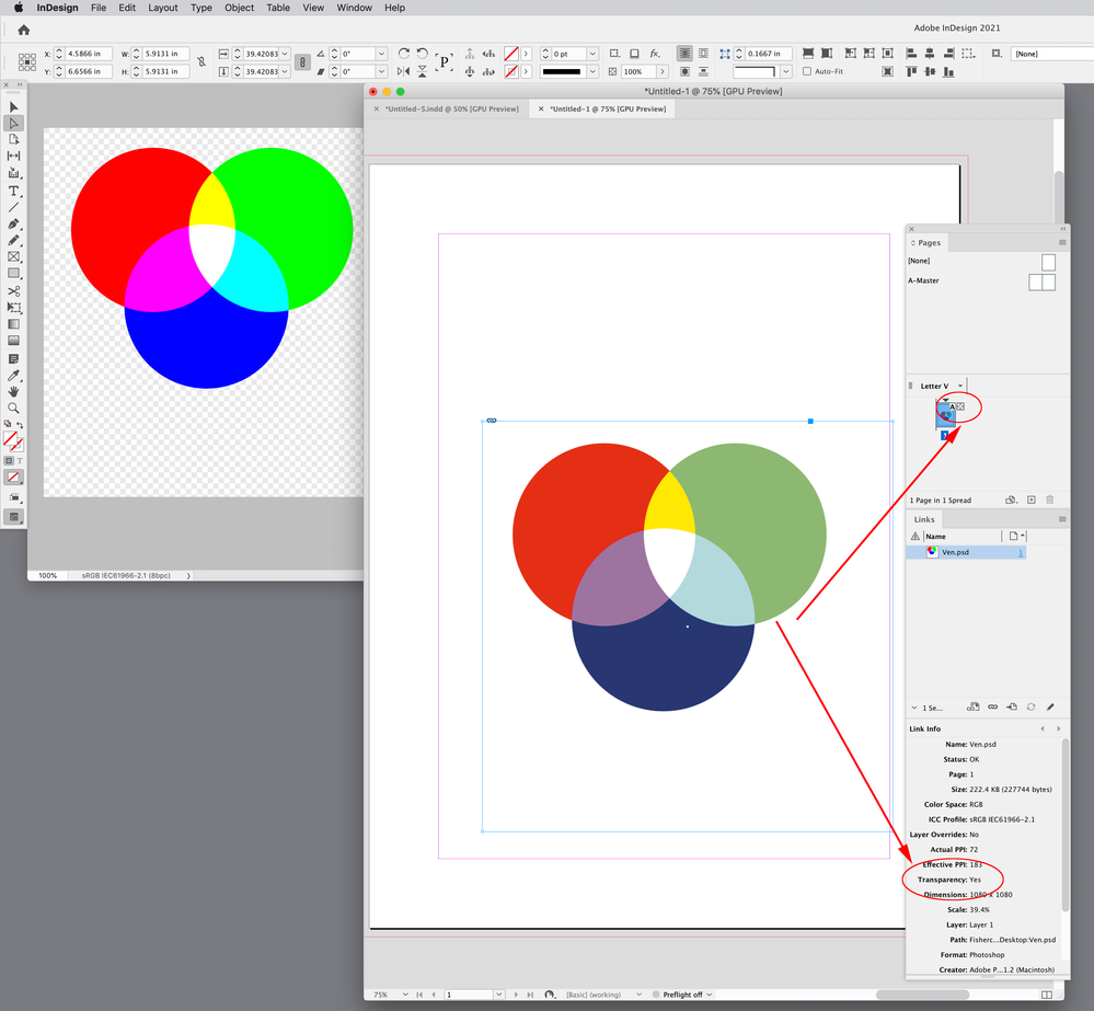
A PSD with a transparent background (no Background Layer), would be considered a transparent object on the page. Select the PSDs and check Link Info. You can also use the Flattener preview panel to check if there are any transparent objects on the page.
Here my Link Info is showing the PSD as containing transparency, and the Pages panel is showing a transparency icon indicating the page contains transparency so the page previews in the CMYK blend space:
If I add a Background layer to the PSD, it will not be considered transparent, even though it has multiple transparent layers in Photoshop—it’s the PSD’s bottom layer that determine whether ID considers it a transparent object.
Copy link to clipboard
Copied
It´s an interesting discussion. Overlay is a bit special when it comes to belend modes, since it is in the category of light. Photoshop will blend these in the document space of the Photoshop file. InDesign will blend the values in the Blend space, a photoshop file is then placed in InDesign already blended, Photoshop files only blend in "Normal" mode outside of indesign, this is a limitation of the PSD format. Also bear in mind that the colours you are using inte the test are not entirely compatible with CMYK gammut, also considering that RGB profiles are usially D65 and CMYK profiles D50 wich means that the lab values do have certain room for interpretation. Following discussion 🙂
Copy link to clipboard
Copied
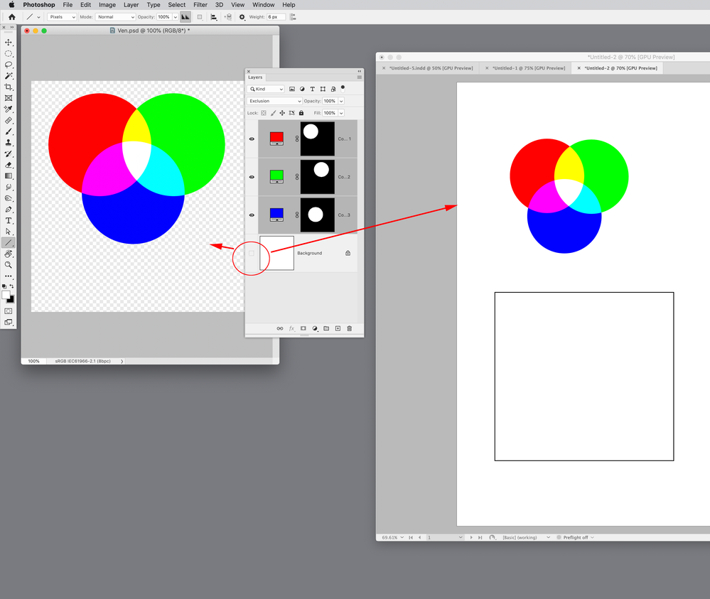
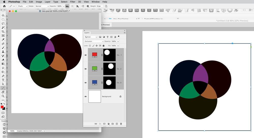
Hi Lukas, I think you do have to consider what’s below the Photoshop and InDesign transparency if you are expecting a match. Here in Photoshop my 3 solid color layers are set to Exclusion with no Background layer below. I’ve done the same in ID with the Blend Space set to RGB. Both documents have sRGB assigned, so the blend space in PS and ID are the same, the InDesign colors have no object behind, and I get a match
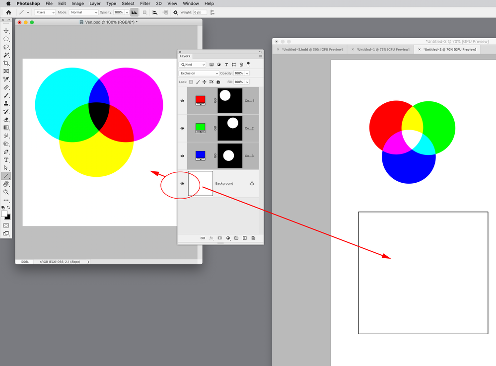
If I turn on a layer set to 100% Opacity, filled with white pixels, the colors change because of the white pixels below:
If i add a white filled rectagle behind the ID transparent page items I get a match again:
If I set my ID Blend Space to CMYK the preview is in my Document CMYK Space—Coated GRACoL. And if I convert my PS file to the same CMYK space I get a match:
Copy link to clipboard
Copied
@rob day Yes I get your example, most blend modes do calulations per channer so the objects may be in RGB or CMYK, but they must be converted to the blend space in order to know how to apply the calculations. The OP example was in a "light" blendmode (Overlay… and that subset nicely grouped in photoshop), those modes have their calculations in LAB i believe. Theblend mode exclusion also works per channel and will also be different if it is in RGB or CMYK … but not understanding what or why. What I am saying is that if you have a layer with say exclusion in photoshop and place in indesign the "excusion" will not be interacting with whatever is below in the indesign file. The blendmode works within photoshop, but a PSD will only beld "normal" blendmode with simple alpha transparency with other applications. Adobe Illustrator is different, but here you would need to use separations preview for preopper viewing, this is because PDF ulike PSD has ability support blend modes at object level though mixing transparencys can quickly become overly complex if you have many colour spaces as well as blendmodes.
Now one interesting example is if you have your RGB objects blended with exclusion convert them to a smart object and then convert to CMYK the RGB objects inside the spart object will blend with RGB logic, but externally those layers will combine with the rest of the file in precomposed state… just as it would be if you place the Photoshop file in InDesign (The Photoshop file is internally blended, the placed result will only belnd in "normal" mode with InDesign native objects) and/or other placed files.
Now the difference is the Illustrator CMYK file that has say a yellow with "lighten", if you don't have a background on it in illustrator it will lighen (or overlay) nothing in illustrator and so remain yellow… but in InDesign, if you place it on a white or any colour that does not contain yellow the result is the yellow in lighten will dissapear. (Photoshop the same excersise the yellow will remain because there is no other mode than normal n the placed PSD file.)
Note that in InDesign and Illustrator you do not norrmally see the transparent grid but "nothing" looks just like "paper". but when there is a transparent object blending with what is beloww "nothing" and "paper" make a dramatic difference (no pun intended)
Copy link to clipboard
Copied
The more I think about it, the more I am tempted to adopt RGB Transparency Blend space for ALL my documents, whether CMYK-oriented or RGB-oriented. You see, in my sample document (and screen captures above), "flattening RGB transparency in RGB space" results in more "vibrant", less "muted" color. In the end, everything becomes CMYK but I feel we lose too much saturation by blending in CMYK?
I'm still not 100% clear of the whole working of InDesign's rendering and why "native" RGB elements are being rendered differently, in CMYK blend space, than "imported" RGB elements, with or without any transparency, with or without Background layer flattened in Photoshop.
Copy link to clipboard
Copied
The more I think about it, the more I am tempted to adopt RGB Transparency Blend space for ALL my documents,
The black channel in CMYK can produce some unexpected blending, so the RGB blend space produces more familiar results. But you do have to watchout for 4-color blacks, see above.
And there can be other problems with default PDF/X-4 exports with live transparency, when the blend space is RGB in ID. You have to pay close attention to the PDFs
Copy link to clipboard
Copied
I agree with Rob here it is all because of the BlacK. Blend modes are easier in RGB, and some work even better in LAB, but that is reserved for Photoshop. In simplistic diagrams we can measure and try to understand the concepts, but if we look at real world illustrations, and consider reproduction processes we cannot limit tp working with RGB. (we could also add in Spot colours it gets even more complex).
If I was doing an artistic rendering in Illustrator, I might stick to RGB throughout the document because the way bled spaces work in RGB logic… but if I want crisp black lines with no registration then RGB is not an option… this is why they introduced the Key colour (See the history of technicolour). What print process has been working on is finding out how to get the right amount of K … and this is not a one time solution …this is where GCR and UCR come in. Now in a CMYK document you may have idential appearance of colours that ave very different builds and will therefore have very differing apperance when blended. RGB allows only one definition per colour, and is therefore more predictable. (I am skipping colour profiles to keep the discussion simpler).
In print we may need crisp text and strokes, and in many cases we are working against physical limitations of real world printing processes. When comics were invented it was just like in art nuveau an aesthetic to turn a bug into a feature. Now registration is sometimes so good that we can ignore that CMYK was to accomodate for inperfecctions in printing process (registration)… but only sometimes and in some processes. And yes, in those processes sticking to RGB would be simpler.
Copy link to clipboard
Copied
Thank you Lucas for sharing your experience. It looks like I did not have to look very far, as Rob Day demonstrated : as soon as the Document Transparency Blend space is set to RGB, 100K Black ink becomes "Four color Black". Blame it on Adobe but that's their policy. No point criticizing or complaining about this "behavior" here. (Edited Nov 9 2022)
-
- 1
- 2
Find more inspiration, events, and resources on the new Adobe Community
Explore Now

