Exit
  • Global community
    • Language:
      • Deutsch
      • English
      • Español
      • Français
      • Português
  • 日本語コミュニティ
  • 한국 커뮤니티
0

Extra spaces between words after applying a text wrap.

Participant ,
Jan 30, 2018 Jan 30, 2018

I am attempting to apply a text wrap to an image inside a text frame. When the text wrap is not applied the text looks and acts normal. However, as soon as I apply the text wrap to the image, the words obey the text wrap, but develop weird extra spaces between some of the words. When I attempt to erase these spaces the cursor only recognizes one space between each word, even though the gap is visually much larger.

Here is a screen-shot for visual aid:
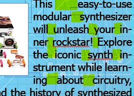
As you can see, the highlighted areas appear to be 2 or more spaces wide, even though there is only one space character present.

Here are the text wrap settings:
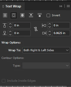
I currently have the text wrap set to bounding box, changing it to object shape changes where the extra gaps appear but does not solve the problem. I have changed the settings in every way that still allows the text wrap to do what I want and nothing fixes the problem. Please keep your answers as novice-friendly as possible. I use Indesign often and I am familiar with the aspects I use but I am by no means an expert.

Please and thank you!

-Hanna

10.7K
Translate
Report
Community guidelines
Be kind and respectful, give credit to the original source of content, and search for duplicates before posting. Learn more
community guidelines

correct answers 1 Correct answer

Community Expert , Jan 30, 2018 Jan 30, 2018

HiInaLandCalledHonahlee ,

We usually aim for about 40-60 characters per line of text. Those lines are very short (about 20 characters), and justified. InDesign distributes spacing between words when you justify, but there aren't enough words to on the line to distribute between, so you end up with huge word gaps.  Set the text to align left, or make it smaller, or the column wider, or make the image smaller.

You could also play with letter spacing (see below), but in my opinion, that won't make it

...
Translate
Community Expert ,
Jan 30, 2018 Jan 30, 2018

HiInaLandCalledHonahlee ,

We usually aim for about 40-60 characters per line of text. Those lines are very short (about 20 characters), and justified. InDesign distributes spacing between words when you justify, but there aren't enough words to on the line to distribute between, so you end up with huge word gaps.  Set the text to align left, or make it smaller, or the column wider, or make the image smaller.

You could also play with letter spacing (see below), but in my opinion, that won't make it much better.

Screenshot 2018-01-30 17.00.24.png

~Barb

Translate
Report
Community guidelines
Be kind and respectful, give credit to the original source of content, and search for duplicates before posting. Learn more
community guidelines
Community Expert ,
Jan 31, 2018 Jan 31, 2018

Only FYI: these large spaces indicate that you are pressing InDesign's justification settings over its limits. It looks like you do have hyphenation switched on, but, as you can hopefully see, there is just not enough room on that first line for the next syllable "mod-" (including the hyphen), or the 2nd line for "will", or the 3rd line for the full word "inner".

As Barb says, don't try to squeeze more than a reasonable amount of text in such a narrow column. (An option she does not mention is choosing a condensed font instead. If that is an option also depends on the longest lines in your text.)

Translate
Report
Community guidelines
Be kind and respectful, give credit to the original source of content, and search for duplicates before posting. Learn more
community guidelines
Participant ,
Jan 31, 2018 Jan 31, 2018

Can you recommend a more condensed font?

Translate
Report
Community guidelines
Be kind and respectful, give credit to the original source of content, and search for duplicates before posting. Learn more
community guidelines
Participant ,
Jan 31, 2018 Jan 31, 2018

Thank you Barb! Can you tell me how to get to this menu in your screen shot?

Translate
Report
Community guidelines
Be kind and respectful, give credit to the original source of content, and search for duplicates before posting. Learn more
community guidelines
Community Expert ,
Jan 31, 2018 Jan 31, 2018

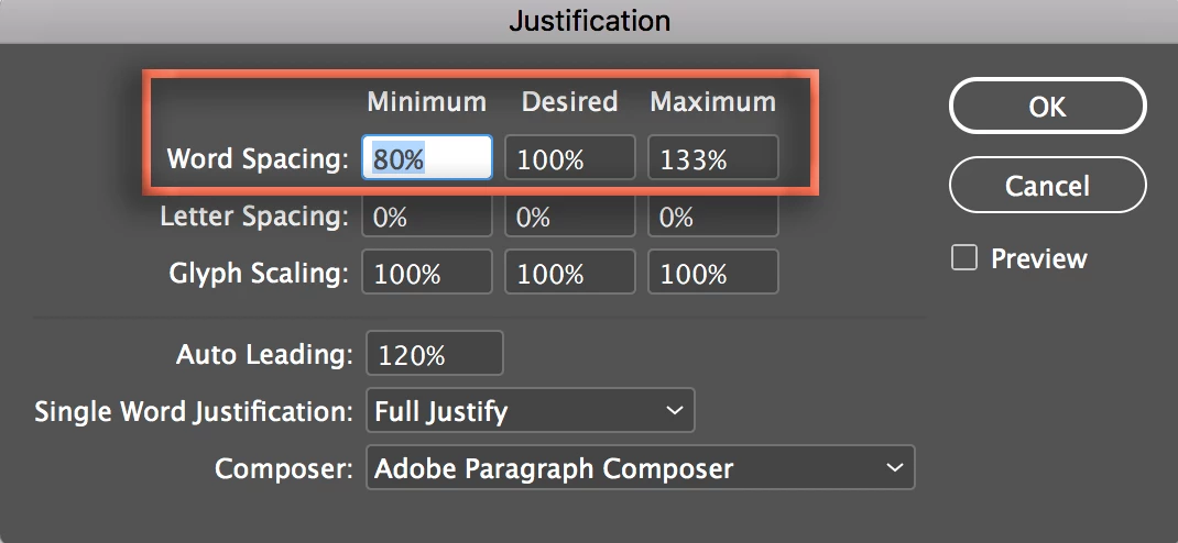
Sure. With the Type tool in the paragraph, click the hamburger icon to open the Control panel menu > Justification:

Screenshot 2018-01-31 08.16.34.pngScreenshot 2018-01-31 08.16.47.png

You have access to Typekit fonts with your CC subscription.

  • Type > Add Fonts from Typekit
  • Set the Properties to Width: Condensed to browse through options.
    Screenshot 2018-01-31 08.19.38.png

~Barb

Translate
Report
Community guidelines
Be kind and respectful, give credit to the original source of content, and search for duplicates before posting. Learn more
community guidelines
Community Expert ,
Jan 31, 2018 Jan 31, 2018
LATEST

You can also get to it from the Paragraph panel flyout menu and it can be included in your style sheets.

The Hyphenation... settings would also have an affect.

When you are setting such a small measure the Justification setting can have a significant affect. You might also consider dropping the point size.

The default with Adobe Single-line Composer:

Screen Shot 5.png

Adjusting the Word, Letter, and Glyph settings along with Adobe Paragraph Composer

Screen Shot 6.png

With the font size set a point smaller:

Screen Shot 7.png

Translate
Report
Community guidelines
Be kind and respectful, give credit to the original source of content, and search for duplicates before posting. Learn more
community guidelines