Parts4Arts
Inspiring
March 10, 2022
Answered

Filled space and ligature problem

  • March 10, 2022
  • 1 reply
  • 945 views

Hello all,
I have a font in progress (made with FontSelf Maker 3.5.7 in AI 2022) that has a solid colour background. Here it is in black for now. I have created the numbers 0 to 9 and the brackets "(" and ")". Also a ligature of "((" and "))", which should create a round beginning and end respectively.

In Photoshop and Illustrator it works when I write "((01 23))" with ligatures turned on. Between 1 and 2 the normal space.

In InDesign the ligatures are "defective" because a bar appears in the wrong place. As I found out by changing the colour of the space to red, InDesign adds a space at the end of a ligature.
Is there a trick in InDesign to prevent this?

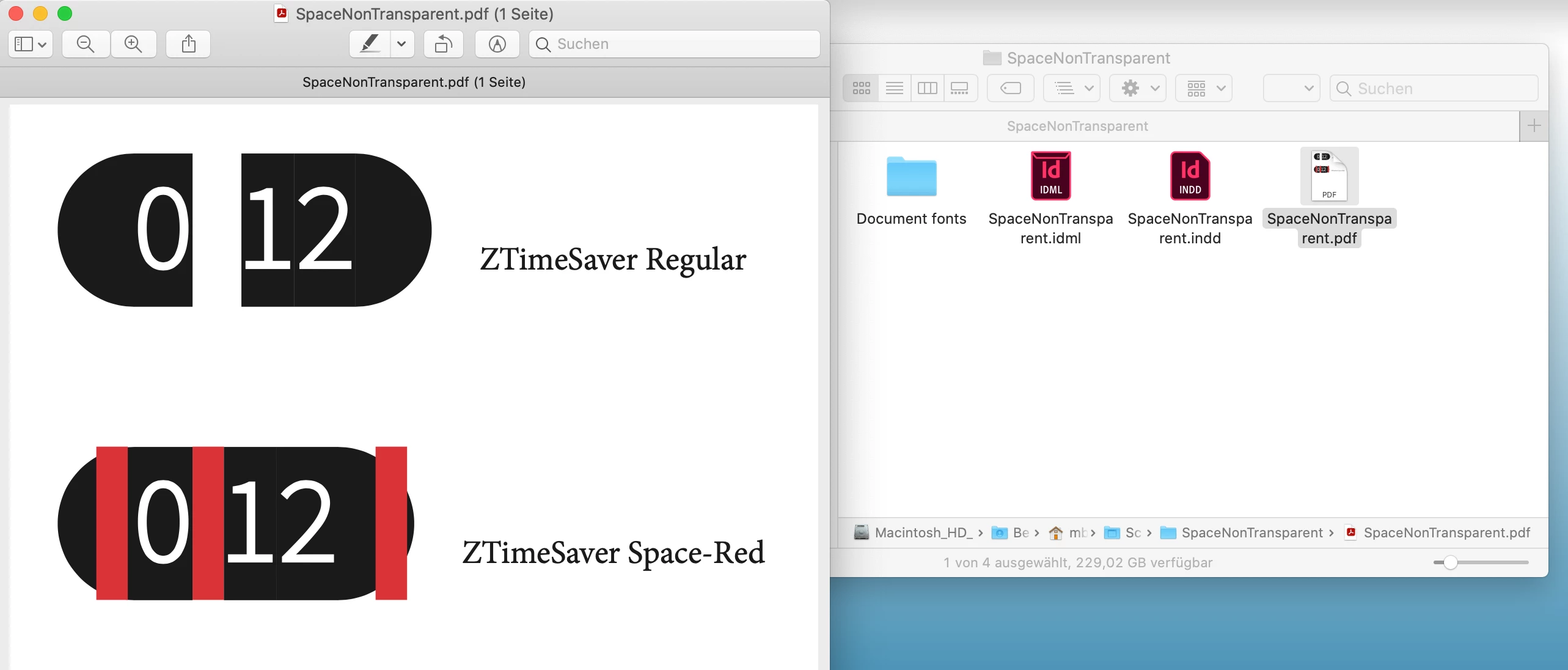
Attached is ZTimeSaver.otf (space is normally transparent) and ZTimeSaver-Space-Red.otf (space is red) for testing, as well as the InDesign document.
(macOS 10.15.7, InDesign 2022 - version 17.1)


- j.


Link to download all files: https://www.computergrafik-know-how.de/download/SpaceNonTransparent.zip


This topic has been closed for replies.
Correct answer Joel Cherney

Thanks for your expanded explanation. It's not too surprising that different apps render the same fonts in different ways, but this difference is quite surprising. It's not that the space is selectable that's bugging you, it's that it's being drawn in front of the substituted glyph! I also found it odd that it didn't show up in my InDesign fonts dropdown when installed in the OS, although your font worked just fine for me in Illustrator when installed normally. 


However, I was able to test your InDesign sample doc with your font in the Document Fonts folder. I couldn't figure out any way to alter this behavior in InDesign. It strikes me as something that is worth a bug report, to be honest. I don't think that your somewhat narrow use case will necessarily get immediate dev attention, but it's clearly a font rendering issue that results from some other kind of developer decision. On the other hand, I recall when we had similar questions here about how the hyphen was being automatically substituted by InDesign in automatic hyphenation, and that makes me think that there may be a way to use contextual alternates (or GSUB lookups or other OpenType features that don't seem to be supported by your font development tool) to make a version of this font that renders correctly in InDesign as well as all those other apps. 


1 reply

Joel Cherney
Community Expert
Community Expert
March 10, 2022

I'm not sure if I understand your question. When you say "a bar appears in the wrong place" I'm guessing that you mean that you would expect your two typed parentheses to compose into a single glyph. If so, I'd say that's something to be handled in the font, which I'm guessing FontSelf can't do; I can't tell from their publicly available information. (But apparently you can chat them up in-app, which seems like it might be useful for you.)  It's not so much that InDesign is adding a space, as that both base characters are still selectable, as in an ff or st ligature. However, the OT spec allows for lookups to do exactly what you're trying to do, it's just a question of whether or not your font development tool supports them. 


Parts4Arts
Inspiring
March 10, 2022

@Joel Cherney  schrieb:

However, the OT spec allows for lookups to do exactly what you're trying to do, it's just a question of whether or not your font development tool supports them. 


My font works in Illustrator, Photoshop and Apple Page correct. So it's a problem in or of InDesign.

In my test the space u+0020 is red. Normaly it has the color of the background of the font: purple or green.

It looks that InDesign add a space to a ligature. If space is transparent it can't be seen, but in my case the red space lays over my ligature. What can I do? Why will InDesign add the space at the and of a ligature? How can this be stopped?


My font in Illustrator:

My font in Photoshop:

My font shown in the font book of macOS 10.15.7. The first glyph ist SPACE (u+0020):

Joel Cherney
Community Expert
Joel CherneyCommunity ExpertCorrect answer
Community Expert
March 10, 2022

Thanks for your expanded explanation. It's not too surprising that different apps render the same fonts in different ways, but this difference is quite surprising. It's not that the space is selectable that's bugging you, it's that it's being drawn in front of the substituted glyph! I also found it odd that it didn't show up in my InDesign fonts dropdown when installed in the OS, although your font worked just fine for me in Illustrator when installed normally. 


However, I was able to test your InDesign sample doc with your font in the Document Fonts folder. I couldn't figure out any way to alter this behavior in InDesign. It strikes me as something that is worth a bug report, to be honest. I don't think that your somewhat narrow use case will necessarily get immediate dev attention, but it's clearly a font rendering issue that results from some other kind of developer decision. On the other hand, I recall when we had similar questions here about how the hyphen was being automatically substituted by InDesign in automatic hyphenation, and that makes me think that there may be a way to use contextual alternates (or GSUB lookups or other OpenType features that don't seem to be supported by your font development tool) to make a version of this font that renders correctly in InDesign as well as all those other apps.