
Font looking different across two supposedly identical documents
Hi all, I'm not a super frequent ID user--I designed an indie book several years ago, and learned just enough to be dangerous, but my author is asking for a paperback version, and trying to tweak the files is giving me an enormous headache.
Original document: created summer 2021, Lucida Bright font.

Now the weird part. I shift+selected both text boxes and the author photo, and I've set the clipboard handling to paste all formatting, etc, but it's coming out like this:
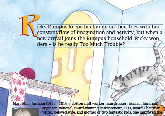
As you can see, the text looks.... beefier, and the sculpting around the capital R is totally gone. The hanging indent around Mary's picture remains. When I try to type in either of these boxes, the text momentarily goes back to its more delicate appearance, but reverts quickly to this pixely, semibold mess. It also seems to be a different size, even though both documents say the font is the same size, and any alterations to the font create absolute formatting hell (below, going from 16 to 17pt).

I am hoping desperately that this is just my lack of experience, I've found a few topics that seem tangentially related, but involved digging into the actual code, which is completely beyond me. Did Lucida Bright get an update in the last few years? Does this have to do with the differences in default paragraph styles between the 2021 and current versions? What is the simplest way to make this look less rancid?