
Font Substitution Confusion: Google Fonts vs. Adobe Fonts in InDesign
For the past couple of years, I have been working with the Barlow type family from Google Fonts for a client.
It has come to my attention that if the Google Fonts are not loaded and activated on a computer, and a document is opened in InDesign, instead of giving a warning and asking for the fonts to be activated, it goes ahead and activates the version of Barlow on Adobe Fonts.
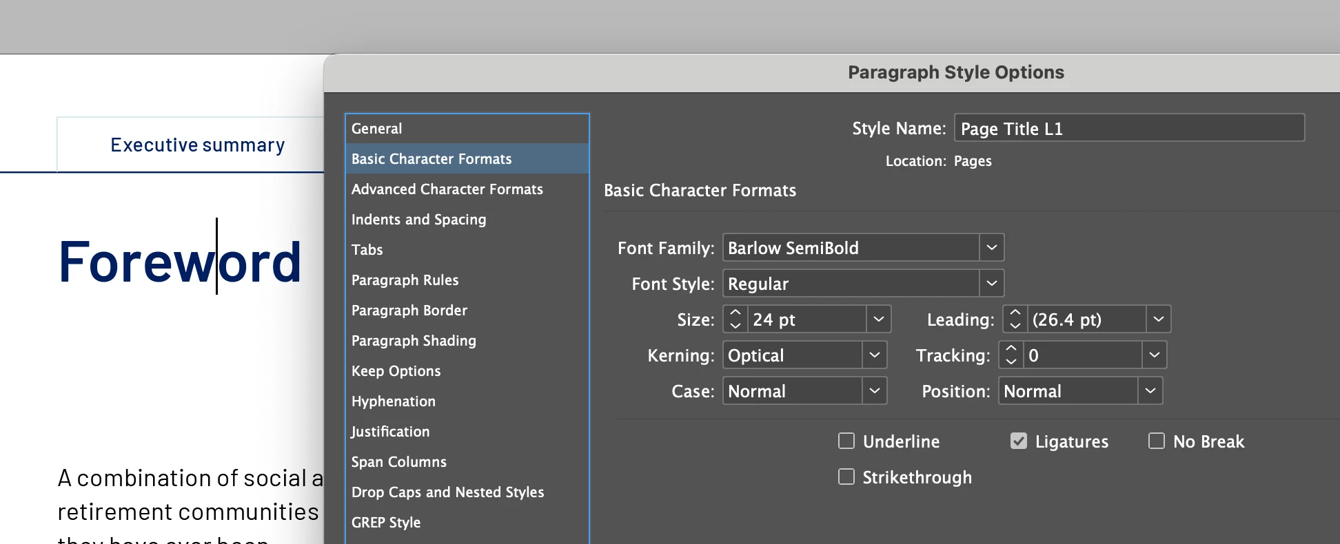
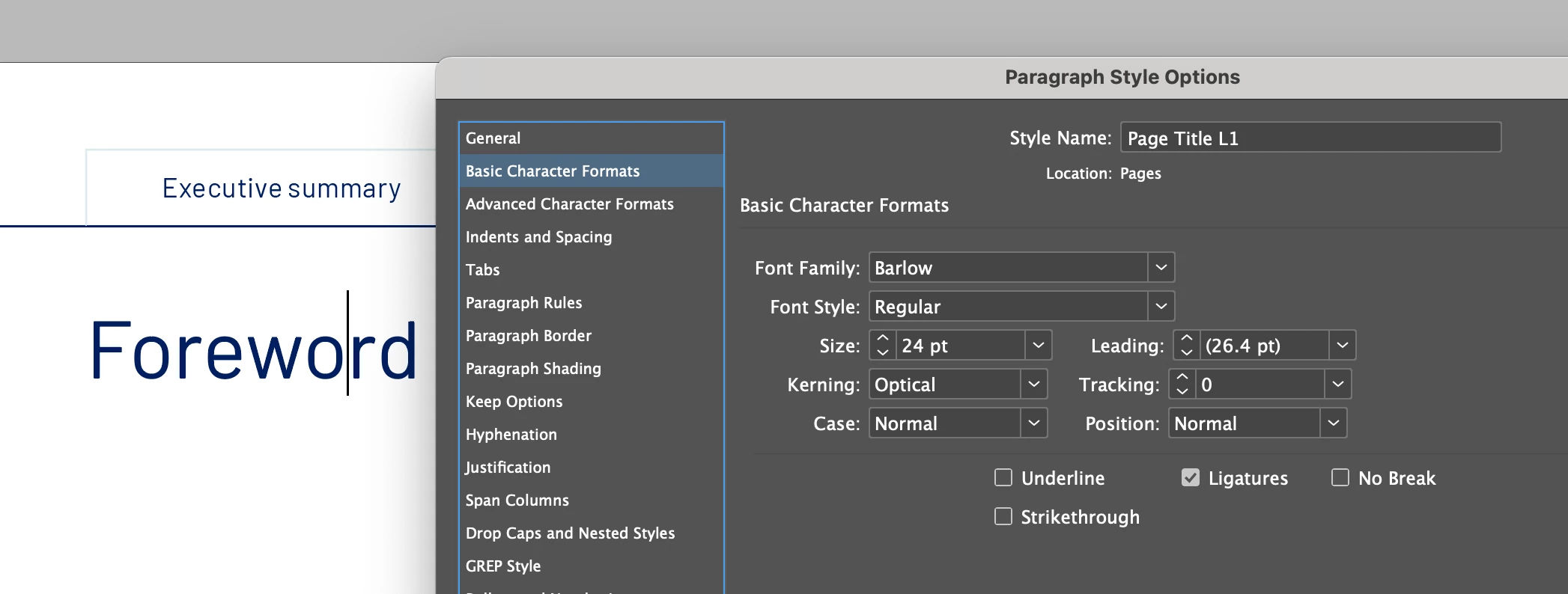
Which would be okay, except it's mapping the weights differently. Bits of type that should be Barlow SemiBold becomes Barlow Regular. It is changed in the style sheets also. So unless someone remembers what each bit of type should look like, they would have no idea that the type style has been changed.
What it should look like with Google Fonts activated:
What it becomes. when Google Fonts not activated:
I understant that the two versions of fonts are structured differently:
- Google – Barlow SemiBold > Regular
- Adobe – Barlow > SemiBold
But if InDesign can't find "Barlow SemiBold > Regular", I would prefer it to throw up a warning so the user can find and replace, rather than substituting with "Barlow > Regular" without telling anyone.
<Title renamed by MOD>