Hi Lhemz0527 ,
for your construct you need only two objects!
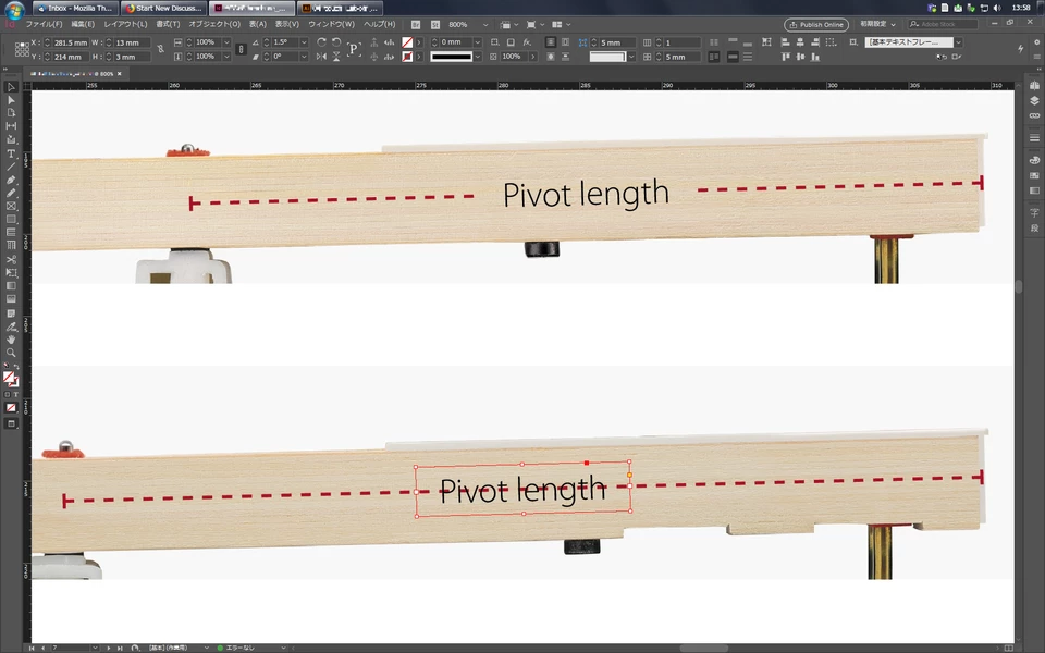
1. Text frame on top with text frame options' fitting options set to "Center".
2. Graphic line at the bottom with line caps defined.
Group both objects.
Set text frame fill color to any color.
Effects of text frame:
Set opacity of fill to 0 %.
If you are using fill color [Black] for the text set text to Multiply.
Select the group and check Knockout Group option.
You now can change the width of the group and the text frame will be always centered.
If you edit the text in the text frame the frame is always centered to the group.
For the distance you want from the graphic line to the text do left and right insets with the text frame options.
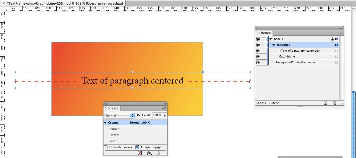
Illustrated with some screenshots from my German InDesign.
Group selected with an arbitrary background, here a rectangle with a linear gradient fill.
Effects panel "Effekte" is open and Knockout Group option is set. ( "Aussparungsgr." for "Aussparungsgruppe" in German )
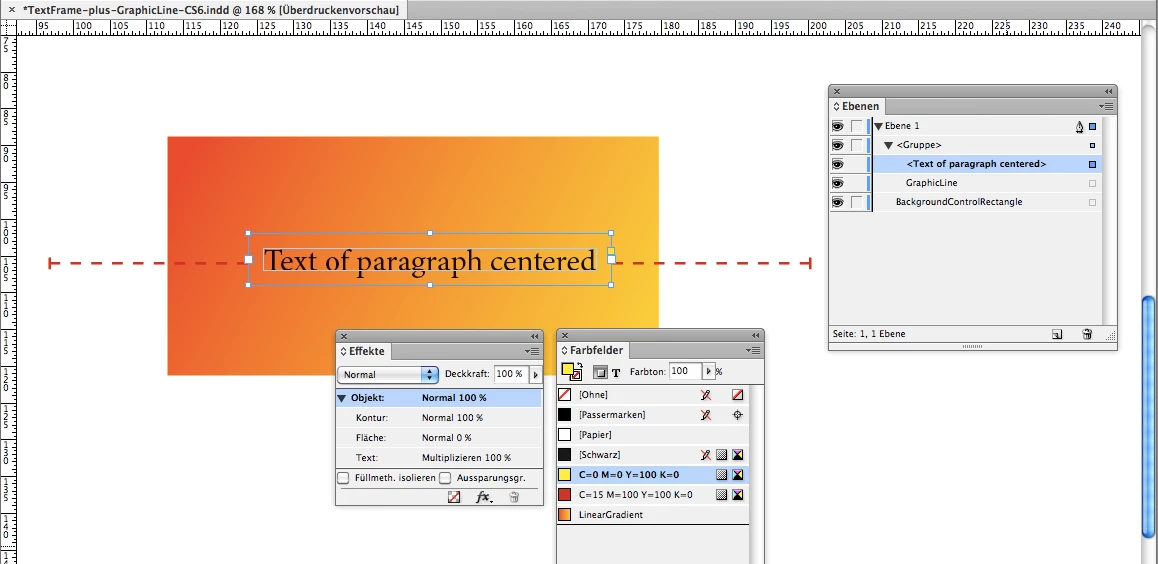
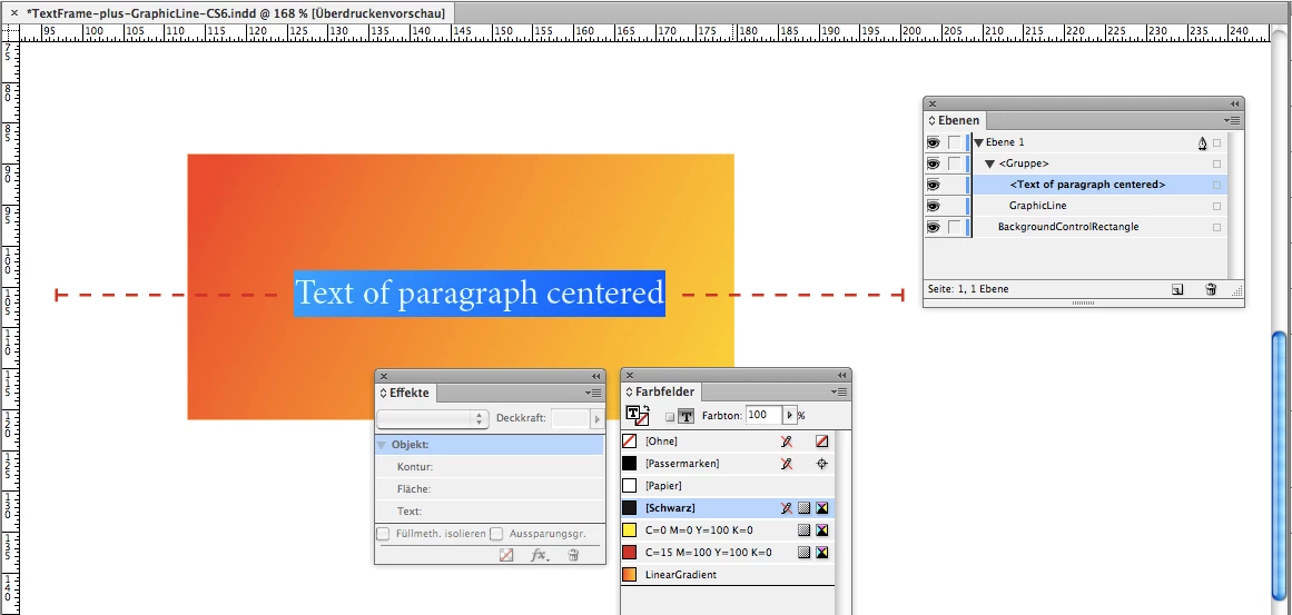
Details of the text frame that is grouped with the graphic line.
Fill color is a yellow. Could be any color, because in the Effects panel opacity for fill of the text frame is set to 0 % :
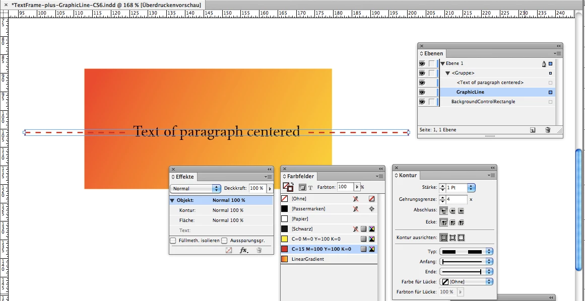
Graphic line selected with line end caps set in Stroke panel ( "Kontur" in German ):
Some more details below. Text selected. Fill color is [Black].
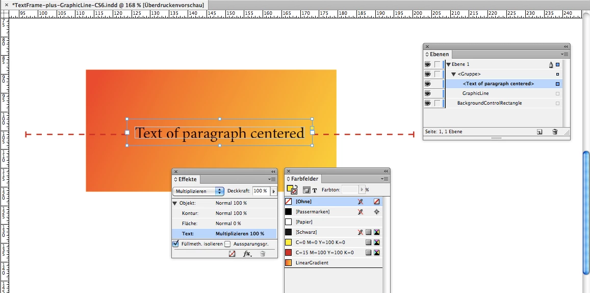
Now with this we have a problem! Since an effect is applied to the fill color of the frame [Black] fill color for text will not overprint the background!
To get this straight—fill color [Black] for text should overprint the background—we use an effect on the text as well:
Multiply on text.
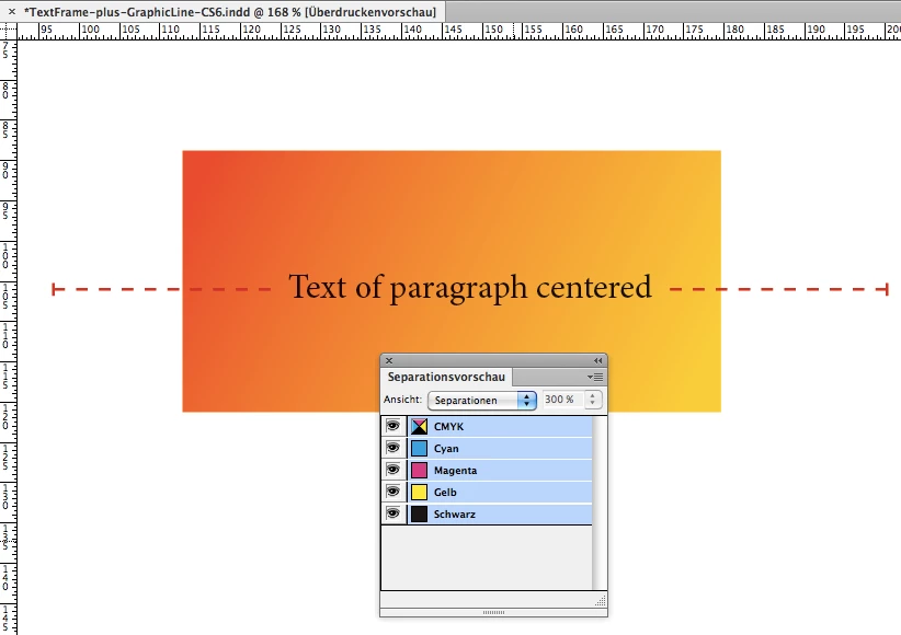
So we check the result of this effect with the Separation Preview panel ( "Separationsvorschau" ).
Here all separation colors visible:
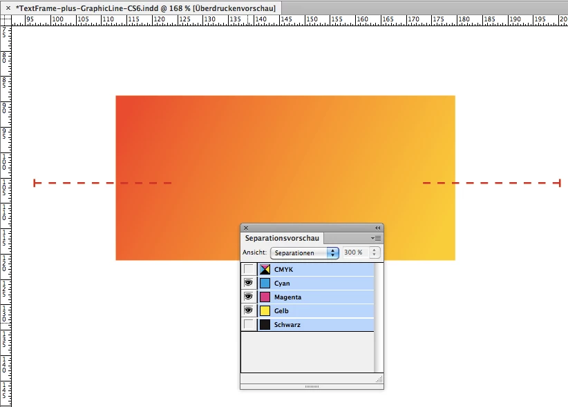
Below only Cyan, Magenta and Yellow are visible in the Separations Preview panel.
And as we can see text will overprint, because there is no visible trace on the other separation colors.
No white knockout for example:
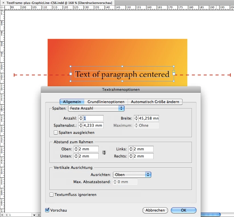
Edit: Other details on the text frame. Fitting options and insets.
Insets here set to 2 mm to leave a gap between the graphic lines visible appearance and the text.
Text Frame Options ( "Textrahmenoptionen" ) > General ( "Allgemein"), Insets all around ( "Abstand zum Rahmen" ) :
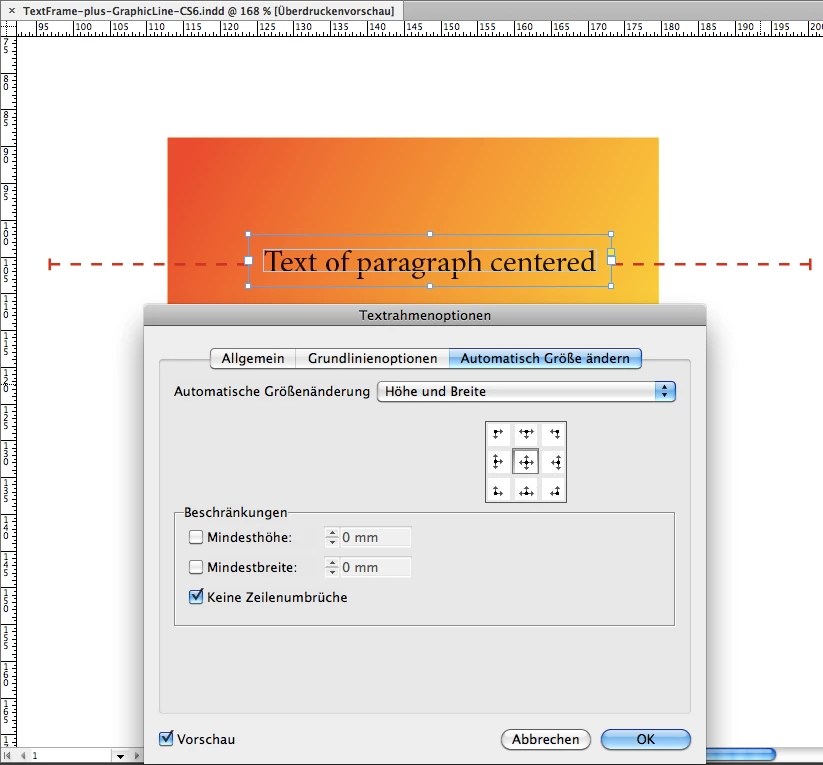
This is InDesign CS6—with CC 2018 you'll see more tabs in the Text Frame Options—Frame fitting options are still the 3rd tab.
Automatic options set to Height and Width and note, that the other options is checked for No Line Breaks:
Regards,
Uwe