
Horizontal dotted line or lines with round caps distorted in PDF (Enhance thin lines)
Hello,
I have this problem. I have been looking around for a solution but I did not find anyone describing exactly the same problem.
I will not tell the whole story and I will go right to my final conclusion and finding.
- When drawing a dotted line or a line with round caps, the round part look bulky and ugly but only when the line is horizontal.
- Since I want to use this kind of line in the upper rule of Paragraph Style, it will of course be horizontal.
- If I disable "Enhance thin lines" from acrobat reader everything is ok. But since this document will be distributed to many people and most of them will use Acrobat Reader it is very awkward to need to tell them to disable this feature (I know there are many angry people about it).
- The lines I am using are not thin at all, they are 14 pt!! Why Acrobat reader is enhancing them?? and only when they are horizontal?? is it a bug??
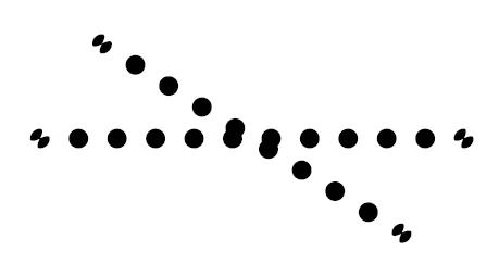
This is the screenshot from InDesign (Lines are 9pt)
And this is the image from Acrobat reader
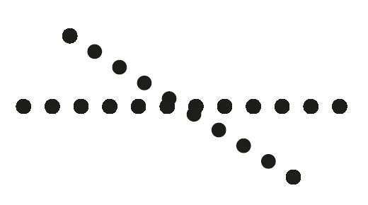
As you can see the circles on the horizontal line look pretty bad, but not in the oblique line (except the first and the last dot, also pretty strange). Also as you can see the connection circles on the ends of the line that they are different in InDesign they are just circles in the PDF (But this is something I do not care for now since I don't want them).
- Is there any work around for that?
- Am I the only one having exactly this problem? (I gave the PDF to a colleague and it was exactly the same on his computer).
Thanks in advance
Samuel
[Moved from non-technical Forum Lounge to specific Program forum... Mod]
[Here is the list of all Adobe forums... https://forums.adobe.com/welcome]