- Home
- InDesign
- Discussions
- Re: How to draw everything on baseline grid withou...
- Re: How to draw everything on baseline grid withou...
Copy link to clipboard
Copied
I want to size all my objects (text, images, everything) to exact document grid increments for the sake of easy drawing/resizing of objects on new pages.
So I activated snap to document grid.
I never need to display my baseline grid because I have set its height to my document grid cell height, so it's incorporated in my document grid.
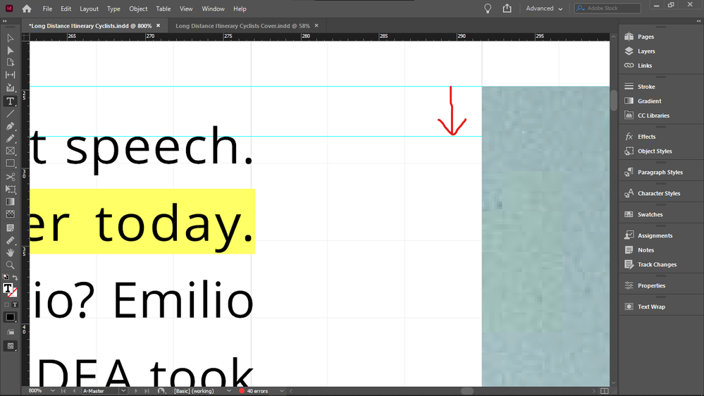
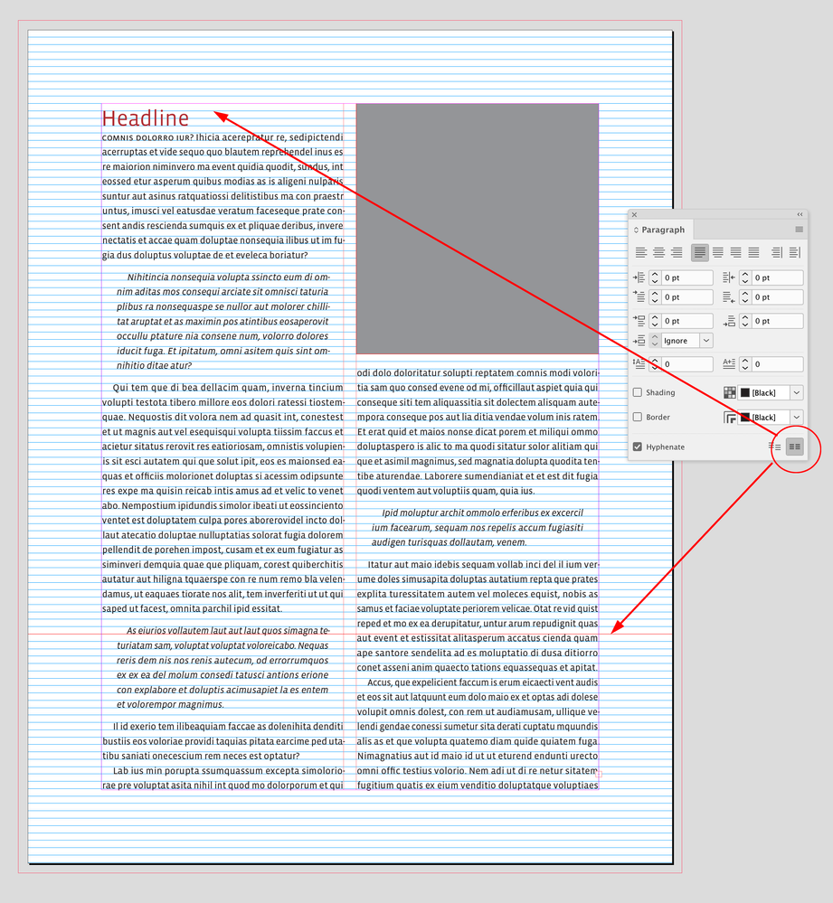
The irritating thing is that everything works well with the document grid increments objects (bottoms, sides) except the upper boundary of images.
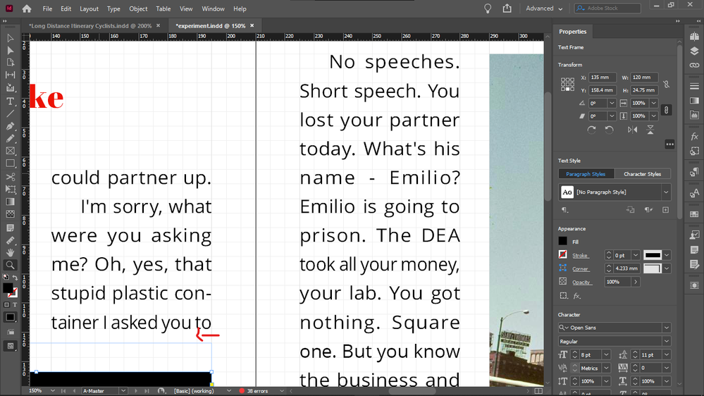
So I always have to crop the top of all images with text on the side down to the median line of the the text line on the top, to get them top-aligned, the cropping shown by the arrow:
So if I do crop them (and I have to, because the disalignment is visible), then all object boundaries are layign on the document grid, except the top of images that have text on the side - so this is quite disappointing.
Because the point is to not see any lines between document grid lines.
The disalignment is especially visible now when I doubled the size of my document grid blocks / and height of my baseline. I did that to be able to see always the real number of baseline grid blocks, no matter the zoom level - because I use them as units, when drawing/resizing my objects on the grid. When my grid block was twice as small, InDesign displayed 4 blocks as 1 block in Fit Spread In Window mode, and that is the mode I use for drawing / resizing / editing - except the top cropping of images I mentioned above.
Forcing my text into every second baseline (for this I must revert my document grid block / baseline grid height to half to get a reasonable leading - which I can't because I must see the real number of blocks at any zoom level) does not solve this issue either, because even if the baseline height is not that tall, the top disalignment betwen the text frame and image is still visible, and additionally, having text in every second baseline only, it causes the top offsets of elements under the text box to be taller, if the number of lines in the text box is even, because then the one at the bottom will be forced to stay empty, adding the impression of extra height to the top offset of the element below it.
Does anyone know such a fix for this issue, that would enable me to keep everything: my large baseline height / document grid cell dimension, not forcing text in every second baseline, and not needing to crop the top of images with text beside them after placing those images - that would create lines inside docuemnt grid cells, and that's what I wanted to avoid by drawing exactly on the document grid, so it wouldn't mess up my vertical math when calculating in my grid units (which I would like to use also as real units, for example when setting offsets, because remembering all the decimals and dimensions of say 3 document grid blocks is not practical).
Thanks.
 1 Correct answer
And it's very unlikely that you will get other text to align using this setting. Here's the only real solution to your request that everything line up on a grid AND there be no gap above text when next to an illustration at the top of a page:
Probably not what you want, again. But if it's not clear by now, what you want is basically impossible. You can have your precise grid that everything snaps to regardless of layout variations, or you can have that top-text/illustration alignment, but (ot
...Copy link to clipboard
Copied
Making the text median height the same as the baseline height (just a tiny fraction bigger so it would force text in every second baseline) would actually eliminate the need of top cropping of images, and it would yield a slightly larger than usual, but acceptable leading, but there would still be 2 issues left:
- two small baseline height / document grid cell dimension, so I could not see the real number of blocks on the scale I am composing in
- extending the offset of elements below, if the number of lines in the column is even
Copy link to clipboard
Copied
I mean extending the TOP offsets of the elements below.
Copy link to clipboard
Copied
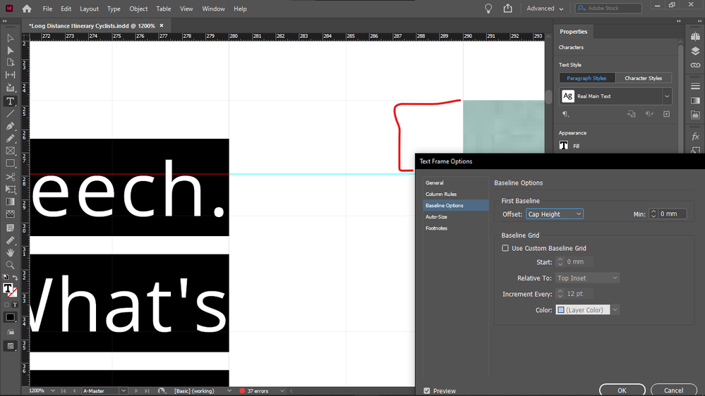
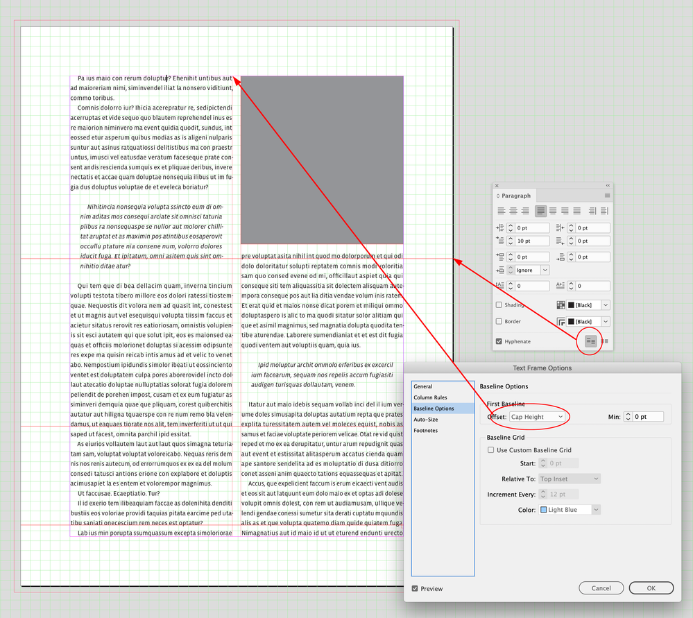
Set the first baseline offset of the text frames to Cap Height.
Copy link to clipboard
Copied
Thanks, looking into it.
Copy link to clipboard
Copied
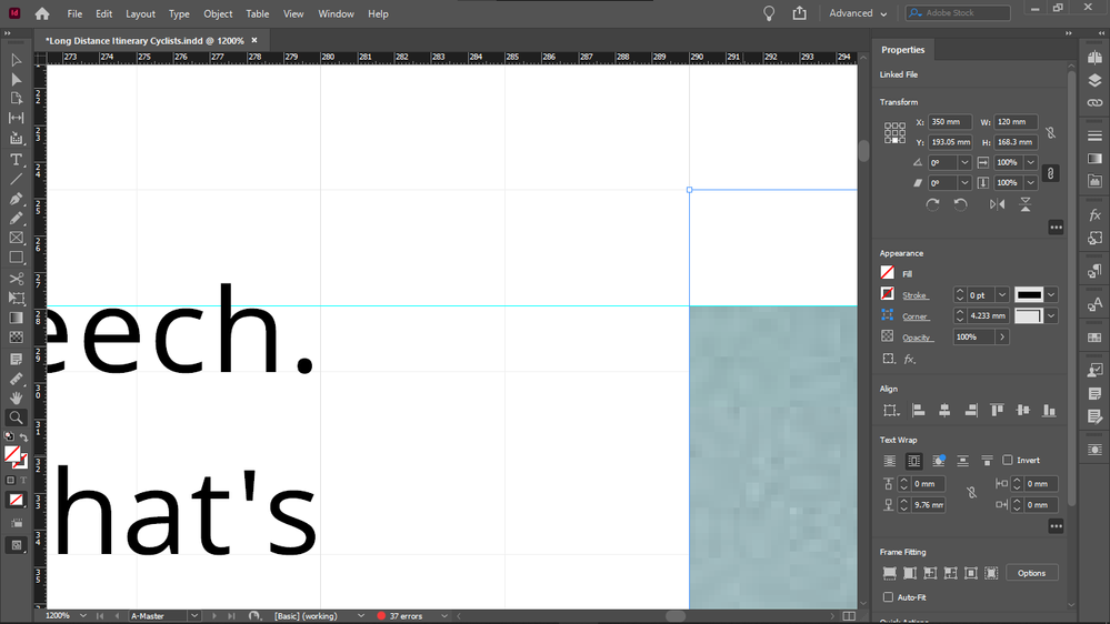
The Cap Height option doesn't seem to work.
I still have to crop the top of the image down to the median line of the top row of my text column to make them flush on the top. (Crop area marked with red.)
In lack of other options, maybe a functionality is needed that detects images that have text beside them and if the two objects are top aligned, automatically crops the image down to the median line of the text, without actually resizing the image object, like this:
Copy link to clipboard
Copied
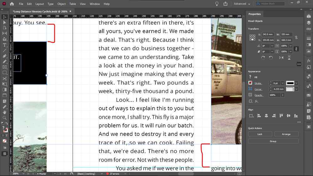
This issue is not only at the top of the pages, it's also other places:
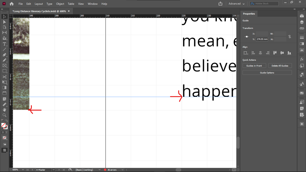
Both offsets are the same dimensions, yet the bottom right offset seems visibly taller because of the same issue, except that cropping here won't help, and resizing the bottom right offset will not help either because the text is aligned to the baseline grid.
Copy link to clipboard
Copied
Unless it's possible to extend the image outside of its object boundary, downwards. That would be the solution. Does such feature exist?
Copy link to clipboard
Copied
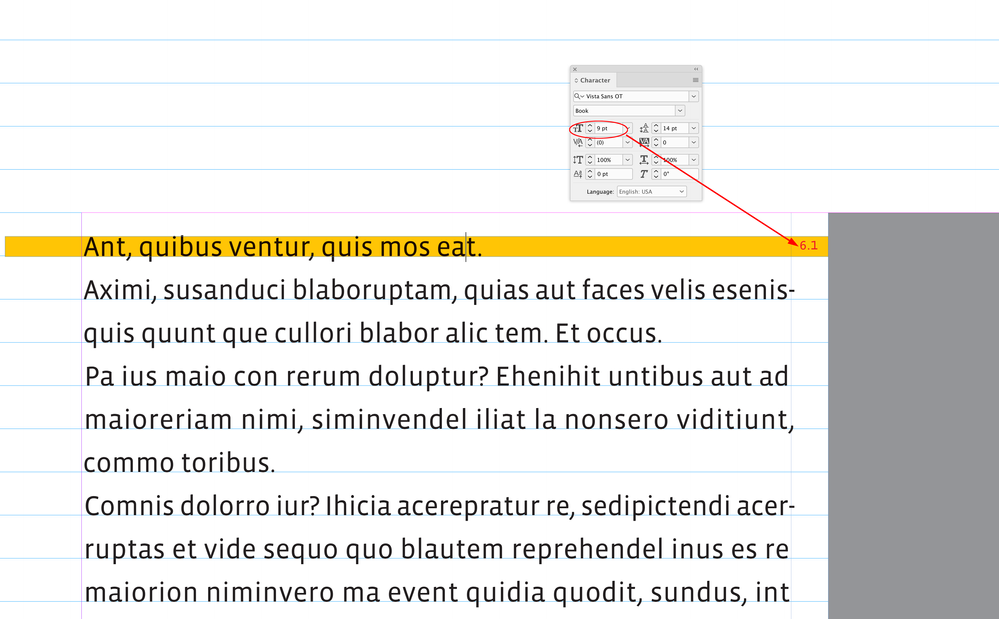
If you have your text aligned to a baseline grid, you can’t align an image frame to the baseline grid and expect it to line up with the text’s cap height.
Here I have 9/14 text aligning with a 14pt baseline grid—the font’s 9pt cap height is at 6.1pts above the baseline, and 7.9pts below the baseline above. I would have to move the image frame in order to get it to align with the text’s cap height.
Copy link to clipboard
Copied
More precisely you have to crop the image (frame) because if you move it, it would cause additional disalignments. That is what I also said, I am just thinking how to automate these croppings so that the image frame doesn't change (to keep the offsets relative to the frames, and to avoid extra "lines" that are not exactly laying on the document grid).
What about forcing the text in every second baseline by setting the text size just a tiny bit taller than the leading, so that the median height would be approximately the same as the baseline height, and only using odd number of lines for columns so that the last and top line would never be empty? Could this technique eliminate this issue?
Copy link to clipboard
Copied
This is what I mean. Sorry setting the leading taller than the text size is what I meant, to forcing the text in every second line, and then increase the text size to (almost) match the baseline height.
Copy link to clipboard
Copied
The problem with my solution is that if the column has an odd number of rows, the bottom row cannot be populated with text, and thus it will give the impression of a taller top offset of the element below.
Copy link to clipboard
Copied
If you have your text aligned to a baseline grid, you can’t align an image frame to the baseline grid and expect it to line up with the text’s cap height.
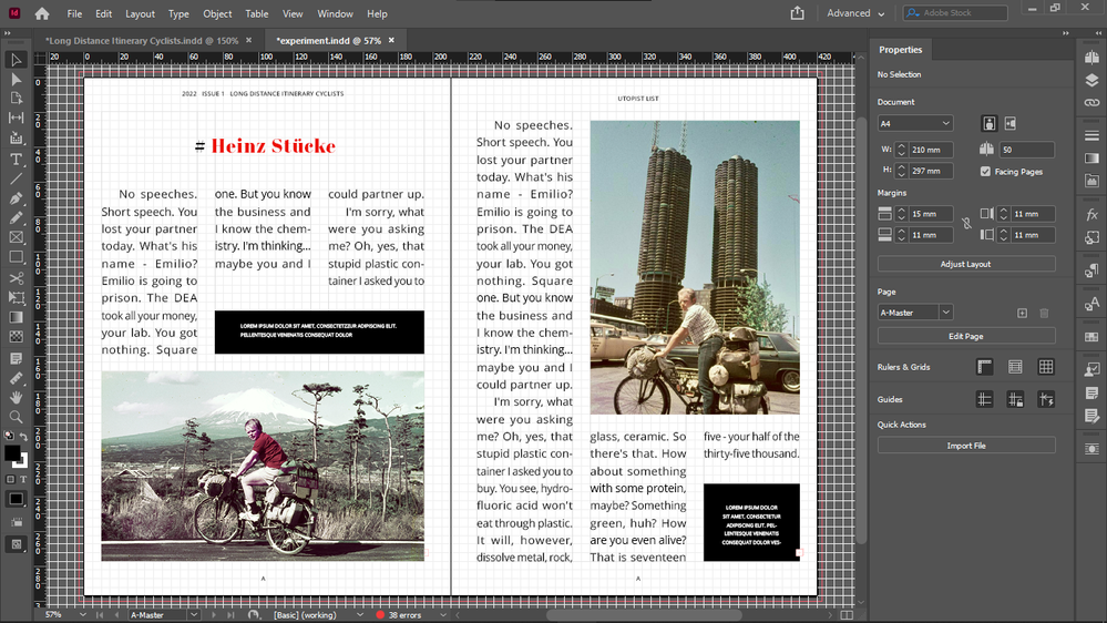
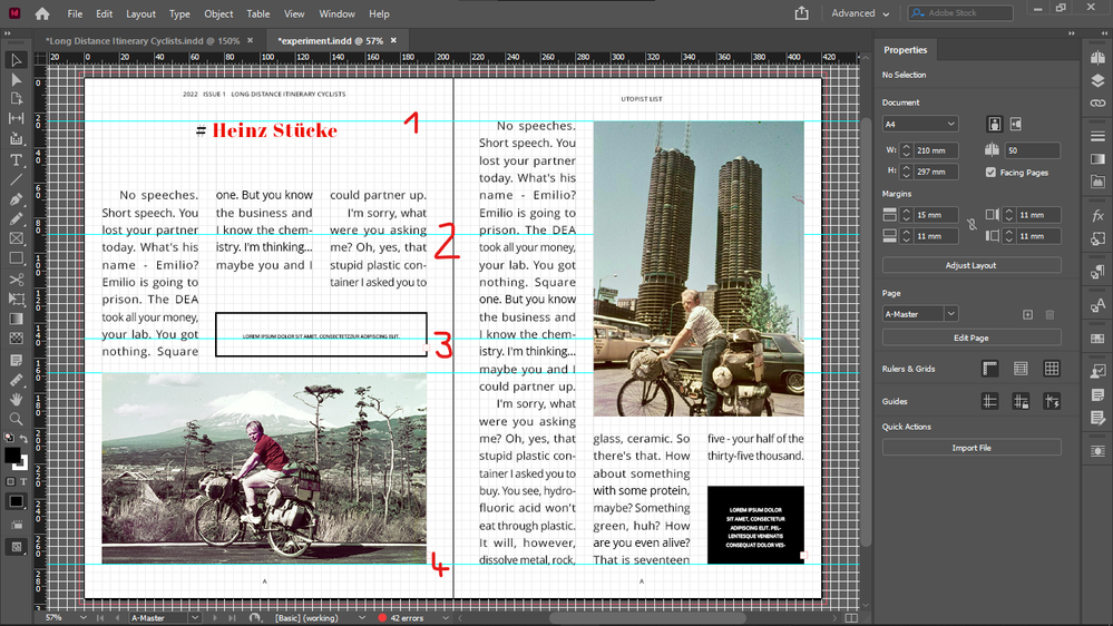
But if you make your baseline grid the same height as your document grid cells as I did in my examples, then you can align (even snap) everything to the document grid instead of the baseline grid, and the top alignment of text and images will be solved if you proceed as I described it in my examples as you see it on my screenshots.
And once I changed my column to an odd number of lines (i shrinked the top of my black box one line lower), the top of the image is flush with the text on the right page automatically, and the top offset on the left page is normal, not extended by empty line. Now actually only 2 problems are left:
- too tall leading
- too large font size, but if I decrease my document grid cell height together with my baseline height, to get smaller font and leading, I will not see the real number of cells in "Fit Spread In Window" mode (the mode I am composing in) and at all zoom levels because InDesign will make 1 cell out of 4. (On my HD laptop screen - not Full HD).
Okay, the confusion with the cell numbers (cause I use them as units) is not so bad, so I could get the smaller font size also, if I scale down my grid.
So only the too tall leading is now the problem with this solution.
Any solution, if there is any?
Copy link to clipboard
Copied
So this is how it looks with halving the grid cell dimensions and font size / baseline height, and flush top of text and image, and correct top offset on the left page if the number of lines in the column is odd. Sorry I meant odd not even. So that is no empty line below the text that would extend the top offset of the element below.
and zoomed out:
But text now seems to not occupy the first lines.
I will come back about that tomorrow.
Any advice appreciated.
Copy link to clipboard
Copied
You don’t have to use Align to baseline grid in order to get the baselines aligned across columns and pages. In the end it is just a matter of making sure the Leadings and any Space Above and Space below are the same. See more here:
So if I want to use the Document Grid and get the baselines to align, I can set the Text Frame Options First Baseline Offset to Cap Height (see @Peter Kahrel ’s post), turn off Align to baseline grid, and make sure all the leadings and spacings are the same in my Paragraph Styles.
Here the Leading is 14pt, the Bottom Offset of the picture frame wrap is 14pt and the excerpt’s Space Above and Space Below is also 14pt—all of the text baselines are lining up across the column:
Copy link to clipboard
Copied
Thanks Rob. It seems that Cap Height offset recommended by @Peter Kahrel didn't work because my text was aligned to baseline grid.
Perhaps this method you presented is the way the makers of InDesign intend to top align text and image boxes beside each oher, officially?
I will experiment with this now and report back.
Copy link to clipboard
Copied
Disabling Snap To Baseline Grid for the text and setting its first baseline offset to Cap Height just moves the issue to the bottom, but it doesn't eliminate it. Now the bottom is not flush. It will be flush if I set its vertical alignment to Justify, but I can't do that across my whole spread or document because of different column heights - doing so it will result in disaligned baselines.
Is anything that can be done?
Copy link to clipboard
Copied
And by the way how acceptable is my fix to keep the alignment to baseline grid, force text in every second baseline, and set the text median line height of text to slighty larger than the baseline height - which would result in a correct leading height, and make sure that all columns have an odd number or rows, so that there would be no empty rows at the bottom that would extend top offsets of elements below?
One thing went wrong with this: the empty line lines at the top of the frame (since text was forced into every second line).
However that is not a visible issue in print, it just creates a gap in the top of the text frame itself, which looks weird.
If all columns have an odd number of rows, it shouldn't cause an alignment problem at the tops, because then all columns would skip the first line.
Copy link to clipboard
Copied
Any future trouble this would cause? What could possibly go wrong?
Copy link to clipboard
Copied
Because with this system everything could be drawn to exact document grid increments, and everything would fit, which is visually very pleasing when creating pages with the document grid shown.
Copy link to clipboard
Copied
This is what I mean:
(but then all boxes that are not on top or bottom must have an odd number of rows to make sure that all columns can have an odd number of rows to not modify vertical offsets in between:
Copy link to clipboard
Copied
Here I have a 7pt baseline grid with 9/14 text set to Align to baseline grid. The baseline’s don’t line up across the columns (because of the 7pt Space Above and Below on the excerpts) and the head is not lining up with the image frame:
Copy link to clipboard
Copied
Look, for me everything is aligned now, inclusively the elements that are not aligned in your spread:
Do you have object boundaries activated to be visible? Can you make them visible?
Copy link to clipboard
Copied
It's because your text frames don't have an odd number of lines. They must have all odd number od lines for this to work. Everyhting, including boxes, or boxes together with their offsets.
Copy link to clipboard
Copied
Just extend your boxes one line and see that everyhting will be flush.
Find more inspiration, events, and resources on the new Adobe Community
Explore Now
