Copy link to clipboard
Copied
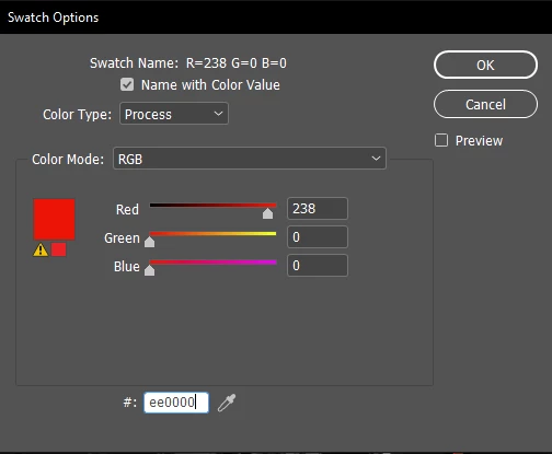
InDesign indicates with the yellow sign that my choosen RGB color cannot be reproduced in the CMYK color mode for print.
My RGB color #ee0000 according to this article:
is the red shade that has the highest contrast with both black and white.
But the color that InDesign chooses to replace it: #ed1c24 (shown in the small square beside the yellow sign, as a comparison):
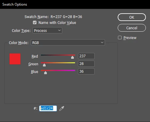
is a much more pale red.
Is this really the closest RGB color to #ee0000 that can be used in CMYK, or I should recalculate the highest contrast shade red (with both black and white) using some other, CMYK scheme?
Copy link to clipboard
Copied
ETA: This is not an InDesign issue. It is a fundamental design issue, one of the most fundamental. It needs to be understood independently of how any one app might manage it.
Working to digital display and working to print are two very different things. That you can be casual about it and convert colors and so forth at several stages is not really an excuse to do so; if a project is, in particular, intended for printing, you have to make every design choice for that end right from the start.
Back up and choose your colors using CMYK. Don't try to "fix" an RGB document designed around (usually brighter) colors print can't replicate.
You might also want to study a tutorial or two on the differences between RGB and CMYK gamuts, so that you have a better grasp of the why and the limitations, especially for print.
—
Copy link to clipboard
Copied
Hi @Chris P. Bacon ,
The article you linked to is referring to web viewing where the RGB color profile is assumed to always be sRGB.
The Adobe print apps allow you to work in any RGB or CMYK space, so the appearance of color is dependent on the assigned color profiles.
Here I have a document with sRGB as its RGB assignment, and Coated GRACoL 2006 as its CMYK assignment. The fill on the left is sRGB 238|0|0 and the fill on the right is GRACoL CMYK 0|100|100|0. If I change the document profile assignments the color appearances change:
sRGB and Coated GRACoL:
sRGB and US Newprint SNAP
Prophoto RGB and US Newprint SNAP
Also, HEX color is simply a different notation for RGB colors, so if I check the 0|100|100|0 CMYK value in the Color Picker, the listed hex value is the conversion from the document CMYK profile to the document RGB profile—Coated GRACoL to sRGB in this case.
Copy link to clipboard
Copied
In lack of a highest contrast (with black and white) calculator specificaly for the CMYK color mode, the only thing I can try to do is to find the closest CMYK color to #ee0000.
My question is if the color suggested by InDesign is really the closest to that sRGB color that can be reproduced in print?
Or should I use some other tool to find the closest CMYK color?
Copy link to clipboard
Copied
Or should I use some other tool to find the closest CMYK color?
No, 238|0|0 sRGB would out-of -gamut any typical offset press CMYK space, and in a larger RGB space like AdobeRGB or ProphotoRGB would be even further out.
Copy link to clipboard
Copied
InDesign is extremely strong (and industry-standard) on things like its color mapping and management. Other tools might have a different interface and allow different comparisons, but none will be any "better."
Contrast issues as subtle as this rarely matter in print. They are more of an issue for things like web site accessibility.
—
Copy link to clipboard
Copied
The printing company told me that if I want exact color reproduction, only choosing from a printed PANTONE color sheet will work, and they can send me that because their printers can only accurately reproduce PANTONE colors.
Copy link to clipboard
Copied
Pantone colors are spot colors. They are most often printed from spot color inks — that is, if you want a precise shade of lime green, it's printed with Pantone 809 ink, not with any composite of CMYK colors.
There are CMYK equivalents for much of the Pantone range, and you can get close to a spot ink color if the printer is technically adept and meticulous. But in general, it's accepted that any simulation of Pantone colors is going to vary somewhat, both from printer to printer, job to job and even within a large print run.
Spot colors are a completely different proposition from composite colors using RGB, CMYK, etc. Unless your print job is using only spot colors, your printer is talking about composite simulations and is saying they will only guarantee a color match if you use a specific Pantone simulation in CMYK.
—
Copy link to clipboard
Copied
Pantone colors are a solid ink spot color system—to use the solid inks you have to print an extra plate (expect to pay more for the extra plate) on press. You can get the closet Pantone solid ink to sRGB 238|0|0 via Photoshop’s Color Picker (probably PANTONE 2347C, but it’s still not an exact match):
Copy link to clipboard
Copied
I will try to find one with PhotoShop then.
Yes it seemed from their message also that Pantone color printing comes with an additional cost.
Copy link to clipboard
Copied
Spot colors (which need the extra plate, and the ink, and thus require extra press setup and "washing" afterward), can double the cost of a print job.
—
Copy link to clipboard
Copied
Also, offset printing is variable—the appearance of process color changes with the profile of the press—the press profile can even change during the run because ink density affects the color appearance.
Even printing a custom solid ink is going to have some variance depending on how well the ink density is controlled during the press run.
If anyone knows how to calculate the red that has the highest contrast with both black and white in CMYK, please let me know.
You can get the Lightness value of a CMYK color via the Color Picker’s Lab values—the L value of 238|0|0 sRGB is 51 (the middle of the scale). So on a press running to the GRACoL profile 0|96|100|0 has a L value of 50.
But CMYK is device dependent, if I change the profile assignment to the deafult US Web Coated SWOP, the L value changes to 53.
Copy link to clipboard
Copied
For my eyes, that is a big difference between the 2 red shades.
If you use a red signature color across your magazine, you will wan tto be the first, much stronger red shade, and not the second, that has much lower color contrast (with black and white).
Copy link to clipboard
Copied
For my eyes, that is a big difference between the 2 red shades.
That’s right, CMYK is device dependent—its appearance changes depending on the press profile.
Copy link to clipboard
Copied
Here are the 3D plots for the sRGB space compared to the Coated GRACoL CMYK space—you can see that there are saturated reds that are outside of the CMYK gamut:
Copy link to clipboard
Copied
If anyone knows how to calculate the red that has the highest contrast with both black and white in CMYK, please let me know.
And then I can use this converter
to convert it to Pantone.
However calculating the highest contrast red directly in Pantone would be best, perhaps.
None of the online color sites can do that so far what I have seen.
Copy link to clipboard
Copied
Contrast is subjective, or at least subject to many factors besides a specific color value. Any bright red is likely to be near the peak of contrast vs black and white; I don't think there is a single optimal value. At least, not one worth chasing down at great expenditure of time and effort.
There are many charts, including Pantone's own, that give CMYK values for the nearest possible match to each solid color.
—