Copy link to clipboard
Copied
InDesign Displays my RGB Blue 0,0,255 as dull CMYK especially for my blue 0,0,255.
I have definitely set my EPS files to RGB color, but only the 0,0,255 blue is converted to an ugly dull blue. I also set my PDF output to RGB, but the blue is still wrong and only wrong for my EPS files. The 0,0,255 blue for text outputs correctly. So, why won't InDesign 15 or 16 output the EPS color correctly?
Sample:
 1 Correct answer
thomasb14279947 wrote:
When you past an RGB color into another RGB illustrator doc 1000 times, it is faster to use spot because at appears in the swatches panel instantly. Otherwise you have to add the color manually 1000 times into the swatches panel. That is how spot came into the RGB picture.
I realize you don’t want to continue along this tangent, but this is worth noting:
What you describe is using spot colors as a workaround for specifying color inappropriately; instead of using spot
...Copy link to clipboard
Copied
When you past an RGB color into another RGB illustrator doc 1000 times, it is faster to use spot because at appears in the swatches panel instantly. Otherwise you have to add the color manually 1000 times into the swatches panel. That is how spot came into the RGB picture. The issue is not about spot colors, the issue is from an outsourced InDesign file with color issues and I have never had this color issue before from an outsourced InDesign file. Please stop going on a tagent. Thx
Copy link to clipboard
Copied
thomasb14279947 wrote:
When you past an RGB color into another RGB illustrator doc 1000 times, it is faster to use spot because at appears in the swatches panel instantly. Otherwise you have to add the color manually 1000 times into the swatches panel. That is how spot came into the RGB picture.
I realize you don’t want to continue along this tangent, but this is worth noting:
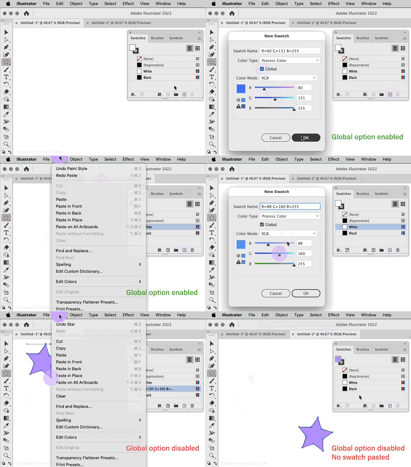
What you describe is using spot colors as a workaround for specifying color inappropriately; instead of using spot colors it would be better to specify your colors correctly. If you paste an object containing a non-spot color into another Illustrator document and its color does not appear in the Swatches panel, then the color was probably defined with Global disabled, meaning that when you apply that color it is not linked to a named swatch. If a color is defined with Global enabled, then it is linked to a named swatch, so pasting an object using that color into another document does carry the named swatch with it into the other document.
Below you can see an example of how using the Global option allows a named swatch to be pasted with an object into a different document.
It’s understandable that you are satisfied because the spot color workaround works, but please realize that everyone is so uncomfortable with it because it is not considered a best practice. The best practice, using the Global option, would also allow named swatches to copy and paste among documents, and with the advantage of being free of the technically incorrect and potentially complicating method of using spot colors in a non-print workflow. (For example, one risk is that if in the future any of the art needed to go to press, then the incorrect use of spot colors would have to be untangled first.)
Copy link to clipboard
Copied
That's exactly right Conrad. Global is not enabled and have never used it. Thx. You are the only one to use constructive criticism Conrad. I will use that option from now on. In addition, have never needed to repetively use the same color library in the past. My employer just decided to use color in our tech art over which is used for 1000s of slides and dozens of projects. Since none of this art is for print I experiment with unconventional options. I have used Pantone Spot Colors many years ago for traditional web offset print, but of course not needed in today’s digital print systems. Take care, Conrad
Copy link to clipboard
Copied
You are the only one to use constructive criticism Conrad.
@Conrad_C also suggested above that you should abandon the 90s EPS format. My "tangent" was just a more detailed description of EPS’s color management deficiencies—you are having color appearance problems with a format that has no color management capabilities, and trying to solve the problem via a Spot color and Ink Manager kludge.
Copy link to clipboard
Copied
As noted by several, "spot colors" are a very specific feature used for generating color separations for specific ink color (or equivalents like spot gloss, foil,etc.) They are wildly unsuited to digital and web use.
You can define custom colors using the RGB palette and they will do exactly what you're trying to achieve now, without any downstream conversion issues. If you're doing digital/web work, use digital/web colors. It's that simple. (You can even look up emulation values for most Pantone colors, if that's your goal.)
Copy link to clipboard
Copied
What is the solution on this?!!!
I have this:
I get this:
Its 2022! You should get what you see!
Copy link to clipboard
Copied
See my answer in your other post:
https://community.adobe.com/t5/indesign-discussions/color-errors/td-p/13186513
-
- 1
- 2


