

- Home
- InDesign
- Discussions
- Re: InDesign Fonts Looking Different Sizes
- Re: InDesign Fonts Looking Different Sizes

Copy link to clipboard
Copied
I'm trying to format a short story on InDesign. I followed this tutorial.
Lay Out a Print Book's Pages with InDesign CC 2017 - YouTube
Everything worked really well. The only issue I have now is, no matter what size I change my font to, different words look completely different sizes. I don't know if it has to do with the text being justified left? And it's an attempt to keep more words on certain lines?
Anyway, it looks really unprofessional as it is. The text was originally all 12pt and is now 15pt. Exactly the same issue either way.
I haven't found anyone else saying they've had the same issue. I have read issues with text looking different thickness on different pages and apparently that can be to do with images and transparency? As I only started using the program yesterday, I don't really understand this very well. However, I only have one image on the first page and it's a jpeg. I tried deleting it and I still had the issue.


 1 Correct answer

Hi Ogham, welcome to this friendly forum.
Please let us know which version of InDesign you have and your operating system and version.
The tutorial is about setting up Paragraph Styles. You set up styles for each kind of paragraph (text, headings, captions etc) and then apply them to the relevant paragraphs. For individual word or words within a paragraph you want to be different e.g. bold or italic, you need to apply a Character Style.
Have a look at the online training videos on Lynda.com, devote
... 5
Replies
5
5
Replies
5

Copy link to clipboard
Copied
This needs more words. (Are you a professional graphic designer who just started with InDesign?)
In particular
ogham wrote
no matter what size I change my font to, different words look completely different sizes
Yeah, well, some words are longer than others. Let's take a look at that sentence. "no" is always shorter than "matter", and "what" is always in between. Changing the font size for all three words won't make a difference.
If that is not what you mean, add an image or two and point out with arrows what problem you see.
Copy link to clipboard
Copied
As stated in my original post, I started using it yesterday.
I've used other Adobe products, but this is my first attempt using in design.
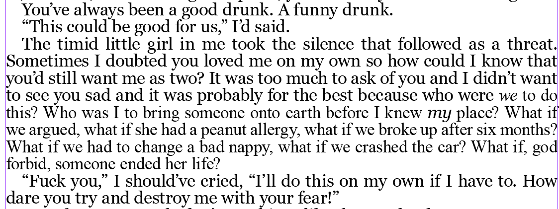
No, it looks like I've used a smaller font size when they're all exactly the same. Why would that have anything to do with the length of the word? After 'what if' it looks like the text becomes way smaller.
Copy link to clipboard
Copied
If you click inside that smaller text and check its size, you are sure it says that it's the same size as the larger text?
Copy link to clipboard
Copied
Hi Ogham, welcome to this friendly forum.
Please let us know which version of InDesign you have and your operating system and version.
The tutorial is about setting up Paragraph Styles. You set up styles for each kind of paragraph (text, headings, captions etc) and then apply them to the relevant paragraphs. For individual word or words within a paragraph you want to be different e.g. bold or italic, you need to apply a Character Style.
Have a look at the online training videos on Lynda.com, devoted to inDesign, they will take you through step-by-step the various features of InDesign. You can get 30-days free access.
Copy link to clipboard
Copied
Thank you! I think setting the character styles has fixed it!
I did set basic character settings in paragraph styles as the tutorial suggests, but for some reason ended up with the results in the picture above - just looks horrible.

Find more inspiration, events, and resources on the new Adobe Community
Explore Now
 AdChoices