 Adobe Community

Copy link to clipboard
Copied
Why do I get gray in the center of my gradients? It actually looks more gray in the file.


 1 Correct answer

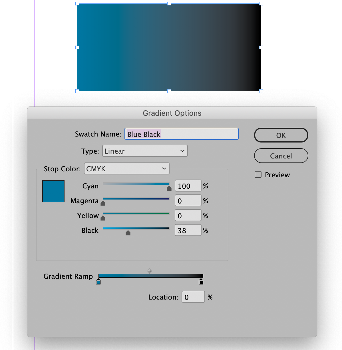
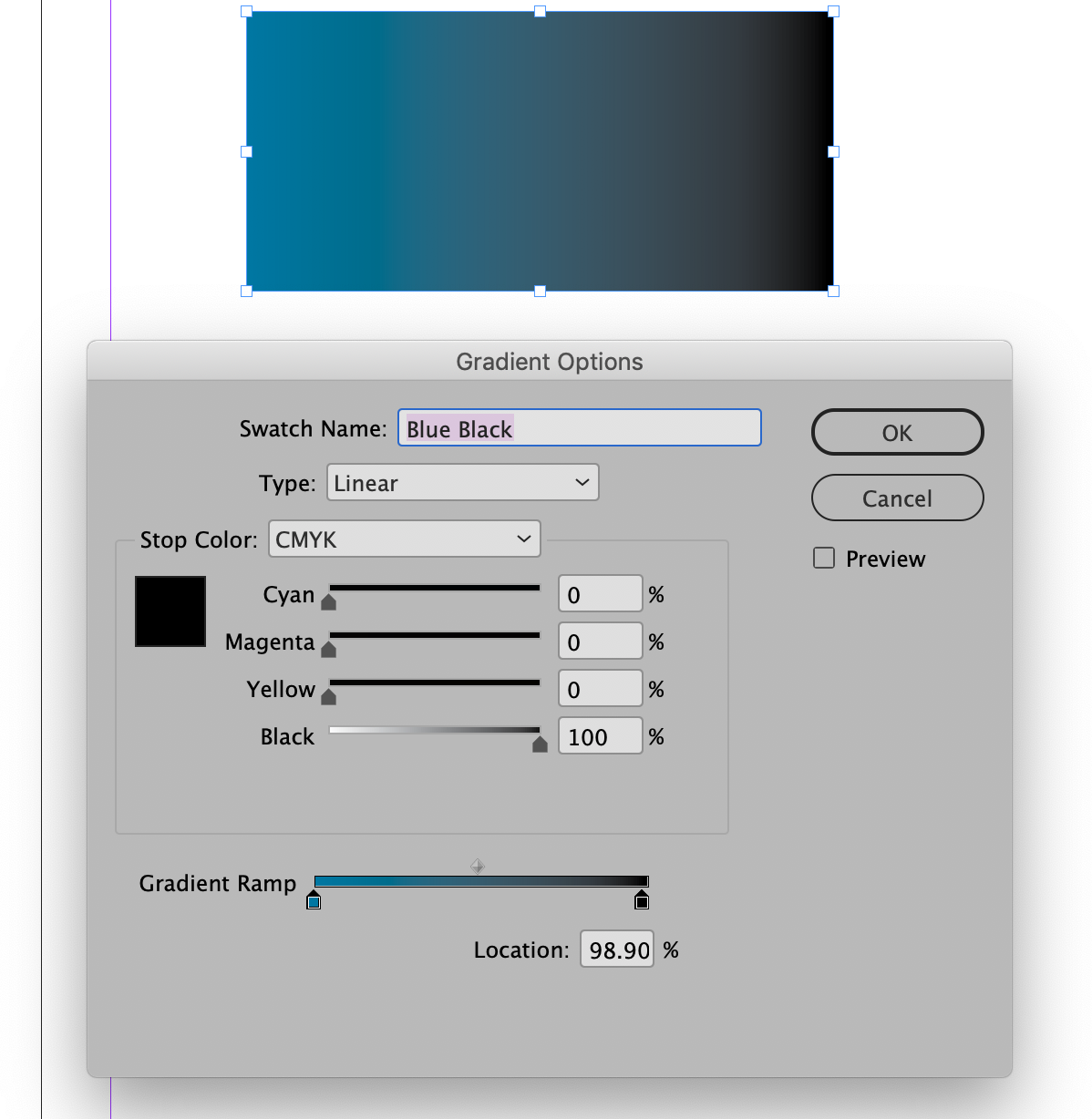
The results you're getting are because you are trying to gradiate (if that's actually a word) two spot colors together. The reality of gradients is that you will need to break down the transition to CMYK or RGB. As you can see in the screen shot below if you use the CMYK breakdowns from the PANTONE CMYK Color Bridge Coated Library rather than the PANTONE Solid Coated (Lab Color) versions you will get a smooth transition.
 11
Replies
11
11
Replies
11
Copy link to clipboard
Copied
What version of InDesign? What operating system?
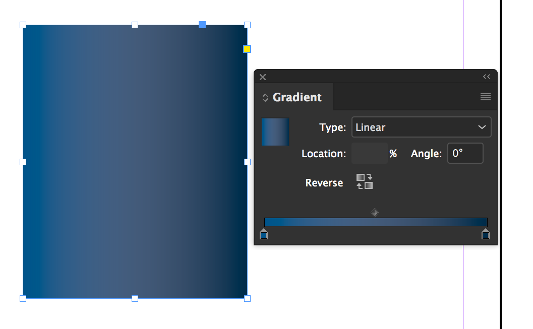
Either double click the swatch, or make a swatch from the gradient and show us the values of each color stop in the gradient, like this:
Copy link to clipboard
Copied
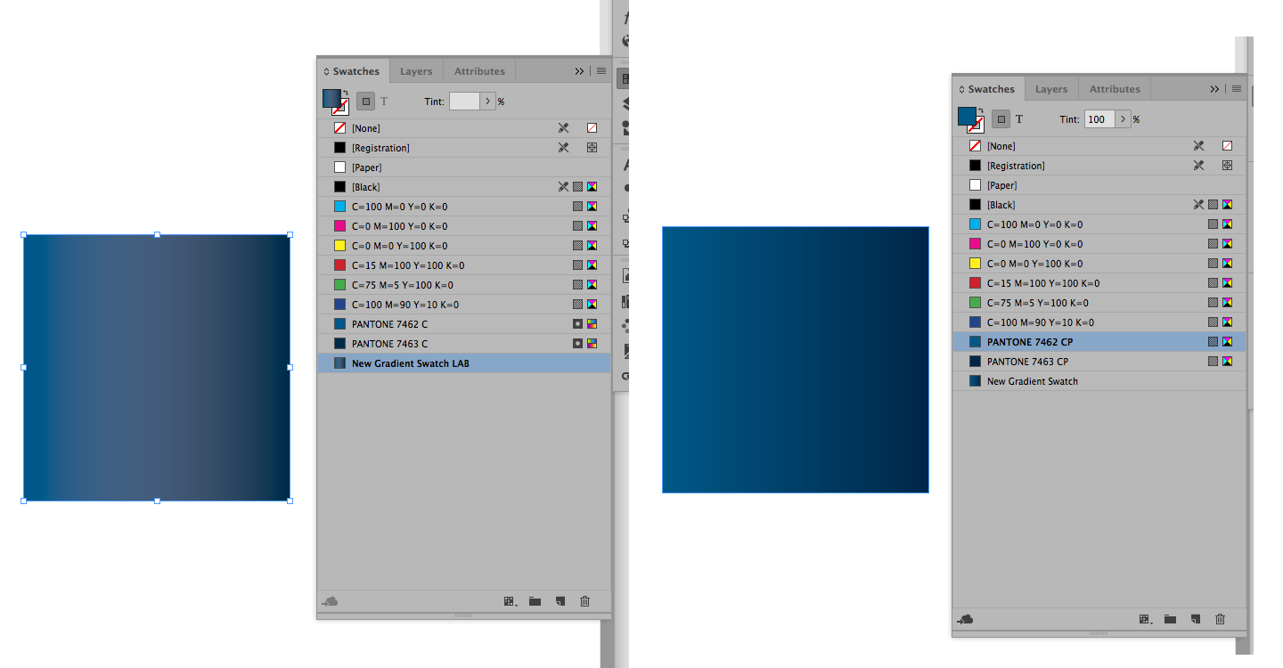
What colors are you using as the beginning and end points of your gradients? Are you trying to blend spot colors or CMYK? Please show a screen shot of your New Gradient dialog window and your gradient panel while a sample of the gradient is selected.
Copy link to clipboard
Copied
using pantone coated 7462 and 7463
Copy link to clipboard
Copied
It's pretty unlikely that you're actually going to be printing a Pantone spot color on top of a Pantone spot color on the printing press (or on your laser or inkjet printer either). You'll likely be printing it as process color CMYK, so you should mix the gradient using CMYK values.
Also, what you're seeing on screen is NOT Pantone colors mixing. It's Pantone values converted to RGB values which are being displayed by your monitor or screen.
To really see the gradient you would need to see it printed out.
Copy link to clipboard
Copied
So, what's weird is it looks ok when small but I'm using it on a poster and then I get more of that gray in between the two colors.
Copy link to clipboard
Copied
The results you're getting are because you are trying to gradiate (if that's actually a word) two spot colors together. The reality of gradients is that you will need to break down the transition to CMYK or RGB. As you can see in the screen shot below if you use the CMYK breakdowns from the PANTONE CMYK Color Bridge Coated Library rather than the PANTONE Solid Coated (Lab Color) versions you will get a smooth transition.

Copy link to clipboard
Copied
That is sooo helpful! Thank you. Will that color hold for printing?
Copy link to clipboard
Copied
It is designed to do so.
Copy link to clipboard
Copied
One last question. In general should I design in InDesign using CP colors for digital print materials?
Copy link to clipboard
Copied
The CP colors are PANTONE's recommendation for the CMYK breakdowns for their colors. In the advertising agency in which I work we have always used these breakdowns with great success. You should be aware, though, that they are not exact matches for their corresponding PMS colors. The spot colors that the Creative Cloud provides through the PANTONE Solid Coated library are based on LAB colors (not CMYK) and will appear on screen much closer to the actual color swatch than the colors in the CMYK Color Bridge (CP). However, if you change the Color Mode from LAB to CMYK you will get a breakdown which is radically different than the one provided in the Color Bridge. So which to use?
On PANTONE's website there is the following:
“In the Adobe applications, if you pull up a solid PANTONE color and ‘convert’ it to CMYK, you will achieve converted data based on the color setting and algorithms used by the software. This data will differ from the explicit data provided in the PANTONE COLOR BRIDGE guide and accompanying digital libraries.
“If your intention is to output CMYK separations which are consistent with the PANTONE COLOR BRIDGE guides, you should be selecting your colors from the PANTONE COLOR BRIDGE libraries, as opposed to selecting colors from the solid color libraries and converting to CMYK.”
Adobe's website says the following:
“When workflows demand that Pantone colors use CMYK values, Adobe recommends that you use the Pantone Plus Series® global colors instead of spot colors.”
The CMYK Color Bridge is one of the Pantone Plus Series so that should be that. However, I have seen a number of vendors using the aforementioned algorithms rounded off to whole numbers as their breakdowns.
So which way to go? Personally, I feel that PANTONE makes the colors so I go with their recommendation. Others choose the converted to CMYK LAB colors. The bottom line is make a choice and stay with it.

Copy link to clipboard
Copied

 AdChoices