Participant
October 28, 2022
Answered

InDesign Neon- und knallige Farben werden mir nicht richtig angezeigt. DANKE.

  • October 28, 2022
  • 4 replies
  • 10818 views

Liebe Community,

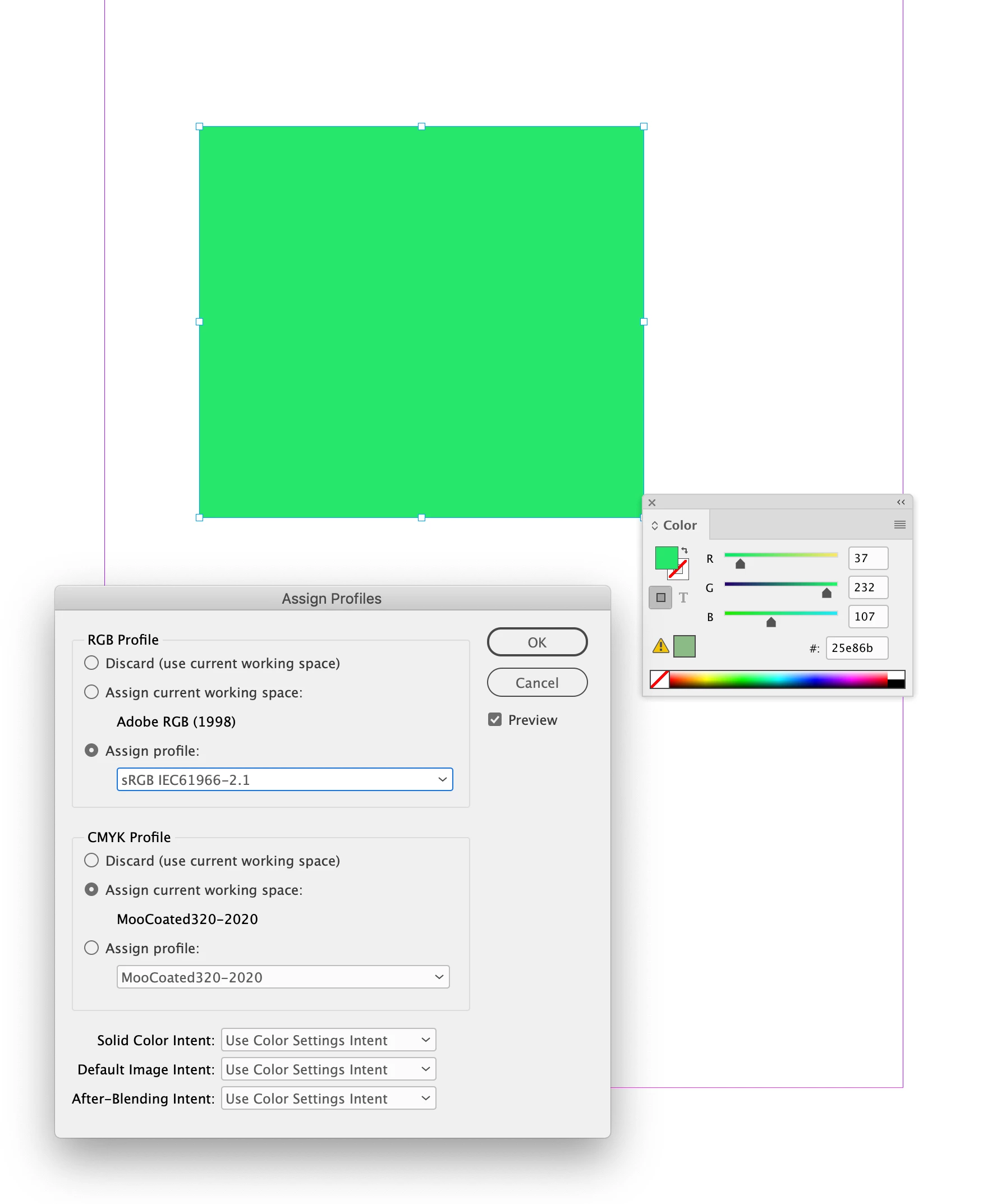
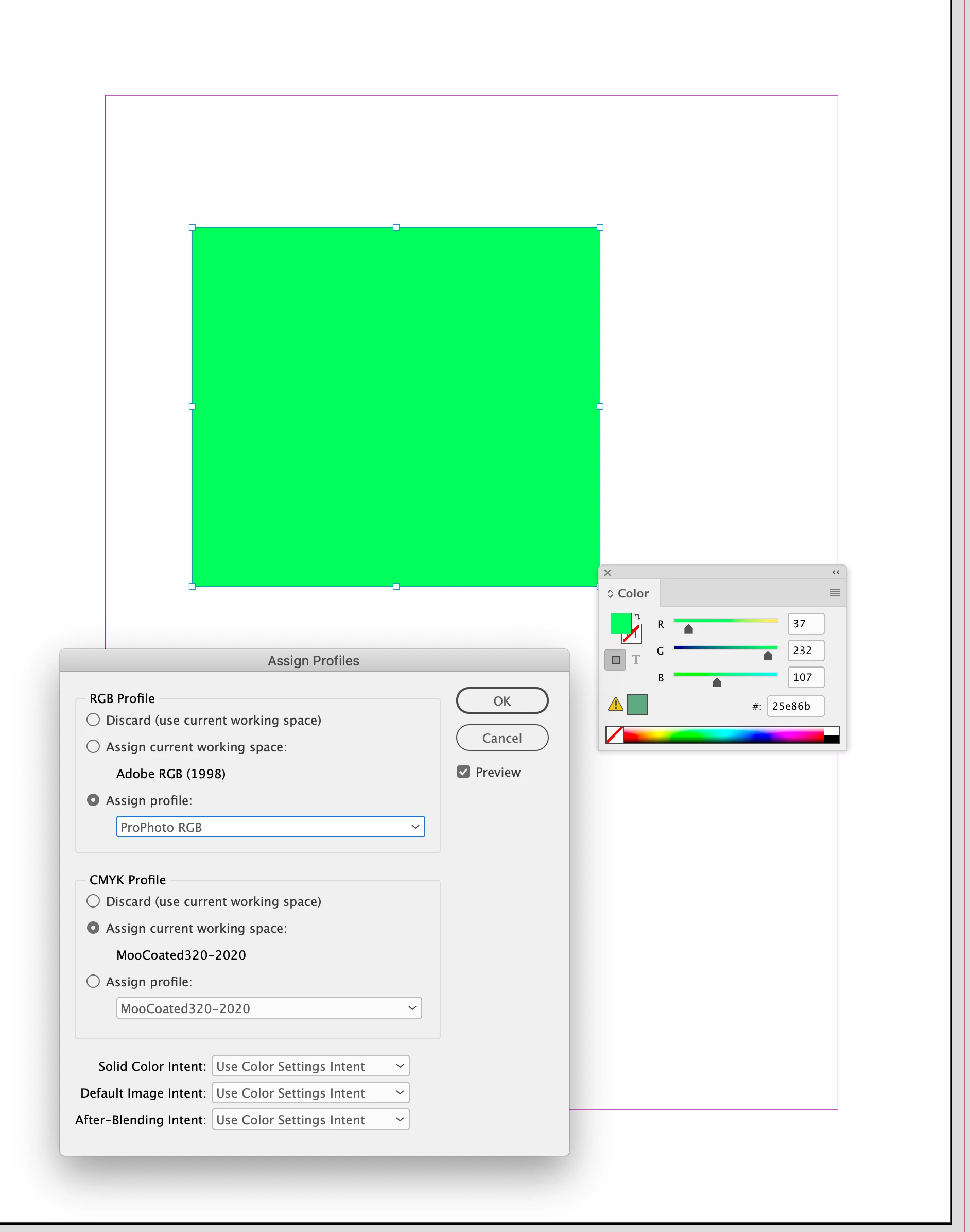
manchmal sieht man ja den Wald vor lauter Bäumen nicht. Evtl. gehört diese Frage in den TOP 10 der dämlichsten Fragen in 2022. Für mich ist das aber wirklich ein Grund kurz davor zur Gesprächstherapie zu gehen.

Wenn ich ein Design erstelle und eine Neon Farbe verwenden möchte? Dann wird mir diese Farbe im Design komplett anders angezeigt als ich die Farbe als RGB Werte eingestellt habe. Solch Farben bekomme ich einfach richtig angezeigt:


DANKE !


Correct answer rob day

Hi @sascha26841088hap6 , The Adobe print applications are color managed—the display of an RGB value depends on the document‘s RGB color profile assignment. The application showing the color picker in your screen capture is probably not color managed and is displaying the RGB value using your OS’s Monitor profile.


Here you can see I have created a fill that matches your #25e86b RGB hex value, and I have the InDesign document’s RGB profile set to sRGB:


If I change the RGB profile assignment to a different profile, the RGB color appearance changes, but its values are the same:


I could assign my system’s monitor profile and get a different appearance. Assigning your Monitor profile (Edit>Assign Profiles...) would probably match the color appearance you are seeing in the application with no color management capabilities.


4 replies

rob day
Community Expert
rob dayCommunity ExpertCorrect answer
Community Expert
October 31, 2022

Hi @sascha26841088hap6 , The Adobe print applications are color managed—the display of an RGB value depends on the document‘s RGB color profile assignment. The application showing the color picker in your screen capture is probably not color managed and is displaying the RGB value using your OS’s Monitor profile.


Here you can see I have created a fill that matches your #25e86b RGB hex value, and I have the InDesign document’s RGB profile set to sRGB:


If I change the RGB profile assignment to a different profile, the RGB color appearance changes, but its values are the same:


I could assign my system’s monitor profile and get a different appearance. Assigning your Monitor profile (Edit>Assign Profiles...) would probably match the color appearance you are seeing in the application with no color management capabilities.


Community Expert
October 31, 2022

What usage is your design for - is it for display on screen only, is it going to print? Who's printing it? What printing technology do they have? Have you spoken with a printers about producing neon colours. 


Display on the screen will always differ from screen to screen.

Legend
October 28, 2022

Mich interessiert das Thema. Mach mal einen Screenshot mit einem Bild/Photo mit Neonfarben innerhalb und außerhalb von ID, damit man den Unterschied sieht. Wenn ich bei mir eine Fläche mit einer Neonfarbe wie RGB #00FF8A fülle, dann sieht es so aus, wie es aussehen soll. 

Participant
October 28, 2022

danke! anbei ein screencopy.... auf der rechten seite kannst du die farbe sehen wie ich mir es wünsche ! auf der linken seite in adobe schaut die farbe matt aus und nicht so wie im original. warum?


Legend
October 28, 2022

Wenn ich die Farbe in ID und PS erstelle und fülle, sieht es gleich aus:

Also muß man sich fragen: welche Einstellung in ID kann den matten Effekt verursachen?

Definitiv sind das Überdruckenvorschau und Farbproof. Klar, genau dafür sind die beiden Funktionen da, dir zu zeigen, daß es im Druck später etwas anders aussehen könnte als auf dem Bildschirm. Aktiviert man es nicht, könnte man hinterher enttäuscht sein. Aktiviert man es, wundert man sich. Ich hab's auch immer aus, aber wir drucken nichts mehr. 


Eric Dumas
Community Expert
Community Expert
October 28, 2022

Hi, no therapy needed.

Can you confirm what you mean by 'neon colour'?

If this is a colour used from the colourbook (Pantone for example PANTONE® USA | Pastels & Neons Guide | Coated & Uncoated) to print in neon ink, your colour needs to remain a spot colour not RGB.

It doesn't matter what it looks like on the screen. The point is that when you check your colour seperation (Prepare to print separations in InDesign (adobe.com)) you will see your neon colour separated from other colours (like CMYK). This will tell the printer to load a special ink (Neon colour number) and print an extra layer on the page with that special ink.


RGB colours will always display differently on screens than when printed on paper, even after complex screen calibrations.

Jens Trost
Inspiring
October 31, 2022

Hast du Transparenz auf der Seite?
Sobald das der Fall ist, greift der Transparenzreduzierungsfarbraum / eingestellt unter Bearbeiten. Wenn der auf CMYK steht, kannst du machen was du willst – die Farbe wird mit dem Gamut deines Dokumenten-CMYK Farbraums angezeigt.

[Nachtrag]Wenn deine finale Ausgabe fürn Bildschirm/Web gedacht ist, stell den Transparenzreduzierungsfarbraum auf RGB. Wenn für Print, darfst du dich nicht an der Darstellung stören. Dann musst du die Farbe eh als Sonderfarbe anlegen, weil in CMYK die Farbe so nicht produziert werden kann.

Ohne Transparenz:


lediglich ein Rechteck mit 5 % Deckkraft eingefügt:

[/Nachtrag]