- Home
- InDesign
- Discussions
- InDesign rendering Illustrator linked graphics dif...
- InDesign rendering Illustrator linked graphics dif...
Copy link to clipboard
Copied
I'm prepping a littany of wayfinding signage where color accuracy is critical. All colors across the Illustrator documents are in the CMYK space with the intentional selection of CMYK+/OGV Pantone swatches (a total of 5 in relatively simple artwork). I've gone through each one and made sure that no other colors are sneaking through via the recolor artwork tool and manual verification of color values.
I initially set these up in Illustrator but am using InDesign for prep and export so that I can add slug for cut decals. For some reason, the color is rendering differently across the the documents. One is more vibrant than the other, but if I turn on Overprint Preview (which bogs the program down), all the colors render the same. Somewhere along my Google searches I read it could be a hidden RGB item I can't see or transparency somehwere. Is that my best bet or am I overthinking it? I want these spotless for production.
Any explanation as to why this might be occuring? No document has any RGB swatches that I can locate.
A business that makes nothing but money is a poor business. - Henry Ford
 1 Correct answer
Update, I've resolved the issue. We had a logo and the white version of it was adjusted to where a portion of the white lettering had a poorly designed transparency mask on it. I thought I had remedied the problem through the manual addition of a color value with the closet approximation of an equivalent CMYK value, but the former maskes were still deeply embedded in the graphic despite being empty which was causing InDesign to assign a profile to the embedded graphic.
Copy link to clipboard
Copied
Update, I've resolved the issue. We had a logo and the white version of it was adjusted to where a portion of the white lettering had a poorly designed transparency mask on it. I thought I had remedied the problem through the manual addition of a color value with the closet approximation of an equivalent CMYK value, but the former maskes were still deeply embedded in the graphic despite being empty which was causing InDesign to assign a profile to the embedded graphic.
A business that makes nothing but money is a poor business. - Henry Ford
Copy link to clipboard
Copied
Resist the temptation to evaluate anything based on its on-screen appearance. Use Separations Preview in InDesign and/or post-export in Acrobat to verify color values empirically.
Copy link to clipboard
Copied
Any explanation as to why this might be occuring? No document has any RGB swatches that I can locate.
Overprint Preview produces different results depending on the mix of transparency, process, and spot colors that are outside of the CMYK gamut.
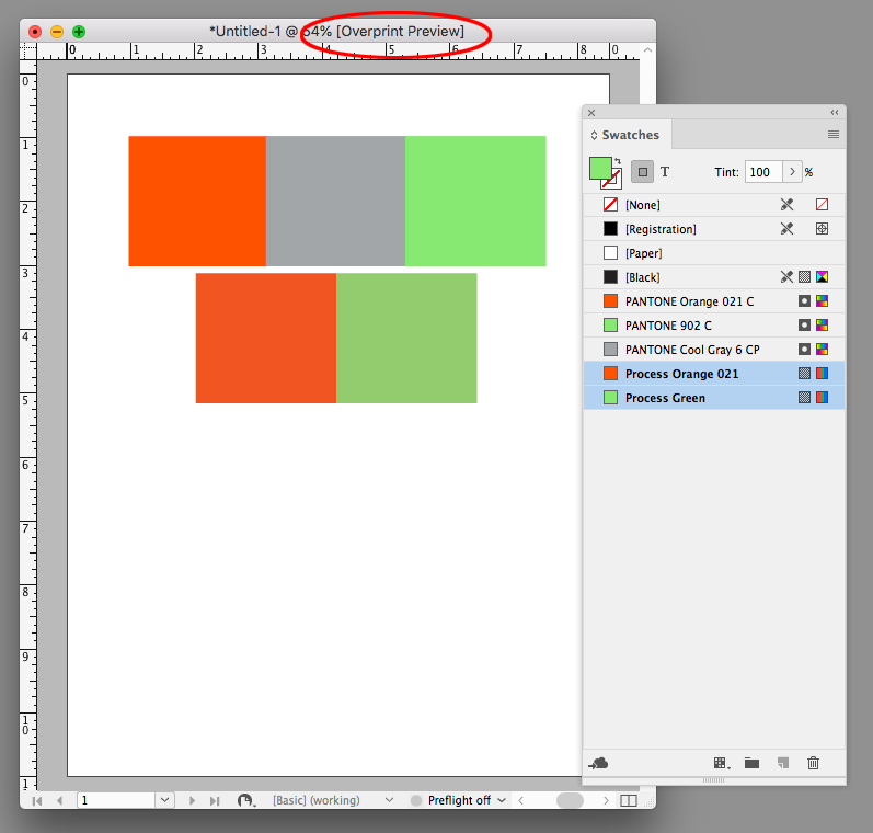
Here the top row of colors are all Pantone Lab defined spot colors—the orange and green are out-of-gamut to CMYK. The bottom two colors are the orange and green duplicated and converted to process RGB colors and are also out-of-gamut.
If I turn on Overprint Preview the top row of spot colors do not change because Overprint Preview is showing the expected print output of the solid ink colors. The process RGB colors do change because Overprint is showing how the process colors would convert into the document CMYK space.
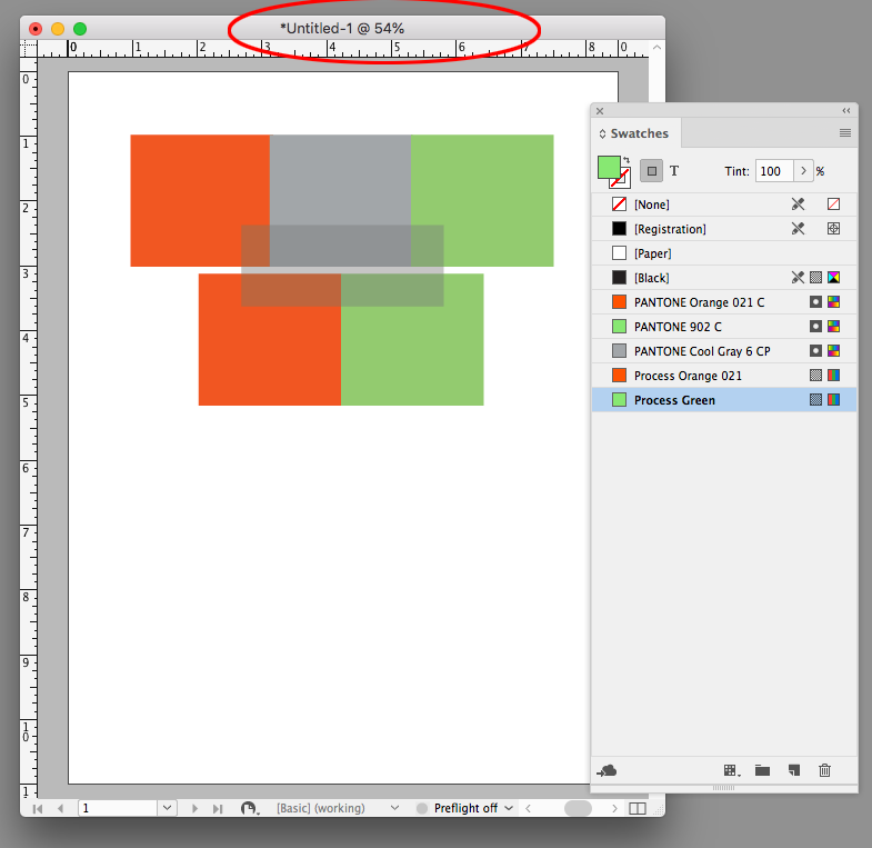
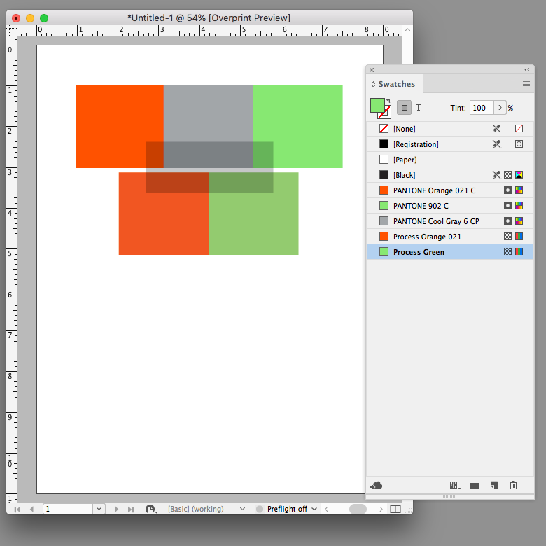
If I add a transparent object into the mix, and turn off Overprint, I get a preview of the page in the document’s Transparency Blend Space, which is CMYK in this case, and all of the page color displays as process CMYK.
This is not how the solid ink colors would print as process and spot separations on an offset press, and I have to turn on Overprint Preview to see the expected print output of the spot, process, and transparent colors:
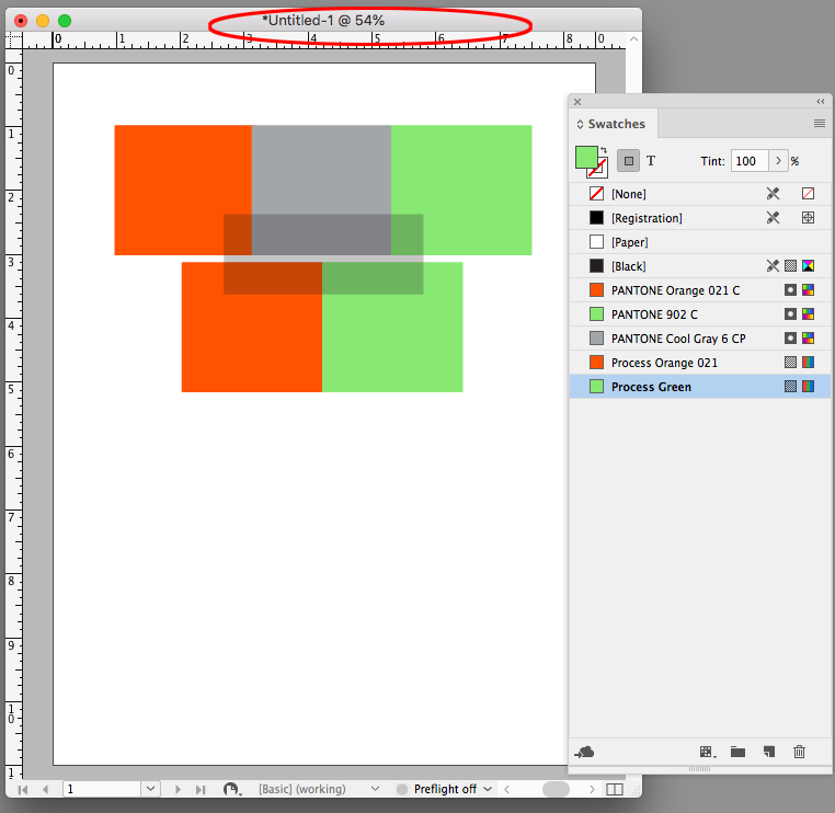
If the blend space is RGB, the preview shows the page as composite RGB when Overprint is off, and the spot colors’ preview don’t change because they are inside of the RGB gamut.
Copy link to clipboard
Copied
That was crazy insightful, thank you!
A business that makes nothing but money is a poor business. - Henry Ford
Find more inspiration, events, and resources on the new Adobe Community
Explore Now


